Q+A with Allyson Torrisi, curator for Images for Humanity and deputy director of photography for People Magazine

images for humanity

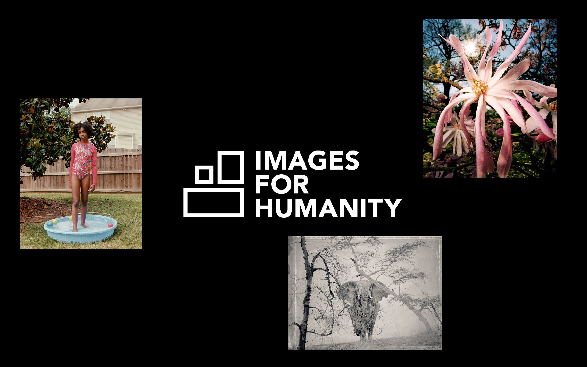
Clockwise from top right: Bobby Doherty / London, 2022; Andy Anderson / Mock Charge, April 2007; Kennedi Carter / Jocelyn, 2020

A collective of some of the world’s top photographers, curators, and industry experts have launched Images for Humanity, a nonprofit harnessing the power of photography to help people in crisis around the world. 

Launched in May of this year with a Ukraine Crisis Fundraiser and print sale—featuring photos from a mix of more than 100 iconic, celebrated, and emerging photographers—the organization was founded by acclaimed photographers Andy Anderson and Max Hirshfeld. All profits from the print sale go to the Ukrainian Red Cross.

SPD chatted with Allyson Torrrisi, deputy director of photography for People Magazine and one of the curators for the project. View the full selection of images available with donation at imagesforhumanity.org.

SPD: How did the idea for Images for Humanity come about? 

Allyson Torrisi: [Renowned photographers and cofounders of Images for Humanity] Andy Anderson and Max Hirshfeld keep in regular contact. They were zoom chatting in the early stages of the Russian invasion of Ukraine, wondering what they could do to help, and landed on the idea of a photo sale. 

SPD: What drew you to the organization? 

AT: My reason for joining the cause was a compassion for the people of Ukraine; their displacement and the ravages of an invasion like this creates. I have been in the photo world for a few decades, and I have experienced firsthand the power of photography. 

Photography and photographers have had a longstanding relationship with crisis, and Images for Humanity, felt like an organic extension of that relationship. We aren’t inventing the photo charity, we have just created a larger one with what we hope will have an expanded impact. 

Some of my favorite people were also involved, and I met some new favorite people. Laurie Kratochvil was my first boss, and has been kind of mentor; we’ve stayed in touch over the years, and when she invited me to be a part of it, there was no way I could say no. 

SPD: What was the process for curation? 

AT: Our priority was to bring together a diverse, impactful group of photographers that would help us raise money. Each curator, there are 5 of us, submitted a handful of names, and as we reached out we got such a great response that the list expanded to over 100 photographers. 

Our request was simple: images that represented their work, personal or professional, and would be good for the cause. We also asked them to think about scale: the prints are gorgeous 8x10, on beautiful paper—so we wanted imagery that would scale well. 

SPD: Do you envision the role of the organization evolving as different needs arise around the world? 

AT: Yes, we imagine this organization expanding and helping other causes, we are already thinking of ways that the curation and the organization can support other causes. 

We’re fortunate to have photography as our medium, as it supports this need for versatility. 

Pop-Up Magazine's Spring Issue: At Home

At the end of May, Pop-Up Magazine streamed their first-ever virtual show. Adapting to nationwide shelter-in-place orders, the Spring Issue: At Home transformed their production to an online experience that could be watched from the comfort of your own home. SPD chatted with some of the team behind this issue including Anita Badejo (Executive Editor), Rebecca Chew (Art Director), Annie Jen (Art Director), Leo Jung (Creative Director), and Megan Lotter (Digital Designer) as they walked us through the production of the show. Read more to learn how it all came together and watch the Spring Issue: At Home here.


SPD: Tell us about The Spring Issue: At Home.
Anita Badejo, Executive Editor: The Spring Issue: At Home is our first ever online show. It still features the signature elements of a live Pop-Up Magazine show — new, nonfiction stories, a diverse mix of storytellers from different mediums and backgrounds, original music from our house band, Magik*Magik Orchestra, and beautiful illustrations, animations, and film — but instead of being presented on stage in a big, beautiful theater, they're all presented on screen. At any given moment, you might be watching some combination of the storyteller, a musician in the band, and art or film, making for a unique experience that we like to think of as a cross between a live performance, a video, and a comic book. The stories all speak to this time in really interesting ways, be it through the experiences of doctors, high school seniors, houseplant owners, or comedians on long bus rides (remember those?). There are all sorts of moments — hilarious, heartbreaking, and thought-provoking — packed into just under an hour.

SPD: Normally, Pop-Up Magazine would be preparing to tour the country with its Spring Issue but due to the pandemic you had to shift to a virtual presentation. What were the conversations like when Pop-Up decided to produce its first-ever online show?
Anita Badejo: Like so many other live shows, we were heartbroken when we realized we wouldn't be able to gather people in theaters. Throughout our history we've been known for being ephemeral, not recording our shows for public distribution. There's a certain magic and presence that comes from watching something in person, surrounded by others, that we've always tried to honor. The pandemic turned all that on its head, and compelled us to reimagine the show as an entirely digital experience. It wasn't long before we realized that with that shift also came tremendous opportunity.

For the first time, we've been able to reach audiences unlimited by place, time, or ticket price and collaborate with storytellers and performers who might not be able to go on one of our tours. We knew from the get-go that we wanted to make something that still preserved the essence and DNA of our live shows, but that was satisfying to see on screen. We weren't sure that was possible at first, but we dove in head-first. One of our senior producers who is an incredible video editor led the charge on leading the team through the production. The rest of our story producers identified which of the stories we had already planned for the Spring [that] made sense in this format and found others to round out the lineup. Our music director immediately started experimenting with how to rehearse and record the band virtually. Our production manager assembled filming kits and had them shipped to contributors across the country. And of course, the art department came up with a design and identity for the video that both reflected the live show but is also totally unique and captivating in its own right.

SPD: How did designing for the production change when the show was moved online? Are there certain assets you had to produce that you normally don’t work on for the show?
Leo Jung, Creative Director: 
For the live show, there are generally three elements that bring the story to life: the storyteller, the band, and the art on screen. We’ll weigh in on other visual elements if there are any (performers, lighting, projections, etc.), but generally the screen is our canvas.

When the show moved to a video format, the screen became the theater — which meant commissioned art needed to share space with [the] storyteller and music. Commissioning art wasn’t very different, but designing the screen to accommodate the other elements was probably the greatest challenge. We’re so used to not seeing narrators and musicians in videos that it seems counterintuitive to include them. For us, each element is so integral to the storytelling that we wanted to make sure they were represented.

Controlling what the visuals are and the timing, pacing, scale of them has always made us quasi-video editors, but adding footage of storytellers and musicians added a level of complexity that was, initially, quite overwhelming. Should the storytellers be standing, sitting, looking at the camera, off-camera? What angle should the musicians be shot? What should they be wearing? These were more plates than we were used to juggling. Thankfully we had a solid team of producers and an experienced video editor to guide us through that process. With a lot of open communication, there was some semblance that we knew what we were doing — even though we often didn’t. After some arduous experimentation early on, we eventually started to understand what worked and what didn’t.

SPD: Are there any major differences to the At Home version of the Spring issue than what was originally planned?
Anita Badejo:
Yes and no. Some of the stories were newly commissioned for the video, as not all of our original stories translated from the stage to the screen. And the dances were entirely inspired by the pandemic, since during this time when almost all of us are confined to the same spaces day in and day out, we felt it was important to have movement represented [in] the show. The pieces created by each of the dancers / choreographers we reached out to ended up being so moving and poignant. That being said, what was so interesting to us when we sat down and looked at our original lineup is that several of the stories we had already planned to feature in the live show were actually perfect for this time. We reached out to Darryl Cheng of @houseplantjournal as we've known that houseplants have been having a bit of a moment for a while now. But they've taken on an entirely new meaning now that they're the only living creatures in some people's homes apart from themselves. For humor writer Mia Mercado's story, we initially planned to give everyone in the audience a greeting card as a souvenir for coming to the show, which we had to let go of. But instead, the shift to video gave our music director the totally inspired idea to use office supplies as instruments, transforming that story's score into one of the most playful and engaging parts of the show. And when we had first assigned Alejandra Vasquez's film about high school mariachi in Texas, we had hoped to have the student musicians perform live in theaters at the end. The virtual performance of those teenagers in their bedrooms is just as, if not more, moving.

SPD: What have been the challenges of planning/designing/producing this show remotely?
Annie Jen, Art Director: 
The production of Pop-Up Magazine is truly a group effort and relies a lot on communication among the team. So it becomes challenging when everyone is [in] different locations and time zones. We managed to be more diligent in communicating and make things work for one another.

Leo Jung, Creative Director: Yeah, working remotely is hard. There’s something that’s lost when people communicate solely via slack or email. Emojis are a pathetic replacement for the nuance of language, tone, and expression. Video-conferencing helps a little, but very quickly, people begin to suffer from meeting fatigue. Since we were making something we’ve never made before, our processes no longer applied. Mix in the fact that every colleague’s living situation is different, and you quickly realize this is not going to be easy to pull off.

We’ve never had to adapt the live show to digital before, so it was uncharted territory for us. What we do is rather unique: We tell a collection of unpublished stories, we compose music for them, and we commission art for them. Each component contributes to an interdependent dynamic of bringing the story to life. So we knew we didn’t want to hide any of those pieces. We wanted to remind folks that while you’re hearing someone tell a story from Portland, someone was playing a vibraphone in L.A., and someone painted the art in New York. There’s beauty in that.

There’s also the challenge of making each of those components feel represented. In a theater, an audience member can choose to shift their focus to different components whenever they wish. In a digital setting, you have to guide their focus. Without it, it’s easy to get lost and confused.

SPD: What is the design process like for each story?
Annie Jen, Art Director: 
The approach of the design process is similar to approaching editorial design. The first step is to figure out a prototype that could work for the show: considering all the elements that makes up Pop-Up Magazine (a range of different types of storytelling, different visual treatments, contributors and music footage), how do we make each story look different but still feel like they are all part of the same look?

When drafts of the story are shared, we will have a meeting with the producers and music director to discuss whether this story would benefit most from illustration, photography, film, or a mix of all three elements.

The Art Department usually focuses more heavily on illustrated/animated stories. When we get a draft of the story, we will start to mark up the script, deciding what are some of the most visual moments from the story, and start considering what will be the best approach for this: Is it illustration? Is it animation? Or a combination of both? What kind of style and pacing do I want the scene to have? Is there any interesting transition that I need to consider? Since you’re working on a timeline, you’re not only considering one single moment but how to pace the visuals out to keep the story going.

SPD: Can you walk us through The Spring Issue: At Home’s visual identity? What are the major creative elements?
Rebecca Chew, Art Director: 
We wanted an identity that feels tactile and handmade, similar to the way our Winter Issue’s identity employed a painted stroke, but also something that could stand on its own as a new event with new content. To achieve that, we hired Stina Persson for her watercolor plant illustrations, with all their drips and layered washes. The identity was never intended as simply a static graphic, and we wanted to take advantage of motion to make it come alive by animating paint to spread and reveal the plant illustration. A well-watered garden budding with new growth was the feeling we were aiming for. The strong bright-green background and bold Knockout type serve to complement, by way of contrast, the wispy and gauzy illustrations. And when we found out that we could no longer bring the show on the road, “At Home” was hand-lettered in to reflect the scrappy way we’re working through this unprecedented crisis.

Megan Lotter, Digital Designer: Over the past few issues, we have been further developing and exploring the motion design of our identity systems. Rebecca and I worked in tandem on this aspect of the identity in its early stages before shelter in place. We had certain expectations for how motion would be applied to our live show and social assets, but as we quickly pivoted and adapted to developing the Spring Issue to live online, our whole team came together to develop totally different ways of exploring motion in relation to the identity. How we adapted our show opener and title cards (both things our live-audience friends will recognize from our live shows) are great examples of this. How could we create parts of our digital show that still felt intimate, considered, and uniquely Pop-Up? We developed a stop-motion approach to create a narrative thread throughout the show, choosing to shoot home environments that tied into our contributors’ home environments.

SPD: What are you most looking forward to with the At Home issue?
Anita Badejo:
For years, we've had fans of the show wish that they could package it up and share it with their friends and family in cities and countries where we don't currently tour. I'm so excited that, for the first time, people can share a Pop-Up Magazine show. I can't wait to hear what new viewers think of the experience.

SPD: How do we watch The Spring Issue: At Home?
Anita Badejo: You can watch it on our website at popupmagazine.com/watch or stream it directly from our YouTube channel (and while you're there, why not subscribe?!). It will live on our channel permanently, so you can watch it anytime you like!

Watch Pop Up Magazine’s Spring Issue: At Home below!

In Pop-Up Magazine, writers, filmmakers, radio producers, comedians, and photographers perform true, never-before-told stories alongside original music and a...


Essence's 50th Anniversary Cover with Creative Director, Nia Lawrence

 
00_NAOMI_Digital-scaled-min.jpg
 

ESSENCE celebrated its 50th anniversary last month with a landmark cover of Naomi Campbell. This cover is a bit different, though, because Naomi photographed the cover herself with an iPhone in her own home. It’s an innovative yet necessary move for the brand, since during the lockdown we creatives have to continue creating although under tight restrictions and limited social interaction. But those limitations didn’t stop ESSENCE. The cover is beautiful, elevated, and effortless. It’s a testament to the brand’s iconic black girl magic.

Justin Miller spoke to Creative Director Nia Lawrence for SPD about the milestone anniversary and cover, as well as the brand itself and how she’s been working, thinking, and living in these times. Here is their conversation:


Justin Miller: Celebrating 50 years of ESSENCE! How does it feel?
Nia Lawrence: Honestly, the whole year has been a conversation about the 50th. Events, the logo, not just the magazine. And right before we went to print, the offices and the city were shutting down, all of our photo shoots were cancelled; it was a crazy rush to get everything out. It was so surreal trying to pivot because the printer will start regardless. 50 years happened so fast! We’ve been looking back at our archives, and our digital archives only go back so far, so at some points we’re flipping through pages that have been bound together—it’s amazing to see how far the magazine has come since the seventies.

JM: You think about the 50th anniversary, it’s a huge number, and thinking about Naomi Campbell—you know, who is an internationally known, respected, and also a powerful and aspirational black woman. Can you talk to me about all of that, and if you all knew that it had to be Naomi since the beginning? 
NL:
Yes, it was always Naomi. It was her fiftieth, it was our fiftieth. At first, we had a shoot, we booked the studio worthy of Naomi Campbell. But everything started to change as soon as we saw her travel in the hazmat suit, right around early February? She’s already a germophobe (rightfully so), and then she wanted a limited set, then everyone had to wear their own suits, we needed a bigger studio, and fewer people, with more space between everyone—and then there was nothing. 

So then we came back to her with, Okay, what if we sent one person to your home? No. What if we just send the cameras to your home? And that’s how we got there! She knows her angles, she knows how to work a tripod, she’s been doing this for years. There was no fear there. [But] we weren’t there to set the lighting and give feedback on hair and lighting. She’s creative directing. It was a huge learning experience.

JM: This makes me think about collaboration with talent, but also with our teams. Where are you feeling the collaborative force is moving? 
NL:
I ask myself this every day. Where are we going? What are we doing? Putting out one issue remotely where everything had started with our team together is one situation. But it’s another thing to start completely fresh with everyone remote. I had just put up my entire mood board for Naomi, and then the next day I had no access to it! The content itself hasn’t been an issue. But executing how to visualize those stories is a huge challenge. Stock photography is amazing, but there is nothing available that speaks to what I need; I need models in masks.

We had just done a huge redesign with our September issue. We’re now shooting nearly fifty percent of the magazine, everything is super conceptual with props and huge teams, and I want to keep that momentum! Our team is scattered, and that’s difficult. But I’m thinking about what is next? What are we doing now, at home, that everyone wants? How are we creating and giving it to them? 

JM: Do you think that sets, and people on those sets, will go back to being the same? Will we find room to cut back? Is Zoom and iPhone going to increase as a content and production medium?
NL:
I hope so. I think that a lot of positive change can come from this. But here is the real thing: you can put together a team and have a huge photoshoot, and have a photographer, two photo assistants, the videographer, two video assistants, hair, makeup, styling—that is how we traditionally work. But COVID-19 is going to change that because I am going to be able to produce the same quality of photography with an iPhone for free. Naomi’s shoot would have been a normal costing cover shoot. And it went from that to what, $75 in messenger fees?

I think we’re going to figure out how to simplify the production. Moving into a more digital space, I’m watching content creators come up with things from their living rooms. One of my videographers started her own show from her home, and celebrities are reaching out to her to be on her show! I’m watching people make amazing content with nothing, with just the tools they already have.

Influencers have been doing this forever, so, I think, they’re going to really succeed at this time. But as we pivot, we take a look at what people are doing in their homes. I love what feels like behind the scenes! I love that I’m watching my favorite models address the camera with no makeup on and go live with their friends. It feels more intimate, it feels more personal, and COVID-19 has changed that, and it’s what we want.

JM: I agree. Naomi herself has a YouTube series now, where she’s sitting at home with a lite beat [of makeup], kickin’ back, talking to her friends. And that’s the level of intimacy and relatability that we’ve all been craving.
NL:
Yes, I think so, too, because in this Instagram world we’ve reached a point of saturation of the perfect pictures and the perfect homes, and now people are getting real. And I love it. If we were to continue with business as usual, to go back to all of the hair and backgrounds and shimmer, it would be tone deaf. 

I got rid of my cable, so it’s hard for me to know what people really want right now. I know what I want. And I know what people want in conversations I have, but are we going to focus on the resilience of the community? Are we going to talk about joy, and how we’re going to get through this? It’s a confusing time.

JM: Exactly. It makes me think about this great shift that’s happening of how magazines and brands use to be aspirational, that was the hot word. This is the “ideal,” when none of it was really achievable, yano? Readers still couldn’t afford those clothes or get that kind of lifestyle. Whereas now, on social, or just because of brands using iPhones and tools they already happen to have, the content is so much more relatable and reachable.
NL:
Absolutely! Everything! I had a blog on the side for a while, and it was about parenting and raising my kid in the city, and it was so refreshing to put that content out for a very small segment of people who might never see a black woman with a kid who’s out here kickin’ it and thriving. We need a place for everyone.

JM: Thinking about post COVID-19 and lockdown, what are your thoughts about the “Powers-at-Be” seeing the level and quality of content we got away with during quarantine, and giving us just one-hundred dollars for a shoot in our budget?
NL:
That’s what I’m worried about! But it’s a double-edged sword. It could possibly make things easier for me as a creative director. Did you see the D-Nice photoshoot with The LA Times right after his first quarantine party? They went to his house, the photographer was ten, fifteen feet away from him; she took a picture of herself, it’s a selfie, so you can see she’s in mask and how far she is away from him. That shoot is her Uber. And we don’t need lighting anymore. 

And again, maybe this all just simplifies it! Maybe I’m able to call a photographer I love who has equipment, send him to the subject, FaceTime me to see the background, and what I see is what I get. We are all loosening the rules right now, everyone has to be a little more lenient.

JM: What’s happening with ESSENCE.com and on social media?
NL:
There’s a huge push for digital and social content, and there’s a big shift for brands and their type of thinking right now. For example, for ESSENCE to do a live video, there’s a lot of conversations and back and forth, and it pushes us back a few days. It’s the same at the other big houses I’ve been at, too. We are really competing with someone who can put content up at the drop of a hat and go on live instantly and stay relevant, whereas we use to compete with other brands themselves.

If Idris Elba calls and wants to go live, are we ready for that? That’s what I’m thinking about.

JM: But ESSENCE is playing a space that is much more flexible and moves at a faster speed than if it were owned by a larger corporation, no?
NL:
Yes, we are, and I have to be so thankful for that. But ESSENCE has only been black-owned and under private ownership for, has it been a year and a half? It’s not been very long. And a lot of people have come from Time Inc, which was an amazing, service-driven company that had been around forever. Our Chief Creative Officer [MoAna Luu] comes from television and branding, and I see how quickly the ideas go from her head, to my ears, to fruition. It’s easier to be a little bit more flexible and creative when you don’t have to run ideas through a chain of command at the top, top.

But again, it’s not as easy. Before ESSENCE, I had my own design studio and I saw how quickly ideas went from brief, to project, and then it’s up in a week. Whereas with ESSENCE (and other brands), it takes months, of testing and focus groups. I want us to move at lightning speed, and not be afraid to fail. I don’t think there’s any failure right now, either. Our expectations for content are low!

I recognize that production studios are closed! I know we aren’t getting any new tv shows for quite some time. I don’t need perfect lighting; I don’t need the whole production. We’ve lowered our expectations, and not that we should lower the creative we put out, but we don’t have to overthink it so hard like us creatives do.

JM: You’ve hit the nail on the head. The ethos and storytelling need to still be on par, if not better. But we have to lean into the times—it’s okay if the quality is not one hundred. The world is not at one hundred right now, no one is at one hundred right now, and that’s fine.
NL:
Put that quote somewhere!

JM: We’re gonna trademark it and take it to the bank.
NL:
The world is not at one hundred right now! Use this time to do your thing. I am an advocate to use this time to think about what you really want to do, do it now or shelf it. We need to rest, too. My heart goes out to everyone who is working from home right now and trying to be creative staring at the same four walls, regardless of what they look like. Having to work from the same space every day is taxing.

0520-ES-CVS-001_WM.jpg

JM: Well especially for all of the parents right now, I cannot imagine. Trying to manage everything at once with homeschooling, kids coming in and out of the Zoom backgrounds…
NL:
Like you said, we are not at one hundred percent! I mean, if my kid pops into a meeting, it’s totally normal at this point. I expect distractions, I expect technical difficulties, and it’s good for the world to realize that everything is not so urgent. We can take a pause.

JM: Yes, there’s definitely an interesting conflict right now between pausing and being active. How much is too much when it comes to content and coverage?
NL:
I agree, and every brand needs a very clear vision and a very clear voice right now and hit these readers with that they want. And I am really curious to find out what our readers want. On my own Instagram stories, I’m like, Is it too much to post this Washington Post article I found? I’ve started second guessing myself, I think we all have. Do we give you our COVID-19 awareness package? Or do we give you the ten things to decorate your home right now? 

JM: And do you think that ESSENCE is not a place to second guess itself? Nor has it ever second guessed itself, as a brand, an authority, a figure of resilience?
NL:
The one thing is always true is that we are serving black women deeply. That’s always been the tagline. We’re shifting who we’re speaking to now. Because fifty years ago, ESSENCE was speaking to my mom, and now fifty years later, it’s still speaking to my mom, and me, and others. That’s a lot of generations. And you see it at ESSENCE Festival, too, you see all of the generations. We’re evolving; we want to stay true to the reader from fifty years ago, and give her content, but we need to always continue to reach the younger readers.

JM: What do the next fifty years of ESSENCE look like?
NL:
So, with our September redesign, I think that the shifts we made with our redesign were small enough to not make our readers feel like we changed and that they couldn’t identify with us anymore. Moving forward, I think it’s time to take a big change, only because I think people will be looking for that. Something that feels different. The world is different, the pages need to feel different. On a basic level, I’m looking to introduce new fonts, introduce more white space, talk to my editors about cutting some of their copy…[laughs] to make the magazine a destination! I want people to come to the pages and feel some relief, to feel relaxed.

I also want there to be so much more synergy between editorial and marketing, and all of our brand partnerships. We have to stand out as a brand right now. Any company with advertising dollars will spend them very carefully. The sales materials have to be in gold foil, we have to cut through the noise. We have to elevate our content in this climate somehow so brands will want to be associated with us on a regular and consistent basis. 

Instagram is such a huge landing point for all brands if you’re searching a new product or makeup artist, for example. I always go to Google but also ‘plus Instagram.’ So I need our Instagram to be the landing page visually for the most iconic black brand that has made it. Ebony has folded, Jet has folded; of all the print magazines, we are the one. And listen, I am very hard on myself creatively, I always think we could be doing better. I feel like I need to relax a little bit, but there are brands out there like Glossier, Allure, and Self, their brand is so strong across their site, video, paid advertising, products, editorial stories. And that’s where I want ESSENCE to be. That’s my dream.

Garden & Gun's Southern Women with Photography and Visuals Director, Maggie Kennedy

 
1 SW book.jpg
 

Late last month, the Garden & Gun team released Southern Women, their fifth publication. After working on this project for almost two years, SPD chatted with Garden & Gun’s Photography and Visuals Director, Maggie Kennedy about how the book came together.


SPD: Tell us about Southern Women.
Maggie Kennedy, Photography and Visuals Director: Southern Women: More than 100 Stories of Innovators, Artists, and Icons from the editors of Garden & Gun is the fifth publication in our series of books. It highlights remarkable chefs, musicians, actors, writers, artists, entrepreneurs, designers, social activists and public officials to offer a dynamic portrait of who the Southern woman is today. Over 200 pages of essays, interviews, photos and illustrations of the modern Southern woman between the ages of eight and ninety-eight. '

As we say in the book, “For too long, the Southern woman has been synonymous with the Southern belle, a ‘moonlight and magnolias’ myth that gets nowhere close to describing the strong, richly diverse women who have thrived because of–and, in some cases, despite of–the South.” 

SPD: Why did Garden & Gun decide to release this new book? What was the brainstorming process like?
MK:
Even though this book was almost two years in the making, it had really been developing organically since the early years of G&G. The magazine first dedicated a cover package to the stories of Southern women in our August/September 2011 issue. G&G contributing author Allison Glock wrote that feature’s opening essay which has generated more response than any other work she’s published in almost a thirty-year career. The continued passion on the subject led our editors to explore the best way to honor the strong and richly diverse women of our region.

G&G Editor-in-Chief David DiBenedetto and Amanda Heckert – deputy editor of the magazine and the editor of Southern Women– spent countless hours curating the diverse mix of potential subjects for the book. It was important to cast a wide net in order to survey women from various backgrounds for suggestions of who best to include in the project. We wanted to build layers into the chapters to allow each woman’s voice and image to engage the reader rather than just repeating a basic profile after profile. Through essays, odes, interviews, conversations, etc. that strong mix of subject matter Dave and Amanda were after came together. 

Once the editorial structure was in place, it then became a big puzzle visually. Talented G&G photo editor Margaret Houston played a tremendous role orchestrating many details once shoots started coming together. Also, art director Julia Knetzer worked with a few artists to achieve a nice balance of illustration woven throughout the chapters.

SPD: This book is almost two years in the making. How did you juggle this project with your daily duties as the Photography and Visuals Director of Garden & Gun?
MK:
Unlike the fast turnaround required for each issue of the magazine, this book project had a longer production time. Everything didn’t have to happen next week! We worked on the book shoots as the subjects were coming together editorially as well as when our regular photo schedules and deadlines allowed. We had the opportunity to take a breath and really think visually how best to capture these women in their world.  

SPD: A few years ago, G&G released The Southerner’s Cookbook, which you also worked on. What were the differences and similarities to producing Southern Women?
MK:
G&G published The Southerner’s Cookbook in 2015. I spent many years in the food photography world so it was a lot of fun to oversee photography for that book and bridge my previous experience into my G&G life. All of the cookbook photography happened within a two to three week timeframe with one photographer and crew. Southern Women dealt with multiple shooters over many months, varying production needs, budgets, contracts, paperwork, etc. Our spreadsheets had spreadsheets! 

Similarly, both books were photo heavy projects so chapter pacing was an important factor. And staying true to the G&G brand visually. Storyboarding throughout the process for both books was crucial and a lot of fun to see it all come together. Also, whether a book is 100 photos of recipes or 100 portraits, paying attention to styling, pacing, variety of camera angles, scale, etc. was critical.

SPD: There’s a mix of portraits from past G&G issues as well as new shoots specifically for the book. What was the process of selecting past portraits to include?
MK:
Yes, the book photography was a combination of original shoots for the book, portraits previously featured in the magazine, and supplied images from photographers and stock. We looked at those past portraits as the new shoots were developing to see how everything worked together visually in each chapter. It was a nice opportunity to revisit those past shoots and potentially run an outtake or two. Photographer Nigel Parry’s portrait of actress Danielle Brooks is a good example. I loved that shoot and how it ran in the magazine but there was one photo that I knew I wanted to include in the book that was always a favorite of mine. 

Also, I spent a lot of time thinking about the very first photo readers would see in the front of the book. How do you choose one single image to represent this entire book about women as well as G&G? Photographer Linda Foard Roberts’ magnolia cover from our April/May 2018 issue worked beautifully. This Southern flower on its own is elegant and strong but in this image, not perfect or too precious. Not a cliché.

1+Danielle+Brooks.jpg
1 Magnolia.jpg

SPD: How many new shoots did you do for Southern Women? What was the planning process like?
MK:
The count was just shy of 45 new shoots. I knew it was important to capture these women in their world. Honor their personality, strength, and wisdom in a portrait most representative of who they are and how they are contributing to their industry. More personal than formal and taking cues from their interviews or essays in the book. 

One example is WWE superstar Ashley Fliehr, known to her wrestling fans as Charlotte Flair. She is the daughter of legendary wrestler Rick Flair. Her interview talks about growing up in Charlotte, North Carolina and how much time she spent playacting in the playhouse her father built for her in their backyard. I decided we absolutely had to photograph her with his playhouse. Ashley of course hadn’t lived there since she was a child and we learned the house had just sold a few weeks earlier. After tracking down the realtor, the new owners, convincing the remodeling crew to not tear anything down yet, the photo shoot miraculously happened. This portrait and interview is about Ashley as a Southern woman so no costumes or wrestling gear required.  

13 Ashley Fliehr.jpg
2%2BDanielle%2BBrooks.jpg

SPD: Can you tell us about some of your favorite photographers that you worked with this time?
MK:
So many great photographers contributed to this book! We worked with some of our regular contributors as well as had the opportunity to partner with some great new shooters. Nigel Parry, Kate T. Parker, David McClister, William Hereford, Melanie Acevedo, Eric Ryan Anderson, and on and on. 

SPD: What are some of your favorite photos in the book?
MK:
Photographer Nigel Parry’s dynamic portraits of actress Danielle Brooks. Originally taken for our February/March 2018 issue, I was thrilled to include a few portraits of her in the book. The lead photo in the first chapter of the book, Performers & Players, is a favorite outtake from the original shoot (seen above). In addition, we needed a great shot opposite the title page in the front of the book. Something that announced all of these strong powerful women to come. This portrait of Danielle could not have worked out more perfectly!

Some other favorites below:

Photographer Willie Anne Wright by Michael JN Bowles

Photographer Willie Anne Wright by Michael JN Bowles

Musician Quiana Parler by Gately Williams

Musician Quiana Parler by Gately Williams

1 Lela Rose quad 1.jpg
Fashion designer Lela Rose by William Hereford

Fashion designer Lela Rose by William Hereford

1 Lela Rose quad 2.jpg
1 Lela Rose quad 4.jpg
Student Daliyah Arana by Kate T. Parker

Student Daliyah Arana by Kate T. Parker

16 Nathalie Dupree 1.jpg
Artist Maya Freelon by Chris Charles

Artist Maya Freelon by Chris Charles

Culinary legend Nathalie Dupree by Sully Sullivan

Culinary legend Nathalie Dupree by Sully Sullivan

Businesswomen Darla Moore by Sully Sullivan

Businesswomen Darla Moore by Sully Sullivan

SPD: What’s next for Garden & Gun?
MK:
I absolutely love working on book projects so hopefully more in my future. We’ll all just have to wait and see… 

California Sunday's Escape Issue with Leo Jung, Jacqueline Bates, Annie Jen, and Raha Naddaf

 
Photograph: Peng Ke

Photograph: Peng Ke


Sibling publications, The California Sunday Magazine and Pop-Up Magazine, devoted their most recent issue and tour around the theme of escape. After we spoke with Art Director Supriya Kalidas about the design elements of the live-magazine event, we chatted with Leo Jung, Creative Director; Jacqueline Bates, Photography Director; Annie Jen, Art Director; and Raha Naddaf, Executive Editor about how California Sunday incorporated the theme into the magazine’s design.


SPD: How does escape play a role in the October issue of California Sunday? What was the brainstorming process like for this themed issue?
Raha Naddaf, Executive Editor:
This is our fourth themed issue (in the past, we’ve produced special issues on sound, teenagers, and an all-photography issue focused on home). When we started brainstorming what this year’s theme should be — along with our colleagues at Pop-Up Magazine, since this issue is our first formal collaboration — Escape stood out. It’s been on our minds all year, and we started seeing stories of escapes — big and small, literal and figurative, exhilarating and mundane — all around us. From politics and the news, from the internet, a prison cell, a climate crisis, a job, or a relationship. It’s also a theme that allows us to tackle so many different stories — in this issue, you’ll read about escapes related to immigration, guns, and the criminal justice system, alongside stories that touch on escaping your meme, a father’s escape in the aisles of Whole Foods, and the long, loving search for Betsy the Cow

Illustration: Julian Gallese

Illustration: Julian Gallese

Photograph: Ash Adams

Photograph: Ash Adams

SPD: We recently chatted with Art Director Supriya Kalidas about how the theme of escape impacted the design of Pop-Up Magazine. Pop-Up and California Sunday share an art and photo department. What was the collaboration process like as the team designed both projects in tandem?
Leo Jung, Creative Director:
Pop-Up Magazine and California Sunday have two distinct visual identities. Finding a way to bring the two magazines — and a joint theme — together, without losing that distinctiveness, was an exciting challenge for the art department. 

My team is quite versatile in its ability to work on both California Sunday and Pop-Up. Nobody specializes in one title exclusively. I think it’s also what keeps them interested and inspired — the work is related but different. Since we have a small team and these special issues were happening simultaneously, I knew we had to divide and conquer. I couldn’t have the whole team focusing on both. Annie Jen led the charge on the California Sunday Escape Issue, while Supriya Kalidas led the way on defining the identity for Pop-Up Magazine’s Escape Issue. We also wouldn’t have been able to pull it off without some big assists from Raul Aguila, Alyssa Foote, and Megan Lotter

For the most part, the two teams worked independently. As I was seeing how things were developing in both, I’d latch onto elements/ideas that naturally overlapped the two explorations so that they could be the bridge that would tie the two brands together. 

There were a number of stories that appeared in both Pop-Up and California Sunday. We thought this was also a really nice way to connect the two brands together. In the beginning, we thought about assigning different artists to work on the same story for Pop-Up and California Sunday, but in the end, we decided it’d be more interesting to have the same artist take two approaches to a story, the way some of these stories are meant to be experienced. 

Annie Jen, Art Director: The decision to go for that approach (the same artist takes two approaches to a story) was a fun challenge. It helped that the story draft for the magazine and the script for the show were relatively similar. But since we were dealing with two very different mediums — print and animation — the art direction needed to have both in mind at the same time, instead of prioritizing one over another, because these directions would affect what part of the story we’d want to visualize, what kind of composition would work for both orientations. They would also influence how I design the layout and how the illustrator thinks about composition for each scene. 

In the story on Waymond Hall, I worked with illustrator Hokyoung Kim on both print and the show. Not only is she a very talented illustrator, but she was also excited and very open to this challenge and working with me to figure out the details. This kind of approach allowed us to be more closely in conversation and more collaborative with an illustrator, which I find is a very enjoyable aspect of being an art director. 

Illustration: Hokyoung Kim

Illustration: Hokyoung Kim

SPD: What were the major creative elements?
LJ:
Once we’d decided on Escape as the theme, the art department started to think about how to make the issue feel cohesive. One thing you’ll notice is that all of the headlines are quotes from one of the subjects in a story. Design-wise, we played around a lot with this idea on the page. The quotation marks frame the page; some stories have more white space surrounding the quotes than others. Some of the headlines are all on one line, one page, while others are separated on opposite sides of the spread. These decisions convey how these people dealt with their various escapes.

If I were to draw a Venn diagram of the two approaches to Escape, there would be a small area of overlap: the use of vertical lines, text alignment, and the imagery of a clouded blue sky. It’s probably more subtle than what most professors in identity design would likely recommend — but the intent was to be in that gray-ish area where the two titles remained true to their brands but still felt connected by association. I’ve always assumed that our readers/attendees are more visually literate than they even realize. Seeing how an identity system clearly ties everything together is satisfying, but I’m also interested in the subtleties and nuances of seeing things that are related in less obvious ways. It’s like seeing siblings with different personalities. They dress differently, but when they smile, you know they’re siblings. I suppose that’s why we call each other sibling publications. 

SPD: Can you tell us about how the issue is segmented into 3 chapters?
AJ:
The issue unfolds in three chapters: escaping the past, the present, and, finally, the future. The interstitials were produced with those sections in mind; the image of the clouds that introduces the “escaping the present” section is a current photograph, while the photograph’s design is altered for the “escaping the past” and “escaping the future” sections to represent subtle changes in time.  

Photograph: Larissa Zaidan

Photograph: Larissa Zaidan

SPD: The "Where is Your Escape" story is one of the features of this issue. How were the photographers and stories chosen? 
Jacqueline Bates, Photography Director:
Our cover story asks residents in three of the most populous cities in the world — São Paulo, Shanghai, and Los Angeles — to share where, and how, they escape. This is our first joint photo-illustrated essay, and I was so excited to work on this. We commissioned one established and one up-and-coming photographer in each city, so six photographers total. I also wanted to make sure we had one photographer who lived in that city and one photographer who didn’t, who could come in and shoot from an outsider’s perspective (a nod to Robert Frank’s The Americans). This amazing group of photographers included Tanyth Berkeley, Cristina de Middel, Lester Guijarro, Peng Ke, Xiaopeng Yuan, and Larissa Zaidan. It was really interesting to see the wide range of answers we received — some people’s escapes were literal and close by (a teenage girl escapes by dancing at an arcade after school), while some were far away (an airport employee’s standby flight to a country he’s never seen), and some to a different time period entirely. Our aim was to photograph people in their natural environment (the way they live in their city), as well as in their “escape” environment. When the latter wasn’t possible or we couldn’t get a photograph that represented it well, though, we commissioned illustrators to bring that escape to life in a different way. As you'll see, illustrations accompany most of the photographs in the essay and really add a new layer to the stories.

LJ: Yes, this may be the first time we had more illustrators than photographers in an issue!

AJ: This was also the first story that touched on all three of the regions California Sunday covers: the American West, Asia, and Latin America, which was an exciting feat for us. 

SPD: How did you decide on the cover photo?
JB:
The cover photograph is Peng Ke’s first editorial commission. It felt like a universal image of escape and longing — and when you open the magazine and see the sub-cover — featuring the subject in her working environment — you see a view into her daily life. The clouds that Annie mentioned using in the interstitials were also taken by Peng of clouds in Shanghai, which really ties the cover and the rest of the issue together as well. 

Photograph: Richard Misrach

Photograph: Richard Misrach

SPD: What was your favorite part about creating this issue?
LJ:
I’m grateful for our photo department’s trust. Naturally, they want to see the photographs they commission take up as much visual real estate as possible — so when the idea of mixing photography and illustration together for the anchoring visual essay on “where people find their escape” was proposed, both Jackie and our photo editor, Paloma Shutes, were open and intrigued. If, at any point, they felt like we were doing a disservice to the photographs, I was prepared to abandon the idea altogether. But it stuck. We all felt that it worked well and felt unexpected in a good way. In the end, we commissioned six different photographers and nine different illustrators. 

JB: As Annie mentioned, this was our first themed issue that included all of our territories, so we had the opportunity to do deep dives into the contemporary photo scenes in São Paulo and Shanghai, which is always so gratifying for us to work with new artists. I also loved going through Richard Misrach’s never-before-seen photos from Burning Man — he stumbled on a group of people while shooting in the desert in 1987. The images are surreal and otherworldly and far from what Burning Man has become today.

AJ: My favorite part is the development of the design system for this issue. The theme of escape allowed us to approach the design in a more conceptual way. We wanted to experiment and think about how to use type to convey the idea of escape. 

I came up with the design for interstitials first, where I typeset the table of contents to form a negative space, having the idea that the type is outside of the box and escaping the form. With this principle in mind, I went in and saw how this approach would apply for each story, and how that would work with different lengths of the headline, how the dek and art could intersect within the space and interact with the headline. The result was something that feels refreshing and feels very different from our previous special issues. It’s less templated, and the design for each story is different enough that it allows the reader to feel refreshed and carries the energetic feeling from start to end. 

SPD: What's next for California Sunday?
RN:
We’re hard at work on our December issue! And we also find time to have some fun... we’ve been having a lot of really great issue launch parties this year in San Francisco, and we also launched The Escape Issue in New York City. It was exciting to see the appetite for the magazine on both coasts, and we can’t wait for you to see the next one. 

Pop-Up Magazine's Escape Issue with Art Director, Supriya Kalidas

Pop-Up Magazine's Escape Issue with Art Director, Supriya Kalidas

Pop-Up Magazine is back with its first-ever themed issue centering around escape. The new tour kicks off next week in San Francisco with stops in Oakland, San Diego, Los Angeles, Vancouver, Washington, D.C., New York City, and Chicago. We chatted with Pop-Up Magazine (and The California Sunday Magazine) Art Director, Supriya Kalidas, who walked us through the design process for the live magazine event.

Read More

Entertainment Weekly's Game of Thrones Issue with Executive Editor and Creative Director, Tim Leong

Entertainment Weekly's Game of Thrones Issue with Executive Editor and Creative Director, Tim Leong

As the premiere of the final season of Game of Thrones draws closer, Entertainment Weekly, put a spotlight on the much-anticipated return with their recent issue. Breaking EW records with 16 unique covers—besting last year’s 15 cover Avengers spectacle—and focusing solely on the hit show, we spoke with Entertainment Weekly’s Executive Editor and Creative Director, Tim Leong, about how the team put together this record-breaking issue.

Read More