Parker Day, Photographer
/
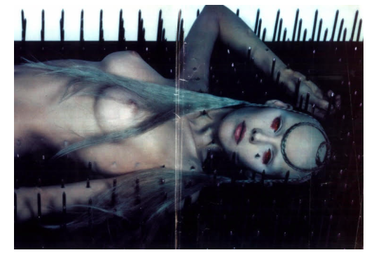
Parker Day: In 1997, I was 13 years old and I lived for a British magazine called The Face. I would make my monthly pilgrimage to my local Tower Records and bask in the glory of its large, glossy pages. It gave me a look into a world that was sexy, alternative, cheeky and strange; a world I wanted to step into. I had just moved to a new town, was a home-schooled only child, and the internet wasn't a thing yet so having magazines like that gave me a sense of connection to something greater. My room was literally bordered in pages I ripped out of The Face. My favorites were anything by David LaChapelle, Nick Knight's portrait of Alexander McQueen and a model impaled by nails, and the raucous Diesel ads. I didn't know the names David LaChapelle or Nick Knight back then but I do believe my exposure to art like theirs inspired me to pursue photography. LaChapelle was my idol throughout art school. I still don't know who the art director or photographer of those Diesel ads were but I wish I did. Diesel was the absolute height of aspirational cool in my mind because of those ads. I learned the power of images at that tender age and it's my hope that decades from now someone looks back on my work as having inspired them to create.