Trevett McCandliss, Creative Director at Earnshaw’s & Footwear Plus

MRR_Cover_July_1988.jpg
MRR_Cover_September_1988 copy.jpg

SPD: What year? 
Trevett McCandliss: 1989-90

SPD: What were you up to? 
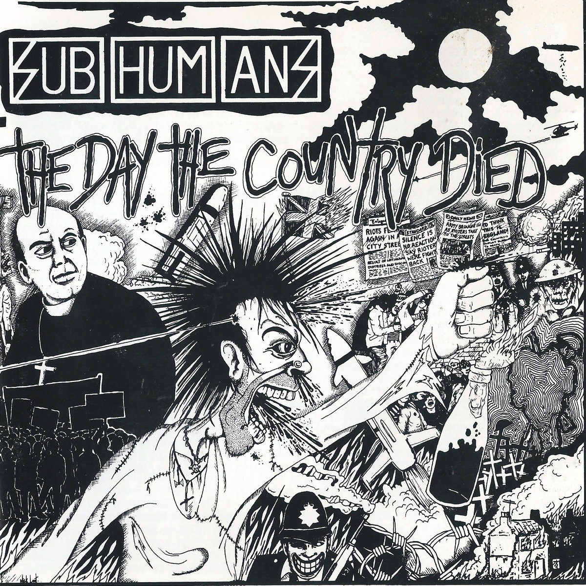
TM: I was discovering punk rock and learning to play the bass. The Germs, Subhumans, Misfits and Dead Kennedys were my favorite bands at the time. My friend’s sister’s boyfriend indoctrinated me into the mystries of loud guitar music in their suburban basement. He would sit with me for hours showing me the proper way to set up a Fender Twin, how to restring a guitar and instructing me as to why high action was better. The following year (in ninth grade) I had my own band that played one gig at our high school talent show. I had painted punk rock logos on my black army jacket and was sporting a mohawk that my friend gave me over the summer. (My mom was extremely displeased with my choice of haircut.)

a2827975541_10.jpg
This_Is_Boston_Not_LA_vinyl_Record_LPIMG_0880_1024x1024.jpg
album_cover_crass_the_feeding_of_the_5000.jpg

SPD: What magazine? 
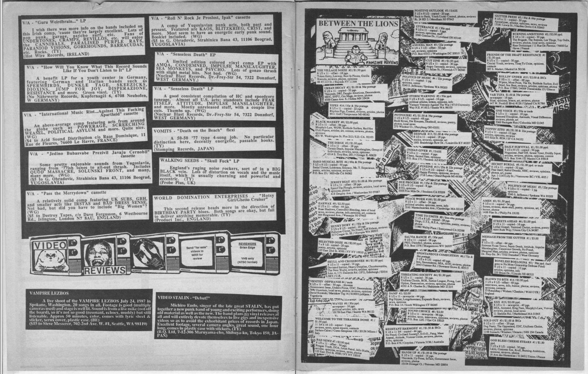
TM: 
Maximum Rocknroll, which started its print run in 1982 as a booklet inside the Dead Kennedys double-LP “Not So Quiet on the Western Front”, released by Alternative Tentacles. The Maximum Rocknroll staff was all volunteer (still is), espoused radical politics, and covered the regional punk rock scenes around America and the world. It was pretty much cut-and-paste collage, black-and-white and made on a copier. It perfectly encapsulated the cheap, DIY, no frills, no budget, all-volunteer idealism that punk music represented. Being associated with this world, however tangentially, held the promise of personal transformation through creativity.

mrr_cover_feb_91.jpg
MRR_cover_Dec_1993.jpg

SPD: What was it that so enthralled you? 
TM:
 The visual language of Maximum Rocknroll was expressive and direct with a purity and brutality that appealed to my aesthetic sense at the time. The same visual ideas seen on the covers of my favorite punk records—Bedtime for Democracy, Give Me Convenience or Give Me Death, This Is Boston, Not LA, The Feeding of the 5000, etc.—were the same ones being used in their editorial design. I could also easily grasp how it was made. Everything was black-and-white, mostly hand-done, typed on a typewriter (or what I thought was a typewriter) and collaged. The world it opened to me was exciting and exotic—teenagers in bands living together in a cheap house, skateboarding and making records.  It seemed like an amazing way to live. Maximum Rocknroll also formed the visual template for a poetry magazine, Fever Dream, that my friend and I created on a copier. He was the editor-in-chief and I was the art director—not that I knew what an art director was back then.

Collecting punk records became a big pastime for me, and Maximum Rocknroll was the only real link to the world that those records came from. There were no band websites or blogs back then. MTV didn’t feature them either. These bands were too cool and controversial for the mainstream, which is just what I loved. The only way to get punk records was to send away for them in the mail or buy them from Newbury Comics in Boston. For a teen from a sleepy New Hampshire town, Boston was the big city. It was always very exciting to visit and check things out.  I would peruse other indie magazines, like Transworld SkateboardingThrasher and Spin. They were all awesome, but they weren’t made with a language that spoke as directly to me as Maximum Rocknroll. And while those magazines featured beautifully lit skateboard sequences, celebrity portraits and professional illustrations, none of that was something I could create or commission. Give me grainy black-and-white photos that have been photocopied a hundred times any day! Maximum Rocknroll represented a world filled with passionate, creative people living the art life, and I wanted to be a part of it.  

MRR_inside_spread_02_late_1980s.jpg

SPD: Do you know who the creatives were? 
TM:
 Tim Yohannan (Aug. 15, 1945 – Apr. 3, 1998) was the founder of Maximum Rocknroll. Yohannan, also known as Tim Yo, was a 1960s counterculture leftist, before shifting this ideology to the punk scene.

SPD: How does that inform your creative now? 
TM:
 I don’t really get a chance to use the raw visual design aesthetic of ’80s punk and hardcore anymore. (That would be so cool!) But I still feel strongly grounded in the DIY approach to design. In that sense, I like to think of a magazine as a group of friends who are dedicated to an idealistic cause and use their limited resources to make something fresh, beautiful, exciting and true to life. I see the punk scene and Maximum Rocknroll as that same arrangement. Deep down I am still as committed as ever to this way of thinking.  I like to do things by hand, and I like stuff that is kind of beat up and messy. I like things that are directly expressive and unpretentious. I like starkness. I’m still an idealist. I’m still a punk rocker at heart—even though I let my mohawk grow out years ago!

mccandlissandcampbell.com

MRR_inside_spread_late_1980s.jpg

Elizabeth Renstrom, Photo Editor at VICE

 
25e98fe78d670ef755e636ea3335f3ab.jpg
6819683893_7a208f3e64_o.jpg
 

Elizabeth Renstrom: I'm not sure if this is too niche, but I was obsessed with the Rollerderby zine and Lisa Crystal Carver ie. Lisa Suckdog growing up. I became aware of her zine in the middle of high school when I was going through a huge Riot Grrl discovery in music and performance. I was listening to Liz Phair's Exile in Guyville (which is still one of my favorite albums) and reading about Vaginal Davis, who both led me to Lisa's beloved zine. I bought a bunch on ebay and my older brother then purchased the paperback version of the first 16 issues as a gift for me. I think what attracted me most was Lisa's approach to interviews and also the random collection of things like virginity loss stories. I was so hungry for stuff that was discussing female sexuality frankly but not exploiting it. I wanted the gross, quivering, bloody, and erotic admissions—and Rollerderby provided. She still hasn't got her due IMO, because people are still terrified of actually putting anything as raw out there ESPECIALLLLLY if it's from a woman. BOO. Thank you for getting my hormone bomb self through high school, Lisa. Your work still inspires me today.

SPD: What year?
ER: 
2006-2007 (?)

SPD: What were you up to?
ER: 
I was just discovering and falling in love with photography and painting a lot as a medium. Very emo, very female singer songwriter, very horny, very high school.

SPD: What magazine?
ER: 
Rollerderby

s-l1600.jpg
lisa_carver_suckdog_aust_poster.jpg

SPD: What was it that so enthralled you?
ER: 
I was really sick of reading glossy magazines for anything related to sex and relationships. They weren't interviewing the artists and musicians I was beginning to get into and I felt like I wanted something gory and obscene. I didn't want friendly advice on 'Omg, what do I do when I get my period at my boyfriend's house?" I wanted a range of female sexuality and rage that wasn't peddling to advertisers or curated by men.

SPD: Do you know now who the creatives were?
ER:
Lisa Crystal Carver

SPD: How does that inform your creative now?
ER: 
I am still, especially in my personal work as a photographer, constantly referencing the way Rollerderby made me feel as a young woman. I can only hope to be as fearless in my choices as an artist and editor as Lisa was with her mag and performances through Suckdog.

s-l1600-1.jpg
s-l1600-2.jpg

Sasha Erwitt, Photographer & Photo Editor

78c68bca550cd9004aa90f1d5854611b.jpg

Sasha Erwitt: The first magazine I fell in love with was YM, and it was a lifegoal, realized, when I got to work there as a Photo Editor in 2003. I was a fan of the magazine back in the mid 90s when I was at boarding school and frequently in search of personal grooming tips, quizzes to find out what kind of person I was, relevant celebrity profiles and social etiquette quandaries. Searching for answers on the Internet was not a thing yet. I loved the practical knowledge combined with entertainment and lifestyle info that the magazine provided. They always had the best celebs -- Liv Tyler, the 90210 cast members, Marky Mark... it wasn't edgy like Sassy or cheesy like Seventeen

I'm not sure who the creatives were at the time I fell in love with the magazine but when I got there in 2003 there was an amazing team in place - Elizabeth Kiester the fashion director brought so much passion and heart to every project and made things FUN. Amy Demas was the Creative Director who shared Elizabeth's vision & attitude and welcomed my photography input. 

I think I've always been drawn to photos with that same general vibe: dynamic, environmental, happy and natural, and not edgy-for-edginess-sake.


www.sashaerwitt.com

22f0b1b5f22f37494550aec5b22c1504.jpg
2lch-ym-magazine-critique-inspiration-cover-avril-lavigne.jpg
d0c369c9a65857f6b9f90b693eaa034d--jennie-garth-prom-dresses.jpg
s-l1600.jpg

Ash Barhamand, Visual Media Director at WWD

sassy-magazine.jpg

Ash Barhamand: I discovered Sassy when I was in middle school - probably 1994. My family had just moved abroad to Hong Kong, and in those pre-internet days magazines were my regular dose of American culture, not to mention information about sex and bodies that I wouldn’t dare ask anyone. I loved many teen girl magazines (Seventeen, YM, Tiger Beat) but as all fans will attest, Sassy was truly special. The cover lines were smart and rebellious and articles featured the likes of Chloe Sevigny, Harmony Korine and Kim Gordon (who I only now appreciate for being so ahead of their time). Most importantly I trusted the Sassy editors. If they told me someone was interesting, I was interested. If they stated a fact, I believed it. And they never led me astray. Their articles were committed to authenticity, useful information and a healthy questioning of the status quo. 

e359dbccf8b091b11ced50934ff23863--sassy-magazine-s-hair.jpg
ac16a380659986e38080ecb1a326f3c4--sassy-magazine-amy-smart.jpg
52fa5e186fc6c.jpg

I never thought that much about the design or photography at the time, but looking back I can see how the visual decisions reflected perfectly the purpose of the editorial. The type was loose and arranged with the photos like a scrapbook, the photography was raw and candid, especially by contemporary standards of the 90s high gloss aesthetic. As for the creatives, as far as I can tell the art side was done in Australia and I haven’t encountered that team- but the editor in chief was Jane Pratt who I did pursue knowing by working as an intern in the photo department at the eponymous Jane magazine which launched shortly after Sassy folded. I found the same irreverent spirit was evident in the pages of Jane especially in early editions - though as the magazine climate became more competitive I think the room for anti-establishment perspectives especially in the female market became squeezed and all but vanished. Now I think we are seeing authenticity and alternate perspectives being championed and demanded by young audiences again, but in media other than traditional magazines. So, I like to think Sassy was a pioneer of honesty in women’s media that is relevant now just as ever. 

In my own work as a photo director, I aim to uphold authenticity photographically by limiting retouching, seeking a diverse talent pool, and trusting my own instincts even when the easy route may be to copy the competition. Most importantly, I try to collaborate with creatives who share the same values so we can make something greater than what we could alone. Even if that’s something as superficial as a story about braiding hair, I think the audience can tell if it’s done with integrity, and that matters.

tumblr_lrby25VmwA1r2784vo1_1280.jpg

Robert Newman, Creative Director at This Old House

 
BN Ramparts1.jpg
 

Robert Newman: Ramparts was the first magazine I ever bought that wasn’t MadCreepy, or a comic book. Almost 50 years later, I still have that issue and I still draw on it for inspiration. Ramparts was like no magazine I had ever seen. Underground and political newspapers and publications from that time were filled with passionate, riotous design, multiple typefaces, scratchy artwork, and muddy photographs. This issue of Ramparts was simple, cool, and understated, using just one typeface and a generous amount of white space. The design seemed at odds with the magazine’ edgy political editorial content. To a 16-year-old infatuated with the New Left and the student revolution, this was a heady and intoxicating mix. I fell in love with the magazine and especially with art director Dugald Stermer’s strong, simple design and powerful graphics. It was the first real magazine that spoke to me and the first one that made me notice its design.

SPD: What year?
RN: 1969

SPD: What were you up to?
RN: I was in high school, in the suburbs outside of Buffalo. In my head I was wrestling with the big issues of the day—the Vietnam War, black power. And trying to reconcile the liberal beliefs I had inherited from my parents with the radical movements that were shaking things up. In a few months I was organizing anti-war protests and marches at school with my friends.

BN Ramparts2.jpg

SPD: What magazine?
RN: Ramparts. The first issue I bought featured a young kid on the cover holding a Vietcong flag and a headline that said “Alienation is when your country is at war and you want the other side to win.” I later found out that the boy on the cover was the son of the magazine’s art director, Dugald Stermer. The magazine blew my mind (as we said back then). But it was really hard to find anywhere in my town; nobody would carry it because it was such a radical magazine. So I went downtown to one of the cutout bookstores, a place where newsstands dumped their magazines after they went off sale. The news agents would rip off the front cover logo/masthead and return it to the distributors for credit, then they’d sell the magazines for pennies to the cutout store, who would sell back issues for 10 cents or a quarter. I bought all the old copies of Ramparts that they had, most of them luckily still with the cover logos. And I started my subscription a couple months later. [You can see one of those cutout issues here, featuring the Diary of Che Guevara and a cover illustration by Milton Glaser.]

BN Ramparts3.jpg

SPD: What was it that so enthralled you?
RN: The Black Panthers, the Young Lords, the Chicago 8, Che, women’s liberation… I didn’t understand all of Ramparts, including the design, but I spent hours and hours reading it and trying to deconstruct what they were trying to say. The design was probably the most disconcerting part of the magazine for me. All the examples of underground and radical newspapers and magazines that I had seen at the time were raw and funky, with edgy (or untrained) design and imagery that matched the passionate content. Radical publications were supposed to look like The Black Panther newspaper or the East Village Other. Ramparts was the opposite—totally understated and sedate. Stermer used only one typeface—Times Roman—throughout the entire magazine. The cover headlines were quiet; sometimes they appeared in small type above the logo. And there was a generous use of white space on the feature openers. The result was a simple, powerful design where the text and images felt heavy by comparison.

BN Ramparts4.jpg

SPD: Do you know now who the creatives were?
RN: Dugald Stermer was the art director until mid-1970. His deputy/production manager was John Williams, who became consulting AD after Stermer left, and produced some striking covers. Williams went on to be the first art director of Rolling Stone, and did a lot to establish the basic DNA of that magazine. Rolling Stone’s studied (and limited) range of typography posited against bold photos and illustrations is straight out of the Ramparts design playbook. Williams’ assistant AD was Louise Kollenbaum, who went on to be the founding art director of Mother Jones. Of course it was only years later that I discovered Stermer’s earlier Ramparts work, from 1966-68. His covers rivaled George Lois at Esquire for creativity and provocation, although his were done with a fraction of the budget. Great illustrators graced the pages of Ramparts: Milton Glaser, Ed Sorel, Paul Davis, even Norman Rockwell. And Stermer did illustrations himself, including a cool cover portrait of Huey Newton. 

SPD: How does that inform your creative now?
RN: I’d like to say that everything I do has felt Ramparts’ influence, but realistically you go where the magazine and circumstances (and the editors) take you. However, left to my own devices I do go back to that simple design palette of type, color, and design that Stermer developed at Ramparts. And the idea that a magazine’s design is so essential to its overall voice and identity (or what we call “the brand” today). More importantly, I think Ramparts inspired me to realize that working with magazines gives you the chance to reach an audience with a message, to do something groundbreaking and provocative and maybe even change the world for the better. And times being what they are right now I think the magazine world could use more examples like Ramparts. We need all the inspiration we can get!

Follow Robert Newman on Twitter: @Newmanology

BN Ramparts5.jpg

Dawn Sinkowski, Photography Director at Martha Stewart

nest-interior-magazine-covers-trendland.jpg

SPD: What year?
Dawn Sinkowski: 
1999

SPD: What were you up to?
DS: 
I was in New York, living on 21st St & 10th Ave. This was my sophomore year at Parsons. I would've been working three jobs, hanging at Mona's and Max Fish and dragging myself to class on occasion.

SPD: What magazine?
DS:
Nest

s-l400.jpg

SPD: What was it that so enthralled you?
DS: 
I loved that this publication was wholly unconcerned with depicting sanity.

It was an unbridled celebration of eccentric living. The images and stories did not anesthetize their subject's aesthetics and did not pander to taste. It was decidedly not about decor. Each story was like peeking in the window of a crazy, fascinating character's home. There was commitment on every page. I love the energy in the pages and how it didn't try to appeal to everyone. In a way, I think it would be right at home with the niche journals being published today. I have to mention the physical, printed object of it: die cut pages, abnormal, irregular shapes that would never fit into pockets. Luscious thick issues with scant ads to be found. The whole venture was decadent and completely over the top.

SPD: Do you know now who the creatives were?
DS: Joseph Holtzman
drove the bus, he was the founder, EIC and art director. Contributing editors included Simon Doonan, Todd Oldham, Catherine Opie, Martin Parr, Richard Tuttle and DJ Spooky, to name a few.

SPD: How does that inform your creative now?
DS: 
Wow. Well, Nest sets a high bar. It feels like part of the philosophy was to work with dynamic, talented people and get out of their way- to give creatives enough space to create. I strive for that when commissioning work.

Lia Clay, Photographer

 
$_57-1.jpg
 

Lia Clay: I started reading TAR Magazine when I was 17 years old. A person that I had a rather romantic pen pal relationship with used to send me it from New York. As many teenagers finding their way into the spectrum of other artists and photographers, Ryan McGinley was god. Part of Ryan’s initial series “Everybody Knows This Is Nowhere” was in the first issue. I remember associating with the types of models he used — often with androgynous features. As someone struggling with gender identity, this new found rebellion against conservative body standards that I was taught growing up with in the South was sort of a revelation. In the spring of 2009, Tar released a cover with Kate Moss by Damien Hirst. It was a photograph of Kate with half of her face, revealing the muscles and tendons underneath her skin. It went along with this article that stated something like “Kate Moss is Never Going To Die.” It was a satirical piece on how Kate had an underground laboratory that was keeping her young forever. It was my last few months before I graduated high school, and immortalized the feeling of being young in the time right before I left home for college. It’s been almost a decade since I first started reading Tar, and even though I am looking forward more and more to growing older,  I will forever remember the feeling that magazine gave me as a teenager. 

CCF03092013_0007.jpg

SPD: What year? 
LC:
2008/09

SPD: What were you up to? 
LC:
I was a teenager, wrestling with the ideas of gender, sexuality, and leaving home.

SPD: What magazine?
LC:
Tar Magazine

Tar.jpg

SPD: What was it that so enthralled you? 
LC:
There was a resonance of youth that I was drawn to. It really epitomized a lot of the things I was feeling, and gave me an association to something outside of what I grew up with. Growing up, I always felt out of place. I was grasping on to everything I could to help me find a sense of attachment to another world where I could start to understand myself. 

SPD: Do you know now who the creatives were? 
LC: Evanly Schindler
+ Maurizio Marchiori

SPD: How does that inform your creative now? 
LC: 
It was definitely a beginning. To be honest, I’m not entirely sure. There’s representations of things I did when I was taking pictures at 17 because it’s where I began to grow artistically, but I think over the past decade, my work has changed so much that maybe it’s best as something to be nostalgic about, rather than inform what I do now. As much as I gravitated towards those images because it was similar to my body type, which ironically was categorized as ‘different’ from growing up in North Carolina, it also glorified an idealized version of youth and representation that is something we are trying to change now. 

www.liaclay.com/

$_57.jpg

Tom O'Quinn, Creative Director at Thrillist

3f4ad20829d6b07955e08787b6af1365.jpg

SPD: What year?
Tom O'Quinn: 1986

SPD: What were you up to?
TO: 15 years-old. Living in Red Deer, Alberta, dying my hair black and sneaking into punk clubs with my older sister in Edmonton. Keep in mind the legal drinking age in Alberta is 18, so it really wasn’t that big of a deal.

SPD: What magazine?
TO: SMASH HITS

77b23dca8082fdf21b1bf918a2e47fa5.jpg
www.tilleysmagazines.com-Magazines-Comics-SMASH-HITS-14.jpg

SPD: What was it that so enthralled you?
TO: At that age, all you care about is defining your identity. SMASH HITS was a UK magazine but we got it in Canada as well. It was so much cooler than any American magazine available to me at the time and was really cutting edge in terms of photography and type. The subject matter was mostly popular British bands with some American stuff thrown in. Looking at it today it seems almost cute, but at the time it was very “insider”. I found my escape from small-town life through this magazine and also through MuchMusic and MusiquePLus, the Canadian equivalent to MTV. Toronto was where it was all happening back then…but I ended up in Vancouver and then Los Angeles before coming to NYC.

SPD: Do you know now who the creatives were?
TO: I have no idea, but it would be so interesting to talk to them. Patrick Nagel did Duran Duran’s Rio cover and had a huge influence on 80s design, so he was probably the first illustrator/designer that made me want to have a creative career. In the late 80s and early 90s, I started reading The Face, which was my second love…so Neville Brody was probably the first magazine designer I can identify who had an impact on me. And Vaughn Oliver of course for music packaging….

www.tilleysmagazines.com-Magazines-Comics-SMASH-HITS-7.jpg
smash-hits-1981-01-08_0000.jpg
2083d93874bb6a85314542f1e5de7d85.jpg

SPD: How does that inform your creative now?
TO: I tend to design big with lots of dramatic type and color… and then pull back. There was a period before magazines where I designed corporate annual reports, so I learned refined typography by reading The Elements of Typographic Style and by designing lots of financial charts printed on 100% cotton paper. My first Art Director job was with Out magazine, and that’s when I knew I loved working in pop culture and entertainment more than anything else. Now I am working 100% in the digital space, with a growing focus on video. So it some ways it’s come back full circle for me, using those initial inspirations of music videos to inform what I do now. Not a lot of typesetting beautiful paragraphs of copy anymore, but using type, image and motion to tell stories in different, exciting ways.

bd41dd1c0573ac38d9ed2ae6eaed6036.jpg
fit-520x390.jpg
Smash-Hits-Covers-from-The-80s-8.jpg
tumblr_nyvyzsLaWl1udnvfeo1_500.jpg