Entertainment Weekly's Game of Thrones Issue with Executive Editor and Creative Director, Tim Leong
/As the premiere of the final season of Game of Thrones draws closer, Entertainment Weekly, put a spotlight on the much-anticipated return with their recent issue. Breaking EW records with 16 unique covers—besting last year’s 15 cover Avengers spectacle—and focusing solely on the hit show, we spoke with Entertainment Weekly’s Executive Editor and Creative Director, Tim Leong, about how the team put together this record-breaking issue.
SPD: You were the editor AND creative director for this Game of Thrones package. How did that work?
Tim Leong: This was definitely a unique experience, running the editorial and then also running the creative. In many ways it was more difficult, as the volume was so great. Thankfully we had an insanely talented team of edit folks also working on it. It definitely had its benefits though. Sometimes we’d have a great idea for a layout, but it’d require getting an extra page or two. That’s an easier argument to win when I’m debating myself. It’s also a bit of a surreal experience when someone hands me a layout to review and I start reading it as an editor, but I’m supposed to be making design notations. Or vice versa.
SPD: How long did this issue take to put together?
TL: Well, we designed it in just over a week, but we started planning the photoshoot more than a year ago. Because we shot the cover and cover story photos on the set during the filming of the final season (by the incredible Marc Hom, and on-set editing by Suzanne Regan), we had to work pretty far in advance. Design-wise, Chuck Kerr was the visual lead for this package. He started moodboarding and brainstorming a month before and worked up until the end to finesse the look of the package. We’ve done a lot of issues on Game of Thrones so we wanted it to look different than the rest. After that it was all hands on deck, and I’m just grateful we have such a hardworking, selfless team. Editorially, we had our first issue brainstorm in the first week of January. It was a bit daunting. It’s the biggest single-topic issue we’ve ever done in our 29-year history. So, no pressure, right? Even for a show that has such a rich history like Game of Thrones, 78 pages is still a TON of pages to fill. I knew James Hibberd’s cover story was going to be massive (as he had a treasure trove of reporting from being on set during the final episodes). I also knew we wanted an in-depth episode guide that recapped every single episode. Between those two stories, that was a quarter of our allotment. With the rest we tried to find new and surprising stories to tell. Then we looked at what stories would provide opportunities for really diverse story formats and visuals. That included diagrams, infographics, annotated storyboards, a photoshoot of prop weapons, maps (love the one James Kim designed for this issue), etc. Finding unique ways into stories is usually a guiding principle for us, but it was particularly critical here as all of the stories were about one thing, which meant there was a greater potential for visual repetition. We obviously wanted to do everything we could to fight that and have every page be new and surprising.

SPD: How was it producing 16 covers?
TL: 16 covers, my goodness, that was insane. It’s the most covers we’ve ever printed (last year we did 15 Avengers covers). Chuck Kerr did an amazing job designing them to be cohesive but also custom to each image. We’ve published a ton of GoT covers over the years and these are my favorite batch by far. He started by working on the Night King (because it’s cropped tighter than the rest) and built a design that worked for that and applied it to the rest. And, big props to our editor, Henry Goldblatt, for allowing us to simplify the text on the cover to try and make it as pretty as possible.
SPD: How many different illustrations do you have in the issue?
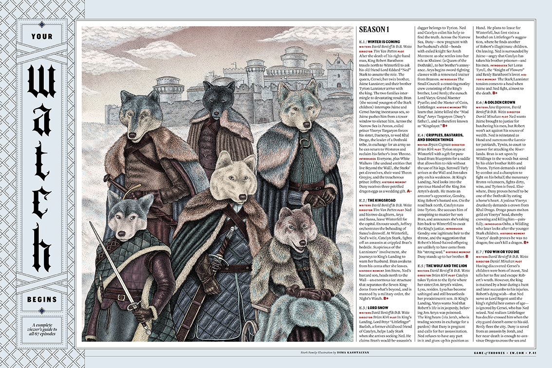
TL: I think we hired 15 different illustrators for this package? The biggest surprise for me was Dima Kashtalyan, who drew a portrait of the Stark kids, but in direwolf form instead of human form. I wasn’t familiar with this incredible artist at all until Erica Bonkowski pitched him for this project. The entire staff was instantly in love with his work and we reshuffled some things to figure out how to use him best.
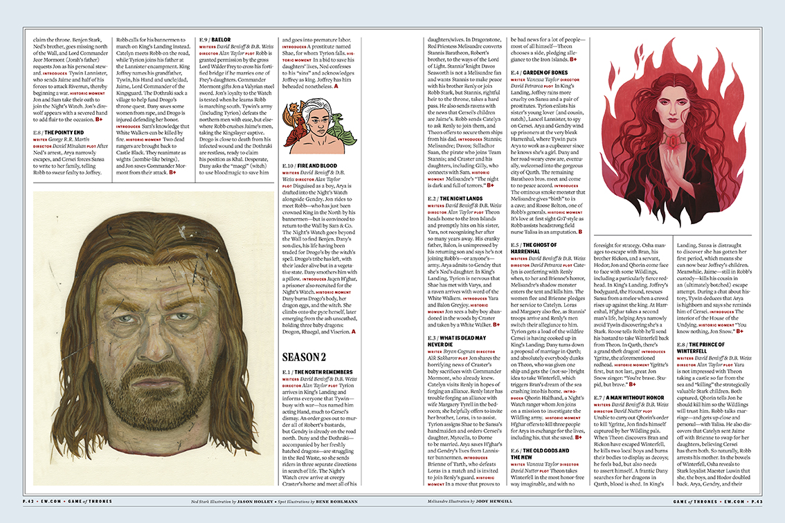
SPD: Can you talk about the episode guide?
TL: We really wanted the issue to be a service guide for readers. It’s been a long time since the last season, and it’s been nearly a decade since the show started. For the episode guide, I was really inspired by two classic EW packages: Buffy the Vampire Slayer from 1999 and our Seinfeld Viewer’s Guide from 1997. They both had these gorgeous illustrations from these incredibly talented artists (including one from Jason Holley, who we also used to paint Ned Stark in this issue), with little episodics photos sprinkled throughout. I loved that format and thought it was such a great service to the reader, so we leaned into that idea and tried to push it forward by not showing any photographs in the episode guide at all. Instead we had these big character portrait illustrations throughout the guide and commissioned one artist to do a series of spot illos that would be peppered in, which actually took quite a bit of math to figure out in advance. The thought was that there would be so many episodic images throughout this package that we should strive to show anything other than episodics whenever possible to keep the reader visually interested.
SPD: How was this issue different than other packages?
TL: One directive was that I really wanted to make this a print-lover’s dream. Because we had so many pages to play with, I wanted to take the opportunity to make the issue as special as possible—something you had to go out and buy. And once you had it, you’d keep it on your coffee table for months to come. You do that by providing great service, which a lot of our stories do. And you do that by infusing as much joy into the issue as possible. Sometimes they’re little details that nobody will ever notice. Sometimes it’s writing funny captions that will make you smile. Sometimes that’s creating a layout that only works in print. And, to be clear, this doesn’t mean we don’t care about the web—nothing could be further than the truth. We have an incredible rollout plan based on the content in this issue. But the point is to make the best possible product for the medium you’re working in, whether it be print, or web, or video, or social, or anything else.
SPD: Do you have a specific example of making the print issue feel special?
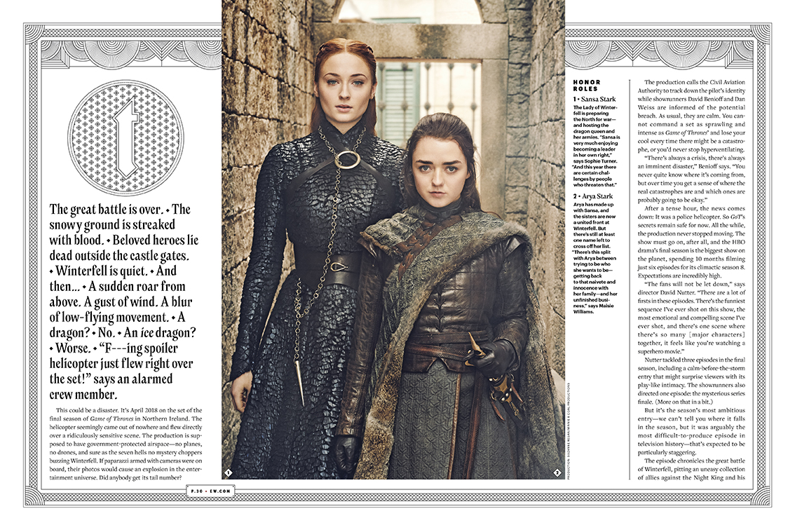
TL: Sure. So, let’s talk about the cover story. Faith Stafford did such an amazing job designing it. We had this panoramic image from Marc Hom of all of the cover subjects, 22 people in total. We mocked it up in a spread layout and it was cool, but it was just so tight. We went back and forth with photo editors Greg Garry and Natalie Gialluca, and we tossed around a few ideas on how to make that situation better, but in the end we decided to blow it up from a two-page opener to a four-page opener so that the image continued on pages 3 and 4. That was a pretty new approach for us. That also gave Faith a page to create an incredibly intricate and amazing headline design. We’d been playing with some intricate pattern work elsewhere in the issue and she really turned it up to an 11 in figuring it out. I love her decision to make it monotone and have everything on that page be a uniform line weight.
SPD: Do you have a favorite story?
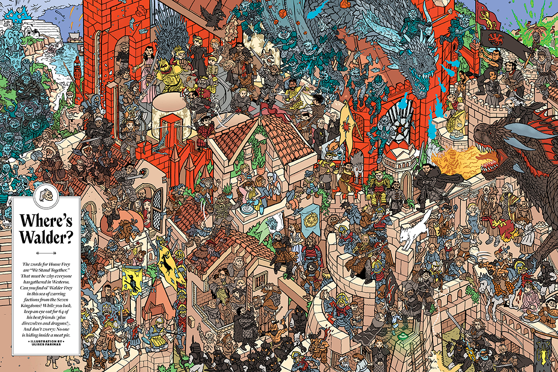
TL: My favorite thing in the entire issue is the “Where’s Walder” spread, which was our take on a Game of Thrones Where’s Waldo satire. There were two factors in its creation: 1) I knew I really wanted to create a Where’s Waldoesque illustration that featured a ton of GoT characters. 2) I wasn’t sure on how to end this massive package. And after a bunch of failed ideas, this seemed like a natural cap to the issue. We started by making a list of 150-160 Game of Thrones characters that could be in the illustration, and started pulling image references of all the characters. Some obvious, some very deep cuts. Then, Anne Latini started organizing the list and figuring out possible scenes. She hired Ulises Farinas to draw the amazingly intricate piece, and I think he fit in 64 characters? There’s so much fun in these two pages. It’s just pure delight. And if we can bring people joy in such hard times, what else can be better?