Gentleman's Journal: Issue 28 with Editor, Joseph Bullmore and Art Editor, Joseph Sinclair Parker
/The September/October cover of Gentleman’s Journal featured A$AP Rocky on the eve of his 30th birthday. Read on to hear more from Editor, Joseph Bullmore and Art Editor, Joseph Sinclair Parker about the cover shoot.
SPD: Why did you pick A$AP Rocky to be the face of the September/October issue?
Joseph Bullmore, Editor: A$AP Rocky was definitely our boldest cover choice yet. I think he’s one of the most compelling figures in music at the moment, and has been instrumental in marrying hip hop with high fashion. He’s also very outspoken and unfiltered in his views and beliefs, which we knew would make for a very different kind of interview for us.
I think we wanted to question the traditional and haughty idea of what it means to be a 'gentleman' by shooting a figure outside our usual comfort zone. Rocky is a new type of gentleman: one defined as much by his sheer self belief as his worldview (or his table manners). We’re also huge fans of his music, and we were intrigued by his secretive creative collective AWGE: it’s kind of like Warhol’s Factory for the modern era, only with even better parties.
SPD: What was the brainstorming process like for this cover shoot? What was your inspiration?
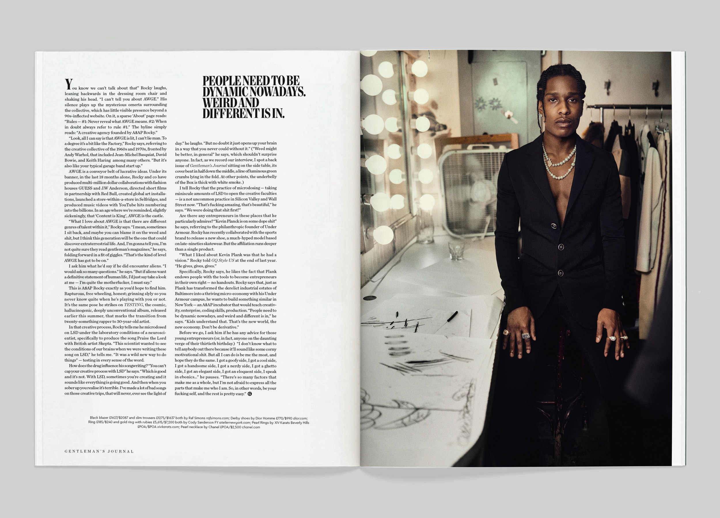
Joseph Sinclair Parker, Art Editor: We listened to quite a lot of Rocky’s new album, TESTING, in the lead up to the shoot. It’s definitely his most experimental album yet, with this anarchic, unusual, hugely varied sound. We knew pretty much straight away that we didn’t want to do anything straightforward, clean or sterile. We wanted to capture his manic, excitable energy with whatever we did.
There was one line from the lead single on the album which we kept coming back to: ‘I put New York on the map.’ We knew we would be travelling to NYC to shoot the story, and we wanted to make the city where Rocky grew up, lived and partied a big part of the piece.
A little later on, we realised that it was Rocky’s 30th birthday a few weeks after our print date. That gave us a gift-wrapped story concept to bring all those threads together: A$AP Rocky Turns 30.

SPD: You both flew to NYC for the shoot and interview. What was the cover shoot like? Was there any specific creative direction you wanted to achieve?
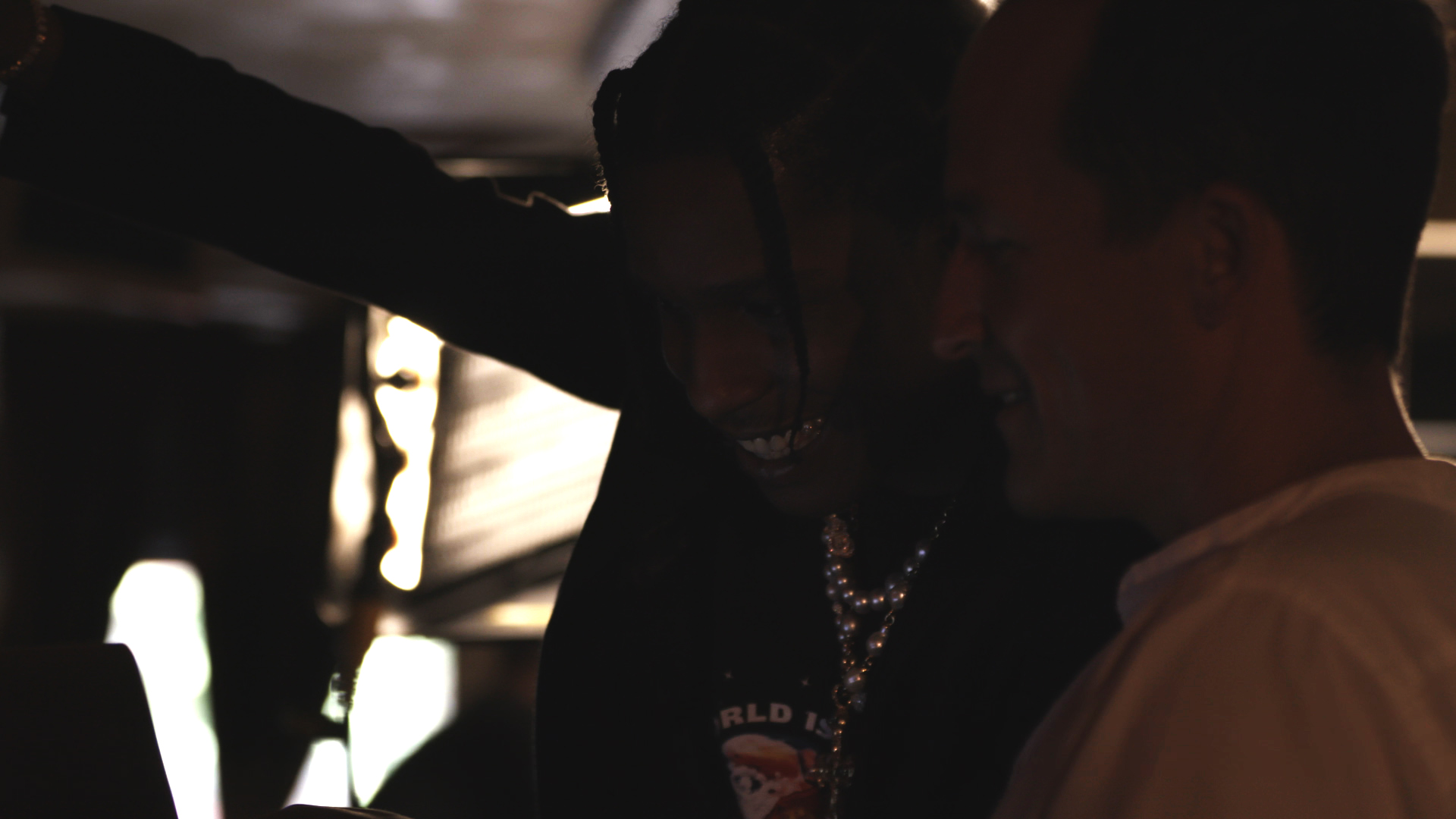
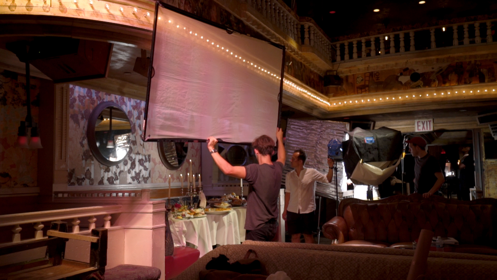
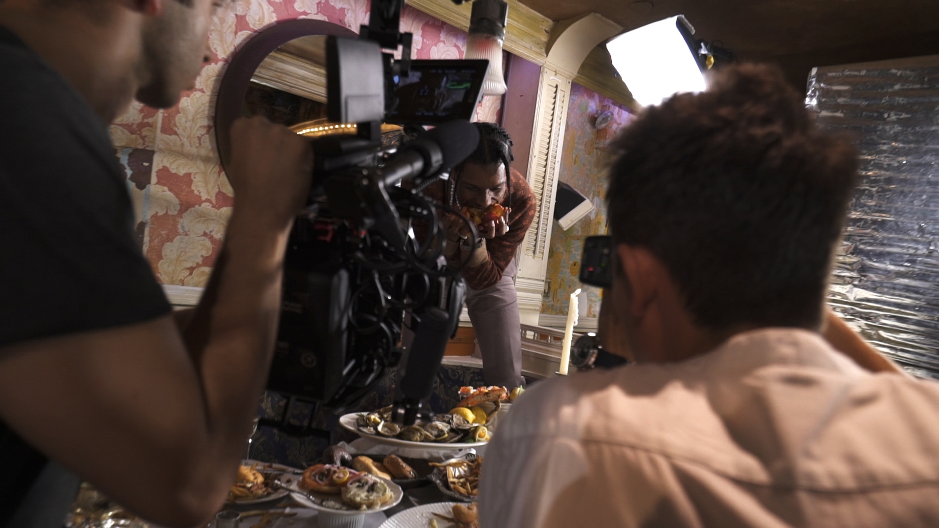
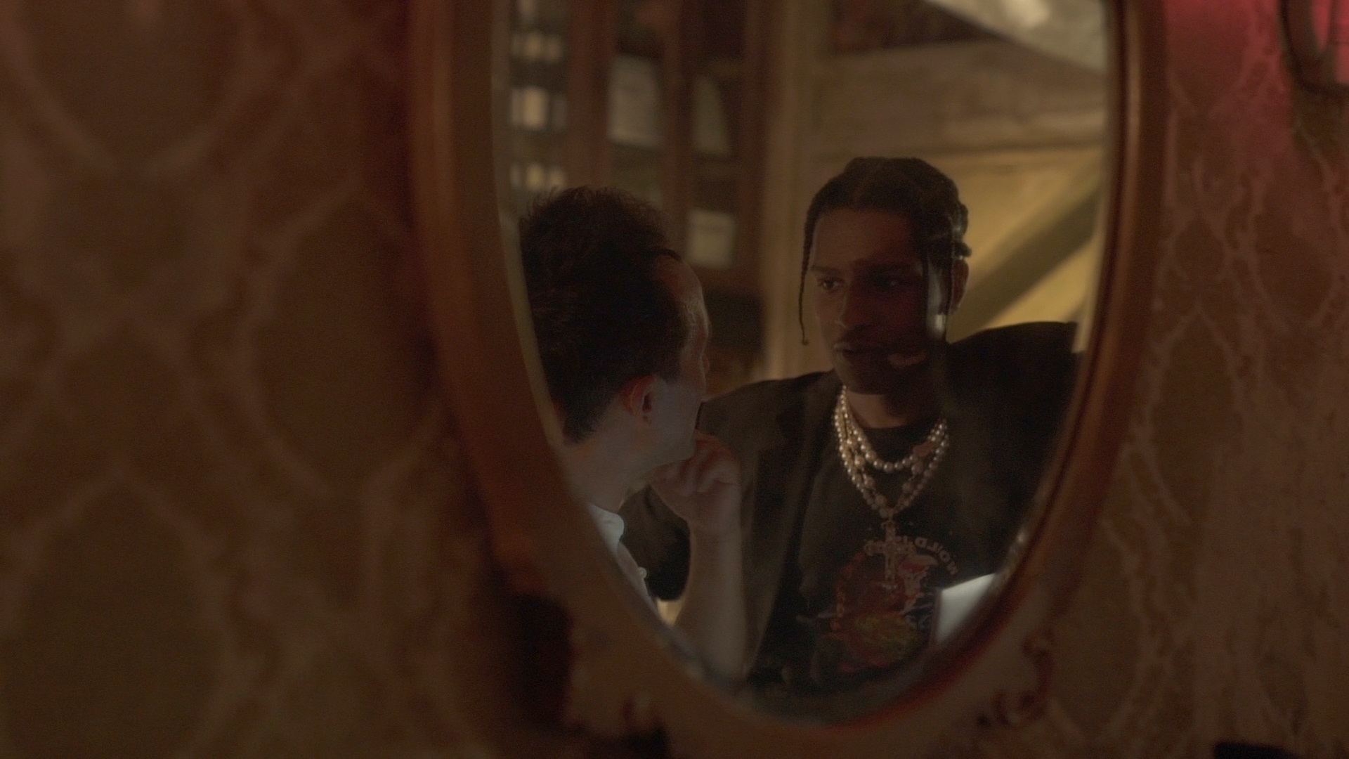
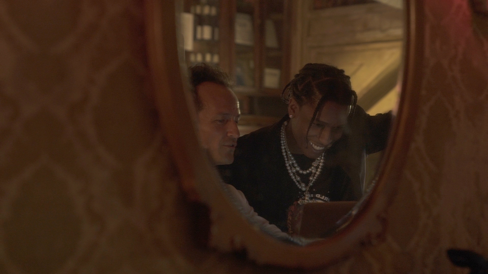
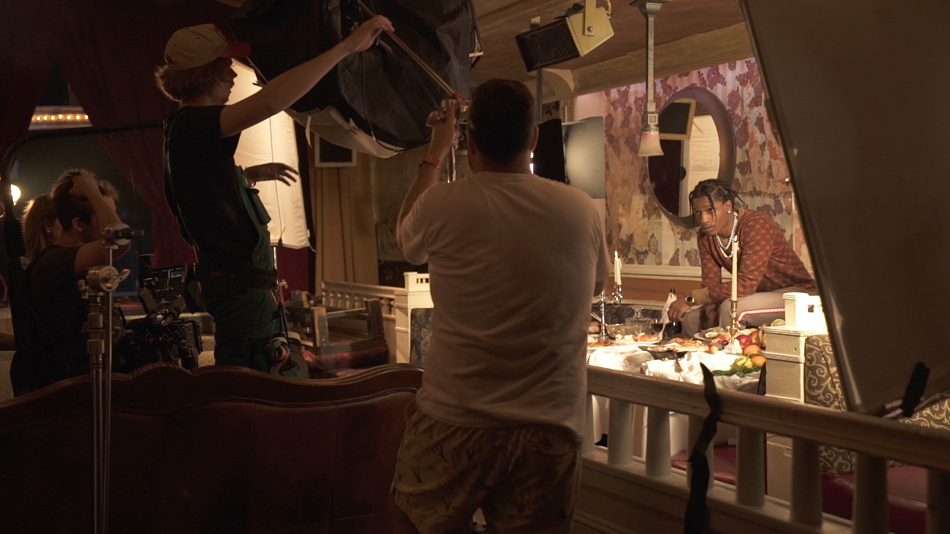
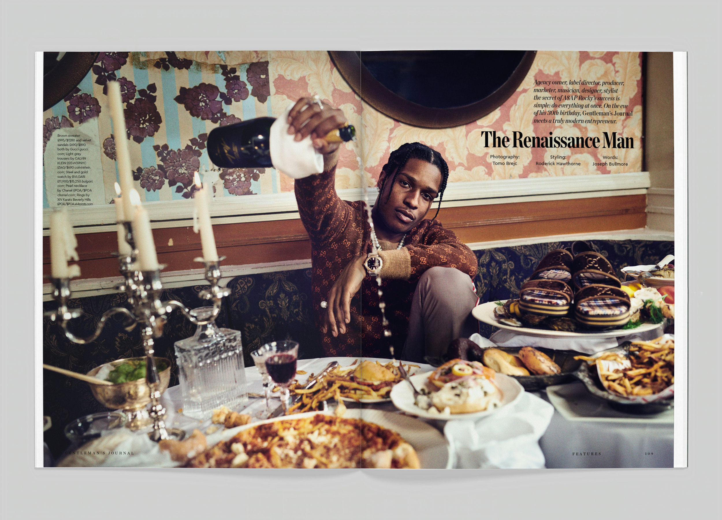
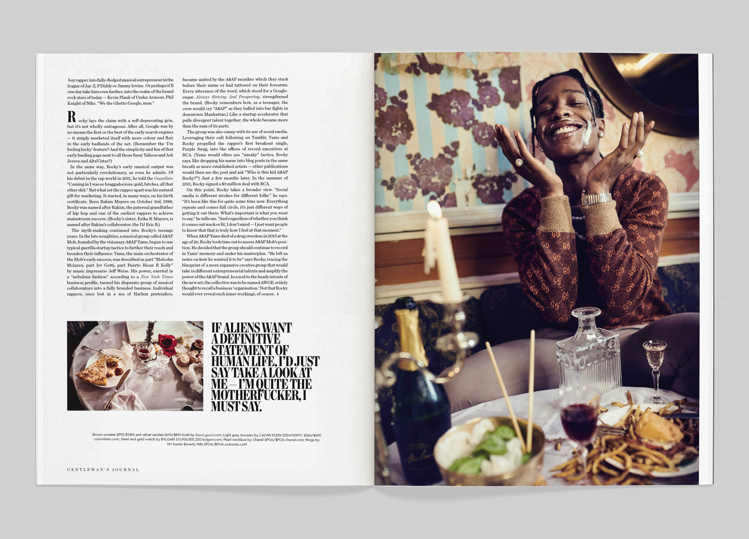
JSP: It was the 30th birthday milestone that led the creative direction on the day. Our venue was the Box nightclub in Manhattan, which is a bit of an institution and somewhere Rocky has spent many evenings over the years. We wanted to combine the anarchic influences of the album with the energy of New York in a kind of baroque birthday feast — champagne, oysters and one dollar pizza on a single tablecloth.
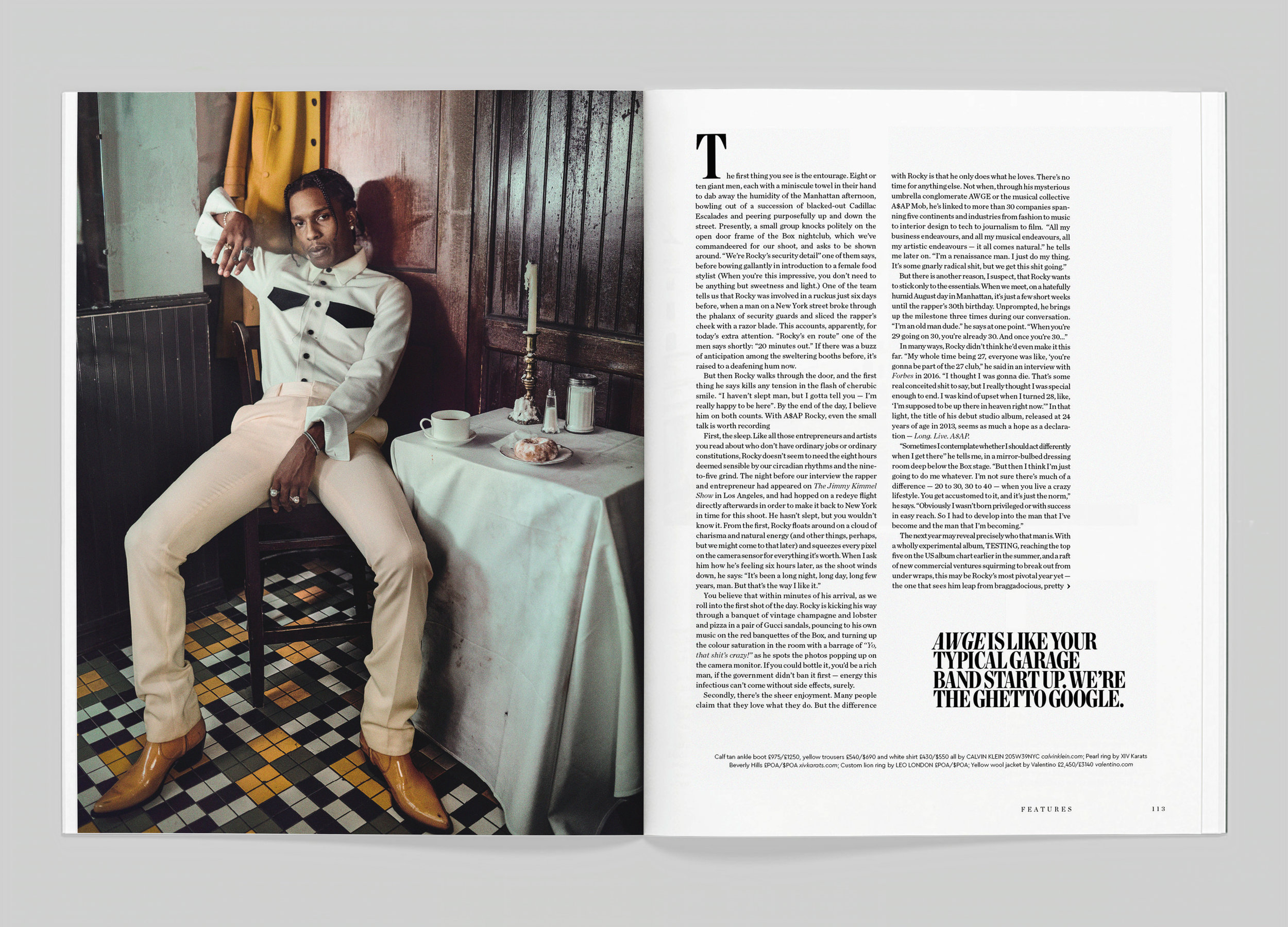
JB: The day went pretty smoothly. Rocky’s entourage was pretty impressive when they first walked in, but they were extremely friendly and well-mannered and often very funny. It was easily one of the most enjoyable shoots we’ve ever done. There was no standing on ceremony or ponderous creative discussions. Rocky and photographer Tomo were pretty impulsive. If they saw something fun to play with — a bunch of roses, a stack of old furniture, a cream cake — they’d use it and go with it and make it work. I think that sums up Rocky pretty well.
SPD: Were there any challenges during the shoot?
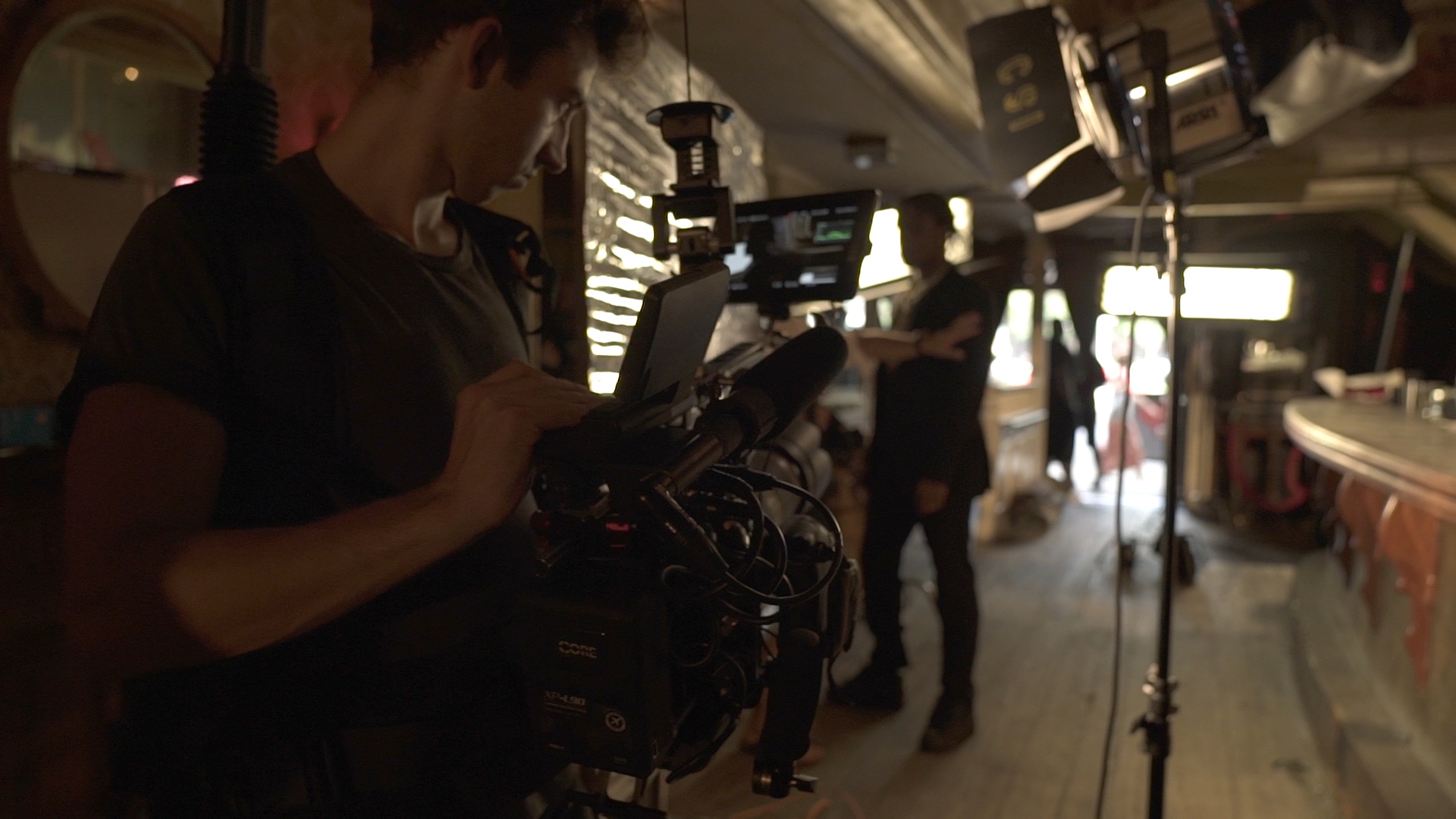
JSP: A big challenge was to divide the time between video and photography. With limited shooting time and two different lighting setups for each look, it became apparent the key on the day was to keep good communication between each part of the team. Rocky’s so photogenic and such a performer that we could have almost shot double in each set up. So we had to be pretty disciplined with moving things on.
SPD: What was your process like while designing the feature?
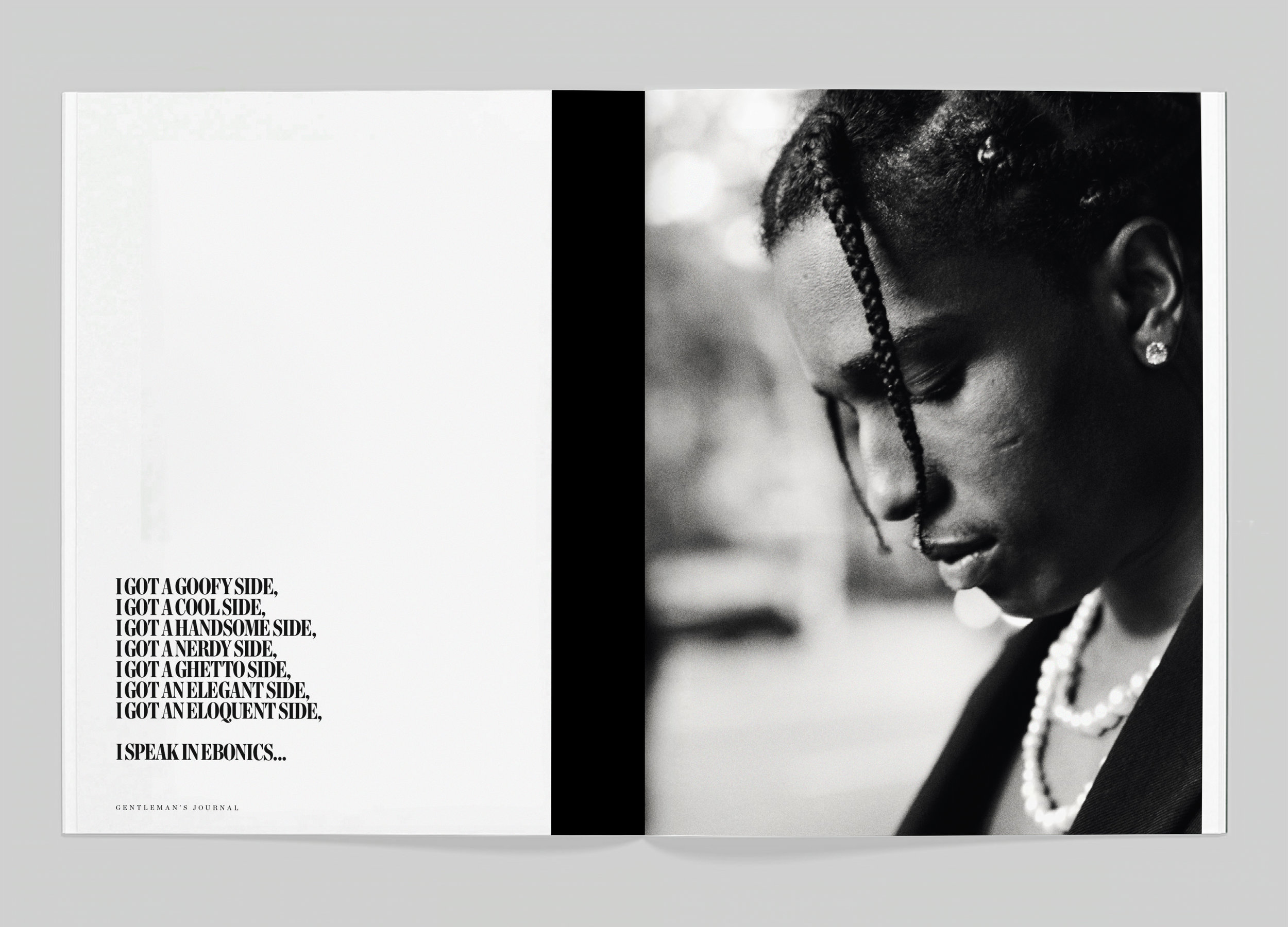
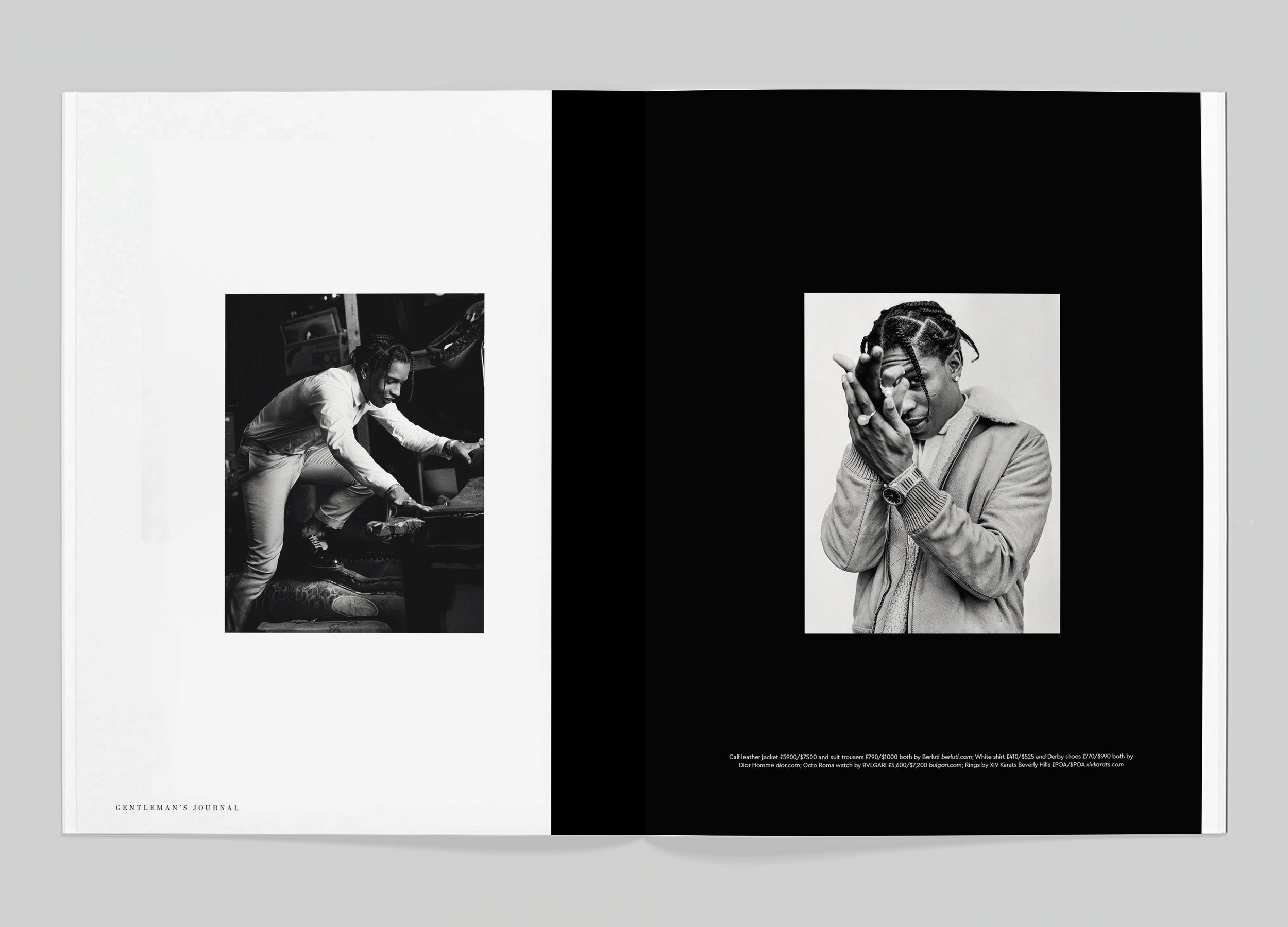
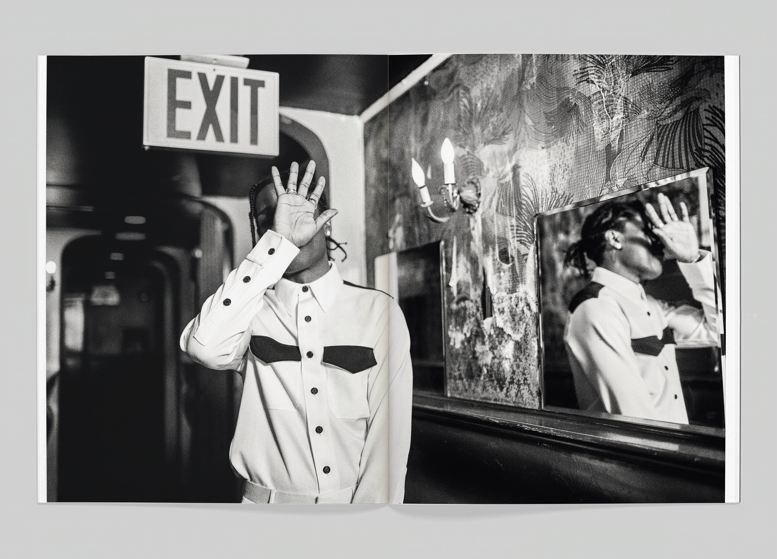
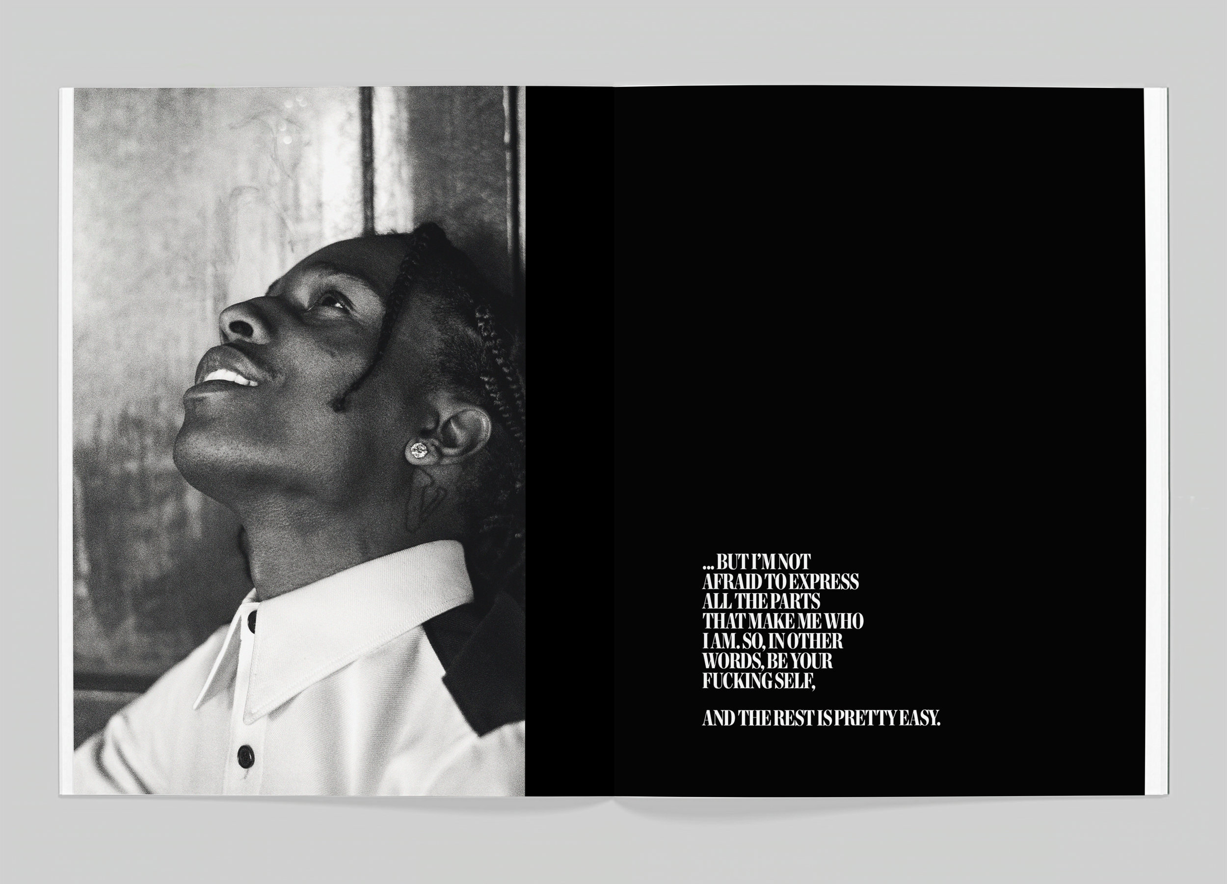
JSP: We wanted to show the diversity of Rocky and the confidence he brings to all of his personas and personalities. Every time you turn the page you don’t know which Rocky you’ll get. I wanted to start the feature with an unfinished intro quote which would finish on the last spread of the feature, encouraging the reader to take the journey through the piece. It said everything we wanted to say, really, about this modern renaissance man: “
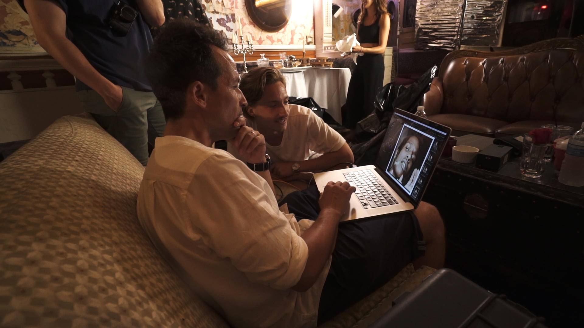
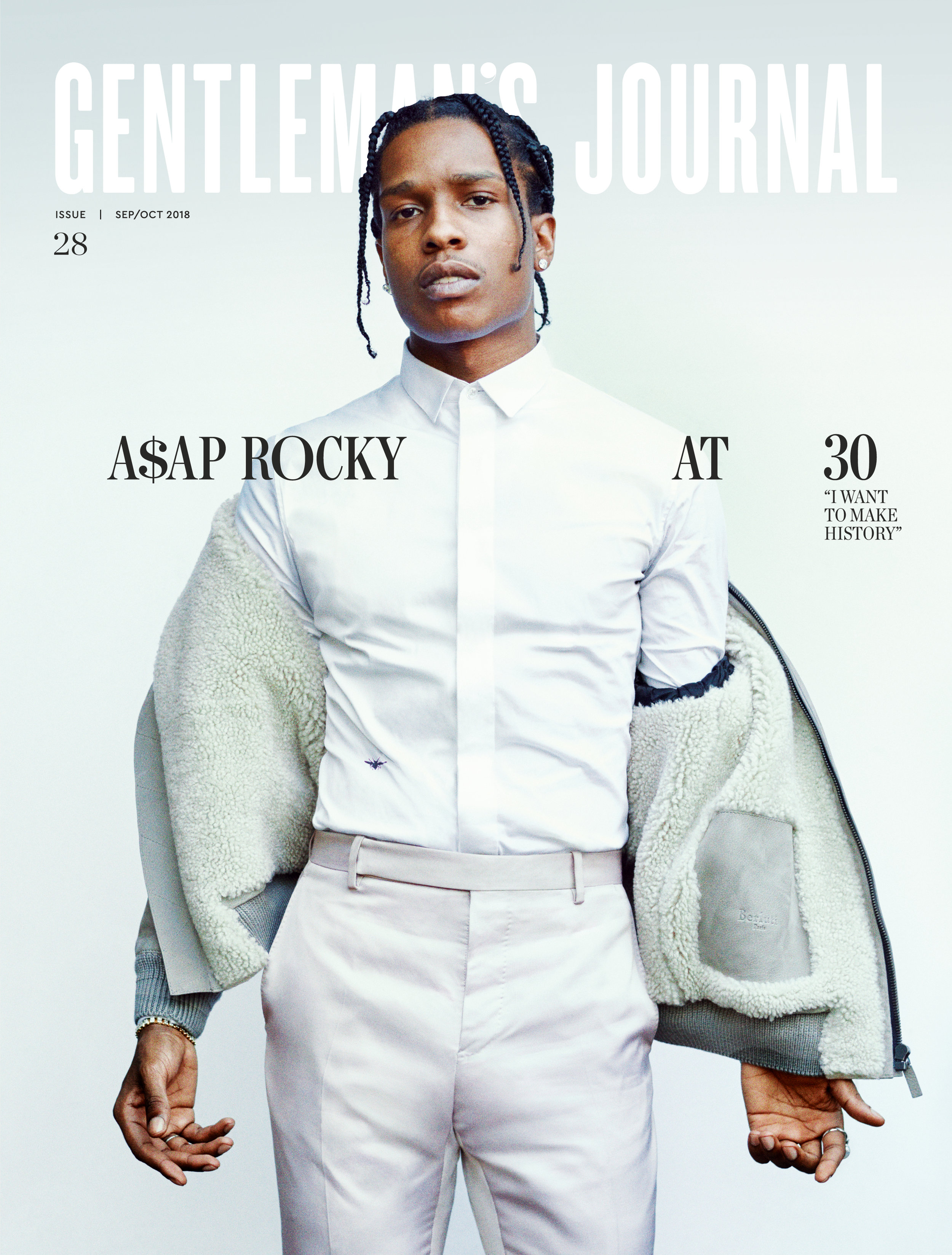
SPD: In the Editor's Letter, you mentioned having so many photos that could have made the cover. Why did you choose this one?
JB: This shot was taken in natural light out on the street in the late afternoon (what you can’t see is me sweating as I held up the huge white board behind Rocky, or the massive entourage on the street corner, warding off the gathering fans).
The light feels fresh and soft, with this very faint blue hue. It turns Rocky’s pale, silvery tailoring into almost angelic wings. His pose reminds me a little bit of of an old oil painting. It’s faintly regal, with a kind of confidence and vulnerability. The styling at that moment (Rocky picked this look out himself) was sharp and high-end and yet a little unusual and dishevelled. I think it says almost exactly what we hope to say in the story: this is Rocky at 30. Take him or leave.
SPD: What's next for Gentleman's Journal?
JB: We’ve got some really big projects coming up in 2019, with some very exciting talent. I think it will easily be our most experimental year yet. We’ve definitely taken some confidence from how well this cover shoot went, and how well it’s been received.
CREDITS
Art Editor: Joseph Sinclair Parker
Photographer: Tomo Brejc
Producer: Chris Balestra
Creative Partnerships: Jordan Doidge
Film: Zexi Qi
Cinematography: Jon Gourlay
Set Design: Meryl Valerie
Stylist: Roderick Hawthorne
Editor: Joseph Bullmore