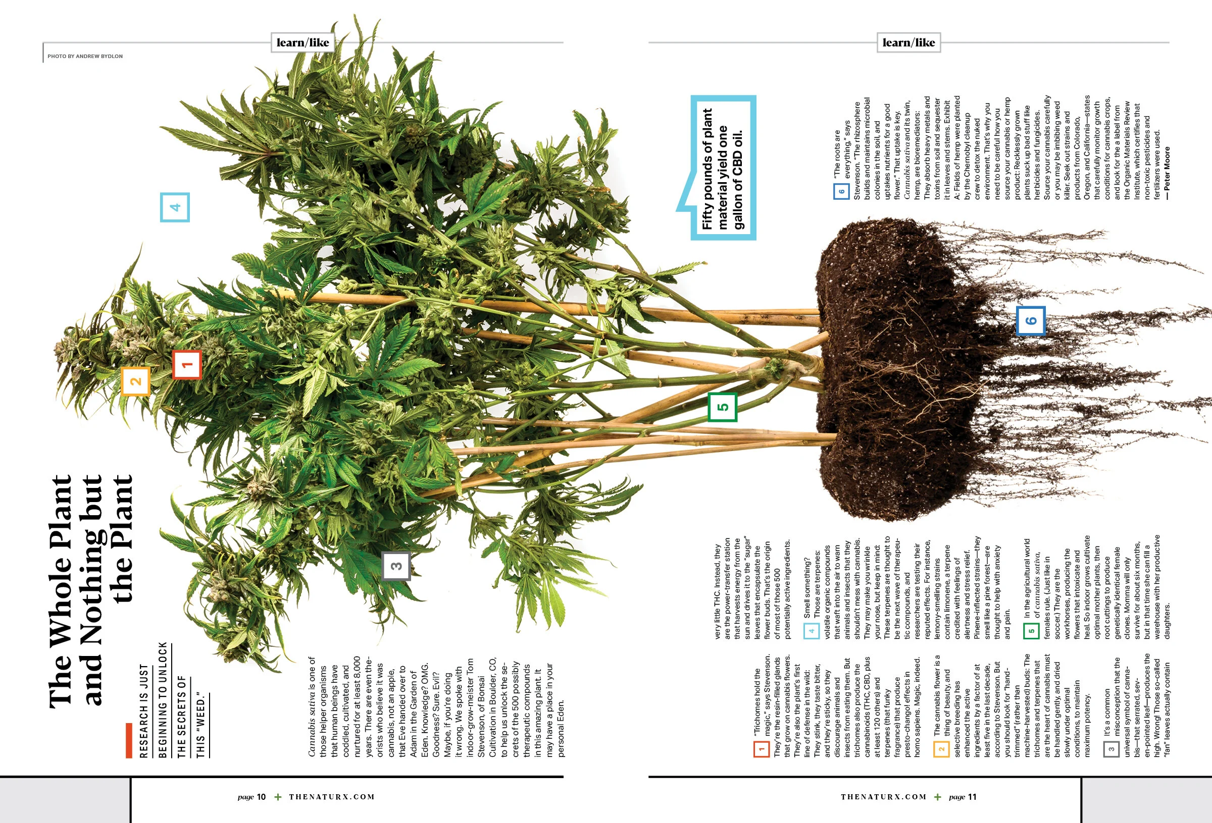
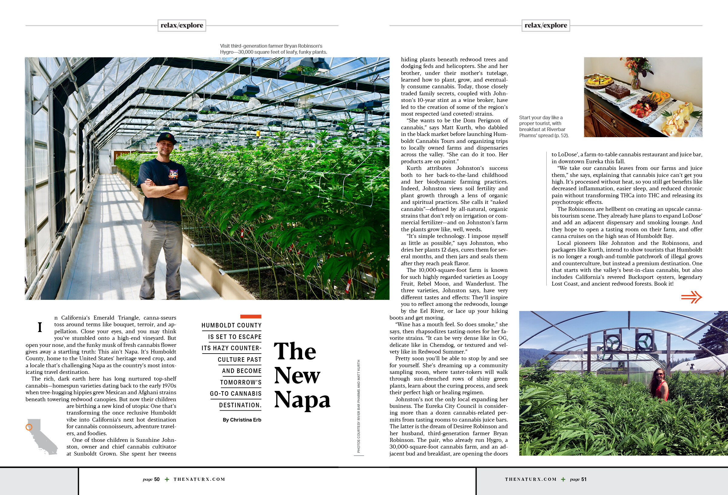
The Launch of NatuRx with Creative Director, Bryan Nanista
/
Last month, Active Interest Media launched NatuRx, a new publication focused on “Better Living Through Cannabis.” We spoke with Creative Director Bryan Nanista about being a one-man art department and the process behind designing this brand new magazine in a short period of time.
SPD: Tell us about NatuRx.
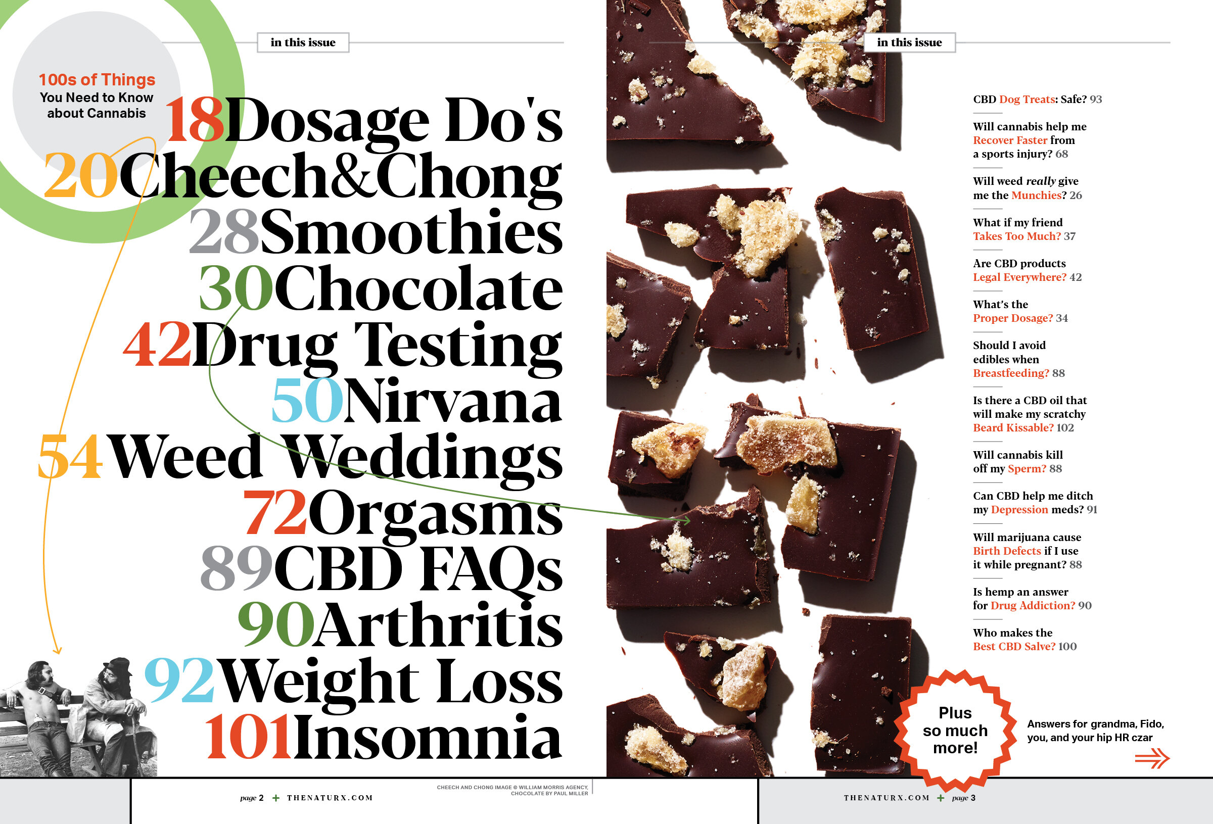
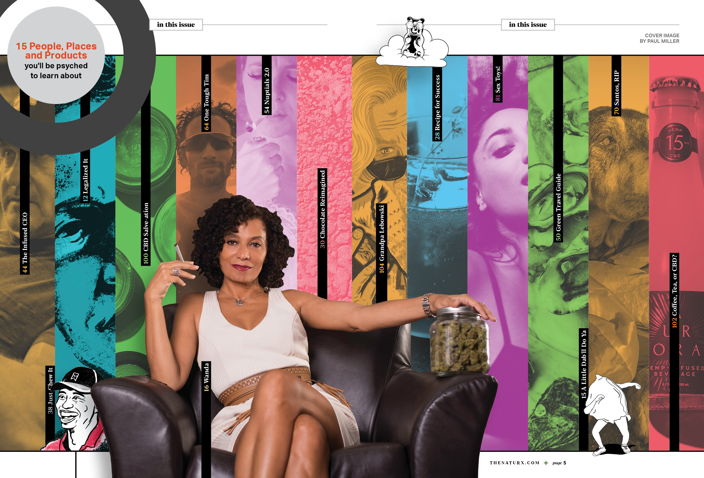
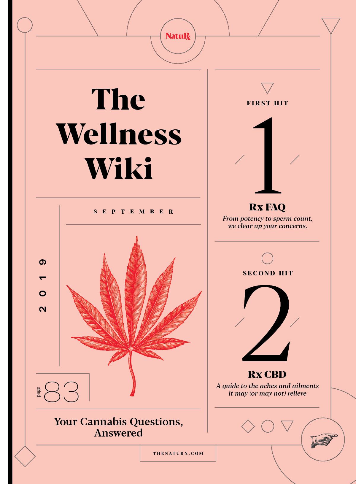
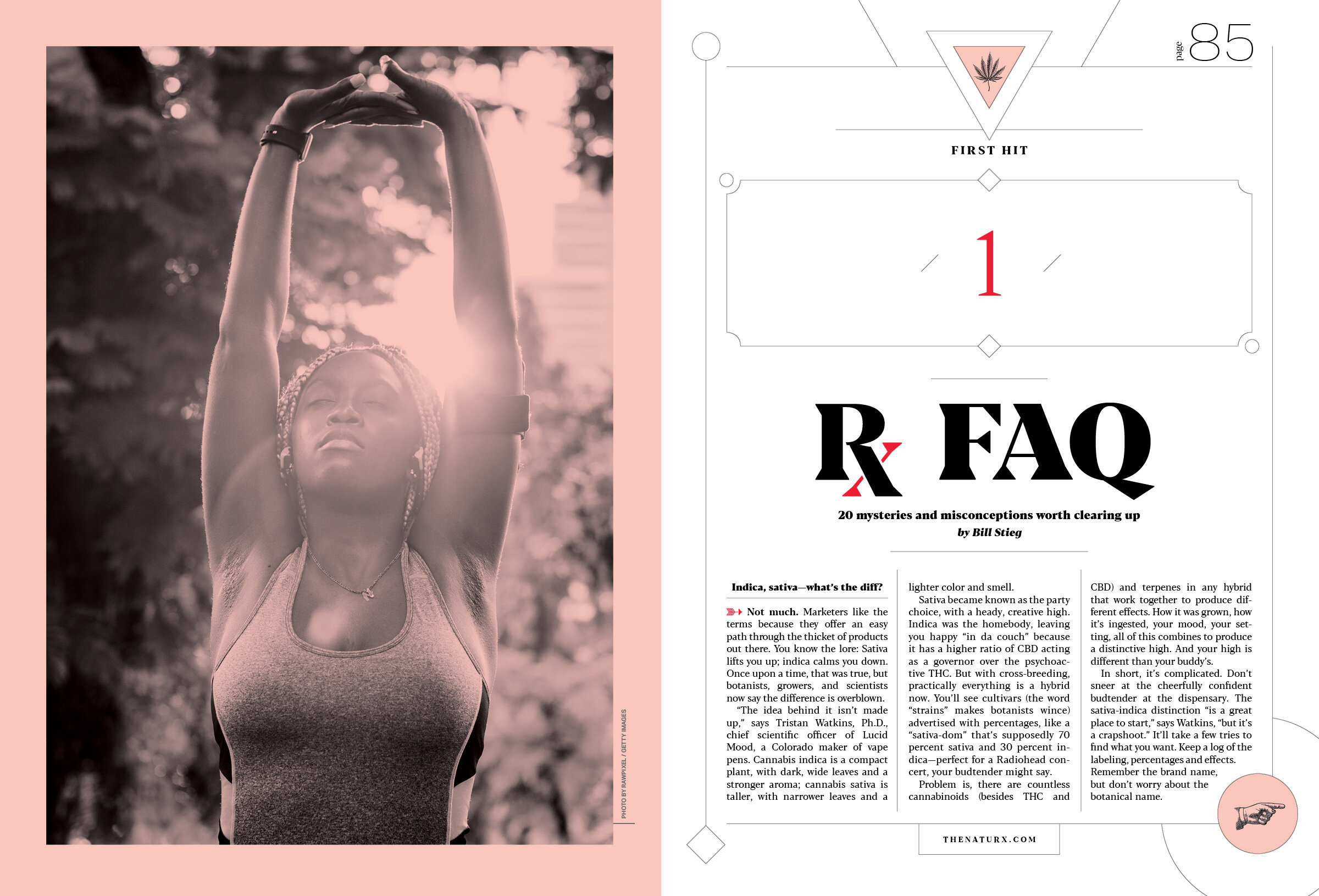
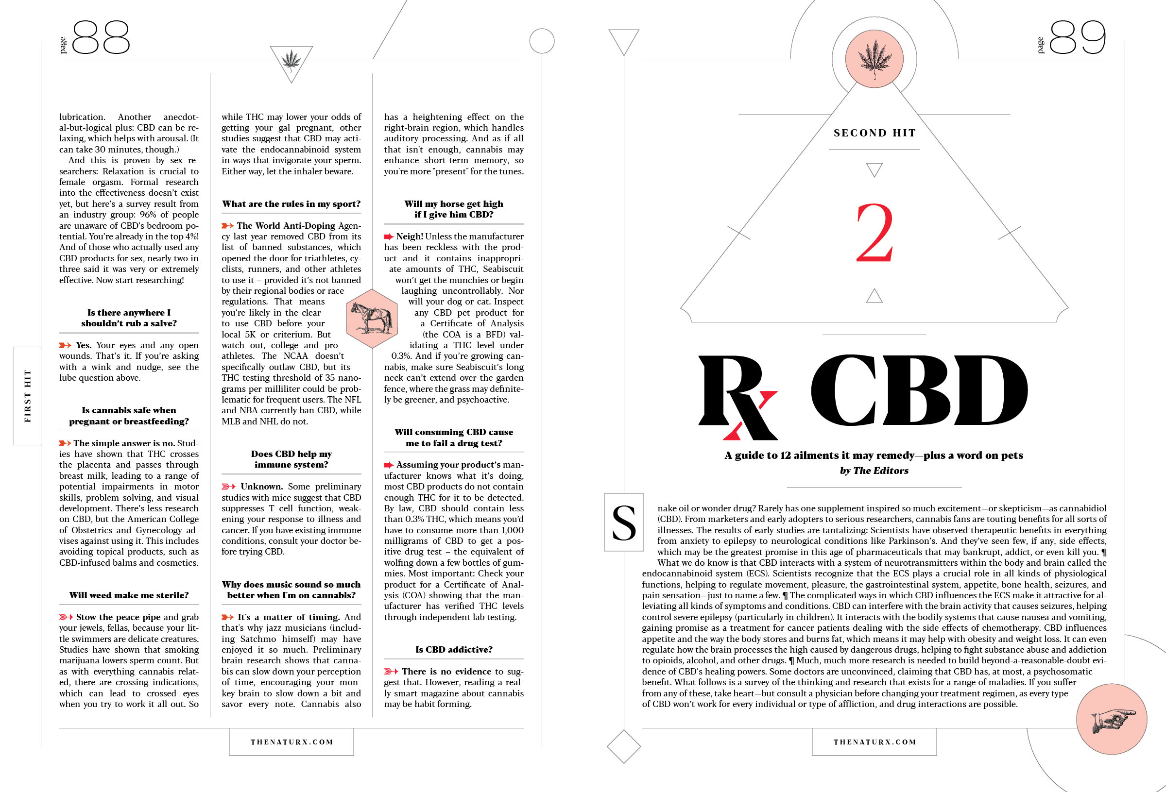
Bryan Nanista: “Better Living Through Cannabis” – cue the weed jokes, right? NatuRx readers certainly appreciate a good high, and our new magazine can guide them to the latest, greatest strains. But NatuRx is no stoner mag. It’s a smart, deeply reported, and occasionally sassy service manual for grown-ups who want to experience the healing powers of this ancient plant. With initial national distribution of 250,000 copies, NatuRx is a serious launch with a serious mission: To demystify and normalize this booming wellness category for the millions of canna-curious consumers out there who’re striving for a healthy, active lifestyle. Published by Active Interest Media, NatuRx will provide world-class how-to editorial from a world-class editorial team who’ve run service-oriented staples like Backpacker, Men’s Health, Clean Eating, Better Nutrition, and Yoga Journal. From sex to travel to recipes to fitness, NatuRx (pronounced Nature Rx) will help you sleep better, play longer, ache less, and focus more clearly– while learning what’s safe, legal, and effective.
SPD: What was the brainstorming process like for the launch of this new publication/first issue? Did you have a particular vision in mind?
BN: Ha! I wish. I mean, I sort of had a general stlyle I wanted, I had mood boards and tear sheets and all that jazz, but I wasn’t sure where I would end up. For me, a big project such as this is like wrestling a monster. Sure the monster is sort of friendly and cute and all, but it has a mind of it’s own and wants to do what it wants to do. Since that analogy didn’t lose anyone, what I mean is that I can create a strong foundation with styles, grids, rules blah blah blah, but the design is always moving and changing. It is very organic (tried not to use that cheesy word) in the way it begins to take on its own shape and lead me down paths I didn’t think I was going to go. And that is one of my favorite parts of big projects, watching them take on their own personalities while I try to keep them focused in the direction I want.
SPD: Are there certain elements you wished you could have included but didn’t make the cut?
BN: To be honest, there was no time to come up with multiple ideas or designs for sections/pages. Almost nothing was “left on the editing floor” but not because we think everything we do is awesome, but because we needed to use everything we had to get this out the door. It was very “run and gun” figuring out the system as we went, which is both a blessing and a curse. Besides some outside writers, the core team consisted of 4 people, 3 on the edit side, and then just me on the design/art side.
SPD: How long did it take to put this issue together/launch the magazine?
BN: We had done some initial mock up pages to gauge general interest from subscribers and, more importantly, advertisers. The project was sort of forgotten about while that process was going on. Then one morning I woke up to an email that said we were a go. We had eight weeks to write and design the first issue. For design, I quickly reworked the overall fonts, colors, and vibe to work in the real world, as opposed to the magical mock-up world where they were first created.
SPD: What’s your favorite part of this issue?
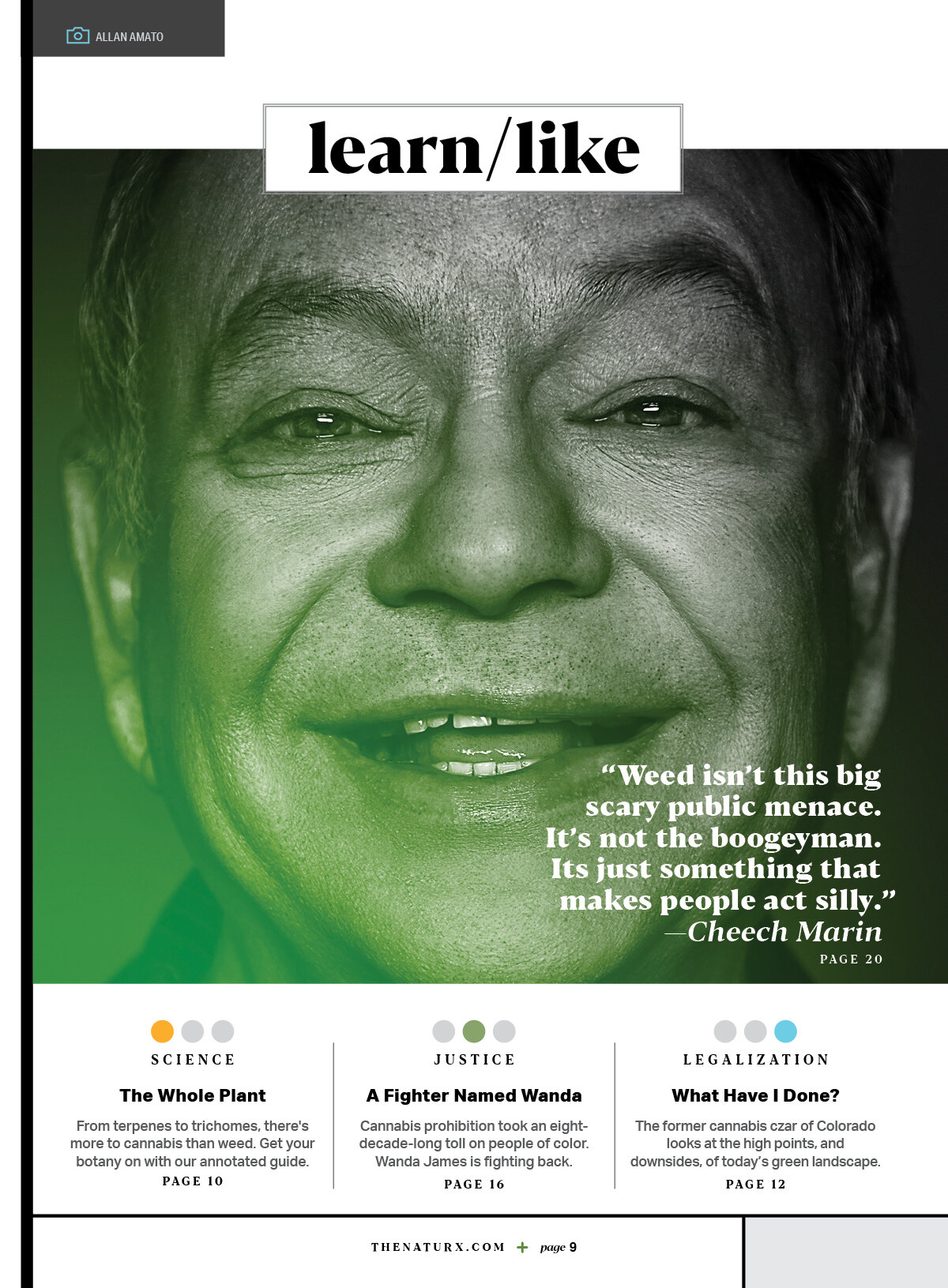
BN: A few things really. One is getting to use more illustrators. I have really never relied on illustations all that much in past work, but our subject matter and stories really lend themselves to illustrations. I have also been in awe of 8by8 and Howler magazines, the style of and the way they use illustration was really inspiring.
One of my other favorite things is a changing grid structure. In the past, I thought it was almost a sin to break the grid, or to use different grids for the same section. But now, I’m more of a “consistency is dead” type designer. I mean, stay in the rules yes, but let’s push those rules as far as we can. Way more fun to design that way and makes for more interesting pages.
Oh, and the actual editorial is fantastic. There are some very entertaining stories in here along with real information that is done with such a great tone of voice.
SPD: What’s next for NatuRx?
BN: Well, to be honest, hopefully just more issues. Starting new mags is pretty hard these days, but hoping this one finds a home. I would love to keep going and see what the design can do and how far I can play with it. That said, we are also doing the full gamut of social, web, and online education to accompany the magazine.
CREDITS
Creative Director: Bryan Nanista with Monochrome Design House
Managing Editor: Christina Erb
Editor-In-Chief: Peter Moore
Founder & President: Jonathan Dorn