Alice Alves, Art Director at Fast Company
/
SPD: What year?
Alice Alves: Early '90s
SPD: What were you up to?
AA: In college
SPD: What magazine?
AA: Harper’s Bazaar

SPD: What was it that so enthralled you?
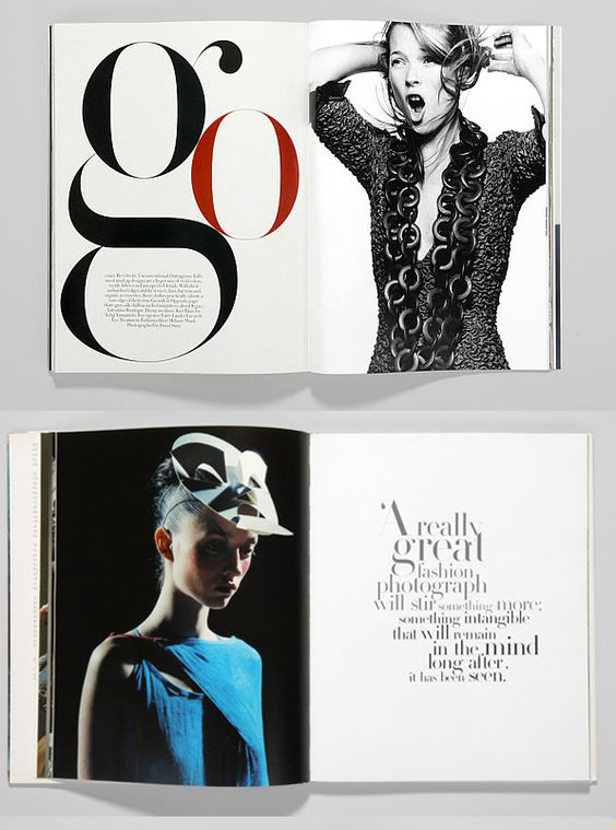
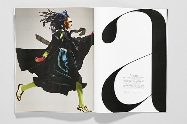
AA: The iconic photography, sure. But dearest to my heart was the beautiful use of Didot. I would pour so much time into admiring those type pages. How many ways can you arrange letters and still get a unique and fresh layout? I had no money to buy magazines, but I worked at the illustrator David Cowles’ studio, where part of my job was to tear magazines, looking for photographs of celebrities that he used as references when he drew portraits (before the internet days). This gave me access to all the magazines I wanted. I got to save some of those Harpers Bazaars and I’ve carried them with me from apartment to apartment throughout the years. I still have them with me now.
SPD: Do you know now who the creatives were?
AA: Fabien Baron. Everyone knew!…
SPD: How does that inform your creative now?
AA: There was an elegance to those type treatments that I’ve always tried to bring to my work. The play with scale, how the typography interacted and played off the photos, and the restrained use of color still informs my work today. During my years at Vibe, we got to experiment with big type for some years, and I definitely referenced the HBs from that era. One of these days, if I’m ever brave enough to work for a fashion brand, I’ll most certainly be looking at my stack of HBs for inspiration.