Jeff Glendenning, Deputy Design Director at The New York Times
/
SPD: What year?
Jeff Glendenning: 1996–2000
SPD: What were you up to?
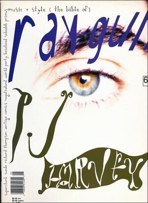
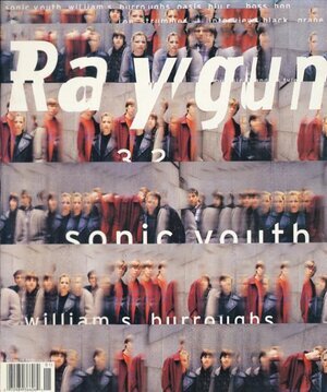
JG: Finishing design school. Arriving in NYC as things had been shifting from early and mid 90s grunge fonts, deconstruction and Raygun...


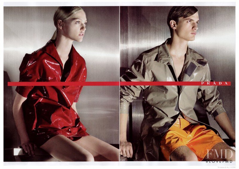
to a modern minimalism of Prada Sport, Meta type and uniformity.


SPD: What magazine?
JG: wallpaper*
SPD: What was it that so enthralled you?
JG: In a way Raygun was a first love as a new member of the graphic design tribe in the mid-90s. It spoke to me as it was the first pub to clearly show that magazine making was something I could actually do with my new passion and major. While I tried my hand at all of it’s stylistic hallmarks, it was really not a fit for my sensibility.
Enter wallpaper*.
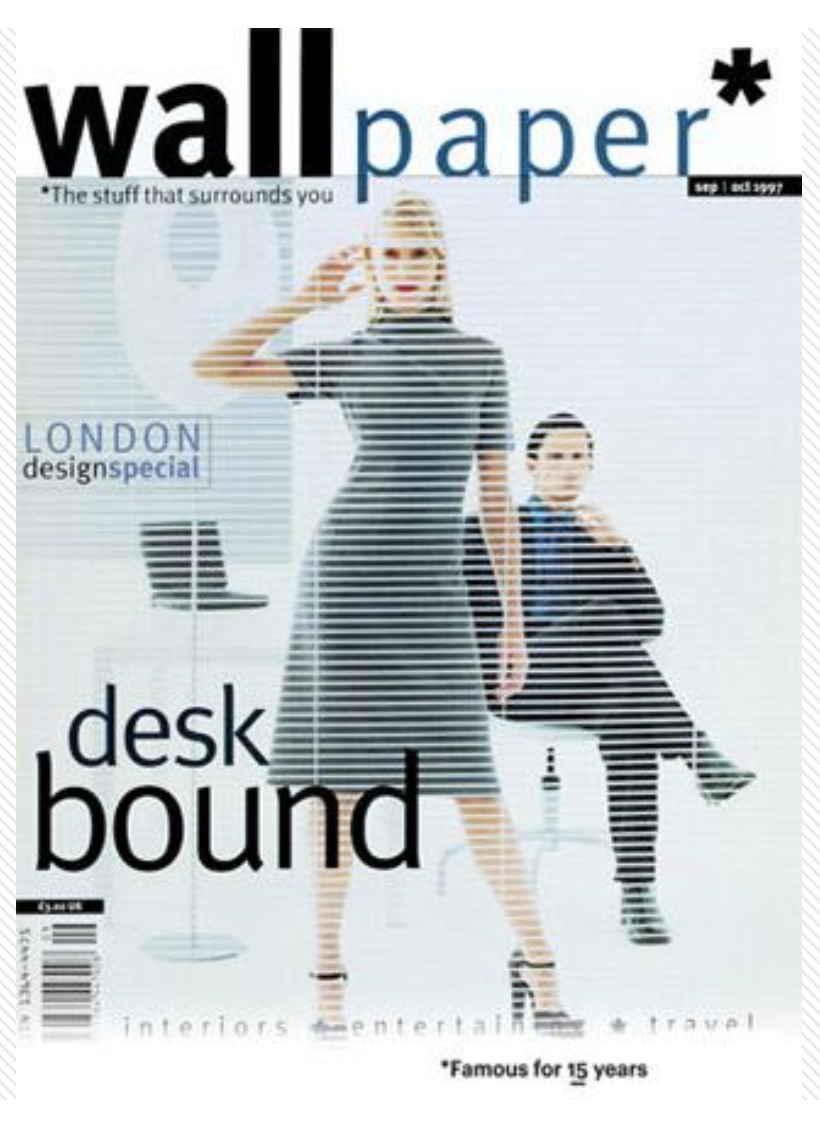


The effect of this magazine was significant for this moment in time and for me personally (as I was getting a POV on the holistic role design can play in life). It was a zeitgeist of sort in the shift from grunge/Raygun to minimalism/wallpaper*. And just as significantly, it showed me the breath design could have on culture at large, as well as one’s life with artifacts and products that we align ourselves too. And facing facts, my OCD was more in line with wallpaper* than Raygun.
(But damn, in a less woke era, it doesn’t hold up for diversity)

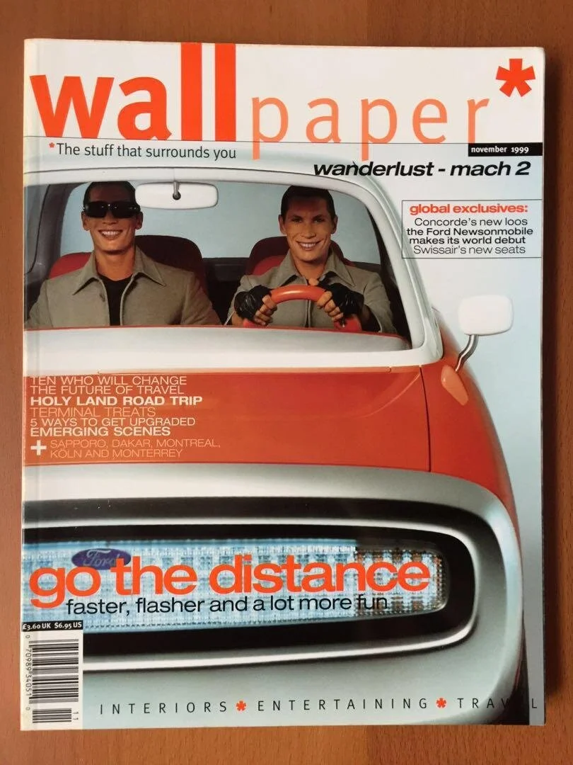
At this time I was also a fan of Fabien Baron’s Bazaar. But I was never fully interested in fashion image making, as much as I could appreciate it in moments. However wallpaper* covers had a bit more of a generalist’s art directed and designed concept. They were fashion photographs in one sense but appealed to my appreciation for simple graphic compositions that at its best reminded me of reminded me of Brodovitch and Avedon Bazaar covers of the 50s and 60s.

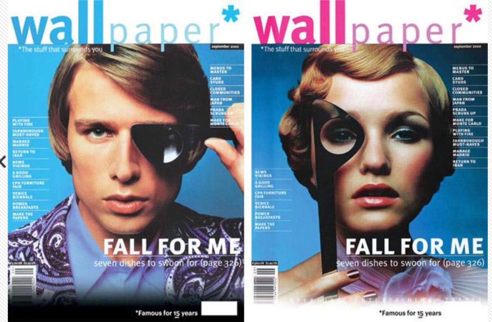

The interiors embraced white space, showed restraint and used a grid incredibly well. (Think today’s Monocle in moments)


SPD: Do you know now who the creatives were?
JG: Tyler Brûlé (editor in chief and chairman of Monocle) was the founder and editor in chief in 1996 until his departure in 2002. Like other star editors that we know and admire (ie, Adam Moss, etc) I get a sense that Tyler is as much a part of the creative vision as the creative team. The rest of the team included Martin Jacobs as CD, Herbert Winkler as art director and Ariel Childs as photo editor.

SPD: How does that inform your creative now?
JG: So Raygun seemed to have a singular mission of being visually expressive (even at the cost of the written word). However, wallpaper* and the goal in the work I make is that it can be both: visually compelling and a clarity of content and what is being communicated. Think Beatrice Warde’s crystal goblet … but one that is a Tyler Brûlé / Monocle collab with some indie glassmaker. I don’t think design should be invisible, but ‘simple’, minimal design has nowhere to hide and everything must be considered. The proportions, materials and story being told.