James Reyman
/
James Reyman, Principal/Creative Director at Reyman Studio: In 2007, I was invited to redesign The Hollywood Reporter, an almost 80 year old, daily magazine that reports on the business of Hollywood.
Like many business to business publications of that time, the publisher wanted to re-imagine the magazine as a 21st century publication and, perhaps, create a more consumer friendly design.
THR had a generic look in its typography and pacing; no real identity to it. I looked at different type families for a new approach and settled on 3 different families created by Cyrus Highsmith of Fontbureau (now TypeNetwork). Considering the subject matter I wanted the type to have a little bit of personality but be serious and easily readable in the presentation of information. The typefaces also needed the versatility to cover all the typographic needs of this daily magazine. The families I chose were Antenna, Prensa (including a brand new condensed face) and Quiosco (with a custom-drawn small caps version)

PHOTO: Geoff SpeaR

We started with the logo. The old logo was ok on the magazine but was not clearly visible on TV or Computer monitors (and phones and watches in the future). Of over 100 logo ideas, a sturdy visual representation of The Hollywood Reporter name using the beautiful Antenna typeface family, was chosen.
The internet had become big competition for all magazines so we considered different opportunities for custom content and branding in the magazine. Since it was a business publication we created an entire new series of charts and tables for the magazine. Very easy to read and very accessible.
Since Nielsen was the parent company of THR at the time, I conceived various infographics that could be created using Nielsen data. One of them was the “Breaking it Down” Chart. This would appear every week. The graphic would chart the money that consumers would spend on entertainment each week or month. It would break down the spending into categories, like Film, TV, Internet, Radio, Books, etc. A main graphic showed the breakdown (eg: TV 40%, 25% movies, 15% web surfing, etc), then additional charts would breakdown those numbers; (EG: What were the ten most popular TV shows, Which were the most popular Movies, most visited web sites, etc) Other charts included TV ratings, film and web metrics.
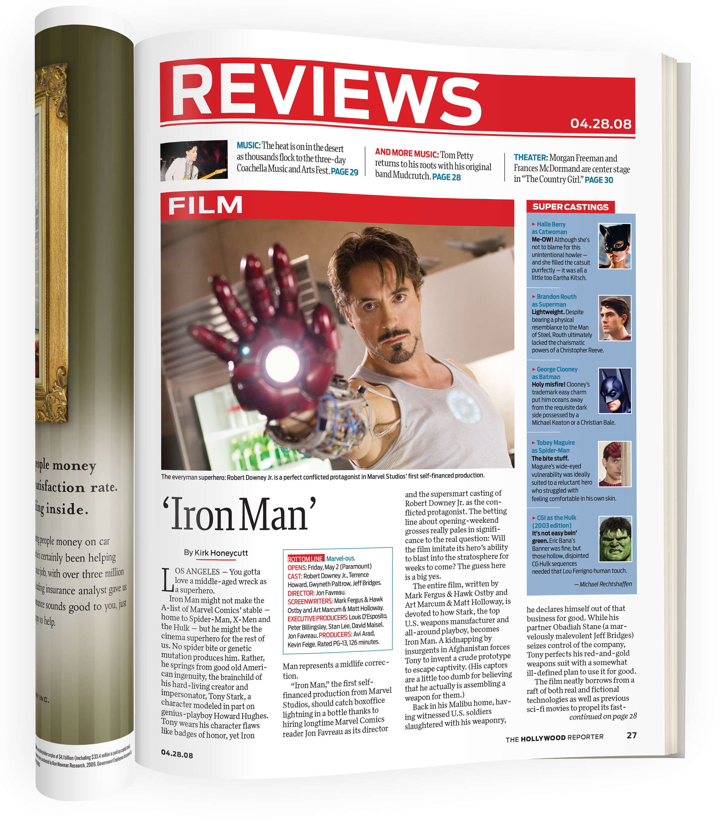
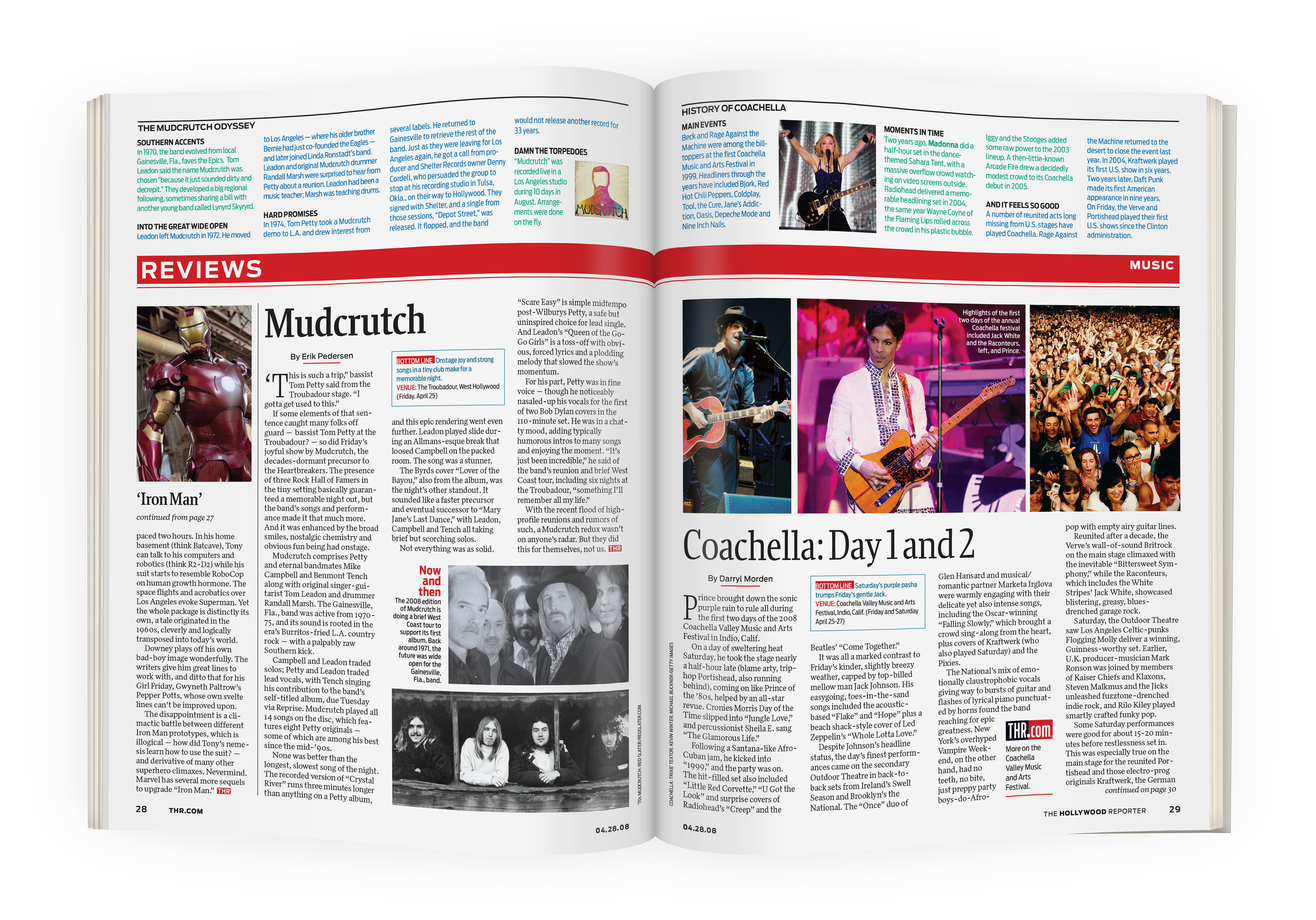
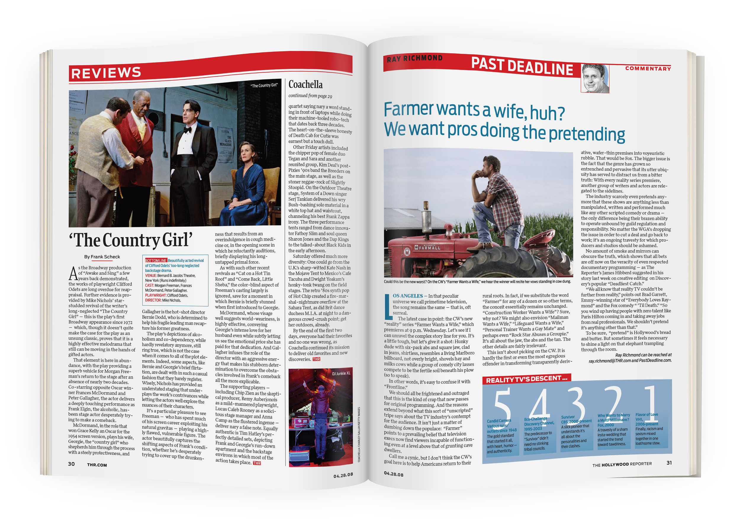
We also made each section more distinct in its visual identity. Commentary pages had wonderful illustrations of the columnists by the illustrator, Alan Witschonke. I sent the magazine a new list of illustrators and photographers to use to bring a high level of visuals to the pages. The Reviews section would not only have a review of a movie or concert, but at the top of the page in sans serif type, we had copy with anecdotes and inside stories of the making of the film or stories from concert goers at a show. This all helped to brand the content and make it uniquely available in THR.
Another idea for branding content was on the commentary and film review pages. Instead of only having a review, the magazine would also recommend other films (with short synopses) of that genre that the reader might enjoy. These elements were meant to add enjoyment to the readers’ experience.
This redesign was awarded the gold medal in the 2008 Folio:Ozzie competition (Best redesign in the B2B category).