Valentina Casali
/
“It is an honour and a responsibility to be part of SPD,
it challenges me to do my best and to keep a high-quality level of work.”
-Valentina Casali, Co-Founder, Sunday Büro
SPD: What is your current job?
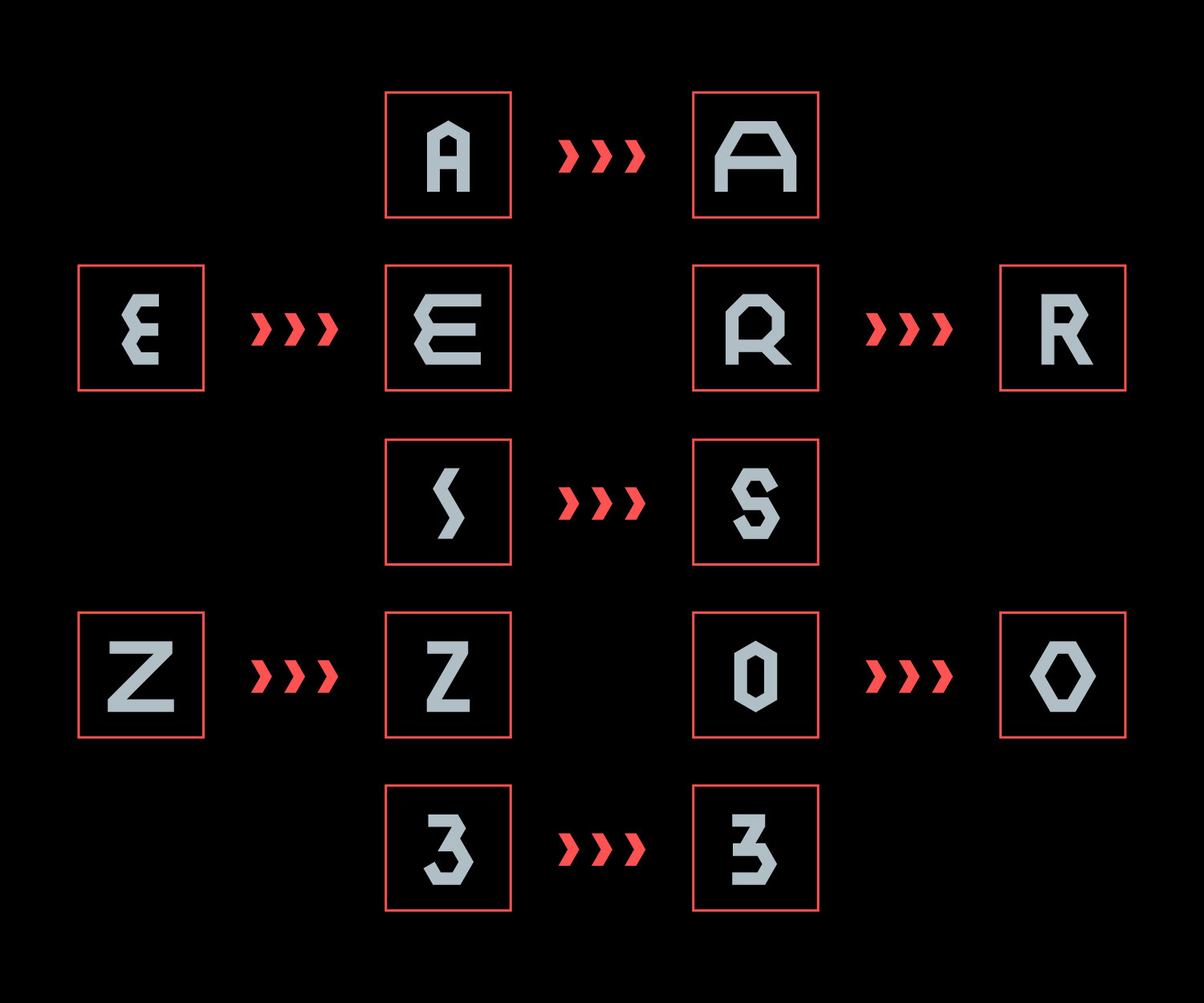
Valentina Casali: I’m currently a letterer at Sunday Büro, the studio I co-founded with Marco Goran Romano. I design custom letters for different purposes, from brand identity to editorial. I also work as a type designer and I occasionally do small sign painting jobs.
SPD: What's your favorite part about what you do?
VC: I love to work with magazines and newspapers because I enjoy dealing with a very different range of topics, you’ll never know what the articles are about. It pushes me to read, research and be curious. I like it because I’m free to experiment.
SPD: Where did your interest in typography come from?
VC: Well, it was more of a necessity than a real interest at first. The design school I attended was very small and didn’t have a typography class. After the first year I thought something was missing, so I started researching and the first thing I came across was the movie, “Helvetica.” I was blown away by Paula Scher’s interview and in the same period at the ISIA in Urbino they were having an exhibition of her work. I had no clue where to start and coming from a small town I didn’t know what book to study nor what institute or workshop to attend. So I asked myself: what are the basics of typography? The answer that popped in my mind was: calligraphy! So let’s start there! I was lucky enough to meet Monica Dengo (one of the world’s most renowned calligraphers) and I spent six weekends at her studio working with a class of people who shared the same interest I had. At that point I was craving for more and I started to also attend type design, letter carving and sign painting workshops. I must admit the driving force behind my work is trying the traditional techniques myself.
SPD: A lot of your typographic work is very illustrative, can you speak about that process?
VC: Well, the studio has two faces and two approaches that merge in the work. I personally have a stiff approach to lettering, it has to work in black and white and legibility has to be there and that sort of stuff (maybe "old school"?), and working with Goran, who is an illustrator, has made me more open to experimenting with color and thinking of letters more as an illustrative artwork than a graphic design piece. Since we mostly produce vector work sometimes I feel something is missing, so I try to integrate handmade brush strokes or marbling textures and stuff like that.
SPD: What's your favorite project that your studio Sunday Büro has worked on?
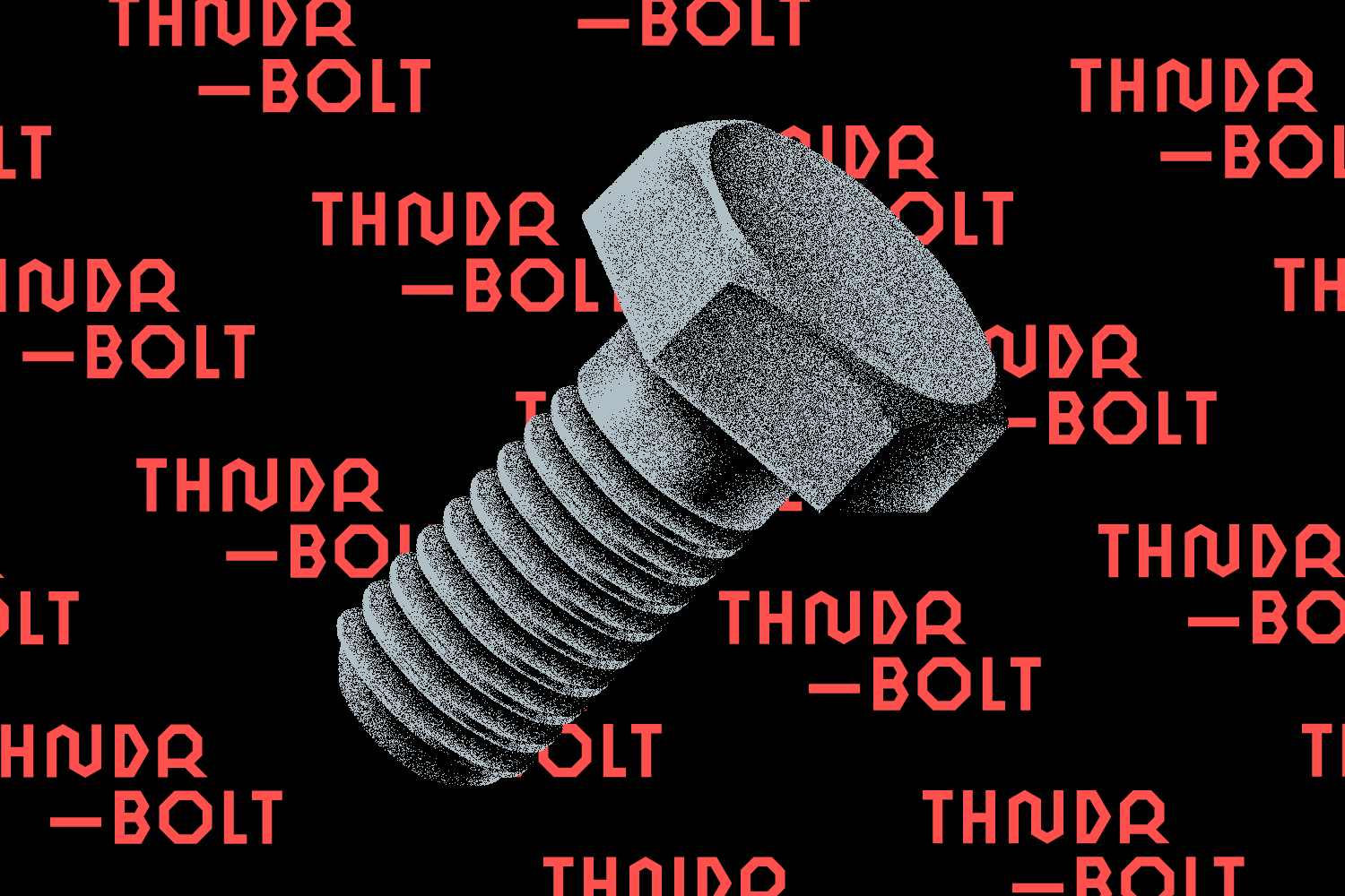
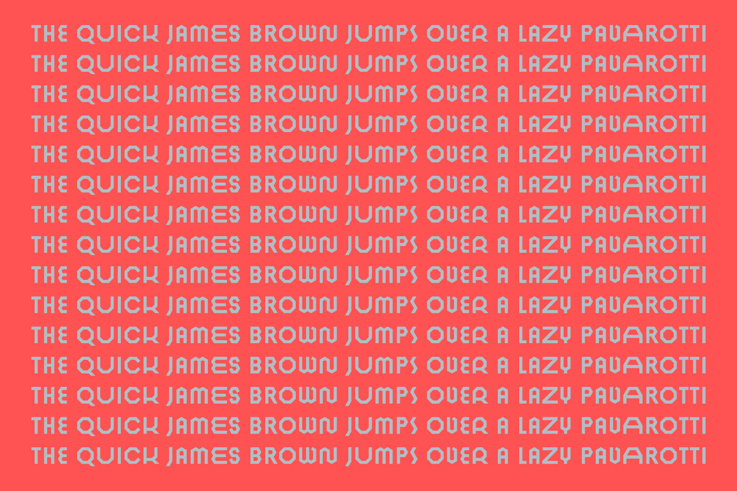
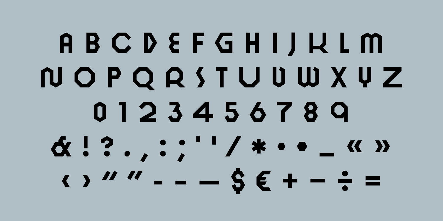
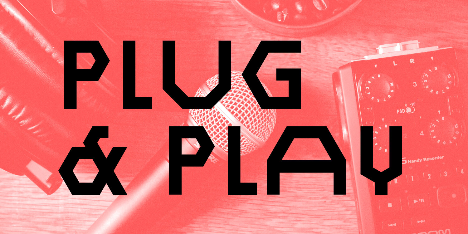
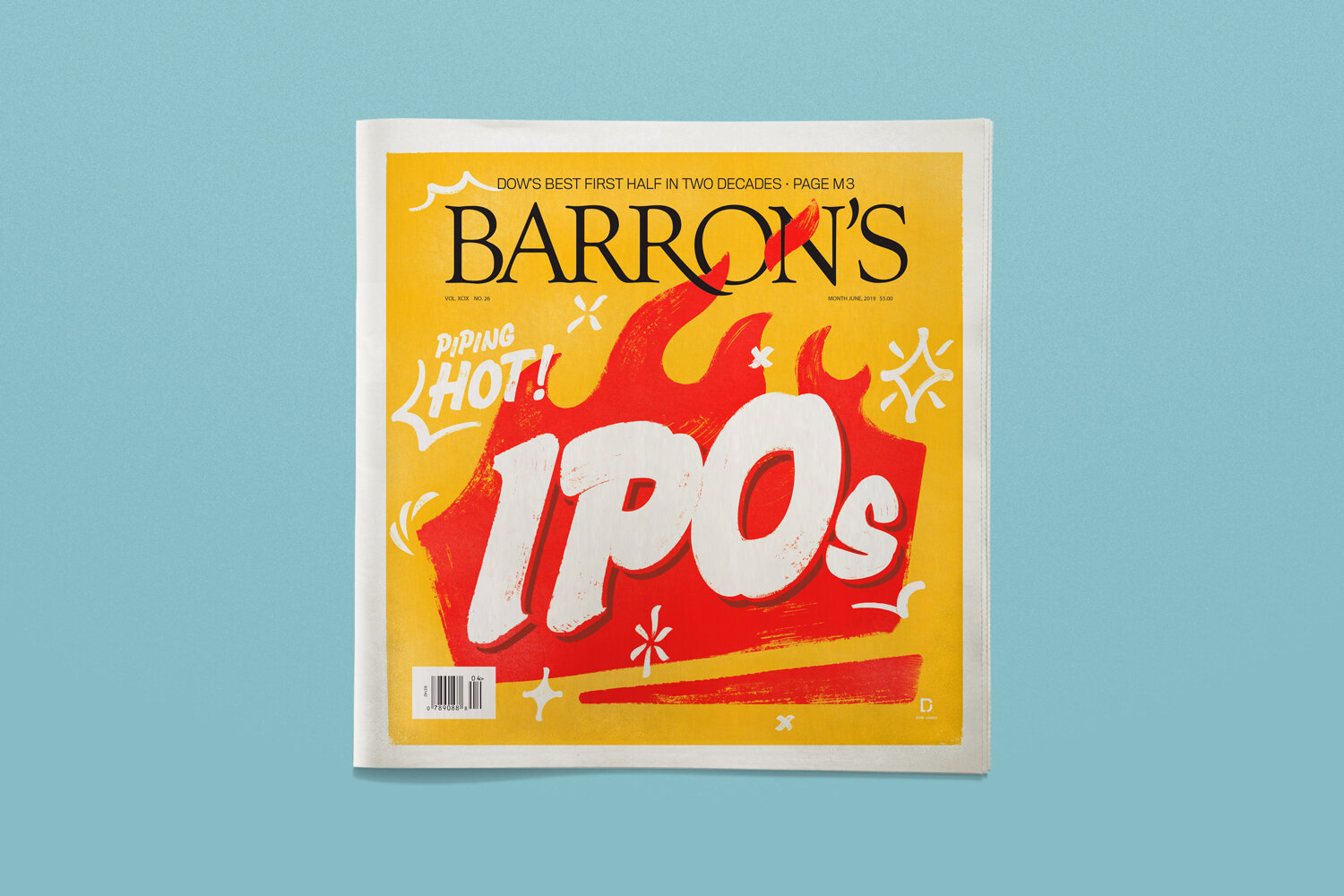
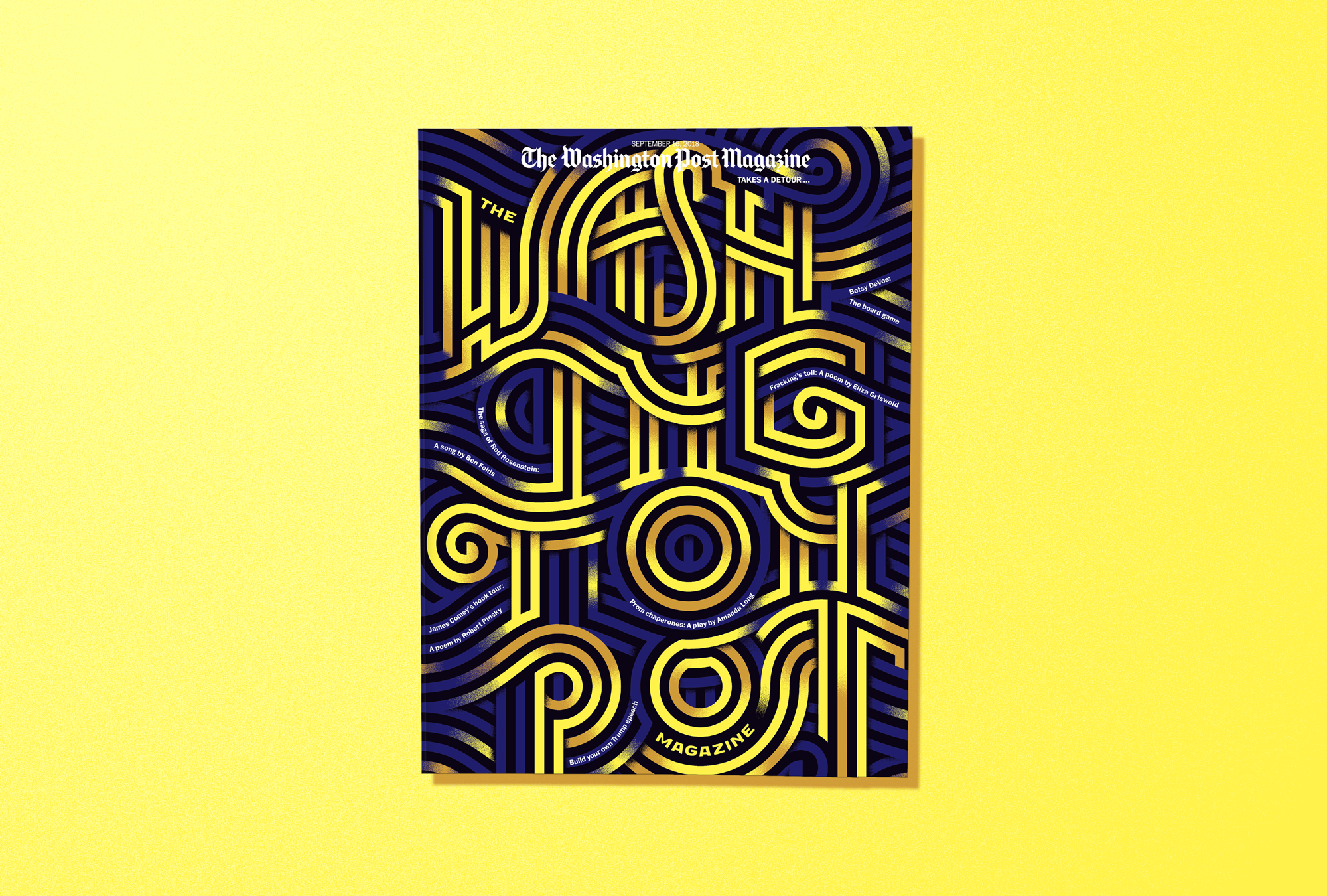
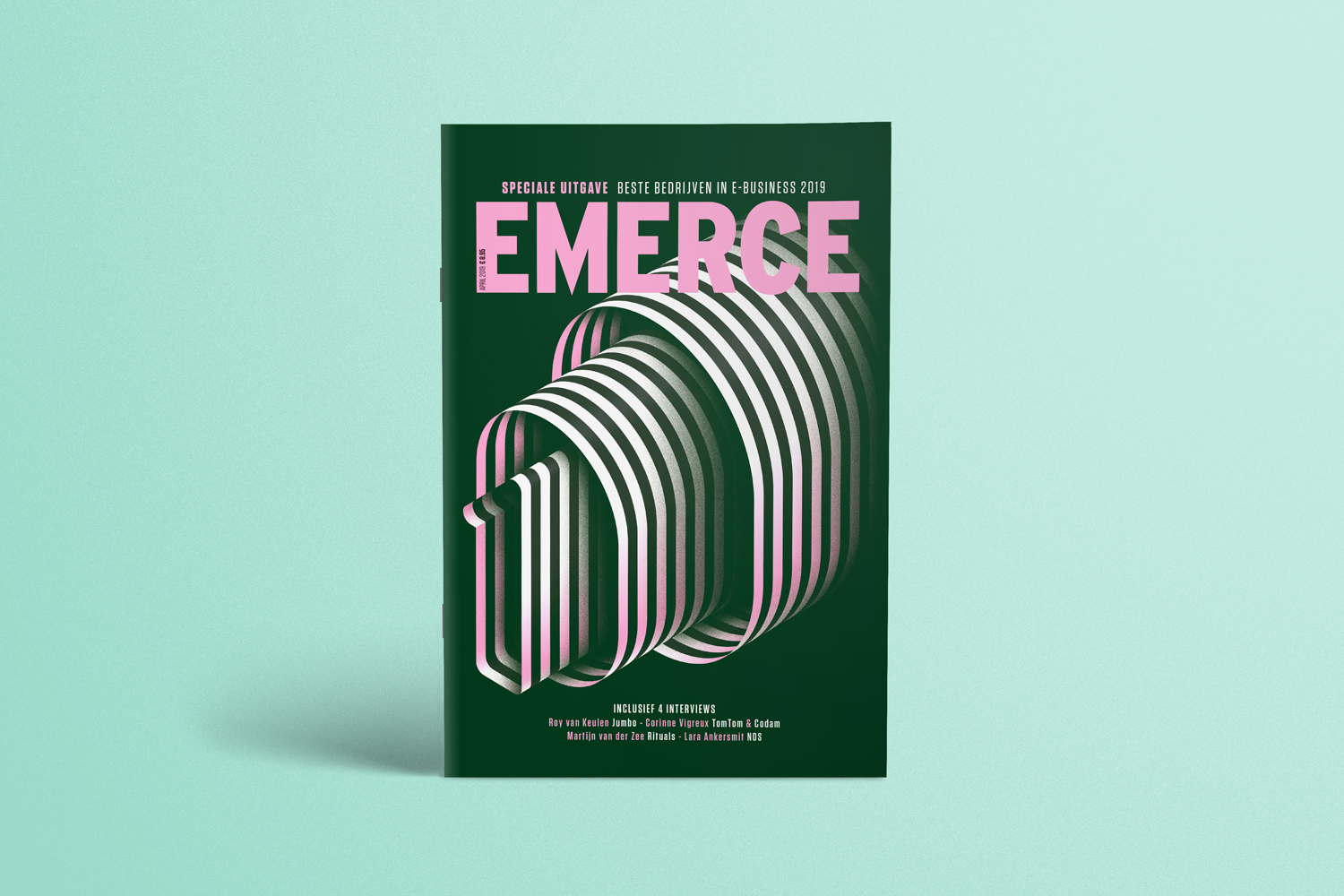
VC: Tough call! I think the work we have done for Il Mucchio Selvaggio, both the masthead redesign and the display typeface THNDR BOLT. It was a real challenge because of the crazy timeline, but we had a great feeling with the Art Director, Francesca Pignataro.
SPD: Where do you go for inspiration?
VC: As strange as it might sound, I like cemeteries and burial grounds a lot. There are all kinds of letters there. The layout, in some cases, is very well designed and some of them are very fancy and decorated and you truly see the effort the author made to reflect the deceased ‘s personality. Plus, they are very quiet and peaceful places.
SPD: What's a future project you would love to be a part of?
VC: I would love to design movie titles! I already reached out to some directors and production companies to make that wish come true.
SPD: What is the graphic design community like where you live?
VC: Italy has a great creative community; many events and exhibitions are now shifting their focus from history to experimental research. It’s definitely becoming more open and international. When I lived in Milan I really enjoyed talking to friends or potential clients and sharing my work in an informal way during an aperitivo. I guess everything, even design business, is planned around a table while you drink and eat in Italy. Anyway, the competition is fierce and pretty diverse, depending on the city and on the market you want to reach.


SPD: Who were your mentors?
VC: Unfortunately, I didn’t have the chance to have a mentor, but during my career I was very lucky to meet very helpful and talented people. Each of them gave me the chance to learn something about the way you should deal with clients, or work ethic or even project development. For example, from Giovanni de Faccio I learned that I should always treat people nice, no matter what; from Anna Schettin to be proud of who I am and what I do as a designer; from Eric Marland to take myself less seriously (and finish the work day with a gin tonic); from Tom Perkins to talk less and do more, and from Antonio Cavedoni how to do research and to not be afraid to ask to somebody more experienced than you. And the list could go on!
SPD: What does SPD mean to you?
VC: It’s a great chance to see the editorial world behind-the-scenes and meet the best! I feel I am part of something big, a community that transcends geographical borders, a group of incredibly talented professionals, who love the editorial world and storytelling as much as I do. It is an honour and a responsibility to be part of SPD, it challenges me to do my best and to keep a high-quality level of work.
SPD: What are you currently working on?
VC: As designers and entrepreneurs we understand the importance of planning and networking. These values are even stronger during this period of change. We have decided to help out with what we do best.
We already donated money as [individuals], but we strongly believe we can make a difference as professionals. During the ongoing lockdown days, imposed by the Italian government directives to limit the spread of the Novel Coronavirus, we started Lettera40. "Lettera" is the Italian word for letter and 40 is pronounced "quaranta" which is a synonym of quarantine: literally Letters from Quarantine.
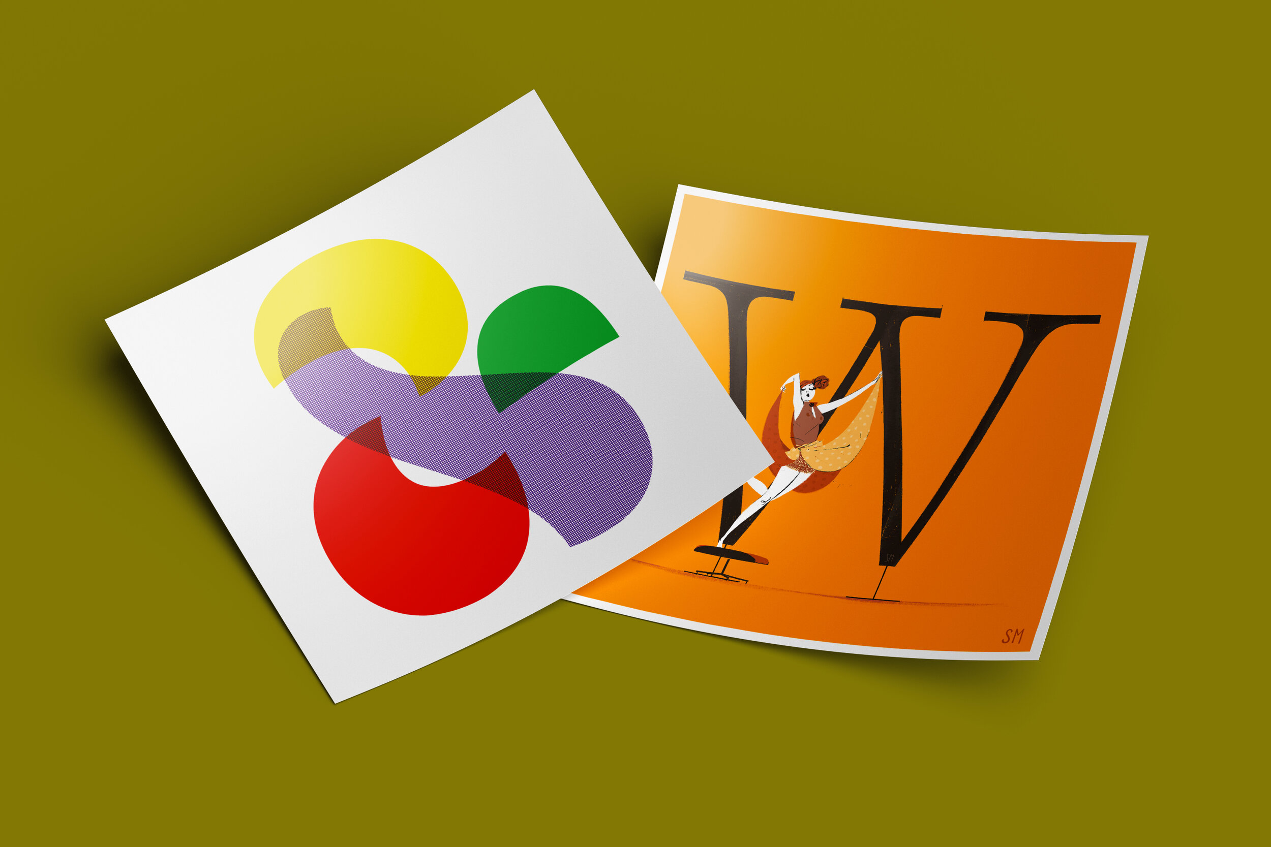
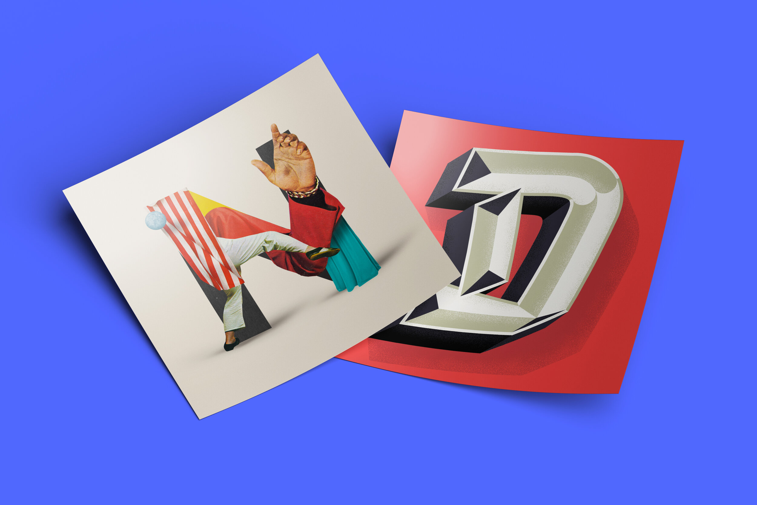
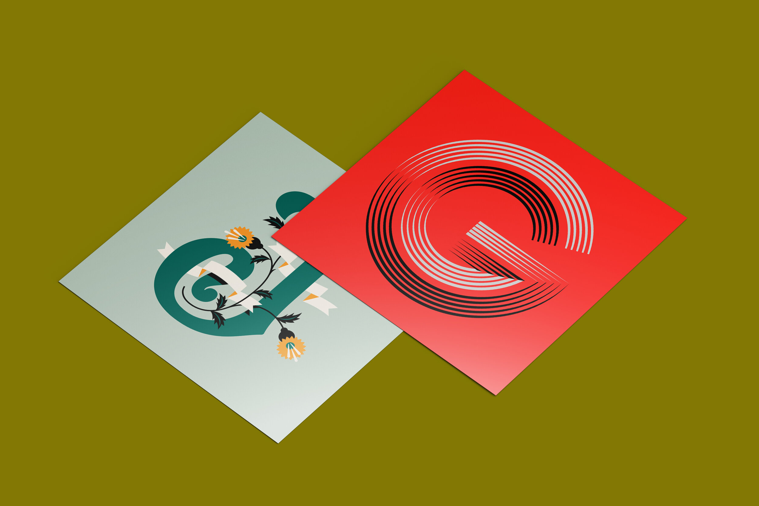
Inspired by the quote "Letters are symbols which turn matter into spirit." — by Alphonse de Lamartine — we asked some of our favorite illustrators, letterers, type designers, cartoonists and artists to interpret one or more glyphs of the Latin alphabet, each with their own sensitivity.
Our goal is to collect as many donations as possible by selling fine art prints on the site, so that we’re able to donate the proceeds to the Italian regions most affected by Covid-19: Lombardy, Emilia-Romagna, Veneto, Piedmont and Marche.
The campaign ends on April 25th, a significant date for our country (it’s when we celebrate our Anniversary of the Liberation from the Nazi occupation during WWII).