Wanyi Jiang, Design Director at Marie Claire
/Wanyi’s Top 5
Wanyi Jiang: I’ve been at Marie Claire for 6 years, and it’s been transcendent to watch (and make) the magazine evolve to this point. I chose these 5 covers because none of them are alike to one another, but they all don’t speak to a specific era. I hope that in twenty years, you’ll look back at these covers and they’ll still feel timeless and capture your attention. I also chose them because they’re just damn pretty to look at. Ultimately, that’s what we want, right? Something that holds our eye?

Penélope Cruz | February 2019
It’s hard to make Penelope look bad. Unretouched, she’s just as beautiful. We went though many, many crops of this image. With the ring, without the ring? I love the shape of her hair here and how it fills out the frame. On the newsstand, your eye goes directly to her eye. It’s arresting. The inside cover of this issue is just her in a hat, cropped super close, in black and white. That one’s a close second.

Zendaya | September 2018
The September Issue! There’s nothing not to like about this image. Thomas Whiteside shot it and he did a beautiful job. Her 60’s bouffant is super mod, and we love the peep of the shoulder. I put the type all on the left side because I wanted her to feel like she was peeking into the frame, instead of being obviously centered or enveloped by words. This way, the words are still important; they’re just, as Beyoncé says, to the left. We’ve also never had a purple background and we found one that’s elegant and still modern.

Halsey | August 2018
The inspo for this was Drew Barrymore circa 1995, when Mark Seliger shot her. And Mark actually shot this image of Halsey. How cool is that? I like it because it feels retro, and there’s no eye-contact, which you usually don’t see on a fashion magazine. We shot this in Coney Island, and the colors are super 90’s as well. I usually think the less coverlines, the better. But the shape of the coverlines actually work really well with this photo.

Hailee Steinfeld | February 2018
Technically Kate Lanphear (our creative director)’s first issue with us! The styling and makeup for this shoot was reminiscent of Brooke Shields from Pretty Baby, so we went there. Hailee looks glamorous yet age-appropriate. To this day, it’s one of our simplest covers and it feels timeless.
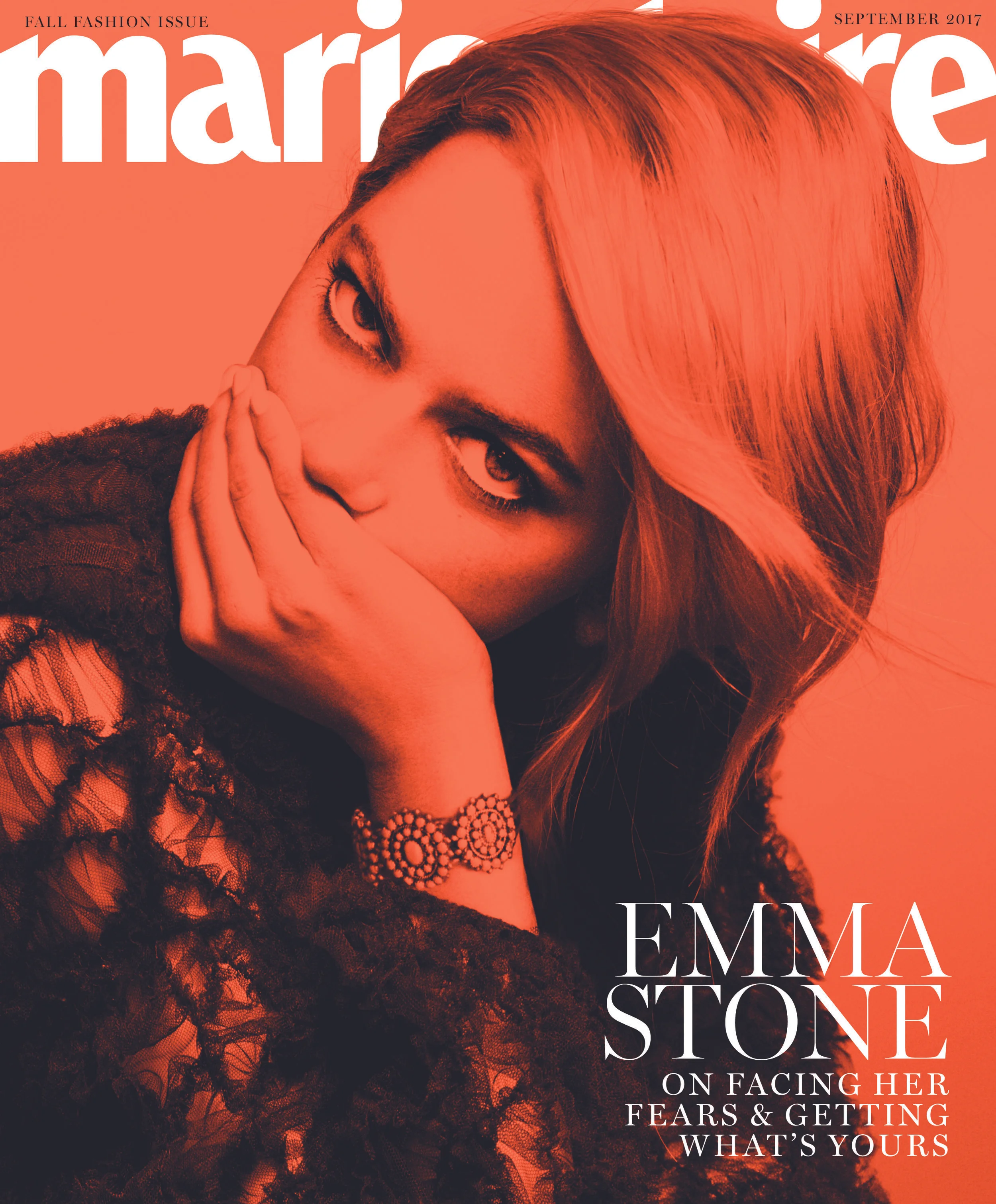
Emma Stone | September 2017
This was a super special issue for us. The original cover was pretty standard. Emma, against a white sky, backlit, boxed with type around her. But we wanted to do something with her in this Fendi dress that wasn’t the standard ¾ body pose. The question was: how do we make this image interesting? Her eye contact is already intense, so we amped it up by turning it black and white and put the orange overlay on it to evoke a vintage 60’s feel. This cover won the ASME for best fashion/beauty cover which was a first for us. It’s our least commercial cover, by far.


