Fast Company's Redesign with Creative Director, Mike Schnaidt
/
Photography: Williams + Hirakawa, Ramona Rosales
As Fast Company approaches its 25th year anniversary, the brand recently debuted an entire redesign. A new logo, rebranded franchises, and an updated visual identity were tackled over a four-month period. Thank to Fast Company’s Creative Director, Mike Schnaidt, for walking us through the entire process. Read on to learn more about their redesign.
SPD: Why did Fast Company decide to undergo a redesign?
Mike Schnaidt, Creative Director: The landscape of business, and how Fast Company chooses to cover it, has changed dramatically since our last redesign 5 years ago. The evolving market, along with the growing number of Fast Company franchises and extensions, made for the perfect chance to take a step back and not just redesign the magazine, but overhaul the entire brand.
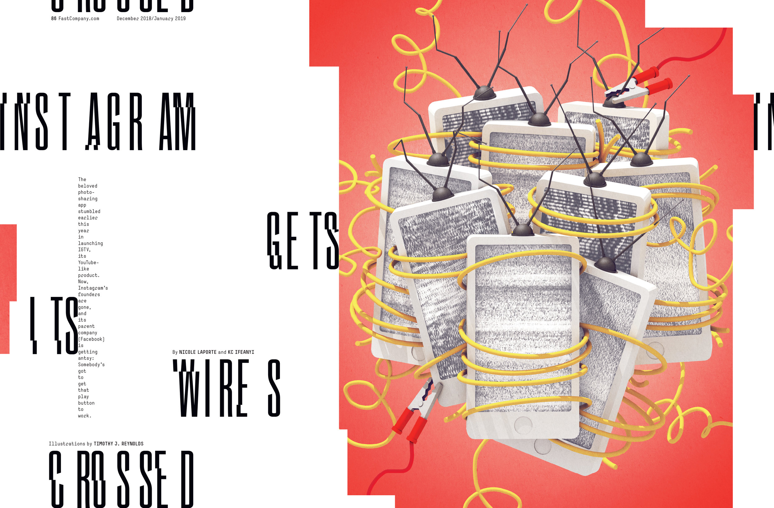
Photography: Juco; Illustrations: Timothy J. Reynolds, Bratislav Milenkovic, Mauco Sosa
SPD: What did you use as inspiration for the new look?
MS: Design is one of the core areas of coverage for Fast Company. This provided an interesting opportunity for our new visual identity– as a chef should eat his or her own cooking, Fast Company should practice the same design thinking as the companies we cover.
Take Slack, AirBnB, and Spotify, for example. There’s a similarity in their design. While the technology is incredibly complex, their branding doesn’t feel futuristic– it’s in fact very friendly and inviting. These companies want to signal they are natural parts of our lives. This breaking of the “black box” feel of technology is the thinking behind human-based design, and of our new look.

Logos: Studio Muti, Peter Komierowski, Matt McCracken, Eight Hour Day
SPD: What was the first thing you changed?
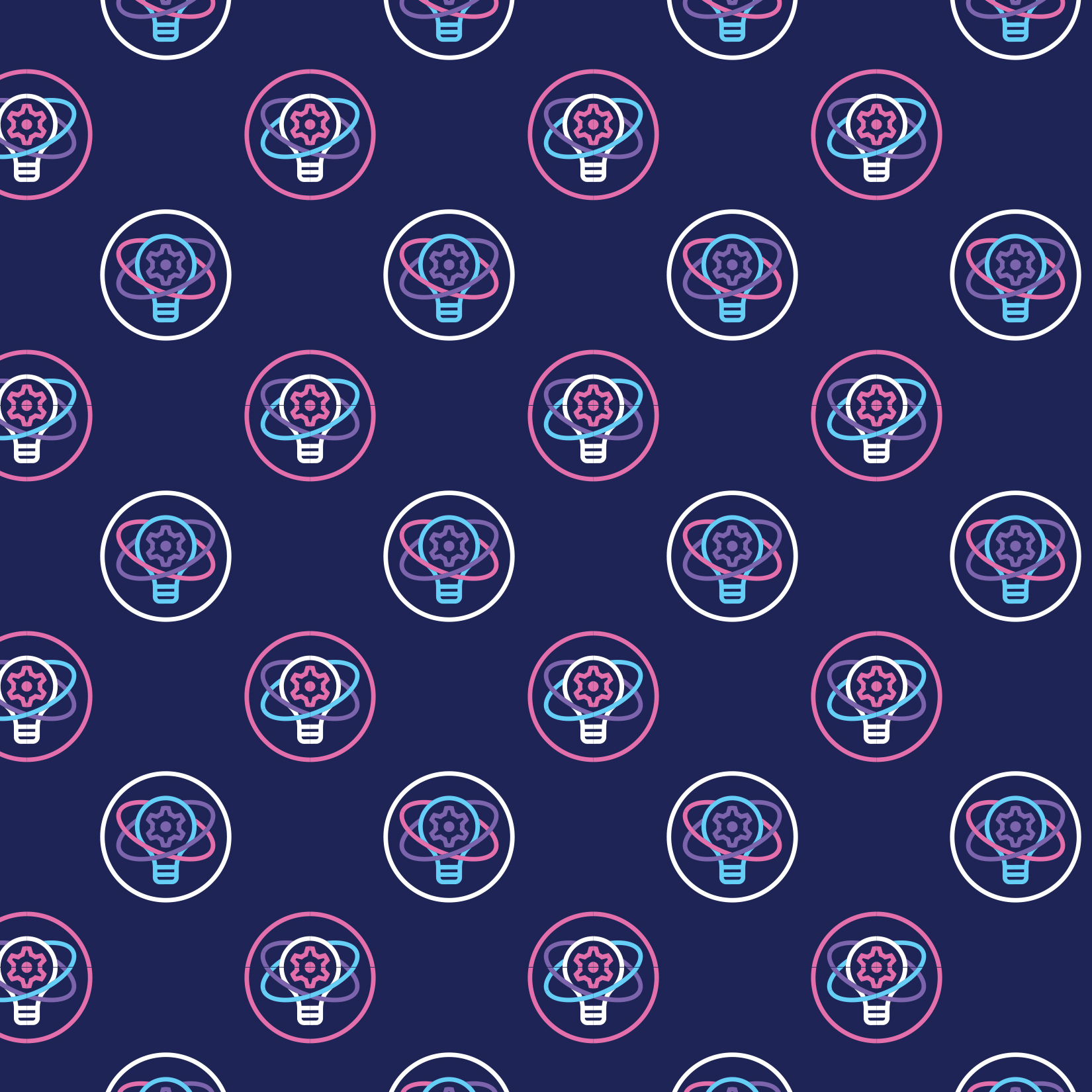
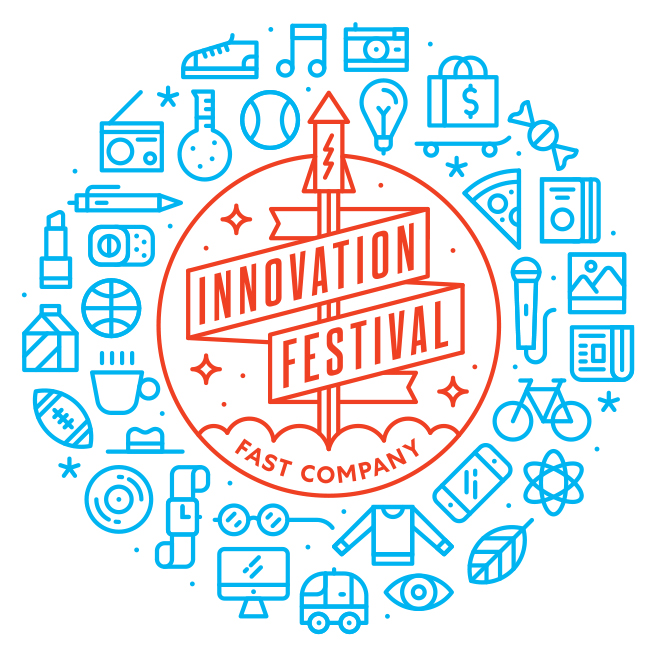
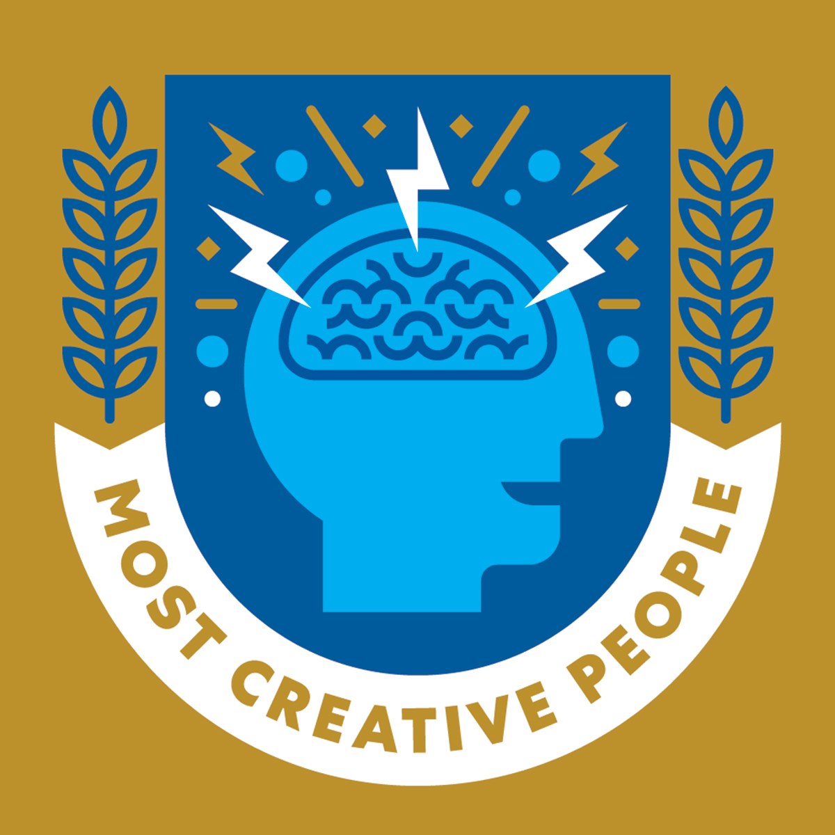
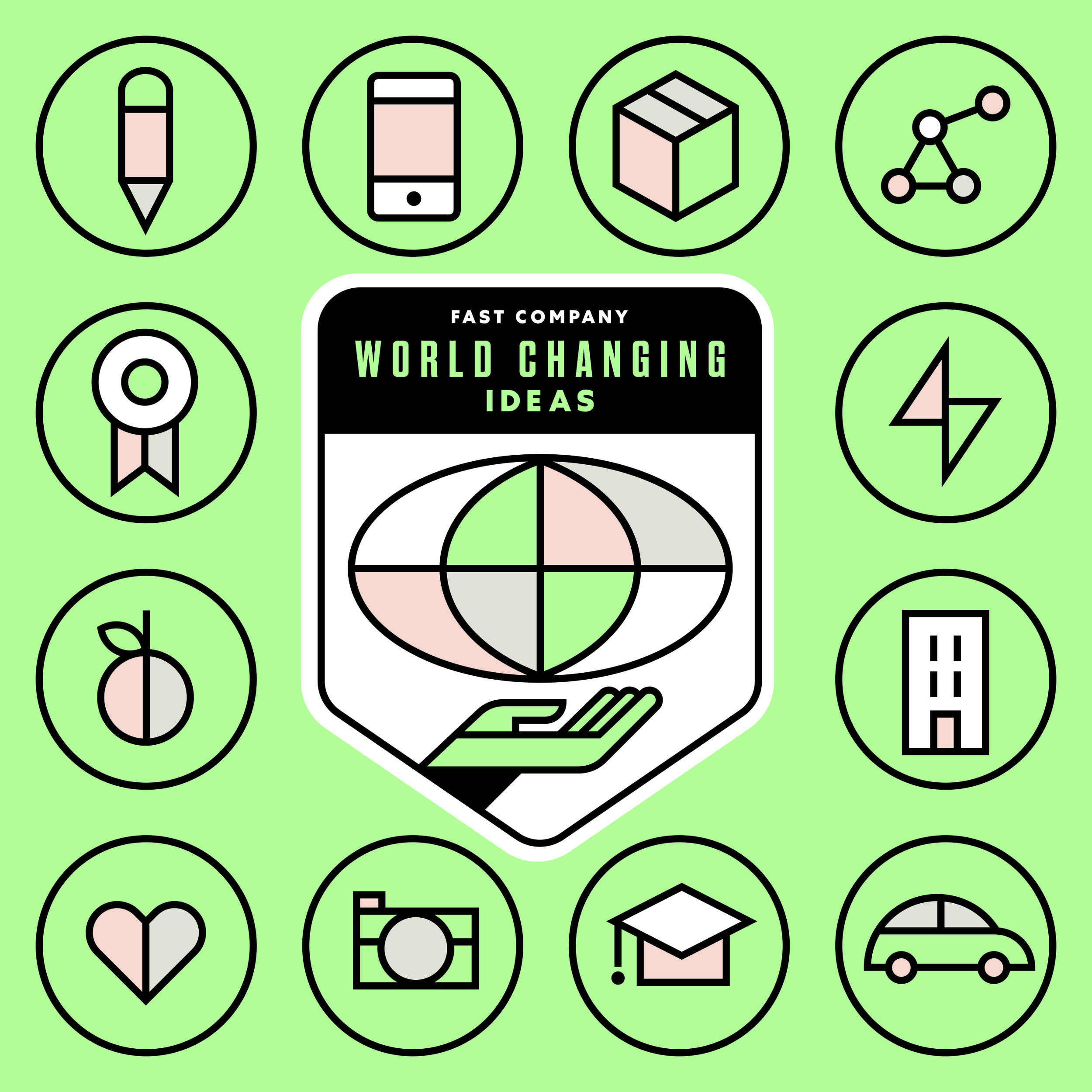
MS: One of the most important areas for Fast Company are our franchises: Innovation Festival, Fast Company Grill, Most Innovative Companies, Most Creative People, Innovation by Design and World Changing Ideas. Whew. As this area continues to boom for us, my first task was to rebrand all six of these.
Logo: Nicholas Slater; Animation: Rick Wake
My goal was to loosen up the design system, so each logo had the space for individuality. I wanted our awards to feel like unique badges, and our events to express the excitement our readers find in their work. Illustration was the best route: it would allow us to utilize hyperbole, and could also be easily animated. When sketches poured in from our various illustrators, we noticed many visual metaphors overlapped (Lightbulbs! Hands! Eyes!), so we had to decide which was appropriate.
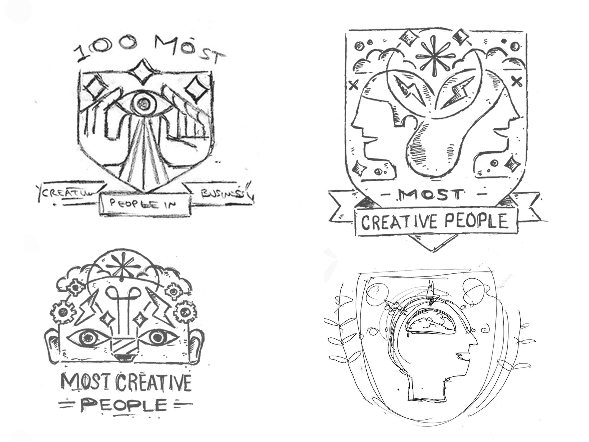
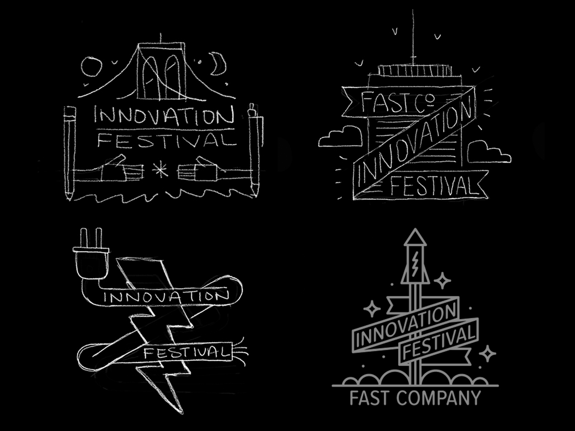
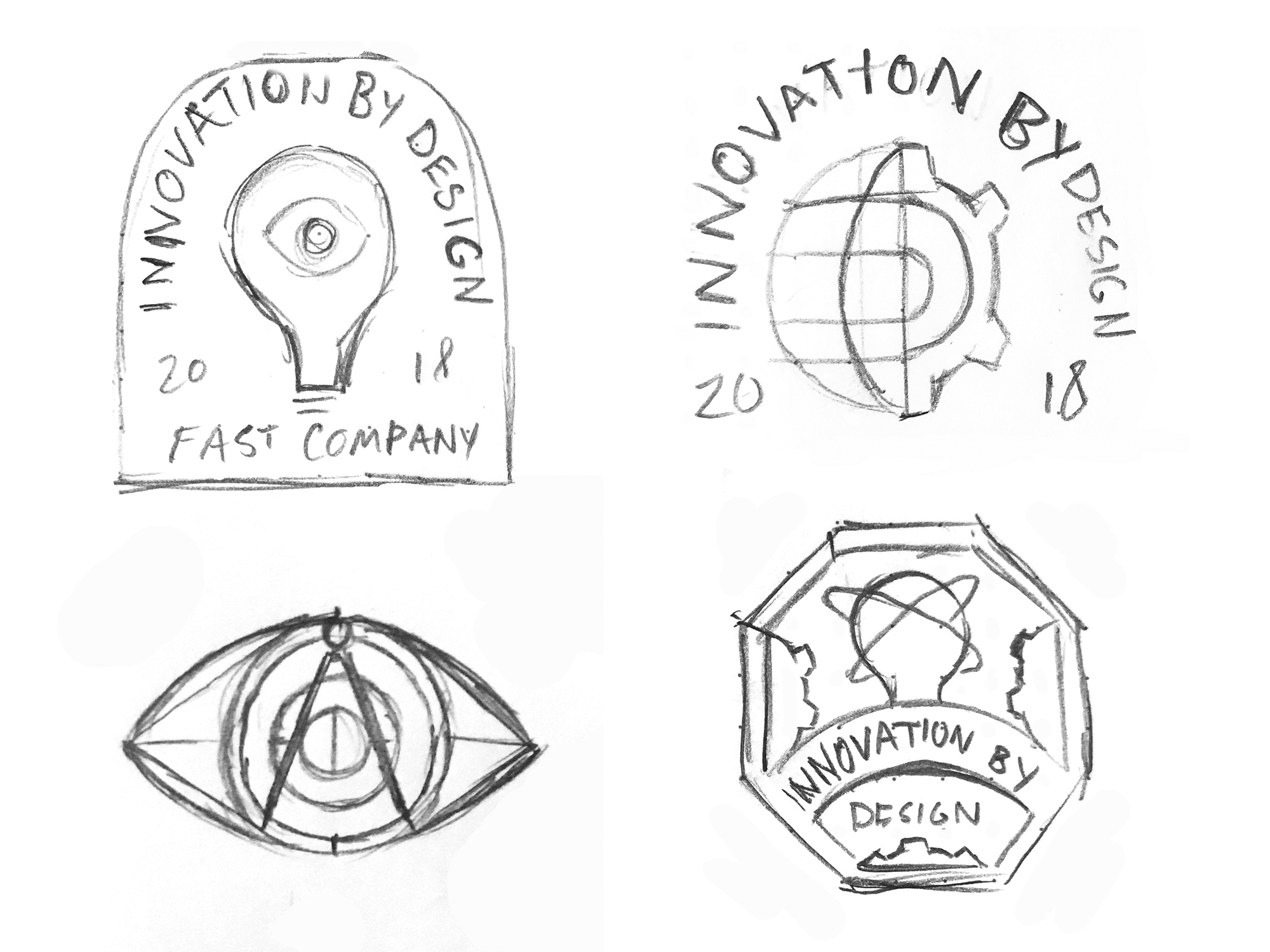
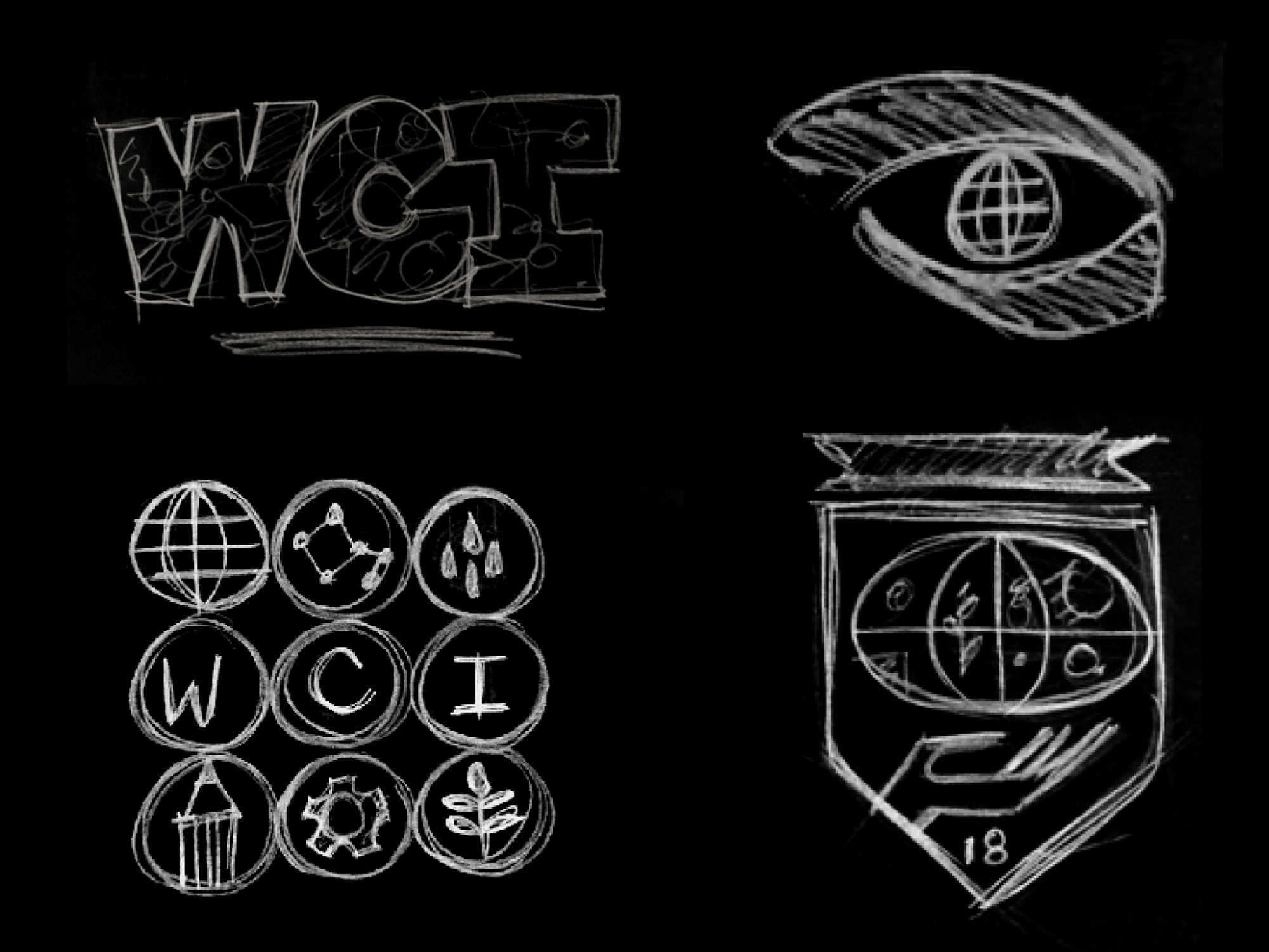
Once we decided upon the symbols, we built out a full design system for each logo. As you can see, these logos are very complex. We needed to be able to scale them down as small as 60px on mobile, and as big as a banner in Grand Central station. So, we created multiple sizes with varying levels of detail, so we were prepared for any situation. Except the one we probably forgot. Y’know, that one.
Type design: Rui Abreu
SPD: What’s new about the logo?
MS: When it comes to a logo redesign, you can either choose evolution or revolution. I began by designing the logo without any imagery– this exercise kept my focus on variety, but also allowed me to see if the type would be memorable outside of the magazine cover.
From there, I did a series of presentations to my Editor-in-Chief Stephanie Mehta, where we gradually narrowed down the pool of logos. After my initial presentation, I placed our logo contenders on a dummy cover, adding design elements each step along the way. The photography remained the same throughout the entire process, ensuring our focus remained on the logo.
Our discovery? The small A and O were undeniable parts of the Fast Company DNA.
I chose to create a fresh logo using the versatile Grifo type family. I love how it’s thin areas feel sophisticated, yet it’s serifs are daring. I set the logo in Grifito, the more condensed version, and the small cap A and O in the wider Grifo. From there, I asked for some adjustments to harken back to the old Fast Company logo, and the type designer Rui Abreu modified all of the letterforms to be more harmonious. Am I the only one getting excited here???
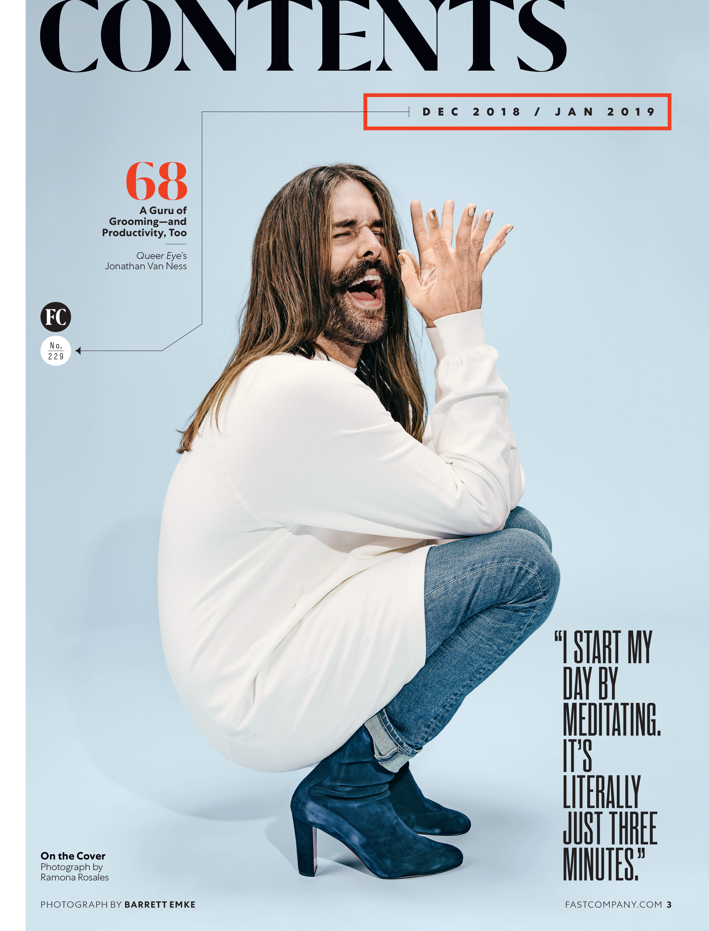
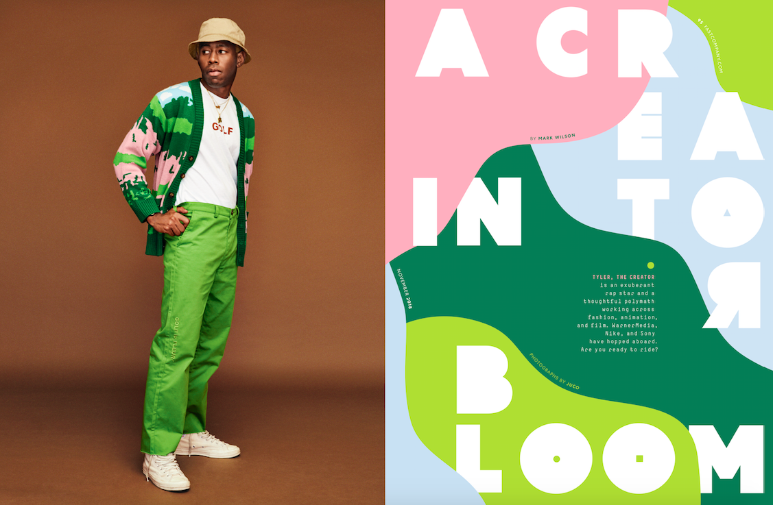
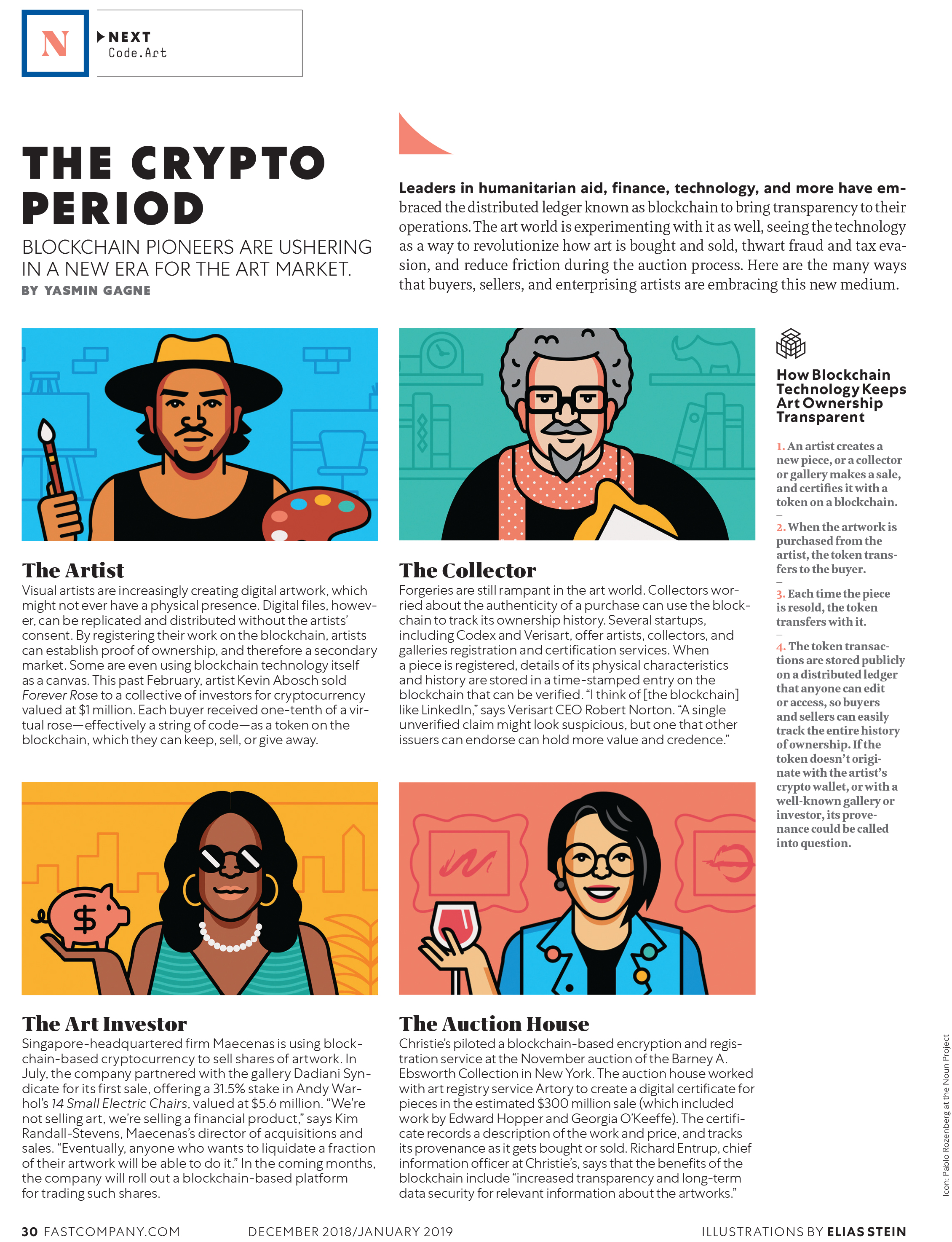
Photography: Jason Pietra, Molly Crana, Ramona Rosales, Barret Emke; Illustrations: Rami Niemi, Supertotto
SPD: How long did it take to complete your magazine redesign?
MS: The redesign was roughly a four-month process. Even before we started designing, I did my homework into Fast Company’s audience, and found where we stand in our competitive set of business publications. Three unique attributes: some of the youngest readers (a median age of 43), one of the highest household incomes ($181k), and the most even gender split (55% male / 45% female).
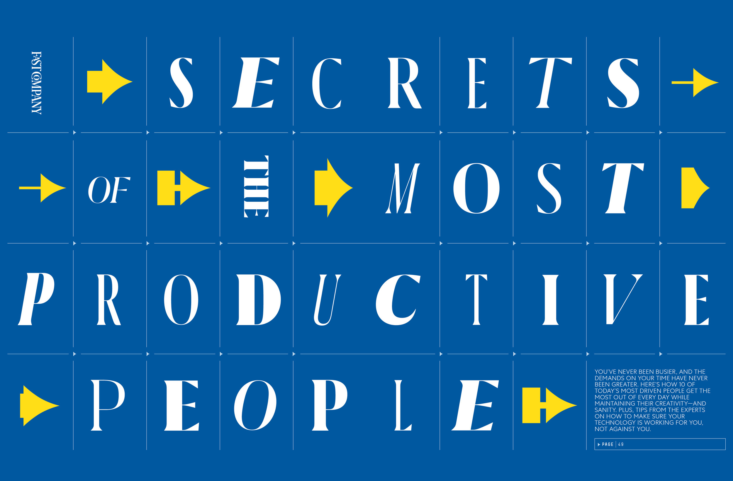
Based on that data, I redefined our design as: “sophisticated,” “playful,” and “gender-neutral.” I find the most creativity within constraints, and these adjectives informed every decision hereafter. From color choices, to photography, illustration, and even our new typefaces: Centra, Grifo, Beckett and Simple.
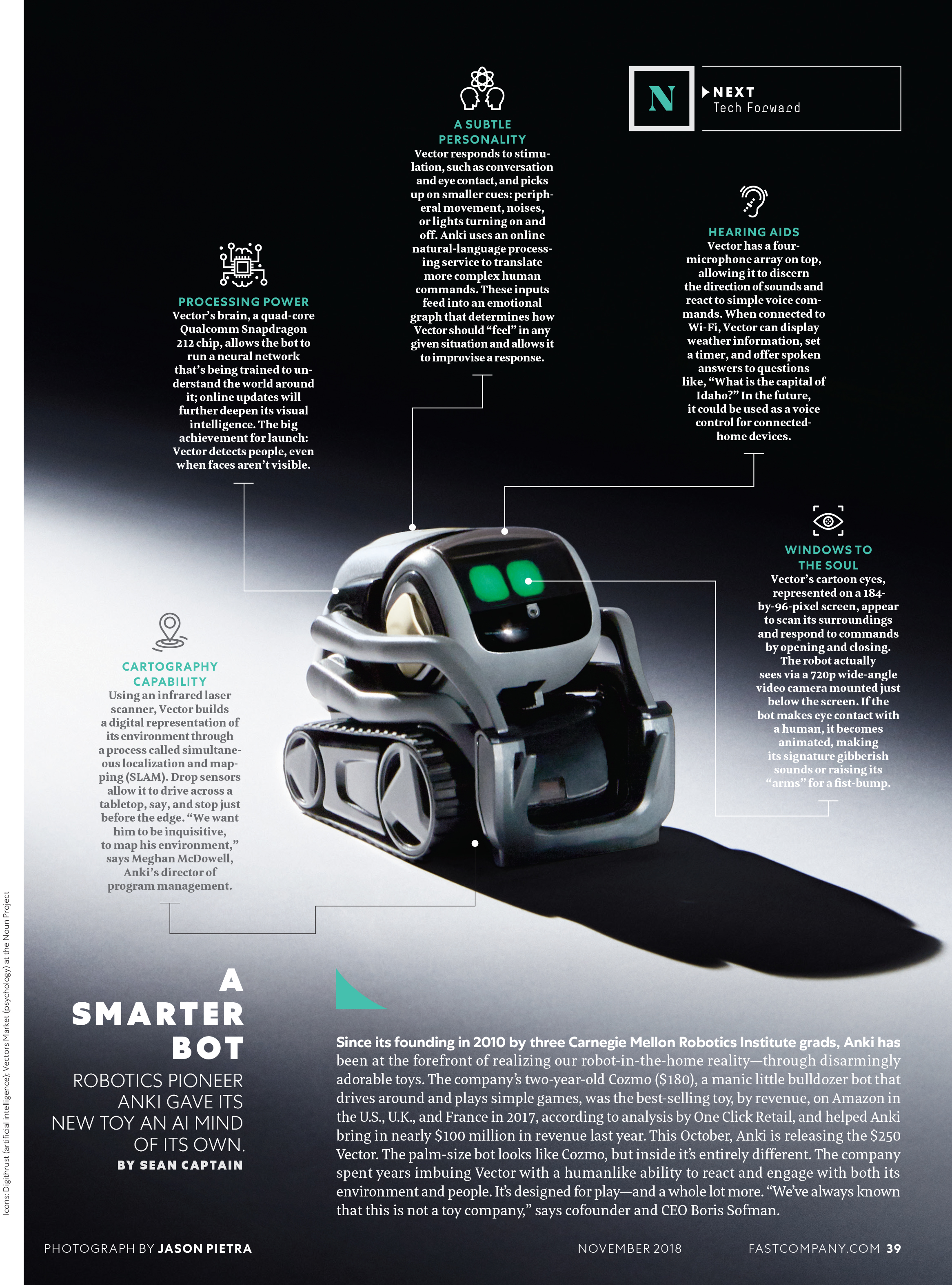
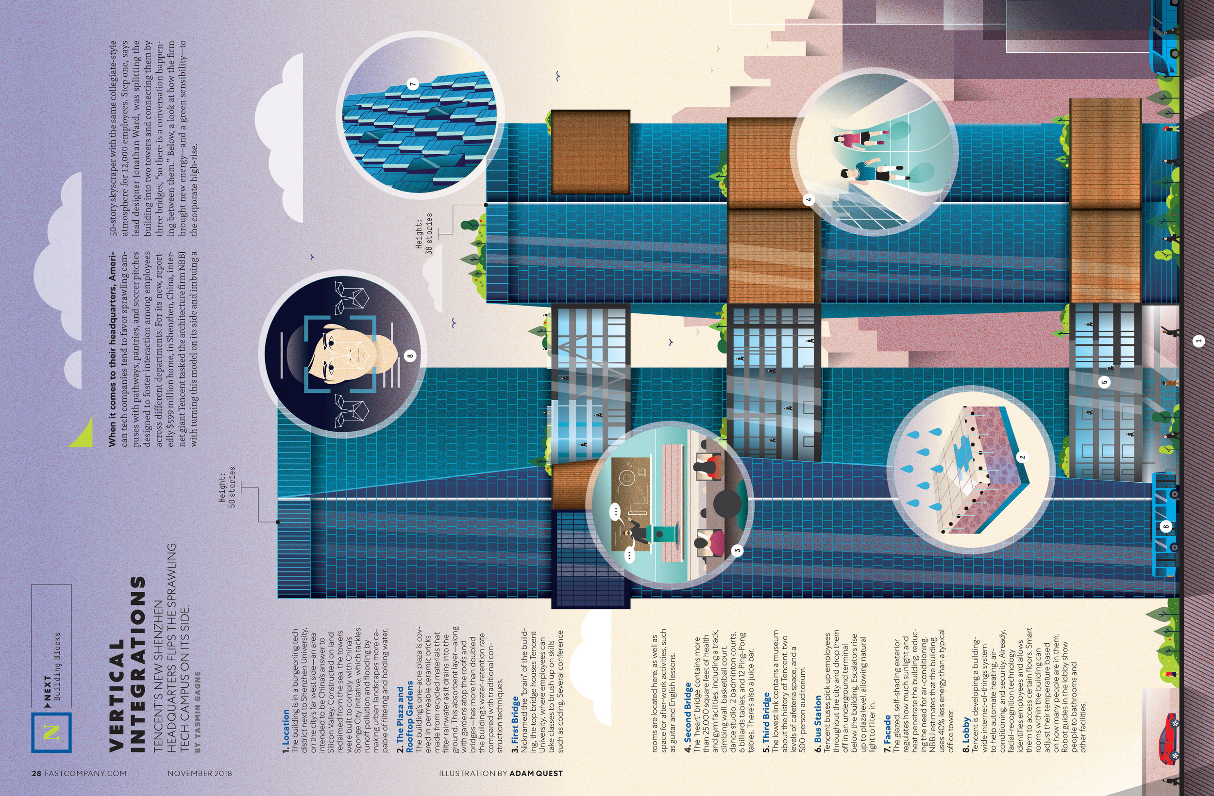
Photography: Jason Pietra; Illustrations: Elias Stein, Adam Quest
SPD: What was the process?
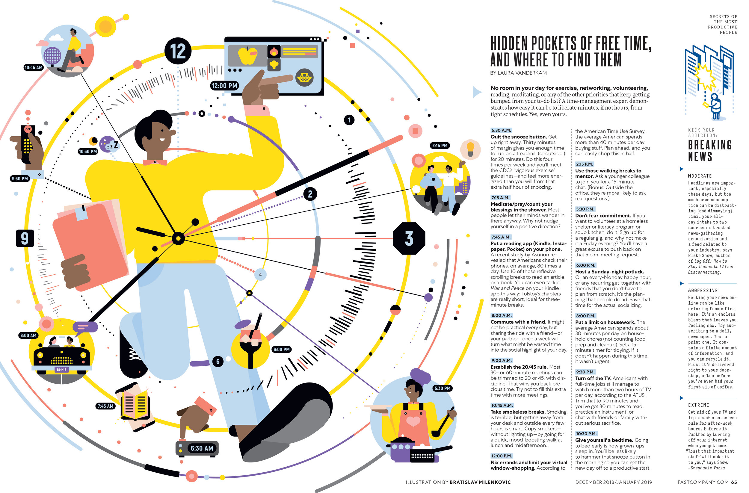
MS: Our new human-based design directive also inspired the actual experience. I wanted to entertain our magazine readers through a variety of visual presentations: the whole grab-bag of infographics, illustration, and photography.
In order to communicate this idea to my editors, I needed to prototype a full issue. I asked my talented Art Directors Alice Alves and Ted Keller to focus on kickass design, and to not fret about what made sense. This exercise toggled between right and left brain thinking, as they first found great pieces of art and then imagined editorial content around them. I presented the finished product to our editors, and they were able to make some incredibly smart content out of it.
Photography: Williams & Hirakawa, The Voorhes, Ramona Rosales
SPD: You mentioned photography. What’s different there?
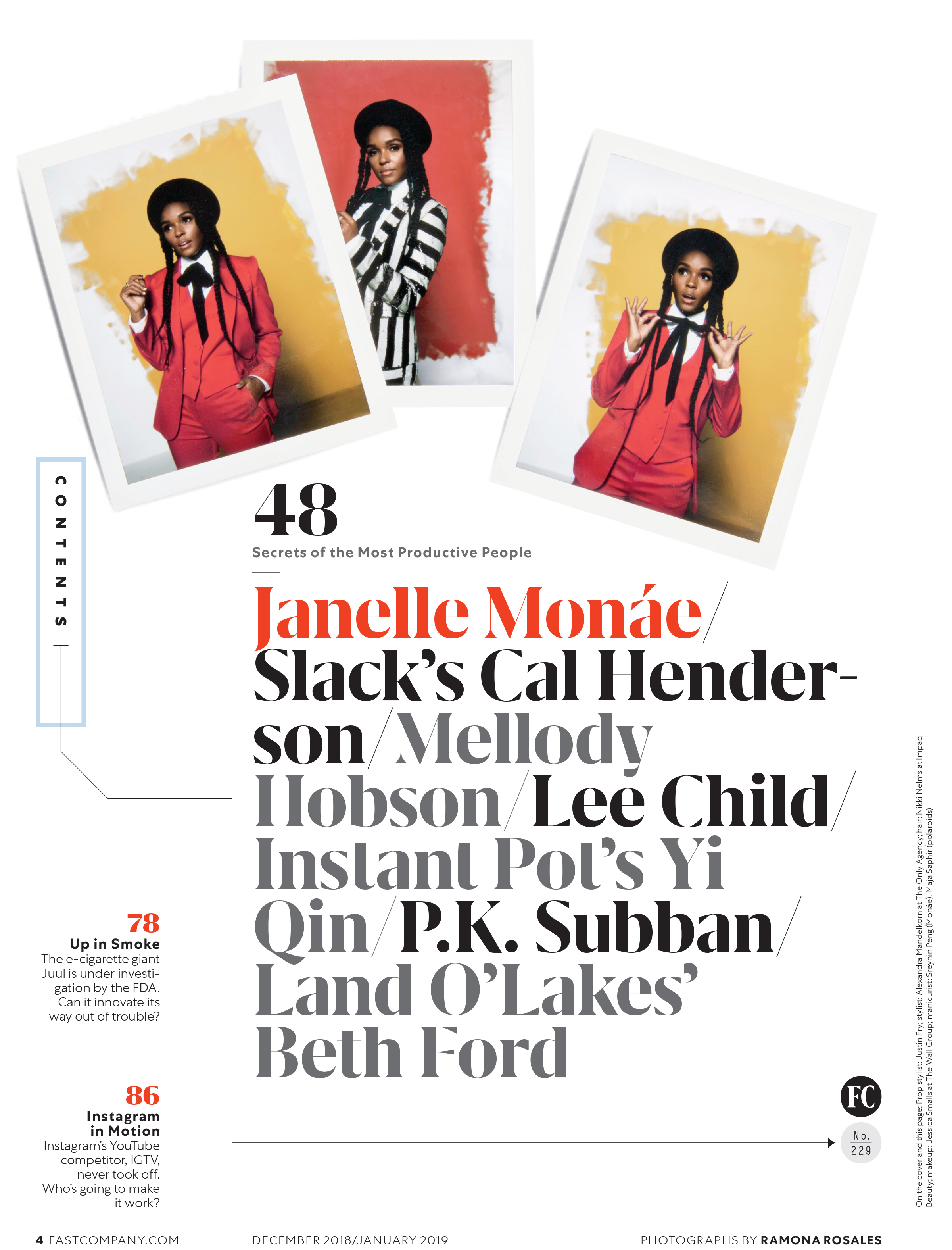
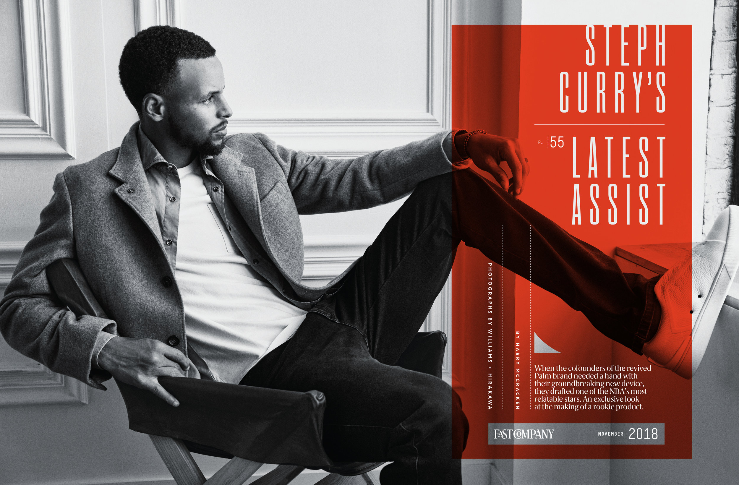
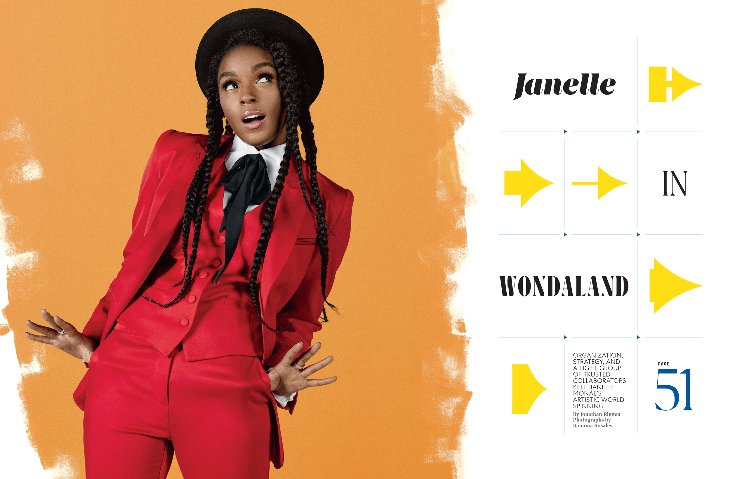
MS: You’ll see a broad mix of approaches. I want our covers to zig and zag from one issue to the next. Our most recent cover of Janelle Monáe, expertly directed by Senior Associate Photo Editor Celine Grouard, is pure pop-culture fun and a very different vibe from the Steph Curry cover. And our next cover is going to be a complete pivot from there. As our subjects are restlessly innovative, it’s important that we ourselves keep finding ways to surprise our readers.
There’s an aspirational aspect to the magazine, so I want our subjects to feel approachable. We’re shooting different moods– a lot more in black and white, as well as in environments, both in and outside of the office. And for those brainier concepts: still life photography. It’s a particular area that my new Director of Photography Jeanne Graves excels in, so I can’t wait to see what she comes up with.
SPD: What’s new online?
MS: We’ve just made the first round of changes to FastCompany.com and it’s microsites. Fonts have been updated to reflect the new visual language, our nav bar cleaned up, and colors reduced so the art sparkles. As it should, because I have a fantastic team of photo editors creating smart visuals at a breakneck pace for online: Maja Saphir, Samir Abady, Daniel Salo, and Daisy Korpics. Just check out our gift guide.
And on social, we’re all creating custom content on the nerdy stuff, like typography, that our design-driven readers love.
Illustration: Studio Muti; Animation: Rick Wake
SPD: Did you run into any challenges trying to come up with a new, cohesive visual language that worked across all the brand’s platforms?
MS: With a magazine redesign, it’s pretty easy to make a change, technically speaking. You essentially adjust the file that you send to the printer. The light switch turns back on, and the furniture has been rearranged.
There are so many pieces to this rebrand, from animations at an event, to email blasts, and even physical awards. A lot of people from different departments are involved, many non-designers, therefore communication is key to achieve a cohesive product. In other words, presentations and style guides. You need to speak design in their language– so they can understand the reason for change, and go out and sell it.

SPD: What’s your favorite part of the redesign?
MS: The spine! Its design is a nod to an earlier decade of Fast Company, and also features my favorite part of magazine-making: the easter egg. It’s a super skinny crop of an image from the issue—one of the many ways my new Associate Art Director Chelsea Schiff finds to innovate upon the magazine. I just wish we could offer a prize for the first to guess the crop.
SPD: How has your past redesign experience helped you?
MS: Popular Science taught me to have a child-like imagination when developing visual ideas, and to not be afraid to break format. Men’s Health taught me that you don’t need much time to make big design decisions– we were only given 2 weeks to execute that redesign. And in between those, I redesigned SternBusiness magazine for NYU, which taught me how to speak design to those outside of our magazine world.

Back row: Alice Alves, Mike Schnaidt, Daniel Salo (printed out on 11”x17"), Samir Abady, Jeanne Graves
Front row: Daisy Korpics, Celine Grouard, Maja Saphir, Chelsea Schiff
Photograph: Jay Woodruff