Howler's Redesign with Metaleap Creative
/
Illustrations by ilovedust and Sewer City
Earlier this year, Metaleap Creative was tasked with redesigning Howler, a quarterly magazine about soccer. Since then, they have wrapped Issue 15 and took the time to chat with us about their work with the magazine. Read on to hear from Metaleap Creative’s José Reyes, Principal/Creative Director and Eric Capossela, Associate Creative Director.
SPD: At Metaleap Creative, you work on other publications and branding projects, how have those experiences helped you as you approached the redesign?
José Reyes: I think that it’s oftentimes surprising for designers—and even clients—to hear that we live in these two very different categories. We just finished up a massive packaging project for a beauty and bath client, and as disparate as bath balms are to magazines, there is a lot that binds them together. Chief among them: systems that hold up across the brand. In the case of all of those previous experiences, they have helped us in terms of trusting our process. What’s worked and what hasn’t, and what we want to say that we haven’t said before. But, those experiences also gave us the confidence to tackle such a massive job like Howler in such a short amount of time, knowing that we could deliver the type of work that both we and our client would be proud to share. More importantly however, is a belief that we have to approach all of our projects with the goal of solving the strategic propositions that are unique to our clients. Those take time to figure out, but if we don’t lead with that, we’re just designing for ourselves.
Relatively uncommon these days, we’re using a 5th color on the first two 16-page signatures in each issue. Seen here is only a decent RGB approximation of 805, so be sure to purchase your very own print copy at howlermagazine.com or at your local Barnes & Noble Bookseller.

Illustrations by bohuy kim
SPD: What was it like crafting a redesign that had to meet certain needs of the client? Were there any specifics they asked for before you started on this project?
José: The first thing we had to do was to understand what kind of soccer Howler wanted to cover. Our editor insisted that in order to differentiate the magazine from others, being a passionate soccer fan would never be enough. Howler’s writers would need a totally different take on the game. A global point of view. They’d have to be asking bigger questions like, “what does soccer mean to this community that I’m covering and how does that effect the world around me?”

Illustrations by Frode Skaren and Dan Disorbo
As designers, we had to understand soccer from this vantage point in order for us to make sure we were telling the right story visually. We had to abandon clichés like, “the beautiful game” and embrace the bizarre world of soccer that hardly gets covered or discussed. Stories like this one about the Zapatista National Liberation Army who use soccer as one of their tools to battle the marginalization of Mexico’s indigenous people, while requiring their combatants to wear masks to “…show themselves to the world, and take off their ski masks to hide from the enemy.” This is soccer that is embroiled in politics and protest. This is the game of soccer that Howler wants to cover.
Of course, this means that the storytelling devices we might employ need to be much more interesting and unique but embedded with greater empathy so as not to let the truth of the story or subject be mired in our own design aspirations. As you can imagine, this is no small task!

Illustrations by Daniel Fishel; Photography by Ryan Hayslip
SPD: What were the major changes?
Eric Capossela: As José touched on, a Howler story is often bizarre, but also rich and compelling. And the magazine as a whole is quite eclectic (within the soccer sandbox, of course). So we set out to complement this storytelling with a lot more depth and richness through the layering of design elements, a playful and challenging color palette, and a few new typefaces for added personality. When flipping through, it could come across as maximalist and relatively chaotic, but there’s a consistent foundation throughout. This structure anchors each page and it’s what allows us to create moments that feel both messy and refined at the same time.

Illustrations by Gabriel Corbera; Photography by Ryu Voelkel and Perry McIntyre
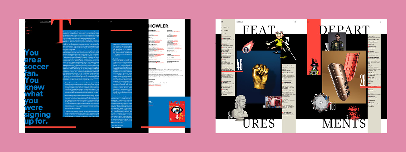
The architecture actually hasn’t changed a lot. We still begin with “Opening Shot” which is 3 spreads of beautiful photography (It’s the calm before the storm!). Pre-redesign, there was a splash spread dividing far-front-of-book and the main FOB section. We liked what that did for pacing, so we added another one between FOB and the feature well. They’re type experiments called “Open Play” and “Home & Away,” respectively. That’s followed by a robust feature well and the same back-of-book pages (“Cutups” by Noah MacMillan, the “Golazo!” goal diagram done in-house, and a historical moment called “Field Study”), plus a new spread of book reviews.

Illustrations by Renaud Vigourt and Jack Hughes; Photography by Joseph Fox and Orlando Gili
SPD: What was the process of developing a "cohesive visual language" for the magazine? What did you come up with?
José: [laughing] I have a tendency to stitch together some fairly idiosyncratic word pictures when we sit around and concept— the weirder the better. It makes a lot of sense in my mind’s eye and gives me permission to let my brain go to work without restraint. Howler was no different. In fact, having an editor who could sit in that space with me and ‘get’ the vibe I was thinking about was really exciting.
I began by describing a general mood which would be less expected for a sports magazine. More hand-drawn. More real. More relaxed…then, it all went gonzo:
When I think about other soccer titles, I hear a sea of vuvuzelas blaring with spittle flying in my face. Cups of beer flying, fists on faces, cameras clicking and flashes flashing, the roar of Lamborghinis in the parking lot with players emerging wearing fur coats, holding tiger cubs, wearing diamond necklaces. Basically, total pandemonium.
Now, imagine Howler being this underground organization whose devotees are unwavering in their commitment to what at first is a nameless desire. A desire that propels and inspires. There’s humming down there, with old-school tech just because… cables are being sent, typewriters are clicking and clacking, adrenaline is in the air, there’s PLOTTING! The leaders are moving Subbuteo pieces around on a giant map that looks a lot like a pitch, plans are being hatched…it’s that scene in “The Terminator” where the resistance is hiding from the Terminators before they break into their hideout! This nameless desire is called reverence, and it fuels joy, hope, misery and heartbreak in a game the world over.
It was from this collision of ideas that we began to form the design ethos of the magazine. We would be unafraid of being messy. Serious when portraying ideas of import. Humorous when discussing the asinine and playful because, well, it’s a game played professionally by adults. We would take risks knowing that our audience is made up of natural born revelers in mayhem, and they would reward us for it—even if we missed the mark. Not unlike one of their heroes who scored a goal with his fist during the World Cup— and got away with it!

Illustrations by Rami Niemi
SPD: What's your favorite part of the redesign?
Eric: First and foremost, I love what I do because I love working with talented artists. And I’ve never had as much fun doing so as I have with Howler. I think there’s inherent joy and escapism to be found in these stories. Combine that joy with the freedom we’ve been granted by our wonderful editor and publisher and you have a recipe for happy art directors, illustrators and photographers.
And I’m proud of the fact that we committed to a spirit of abandon. There’s still a level of refinement of course (we can’t give it up completely), but we’ve done away with a few time-honored “rules” and it’s been a revelatory experience. From the cover to “Back Line,” there’s a controlled chaos that can be daunting but is also extremely satisfying in the end. We wanted to create something that has “replay value” and with so much to look at, I feel we’ve achieved that. With titles like Howler evolving into something more closely resembling coffee-table books, we want you to keep it around a while and hopefully find something new each time you pick it up.

Illustrations by Muti, Julia Laskowski, Alexander Wells, and Aiste Stancikaite

Illustrations by Noah MacMillan and MLC