Anais Maroon, Photo Director at The Future of Everything
/
SPD: What year?
Anais Maroon: As long as I can remember. But maybe around 1988 I started becoming aware and absorbing it, all through the time I left home.
SPD: What were you up to?
AM: Being a little girl, fascinated by all my mother's things, turning into a precocious teen.
SPD: What magazine?
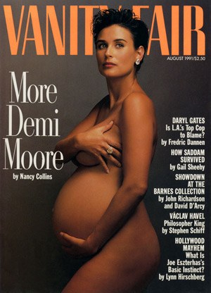
AM: Vanity Fair


SPD: What was it that so enthralled you?
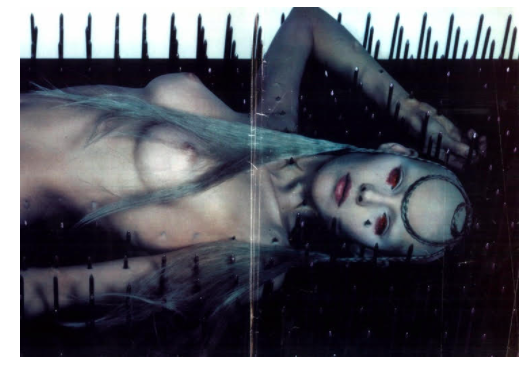
AM: My mom had a subscription to Vanity Fair from before I can remember. Issues were a staple in the house. One or more was always either next to her bed, in the living room, or out on the deck. I was fascinated by the beautiful people, the glamour, the shocking pictures, and I was also introduced to timeless photography like Herb Ritts, Helmut Newton & Annie Leibovitz. I think I learned what being controversial meant from Vanity Fair. The exposure opened the door to an obsessive interest in wild, humorous, unrestrained beauty within all sorts of magazines. I pasted a rotating assortment of tear sheets all over my bedroom walls and discovered photography as an amazing and delicious way to push conversations and boundaries forward. I graduated to other magazines by high school, but the Vanity Fair's were always in the house, always on my mother's lap, always making an impact on my young, formidable, creative brain.

SPD: Do you know now who the creatives were?
AM: I do now from investigating later in life: Ruth Ansel, David Friend, Charles Churchward.


SPD: How does that inform your creative now?
AM: Vanity Fair tried to push the boundaries, while combining timeless beauty and humor. This was something I was exposed to through so much of my young life, which occupies such a sentimental place in my memories. I'm always striving to create work that is beautiful, dynamic, thoughtful and timeless *which is the extremely difficult trick*.