Kristina DiMatteo, Design Director, Brand and Marketing at New York Media
/
SPD: What year?
Kristina DiMatteo: 1994-1996
SPD: What were you up to?
KD: I was commuting to school in Manhattan studying design. My schedule was broken up awkwardly so I often had windows of downtime where I would walk around the city getting inspired, or go to magazine shops to soak up the latest issues of my favorite magazines (Rolling Stone, Ray Gun, Flaunt, Colors and Interview).
SPD: What magazine?
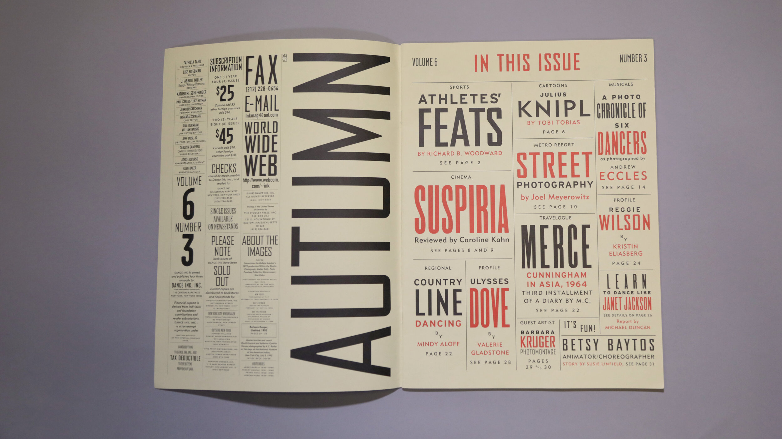
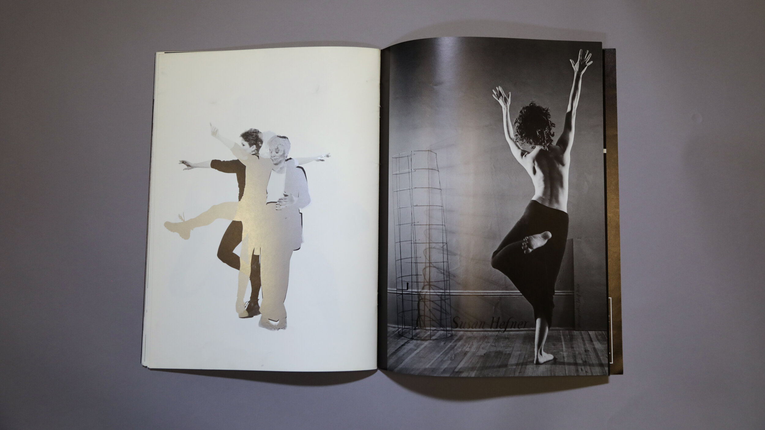
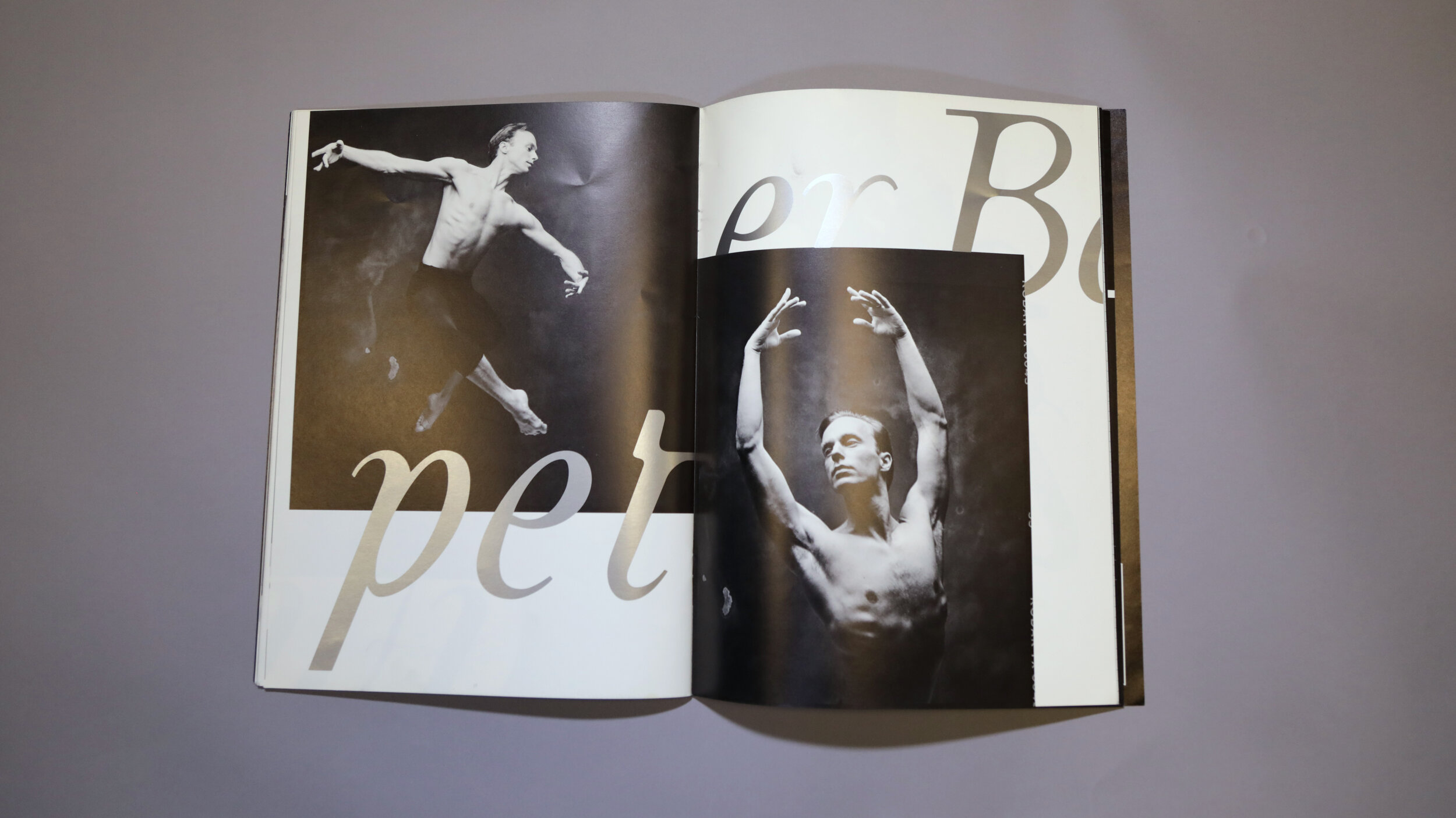
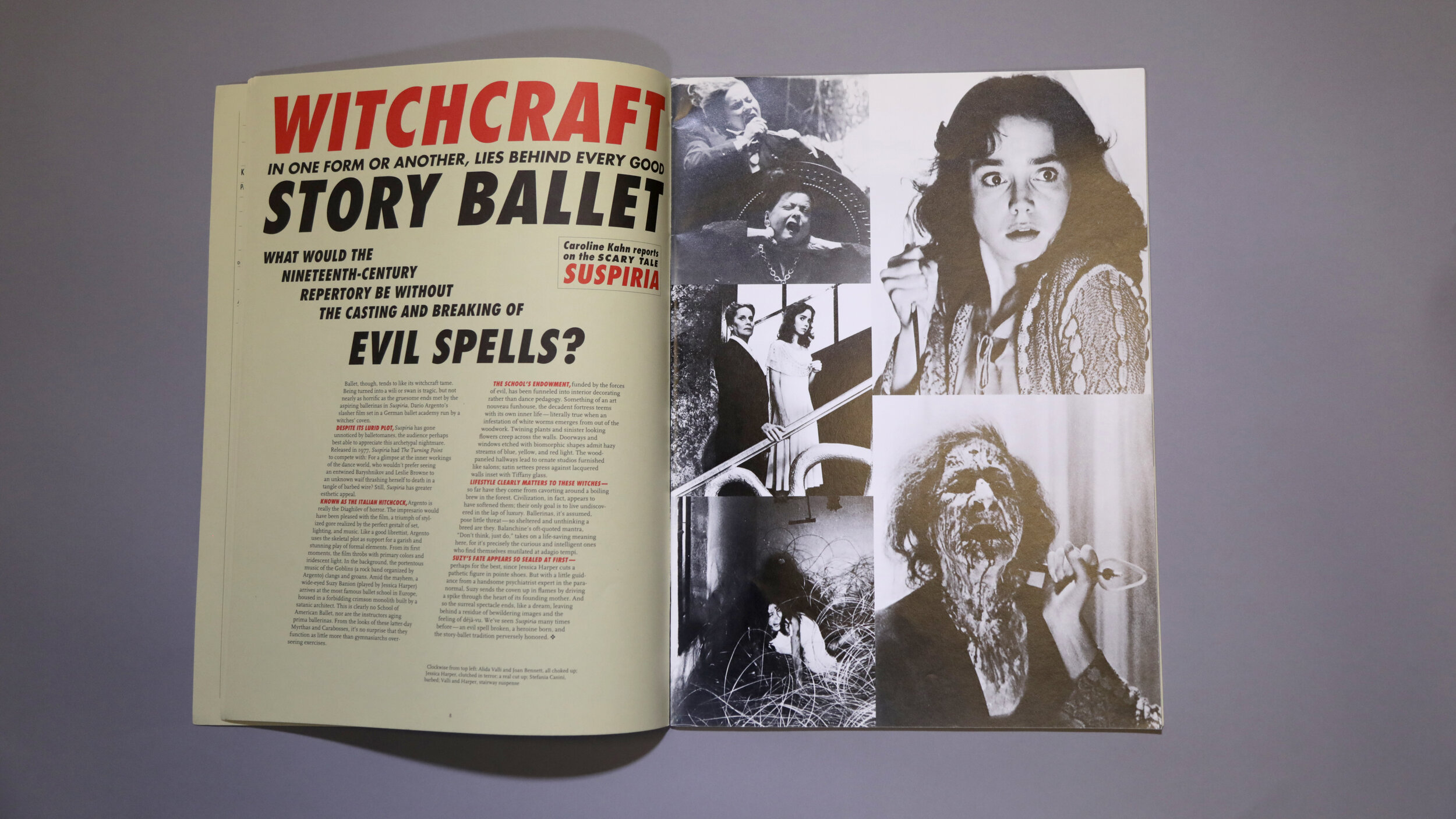
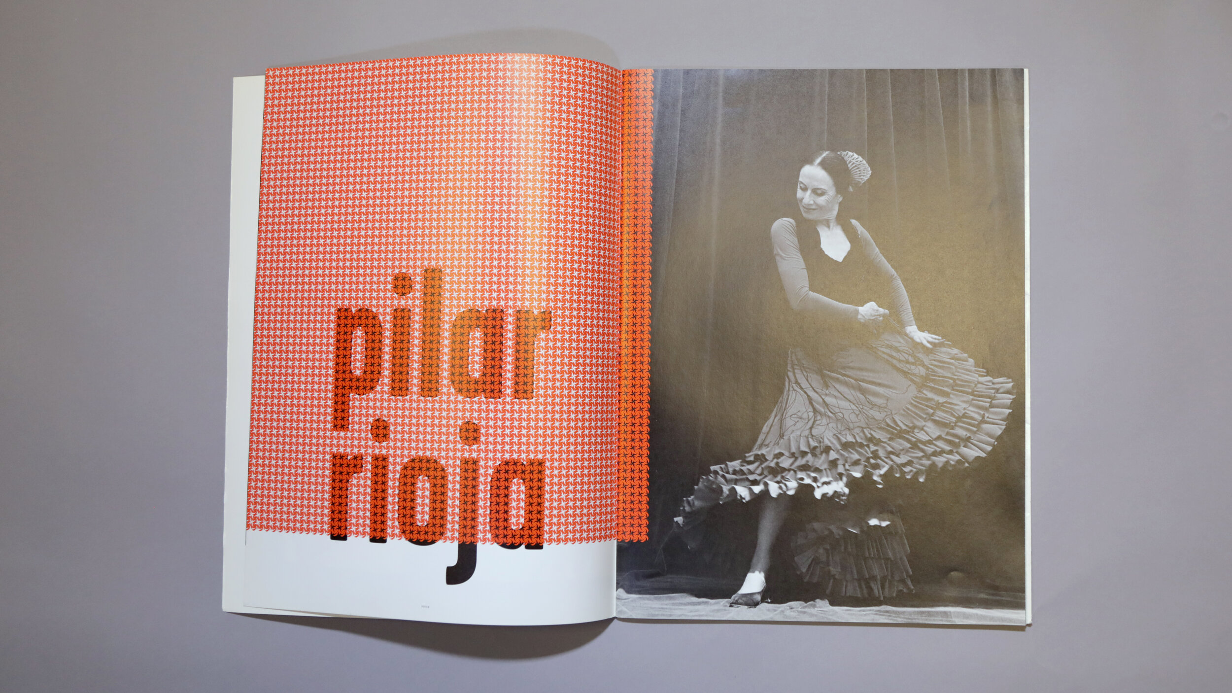
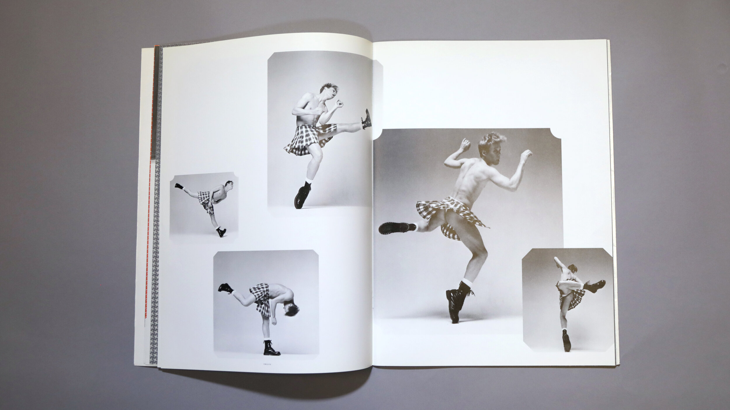
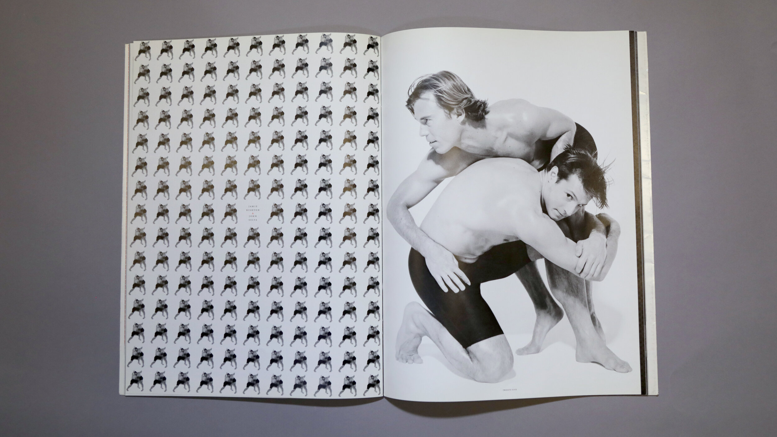
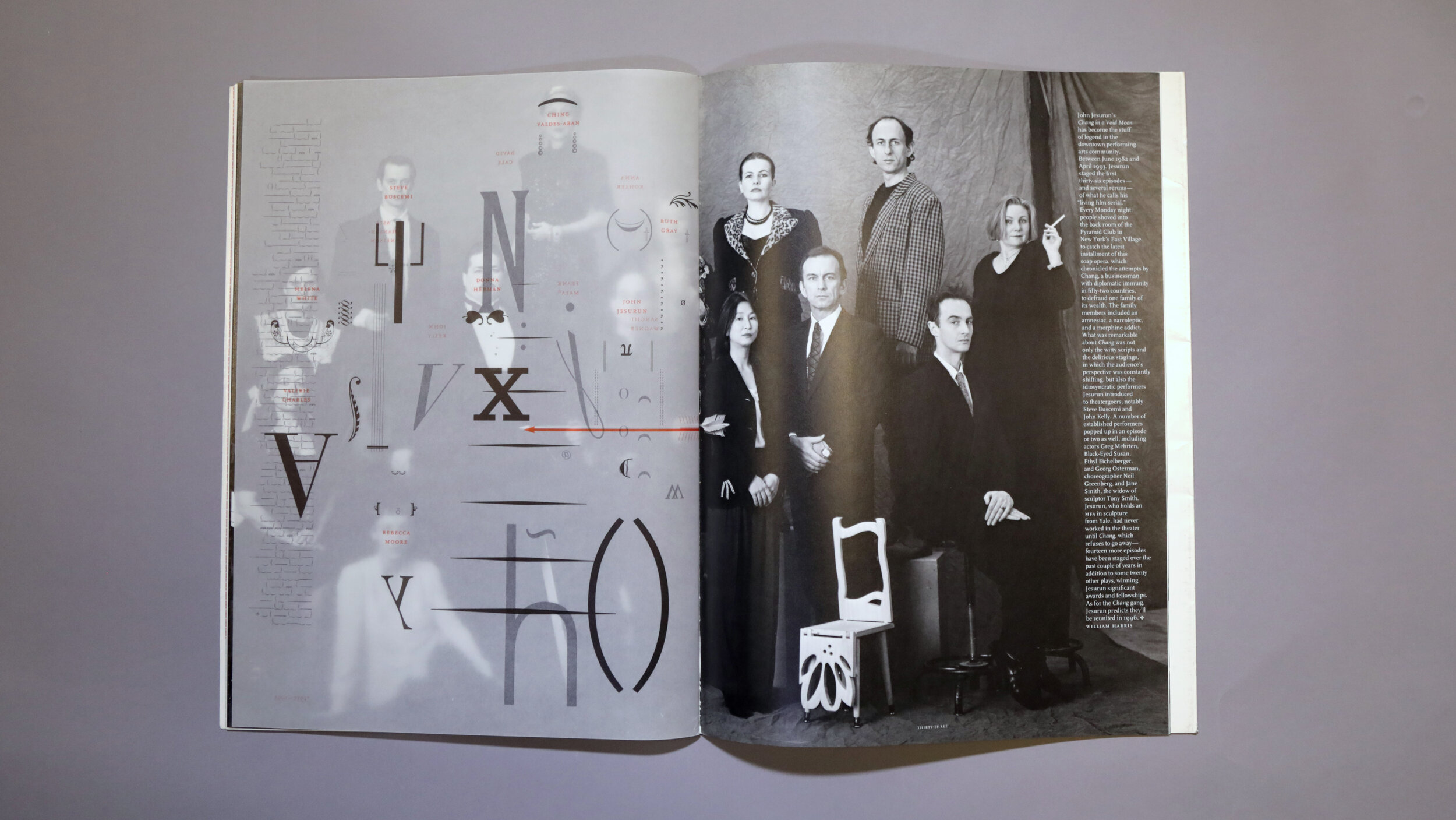
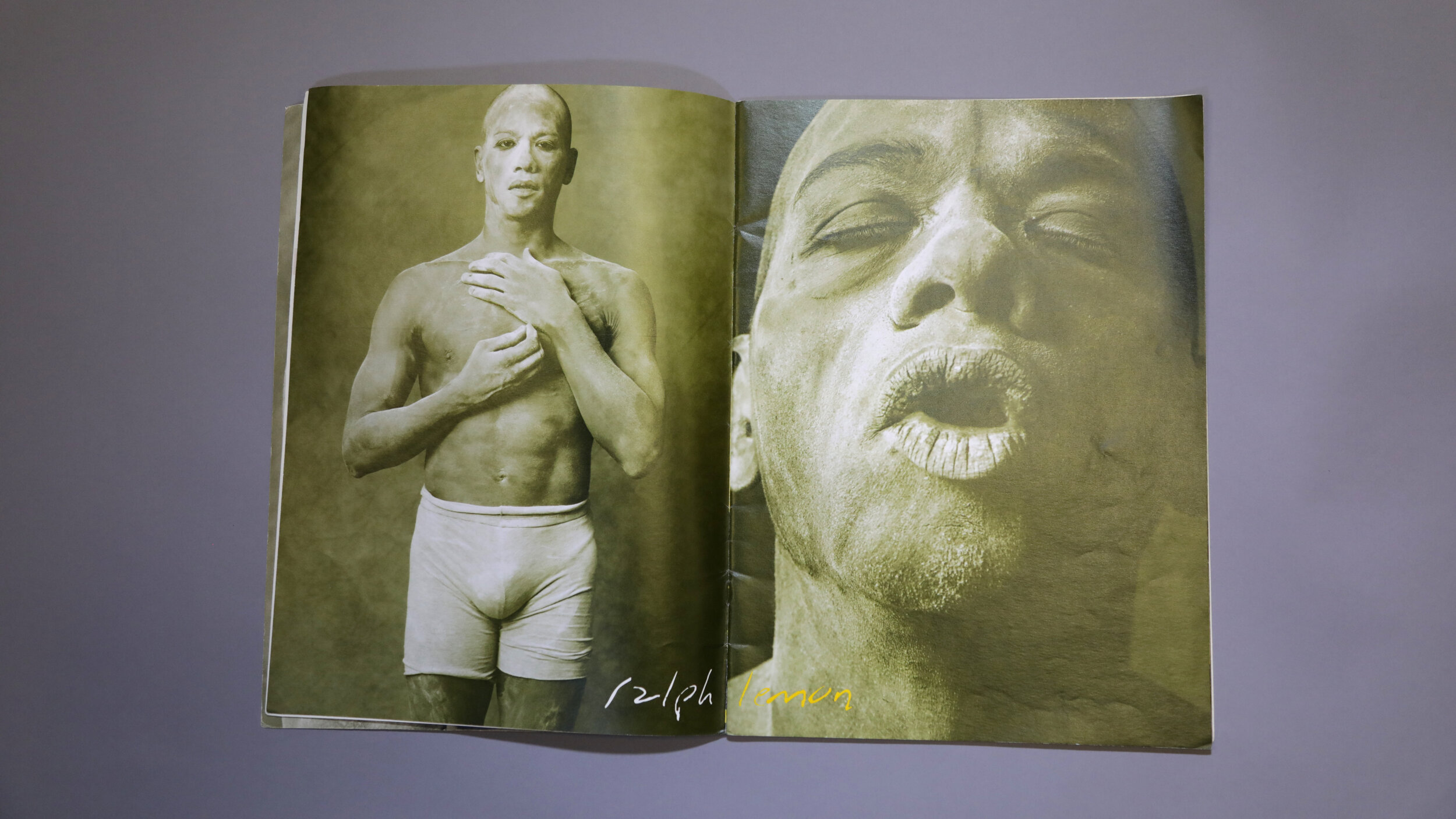
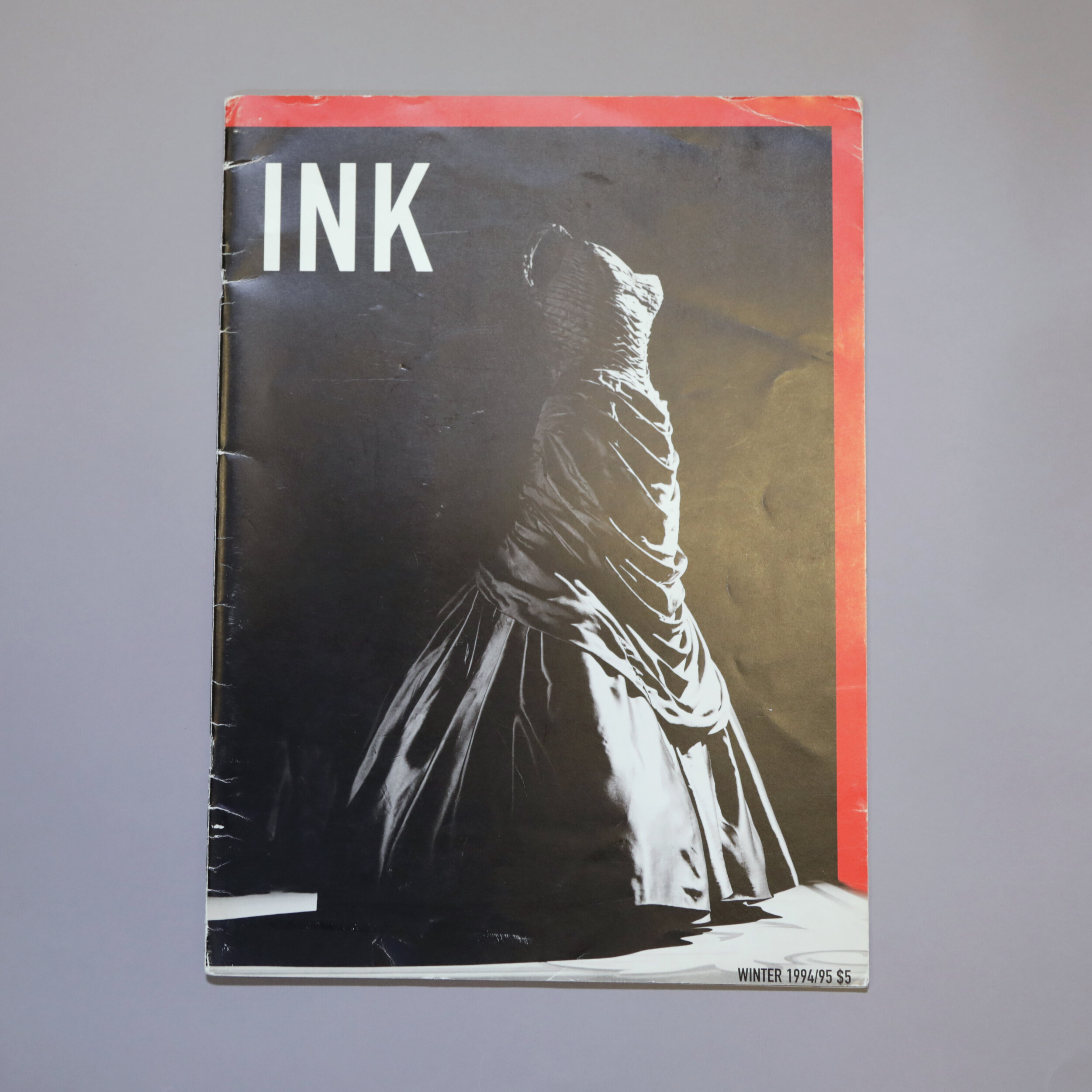
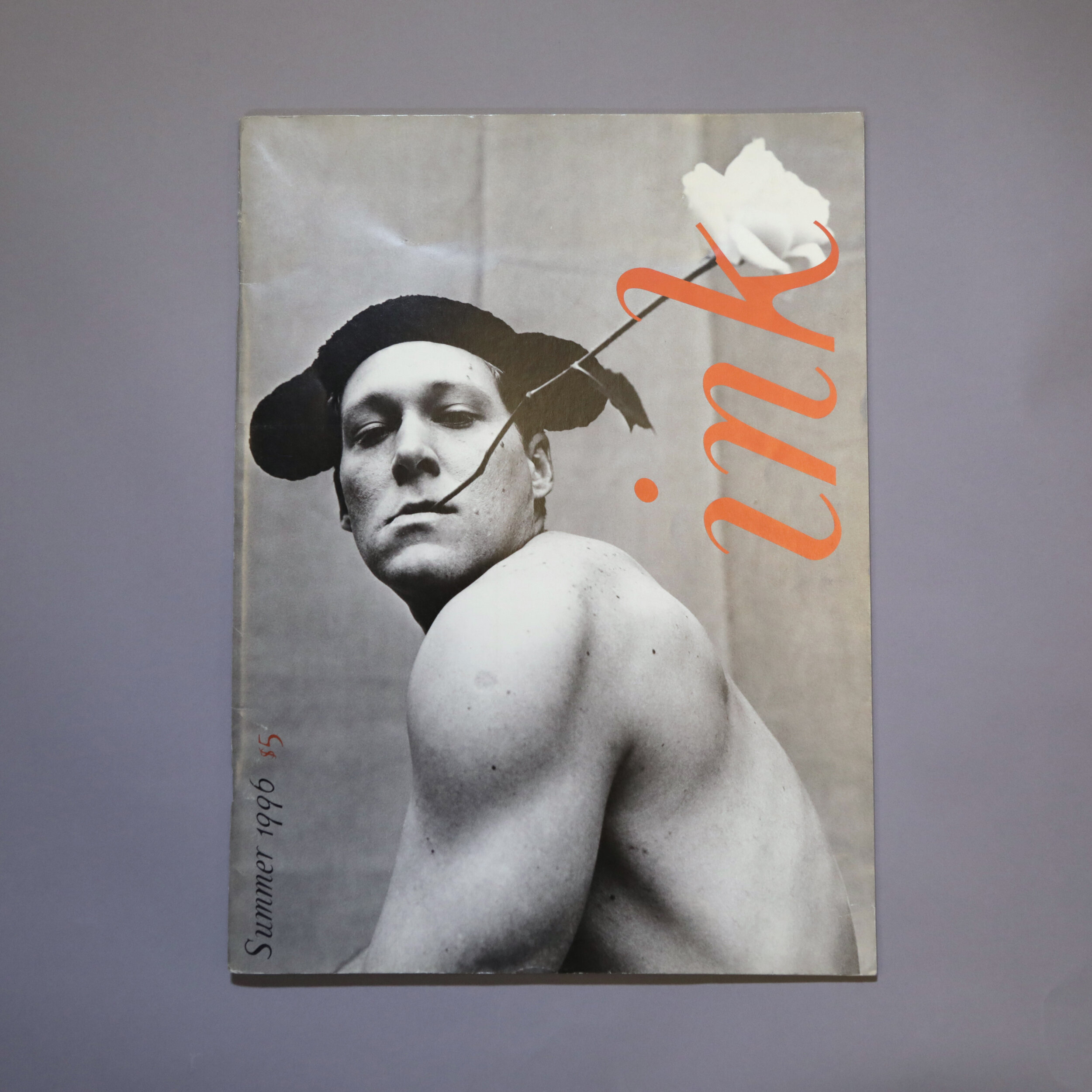
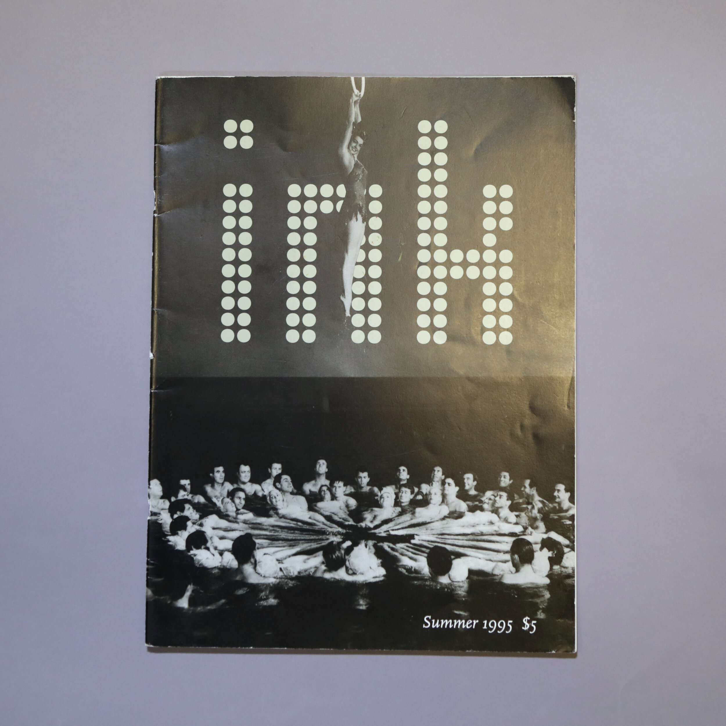
KD: Dance Ink

SPD: What was it that so enthralled you?
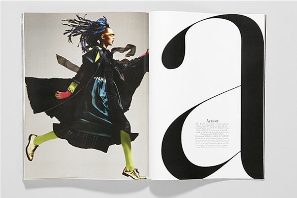
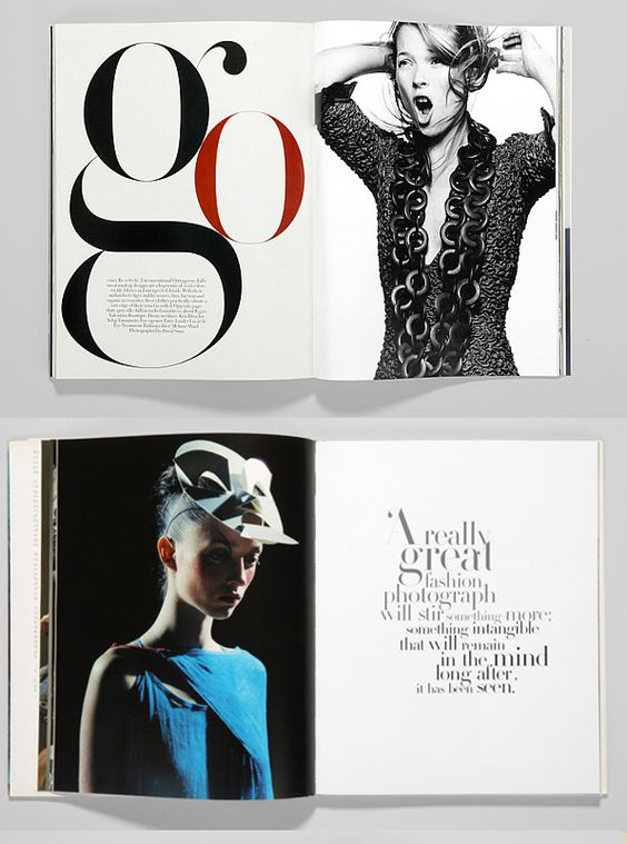
KD: One day I stumbled upon this oversized uniquely printed quarterly about Dance. It was an experience different from what I was used to seeing, not quite indy grit not quite glossy.
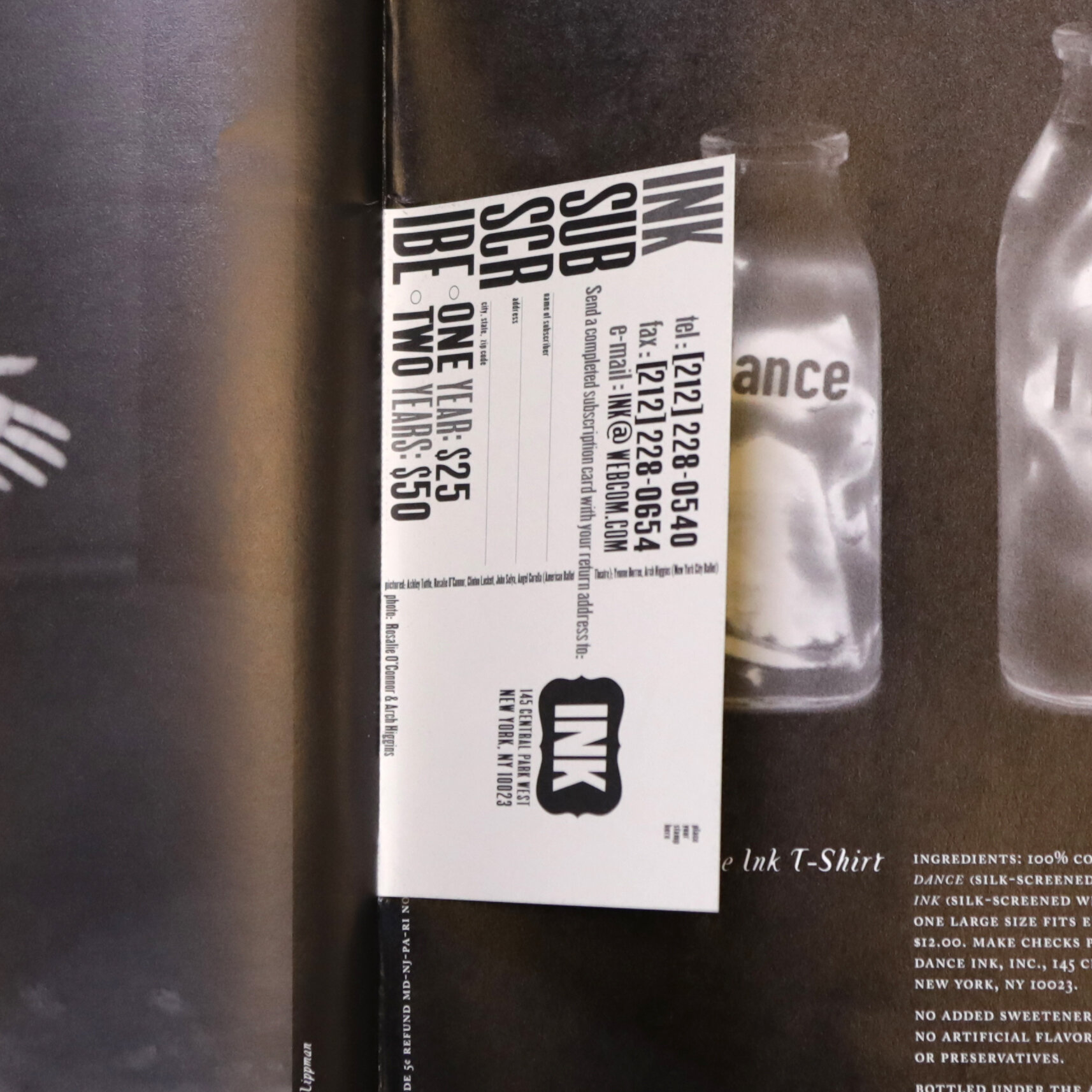
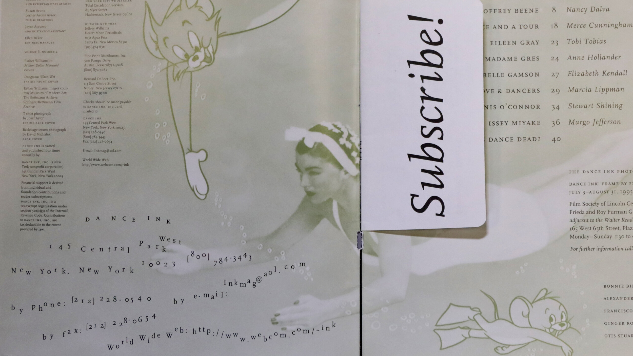
Because of its independent nature and art form it covered, they were able to walk a different line. Every aspect held my interest, from the content to the artful photography, the powerful design to the experimental typography, even the blow-in card was worthwhile.
The level of detail was equally as memorable. In one story that nodded to water/bubbles they turned every letter ‘o’ white while the rest of the text remained black. Patterns (either graphic or created by using repetitive photography) became a running thread through some issues and typography was printed on velum to mimic the content in the photograph it was sitting upon.
I particularly loved how every issue had its own personality yet still felt part of a whole. They felt like an equal combination of being delicate, strong, playful and smart.
Dance Ink was geared towards a particular audience so simply knowing about it felt like you were in on a special secret.
SPD: Do you know now who the creatives were?
KD: The art director was Abbott Miller, then of the multidisciplinary studio Design/Writing/Research.
SPD: How does that inform your creative now?
KD: That no matter what type of project or its scale, big impact can happen. Try to create some surprises and find moments that make you feel happy.