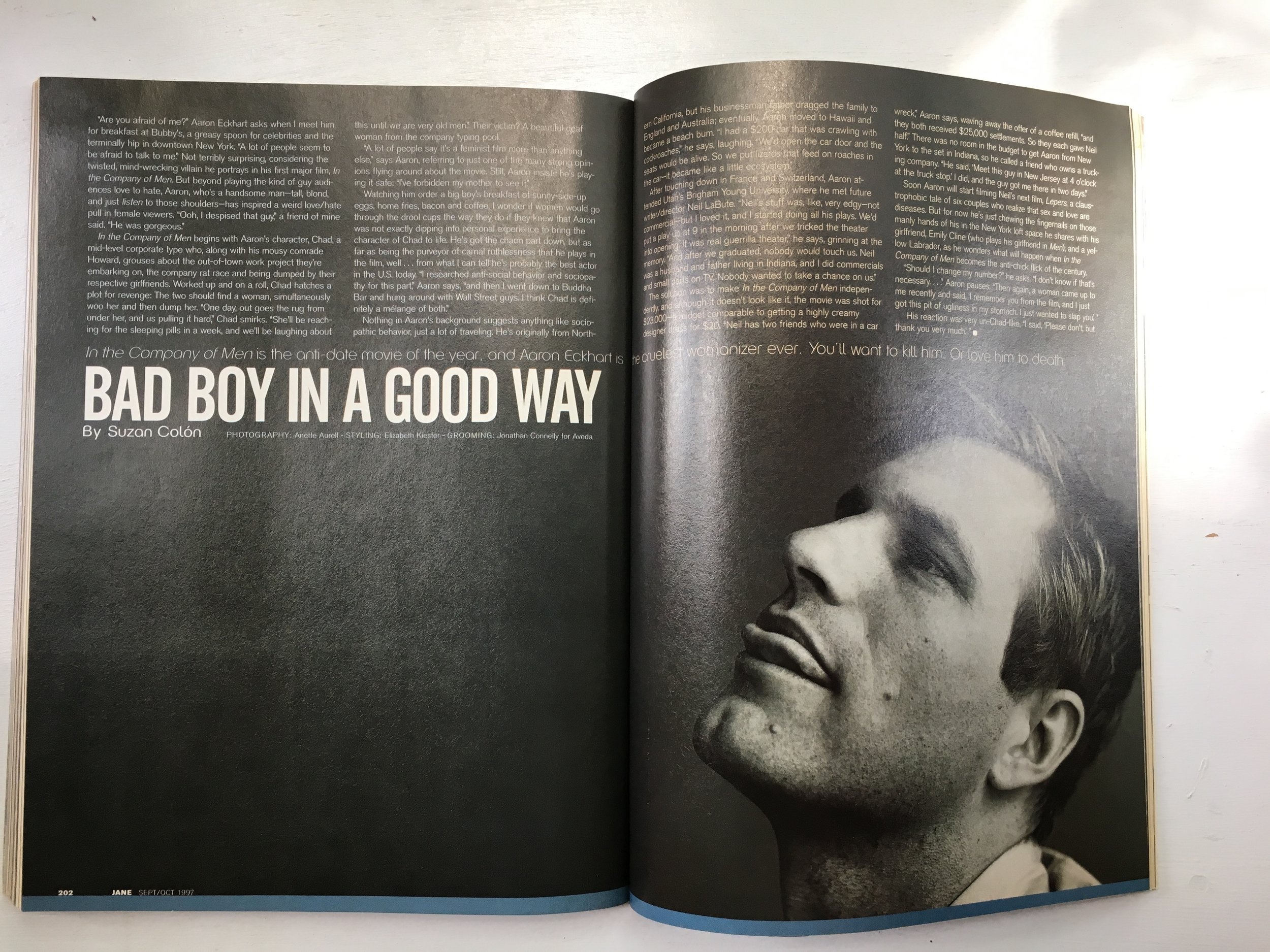
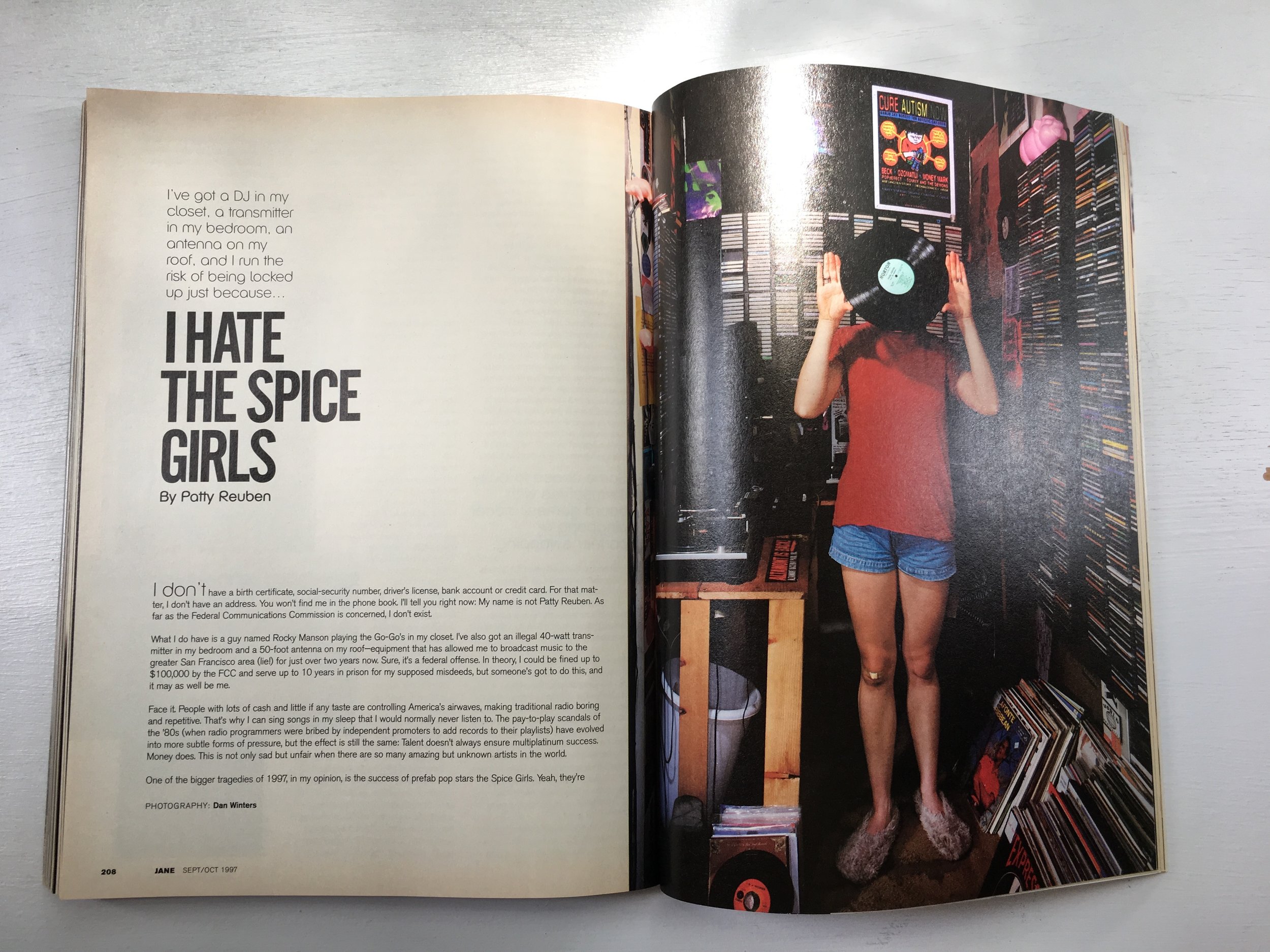
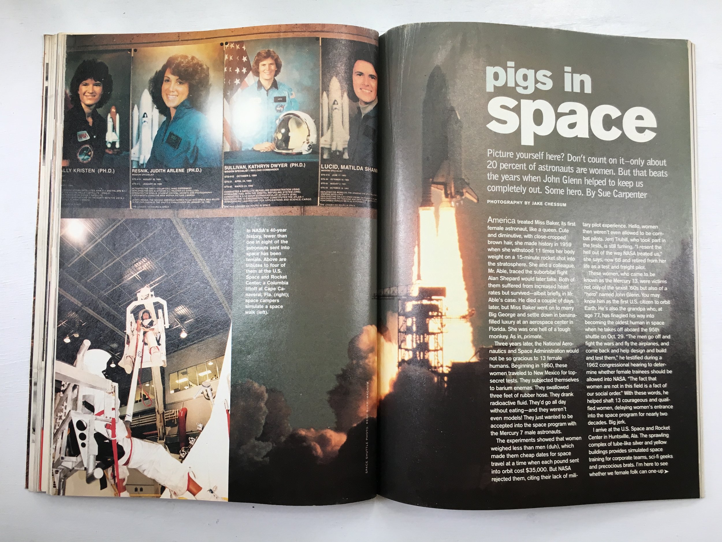
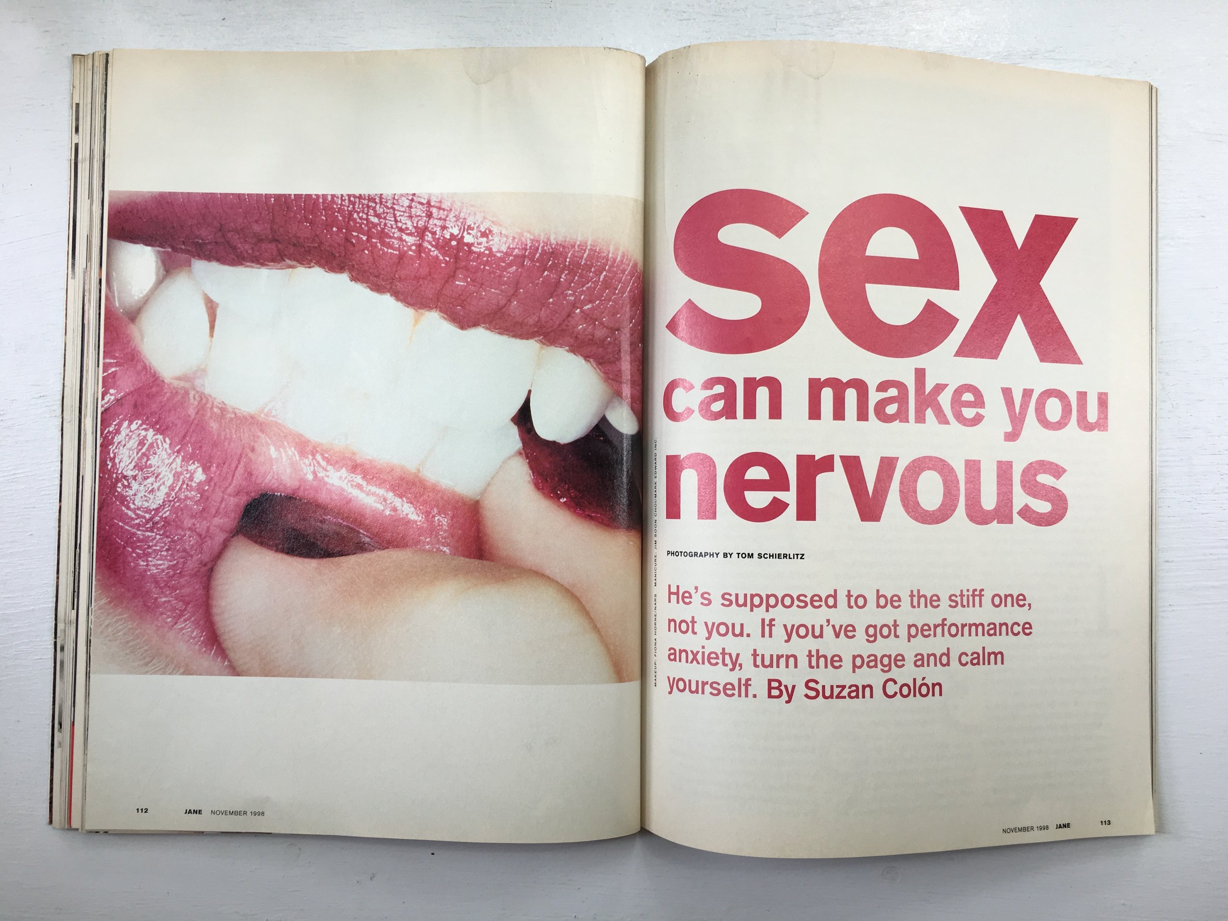
Andrew Hetherington, Photographer
/


SPD: What year?
Andrew Hetherington: 1985
SPD: What were you up to?
AH: I was a teenager living in Dublin, Ireland. At that time personal style was very much defined by what music you listened to and that dictated the tribe you belonged to; skas, mods, punks, new romantics, metal heads, etc. I was a new wave type and fancied myself as an artist, musician or fashion designer. I couldn’t sing, play an instrument, draw or sew but I discovered photography as the gateway to indulging my passions. I started taking photos of bands I knew and poured through the pages of music weeklies like the NME and Melody Maker for inspiration discovering the B&W photography of Anton Corbijn and Steve Pyke.


SPD: What magazine?
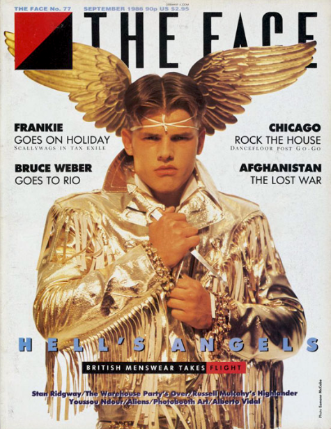
AH: The Face
SPD: What was it that so enthralled you?
AH: The Face was the game changer for me and couldn’t have come into my life at a more perfect time. It was so much more than a music magazine; diverse, colorful content all presented in a groundbreaking way, it wasn’t aimed at women or men but at everyone of all backgrounds. It echoed the cultural and social changes that were happening in the U.K. at the time and became that generation’s style bible for awhile. Fashion, music, nightlife, films; all delivered with just the right amount of attitude through bold design and great photography. It opened my eyes to a whole new world of sub cultures and was my internet; how I found out about latest bands, designers, DJ’s, directors, photographers and stylists. I couldn’t wait for the latest issue each month and would race to the newsagents to pick up a copy.
SPD: Do you know now who the creatives were?
AH: I paid particular attention to the photographers. There was a fresh young generation of British and European shooters who were changing the traditional photo playbook. Rules didn’t seem to matter anymore. Seeing the work of Nick Knight, David Sims, Craig McDean, Elaine Constantine, Juergen Teller, Stephane Sednaoui, Corinne Day, Derek Ridgers and Jamie Morgan blew my mind. But it was also how the photography was incorporated into the design and how they both pushed each other in new directions that really excited me.
Neville Brody was the creative director from 1982 and he was succeeded by Robin Derrick and Phil Bicker in the 90’s. All legends, who left their mark not on only the magazine world but contemporary design and culture too. The Face also pushed style and fashion in new directions mixing genres and genders in what at the time was quite a revolutionary way.
I can clearly remember photographs and layouts that left an indelible impact on me. Morgan’s photos of the Buffalo movement; a whole new look juxtaposing genres and styles created by iconic stylist Ray Petri, struck a particular chord. The cover they shot with Felix Howard from May ’85 is the first one I remember. Felix was a 13 year old boy but to quote Morgan "had the face of an elder person. To me, from a photographic point of view, it was a direct kick against the photography that was happening at the time in fashion magazines – pretty, colourful, female images.” Corinne Day’s photographs of a young Kate Moss for the mythical “Third Summer of Love” issue from July 1990 also left an indelible impression and heralded the age of raw and real fashion photography.

SPD: How does that inform your creative now?
AH: The Face was a constant creative companion for me from 1985 through to the late 1990’s. I treasured every copy for years and years. The photographers I gravitated towards had a distinctive visual style and that is something I strive for throughout my own work. The Face also taught me how photography and design were equally significant in a magazine layout and how they could elevate each other to the next level. To this day I am really excited to see my work in print and to see how the art department uses my photographs as part of the overall design package.