California Sunday's Teen Issue with Leo Jung, Jacqueline Bates, and Alex Tieghi-Walker
/
The recent December issue of The California Sunday Magazine is the second themed issue in the magazine's history and centers entirely around a day in the life of today's teenagers. However, the issue didn't just cover teen culture from an adult perspective; teenagers were important collaborators and contributors as well. Creative Director, Leo Jung and Photography Director, Jacqueline Bates worked with teens in producing this issue by having their photographs and illustrations appear in the pages of the magazine while the Brand Studio's Creative Director, Alex Tieghi-Walker tackled the unique challenges of branded content by working on fitting a company's needs with the magazine's aesthetic. We spoke to Leo, Jacqueline, and Alex about California Sunday's special teen issue. Read on for their answers and see more images from the issue below!
SPD: Why did you decide for this issue to be about teens? How is this different from previous issues?
Jacqueline Bates, Photography Director: This is a special themed issue of The California Sunday Magazine with a sharp focus on the lives of teenagers across California and the American West. It’s an odd and anxious time here in the United States, and we’re all coming of age in a way. So we spent some time listening to teens to learn more about their lives and what they make of the world around them. In keeping with the theme, we also wanted to make sure we included teenagers in the making of the issue itself: Some wrote stories through partnerships with 826 Valencia and Youth Radio, others illustrated or photographed entire stories themselves, and many others worked as photo assistants alongside experienced, acclaimed photographers. The issue is about, by, and for teens, and we wanted to make sure it also looked that way on the page.
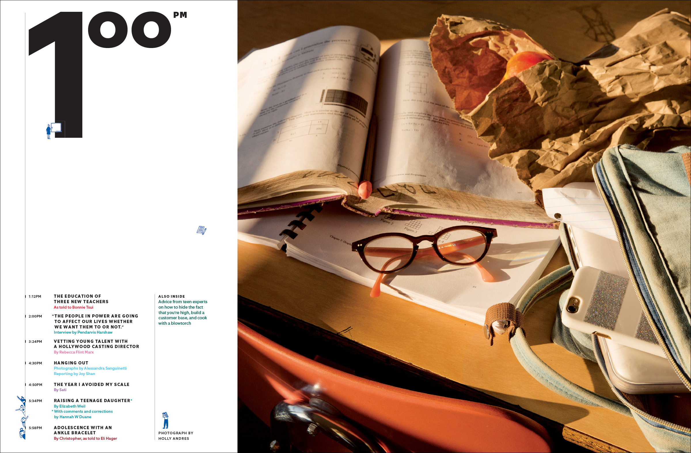
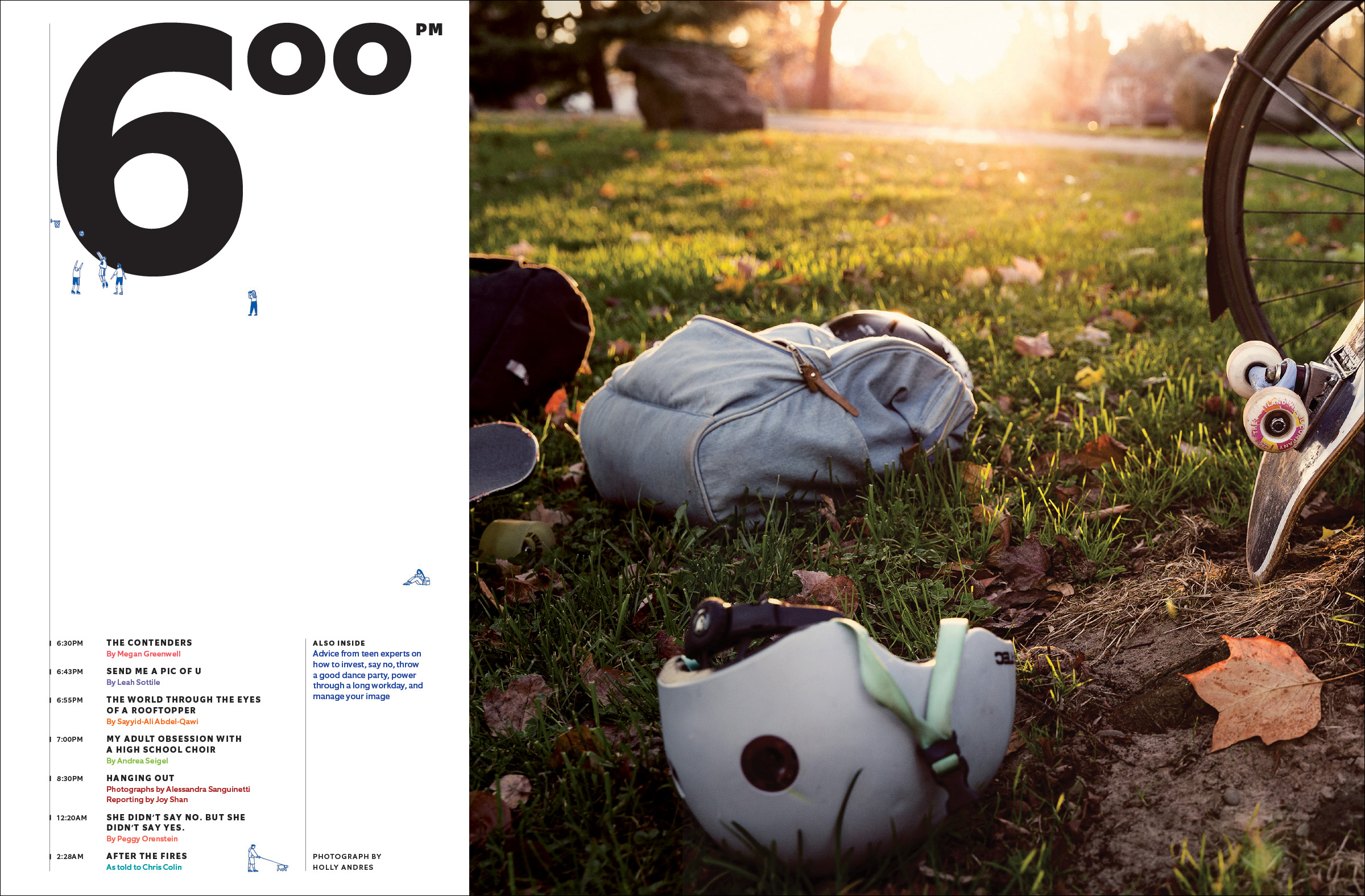
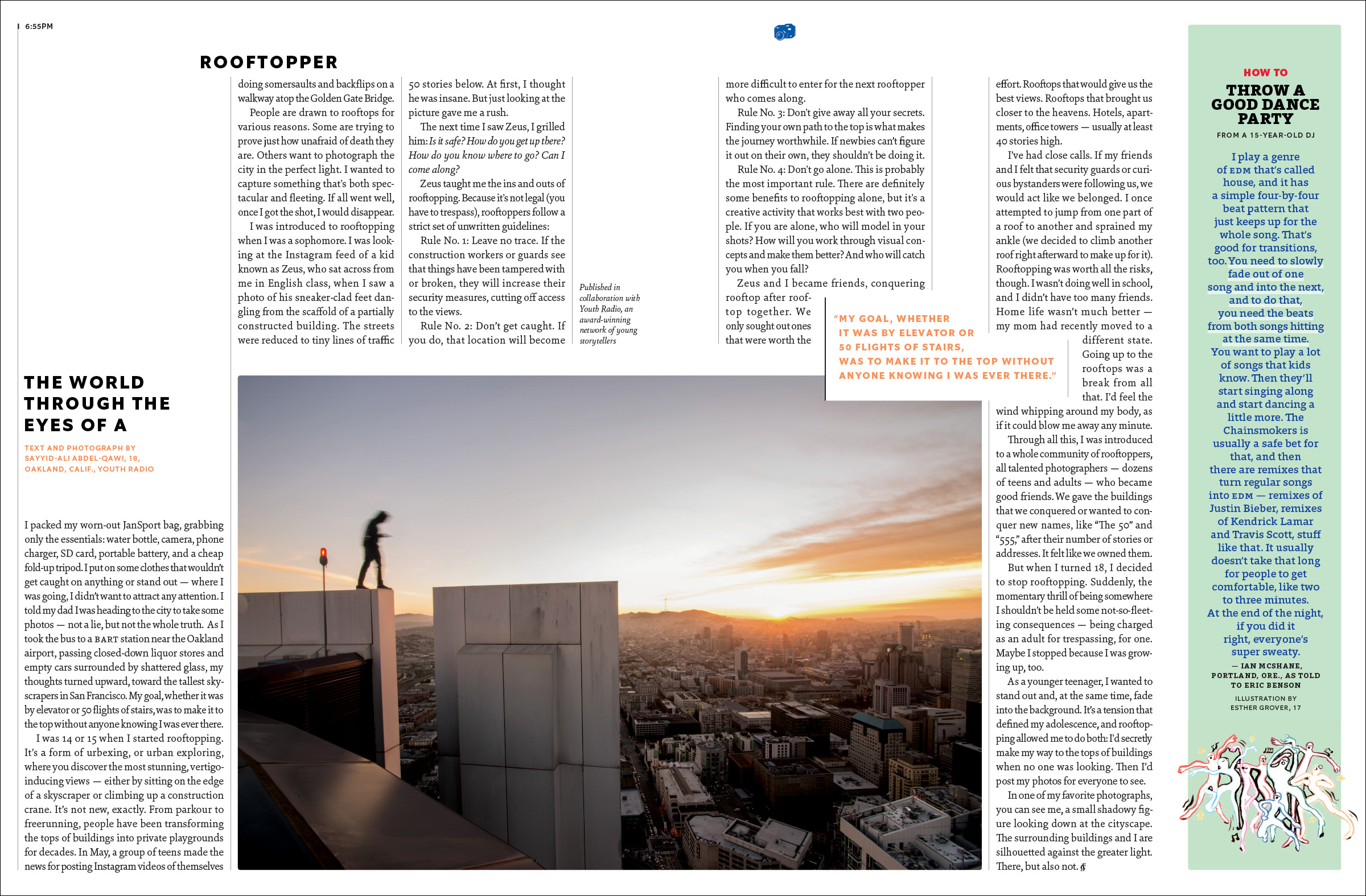
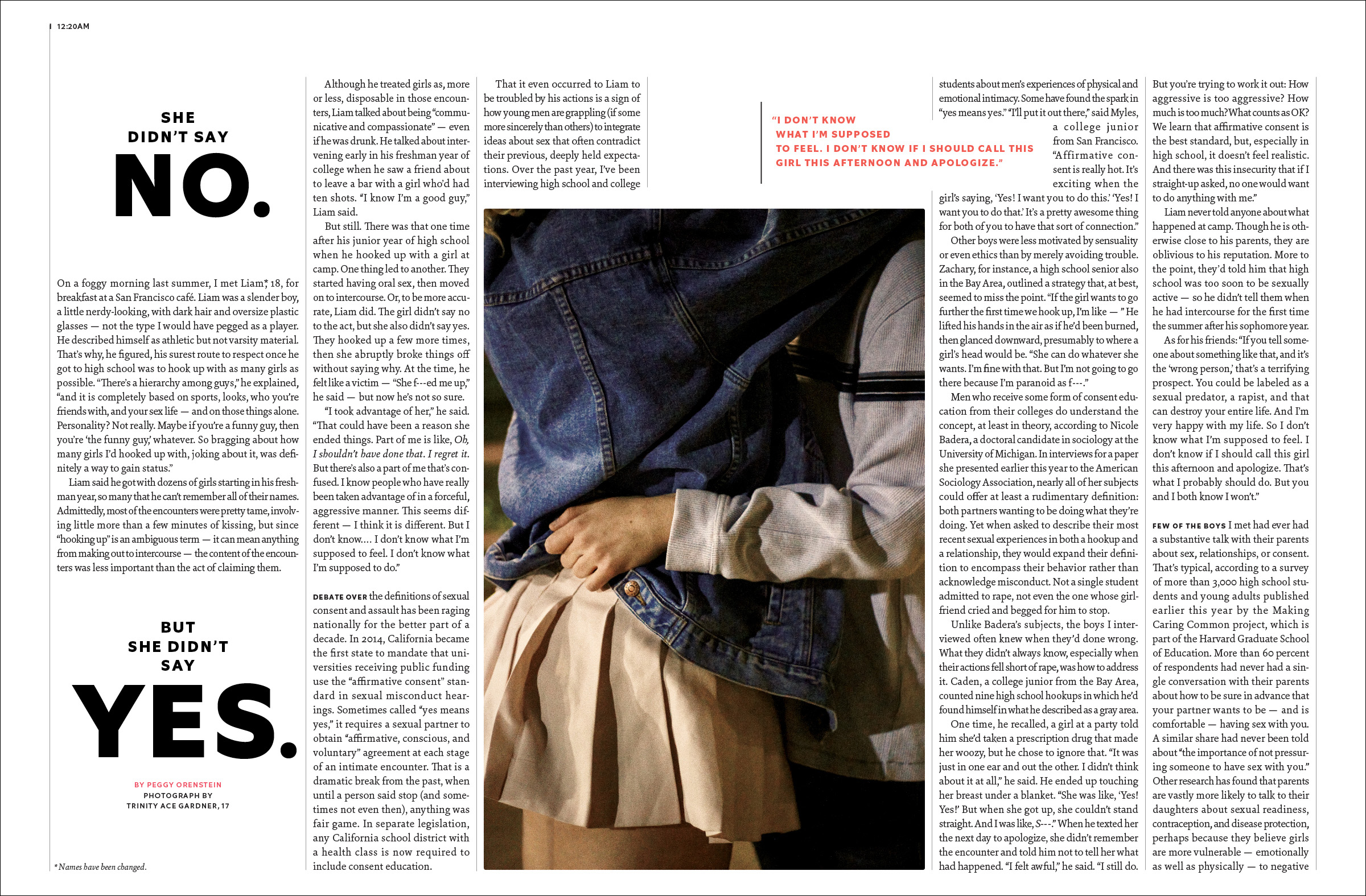
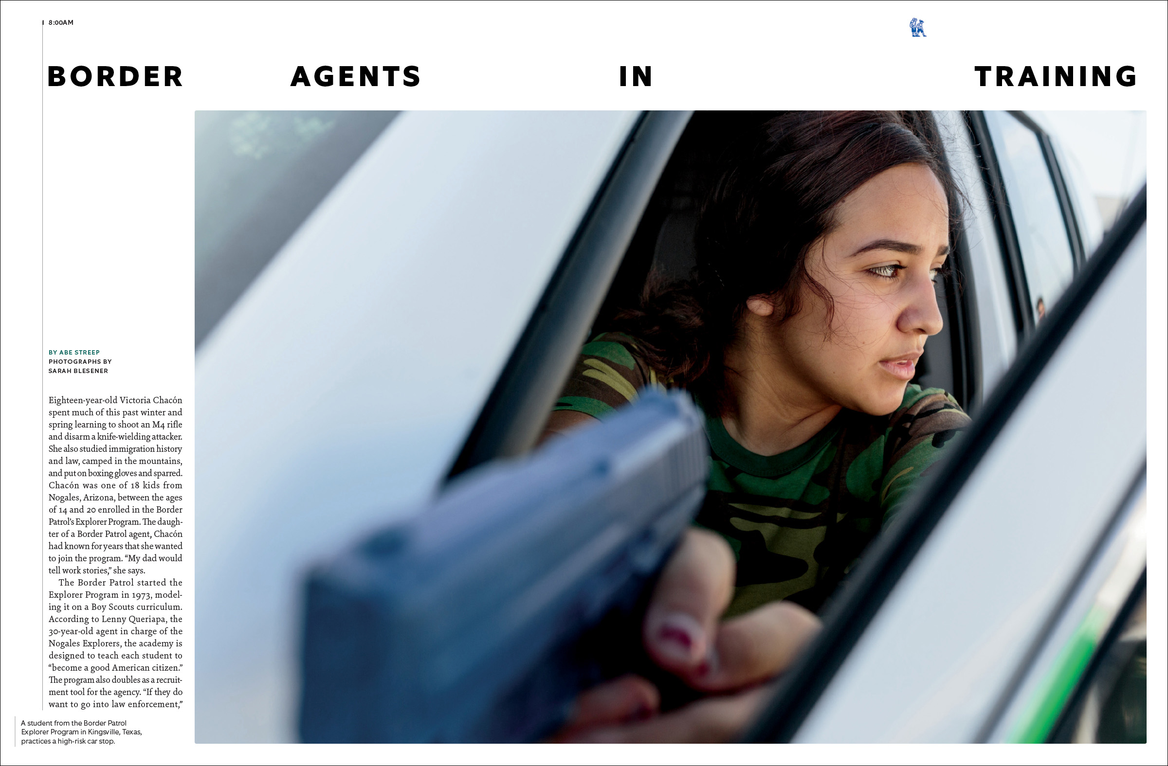
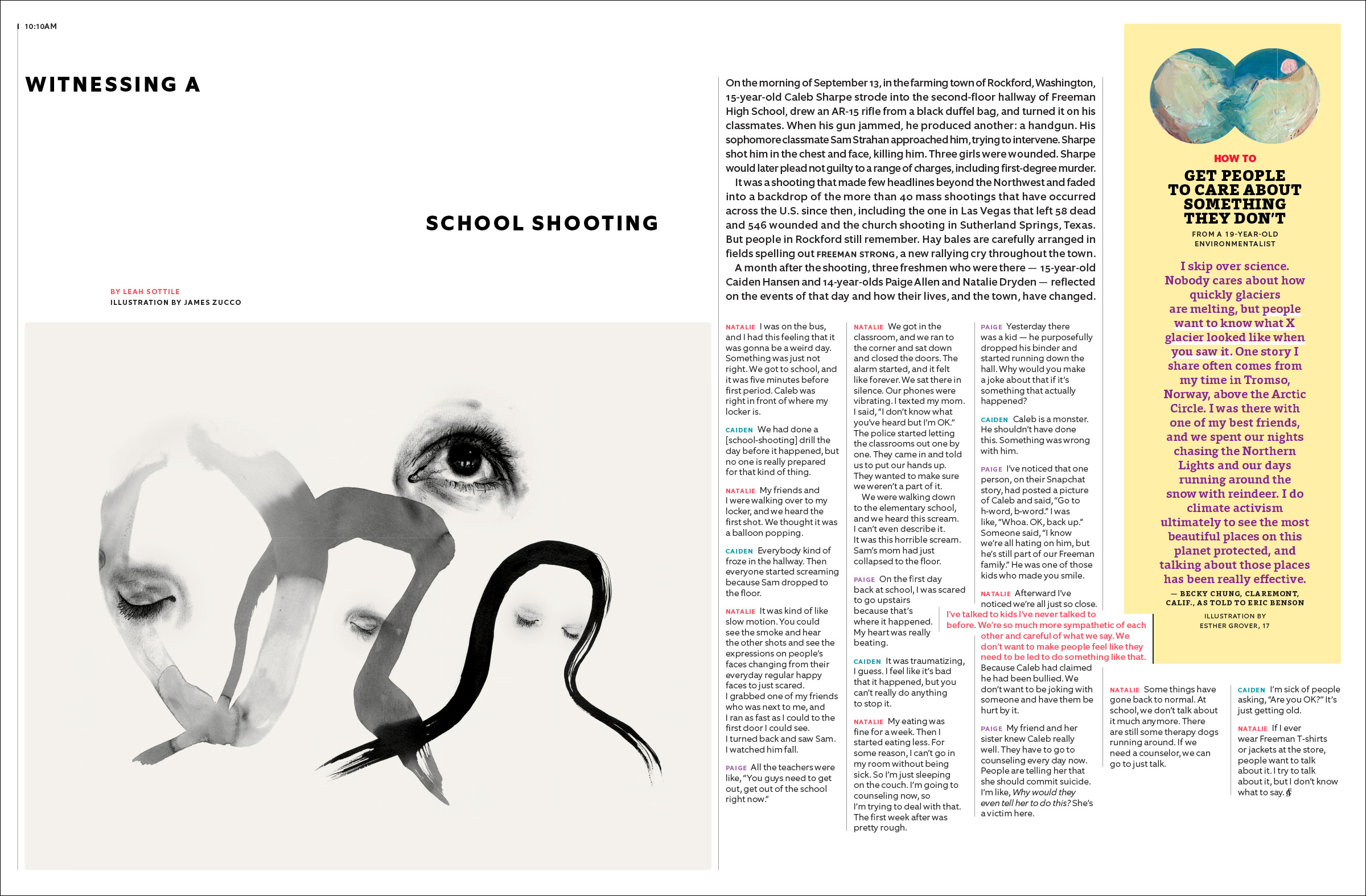
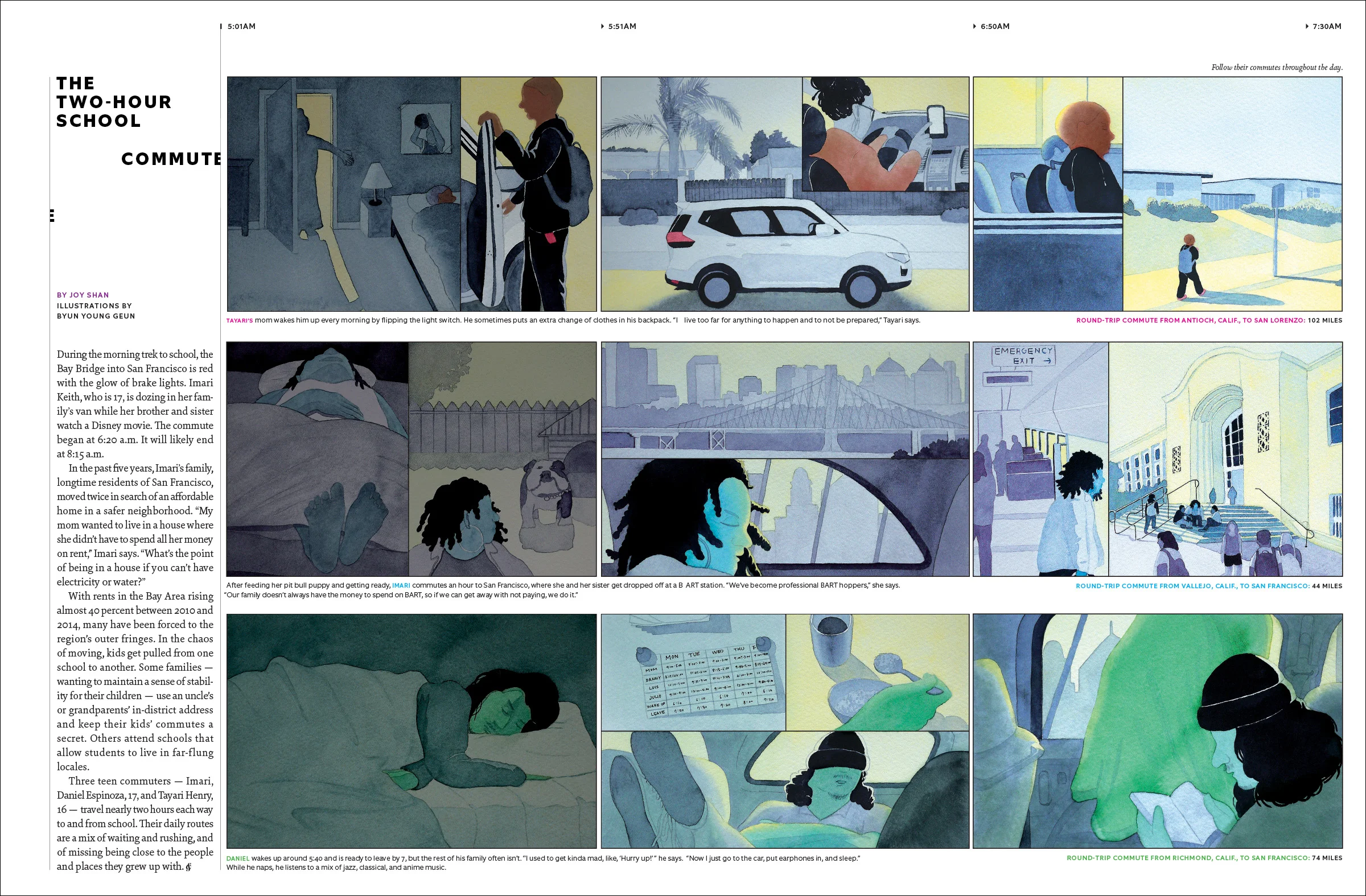
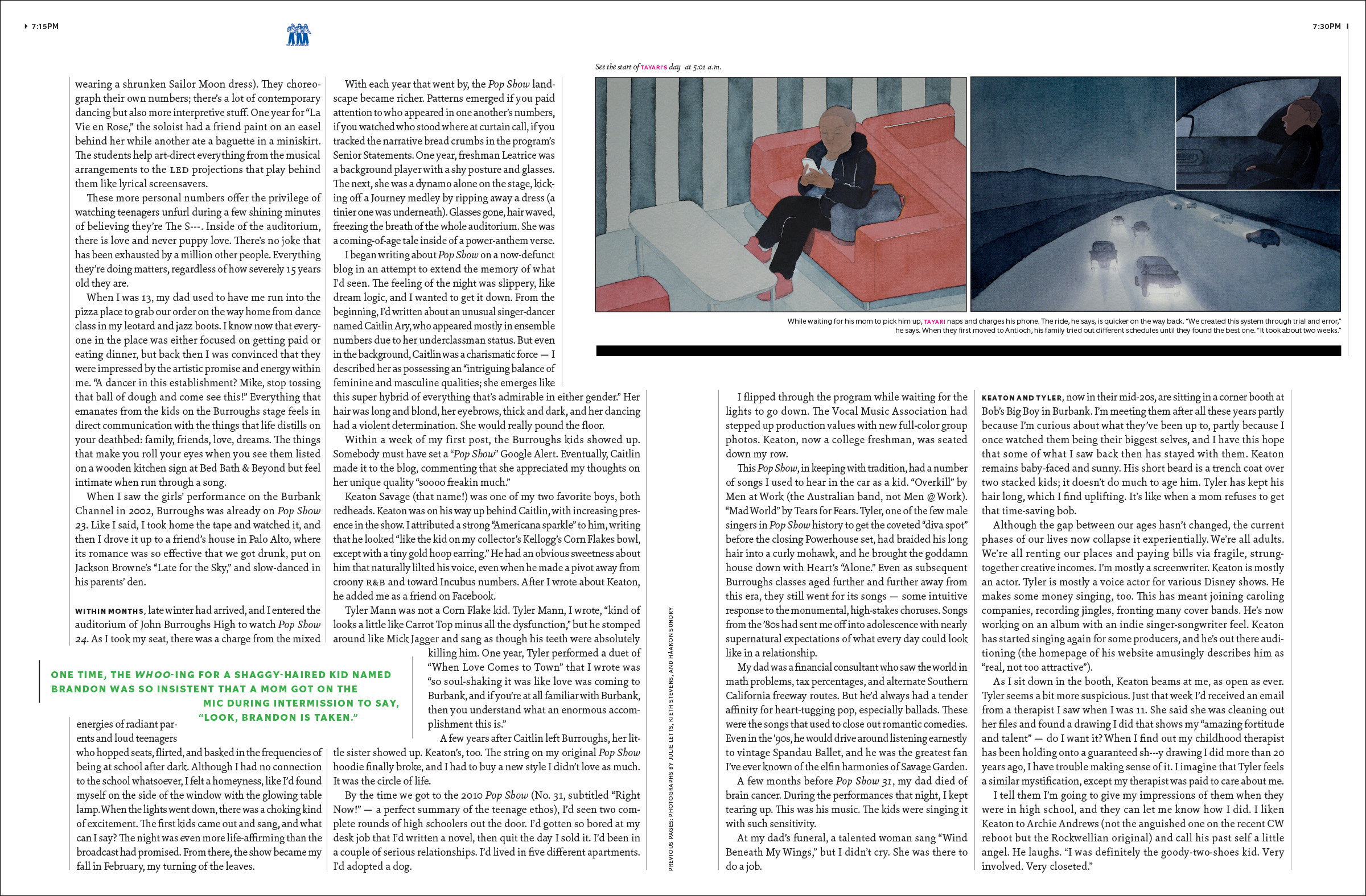
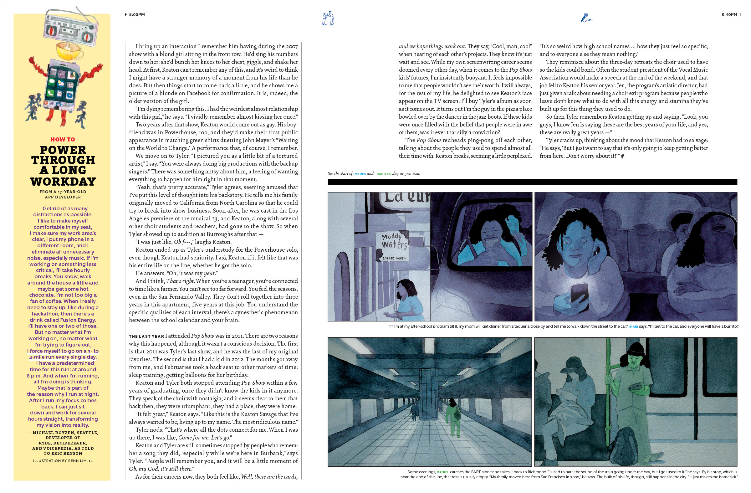
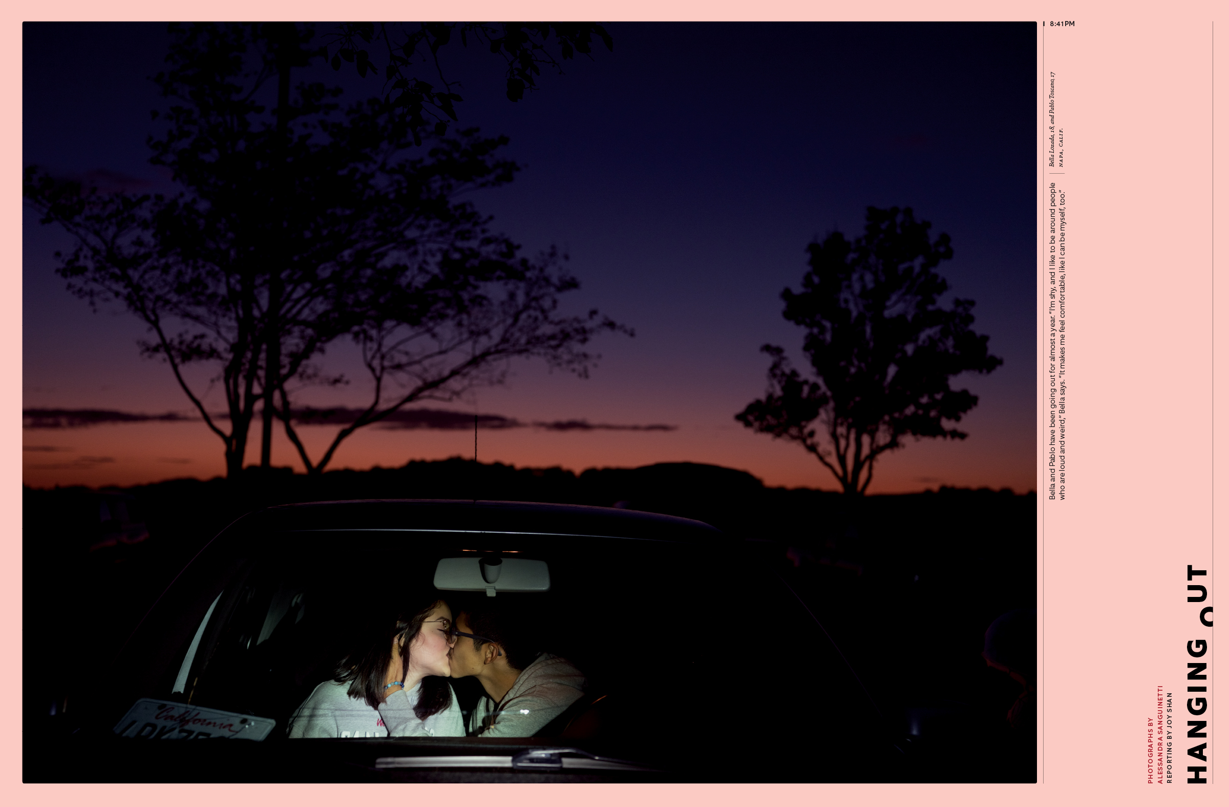
Leo Jung, Creative Director: You’ll notice that there are no page numbers. We wanted to build the issue around a 24-hour day in a teen’s life, so we organized the issue by timestamps as opposed to page numbers. The issue starts at 5 a.m., and the stories occur at various times throughout the day when teens would typically experience them. For instance, assistant editor Joy Shan takes you through three students’ long morning commutes to school at 5:01 a.m. (illustrated by Byun Young Geun and art directed by Annie Jen); then illustrator/journalist Wendy MacNaughton explores what lunch is like at four different public schools at 12:00 p.m. Each section — morning, day, and night — was visually anchored by a still-life photograph by Holly Andres (who was assisted by teens). The art throughout each section reflects the time of day the story took place. In the end, all of this comes together to emphasize the idea of a day in the life.


SPD: What was it like collaborating with the teen contributors? How did that process work?
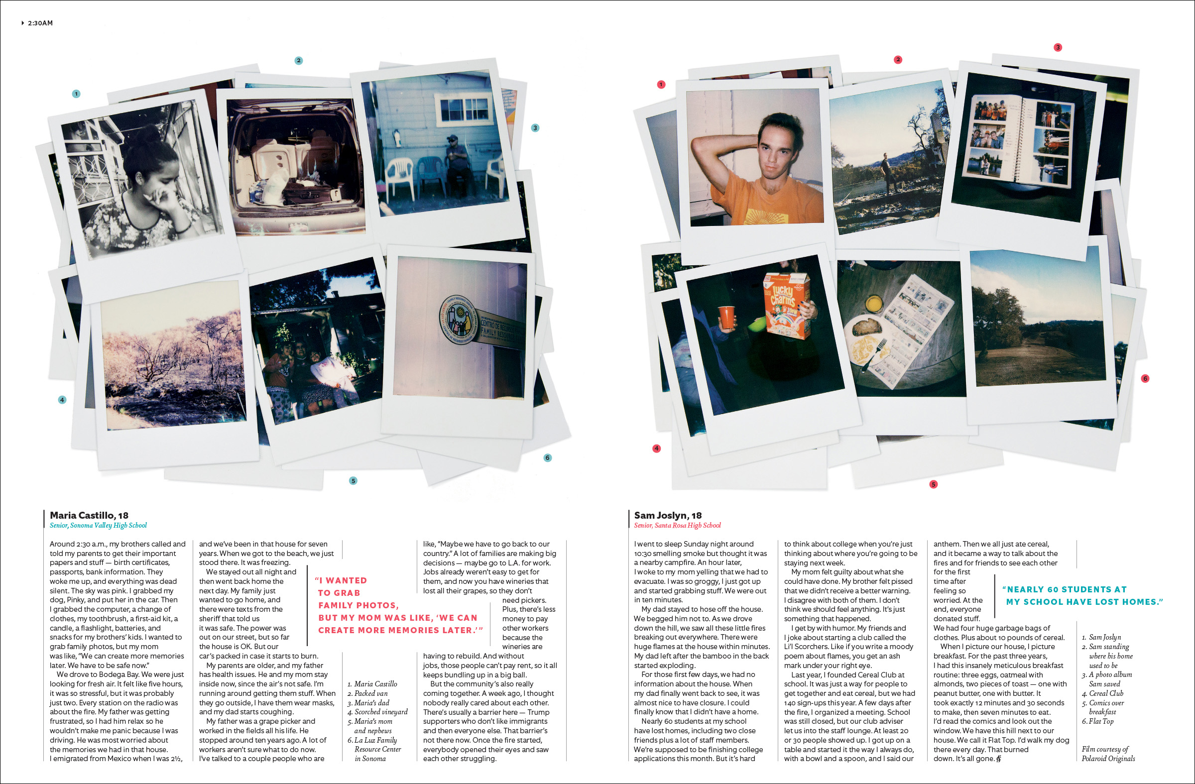
JB: In every issue of California Sunday we feature photographers in different stages of their careers — from emerging to more established. It was important to us to have teen artists involved in a significant way for it to feel authentic. I found it really gratifying to work with such young talent — many of the teens had never published their work in magazines before. Whether they were assisting acclaimed photographers or shooting their own stories, they were so enthusiastic and thoughtful about the collaborations. To find young talent, Paloma Shutes, our photo editor, and I reached out to teen arts organizations and high schools across California. Also, when commissioning a non-teen photographer, we encouraged them to have teenagers on set to collaborate on the shoots. For Elizabeth Weil’s essay, “Raising a Teenage Daughter,” which was annotated by her daughter, we asked Tabitha Soren to work with her daughter, Dixie, to shoot a portrait of the subjects. For Megan Greenwell’s story about Latina boxers in the Central Valley, we commissioned an 18-year-old photographer who is part of the Las Fotos Project, a nonprofit that works with teenager girls from low-income communities of color who do not have access to photography equipment. For another story, we asked two Northern California teens affected by the recent wildfires — who were tasked with writing about their experiences — to have them photograph their surroundings (thank you, Polaroid Project, for letting us loan some of your cameras!) and what remains after the fires. We thought it would complement their words in a really touching, meaningful way.

LJ: Finding teen artists is a little trickier than finding professional ones. It's not like they have slick portfolio sites waiting for art directors to call on them for gigs. They're doing it for fun, for school, or just for themselves. Many happened to have Instagram accounts, which turned out to be a great resource for getting a sense of an artist's work, what interested them, and what types of mediums they were comfortable working in. I was really interested in those that had a diversity of work in terms of subject matter and mixed media. That open mind, that versatility, and that fearlessness in experimenting were inspiring to see in such young artists. Once we connected, it was important to get their parent/guardian's permission right away. They are minors after all!
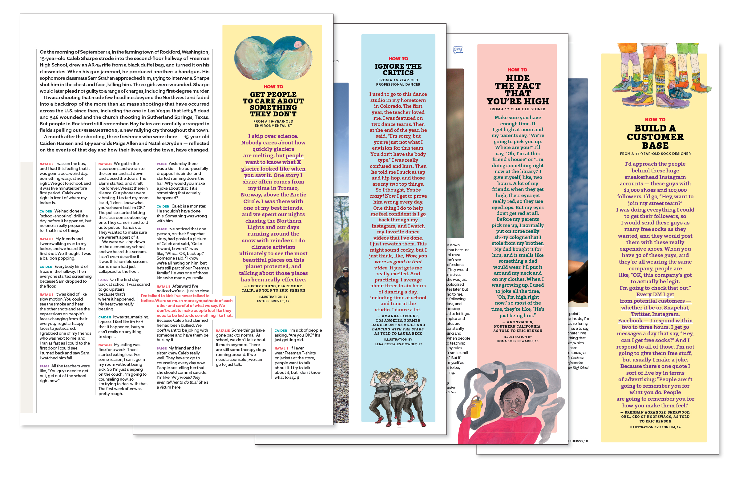
So what did they do? Our senior editor, Francesca Mari, had writers ask 14 different teens for some expert advice. I distributed those pieces amongst four teen artists: Lena Costales-Downey (17) of Hayward, California, Esther Grover (15) of Los Angeles, Roma Soep Edwards (15) of San Francisco, and Renn Lim (14) of Singapore. And they all blew me away with what they came back with. Had we not listed their ages, I'm sure readers would’ve just assumed the illustrations were done by professionals. They're incredibly talented, and I have no doubt we’ll all see more of their work in the not-so-distant future.
I couldn't have done it without the help of some fantastic people/organizations, especially Pablo Christi from Oakland School for the Arts and Kai Monet from MOCA in Los Angeles.
SPD: What was the process of incorporating branded advertisements into the issue so it all flowed together? What was it like working with Dropbox and Airbnbmag?
Alex Tieghi-Walker, Creative Director for the Brand Studio: Brands are finding much more success when they model their promotional messaging on the approach of great editorial storytelling — storytelling that is authentic, unexpected, and delightful — and our Brand Studio is designed to do exactly that. Working with clients as creative and open-minded as Dropbox and Airbnbmag enabled the Studio to develop two really exciting projects for this issue.
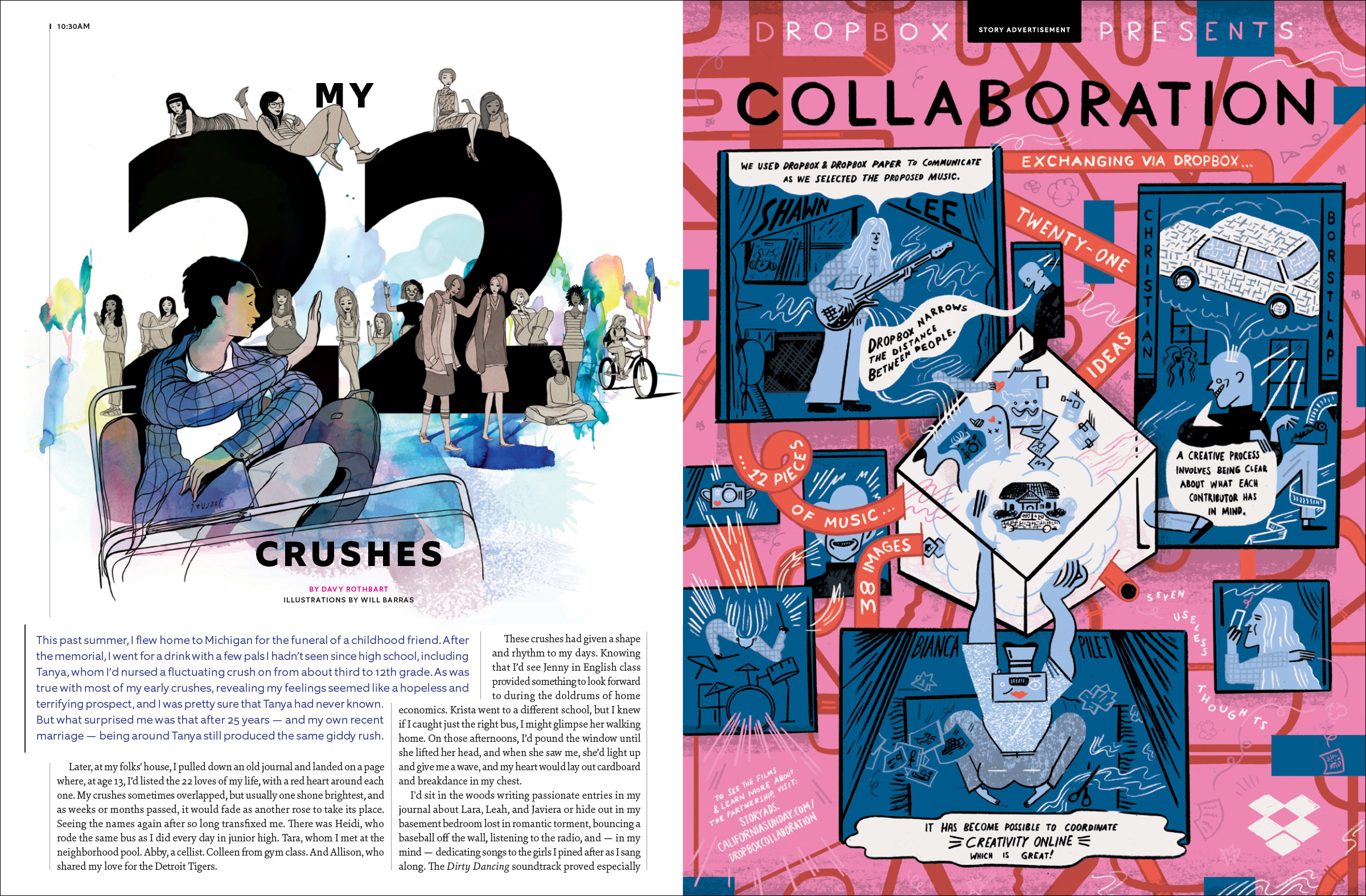
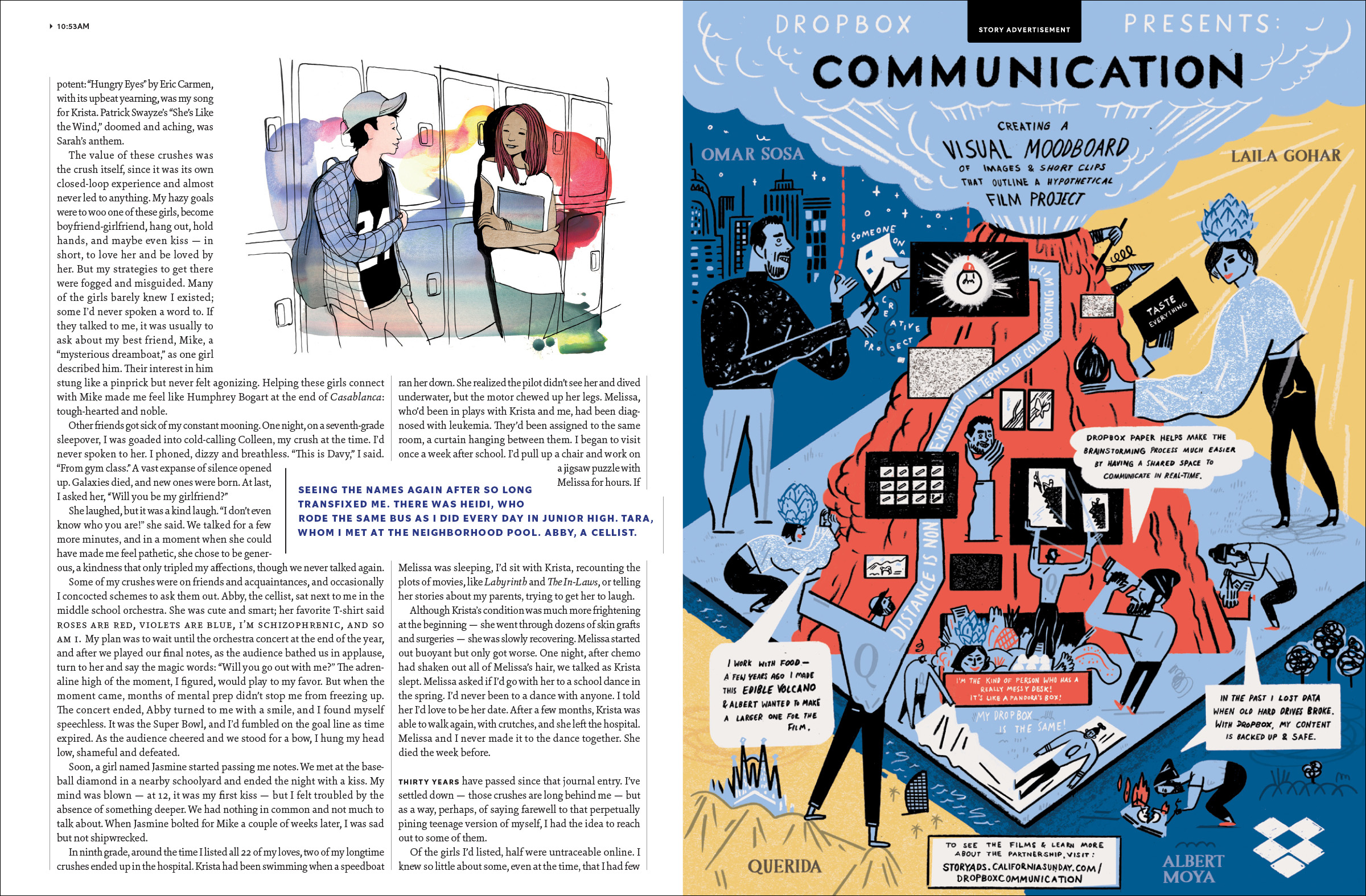
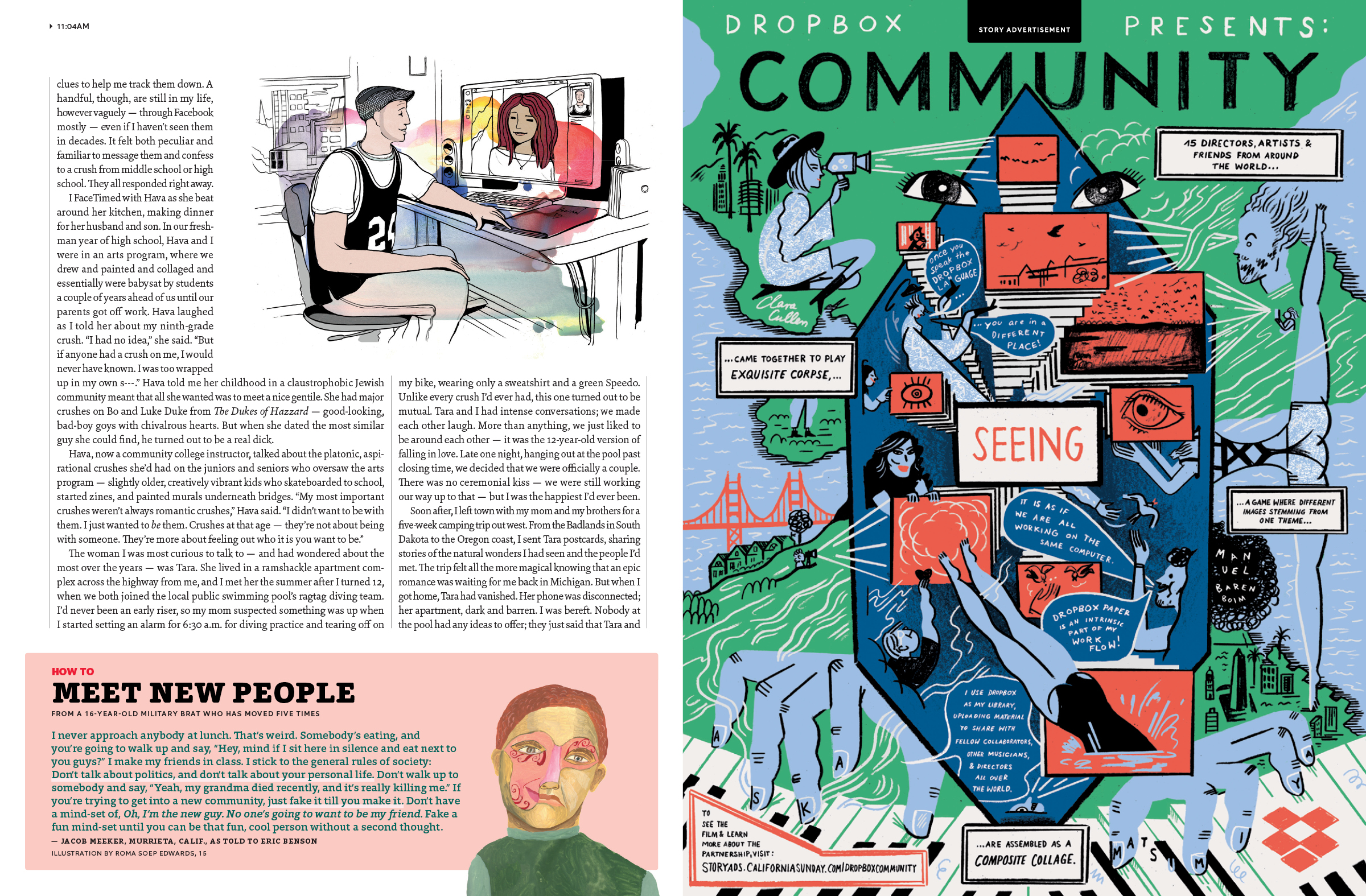
As part of the Dropbox partnership, we pulled together more than 25 creatives from around the world — composers, photographers, illustrators, and directors — and invited them to collaborate using Dropbox Paper. (During the entire process, they never met in person or on the phone.) The series highlights three fundamental ideas contained in every creative process: collaboration, community, and communication. These are some of the themes explored by the editorial content in this issue, so the ads — a triptych of specially commissioned bright and illustrated comic strips — felt very much like part of the adventure our readers experience when turning the pages of the teenagers issue.


SPD: Did you run into any challenges putting together this special teen-themed issue?
LJ: Commissioning artwork from teens was new — and risky. The prospect was exciting, but their lack of experience was also anxiety inducing. I have the white hair to prove it. I intentionally padded in some extra time for deadlines, just in case a version of “the dog ate their homework” reared its unexpected (expected?) head. I totally get it, though. These days there are a lot of demands and expectations imposed on teens. It's no surprise that time management isn't their strong suit. I expected the worst, but all things considered, it was a fairly smooth process for most of the teen contributors.
Doing away with page numbers and organizing the issue around the timestamp was a fun idea, but I also didn't want it to feel completely arbitrary. The more often the story and the art reflected their timestamp, the more the reader would feel like they were moving through a day. To add depth to the idea, I loved the prospect of introducing a story at one time and then coming back to it later in the day. To be honest, I wasn't certain how well that idea would play out. Sometimes interesting ideas are better in theory than in practice. The last thing we want to do is annoy or confuse our readers.
It took some trial and error, but we ended up applying this treatment to two stories (“The Two-Hour School Commute” and "Hanging Out"). I’m really proud of how those stories came together in the end. They really made the idea of time passing that much more real.
ATW: Telling any brand story in print is an interesting challenge, and solving that problem in exciting and new ways is one of the most enjoyable parts of working as a Studio group. For our Dropbox project, we had to narrow the complexities — and sheer breadth — of creative process into three simple comic strips. To do this, we interviewed every one of the 25 different creatives we had worked with and created surreal, topsy-turvy, and fantastic worlds that visually represented how creative ideas are expressed, shared, and developed. Every time the viewer looks at the pages, they will see new drawings and moments that they might have missed before. Consumers don’t need to sit through commercial breaks or linger on print ads anymore if they find them to be boring or inauthentic sales pitches. By telling the Dropbox story in an engaging and fascinating way, we are hopefully changing the way consumers see and experience brands.
SPD: How did you decide on the cover?
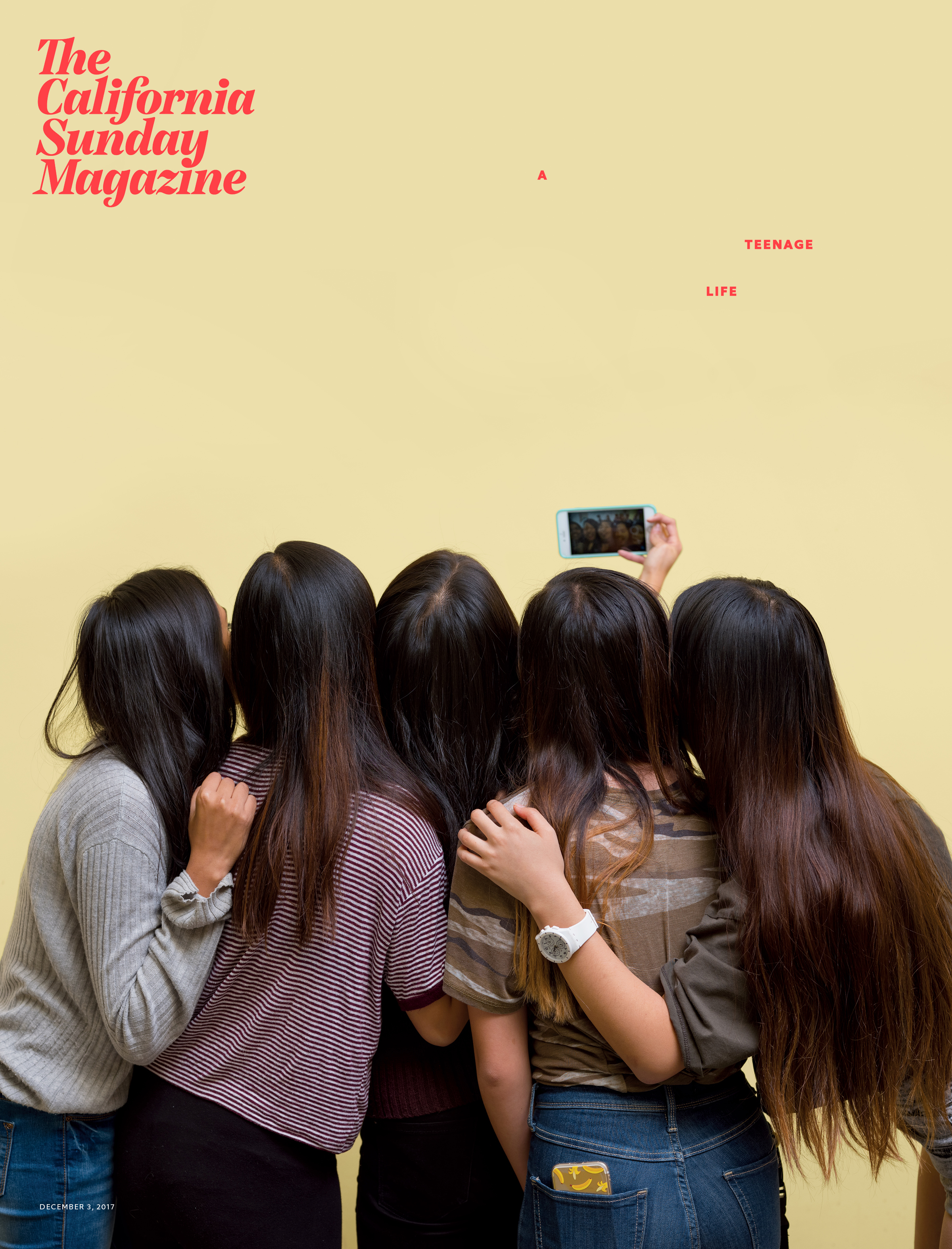
LJ: There were a lot of great contenders for the cover. Ultimately, we gravitated toward this cover because of its immediacy and universality. There’s just no doubt that they're teens. More important, there’s no doubt that they’re teens of today. I love the small details: the phone in the pocket with a banana case, the impressive hand contortion of the selfie-taker, and the fact that they're all the same height and look like they share the same head of hair. It's so good.
SPD: What’s your favorite photo or story from the issue?
ATW: I think one of the best things about this issue is that the magazine team used actual teens to create a lot of the content. Giving teens a voice and platform to express their own realities is super important and lends an immensely personal and thoughtful element to a lot of the issue. I especially love the story about the North Bay wildfires, where teens who had been directly affected by the fires documented their new environments using polaroid cameras.

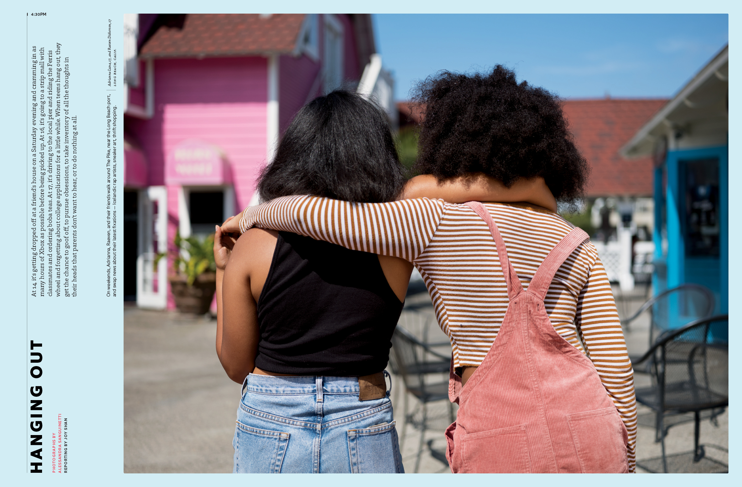
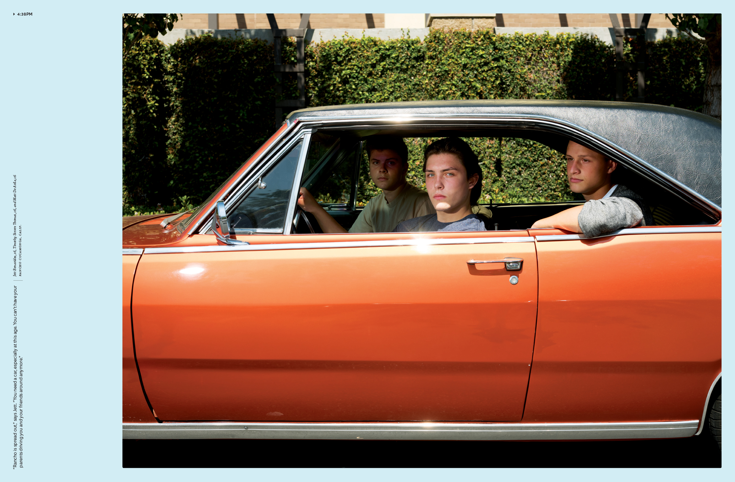
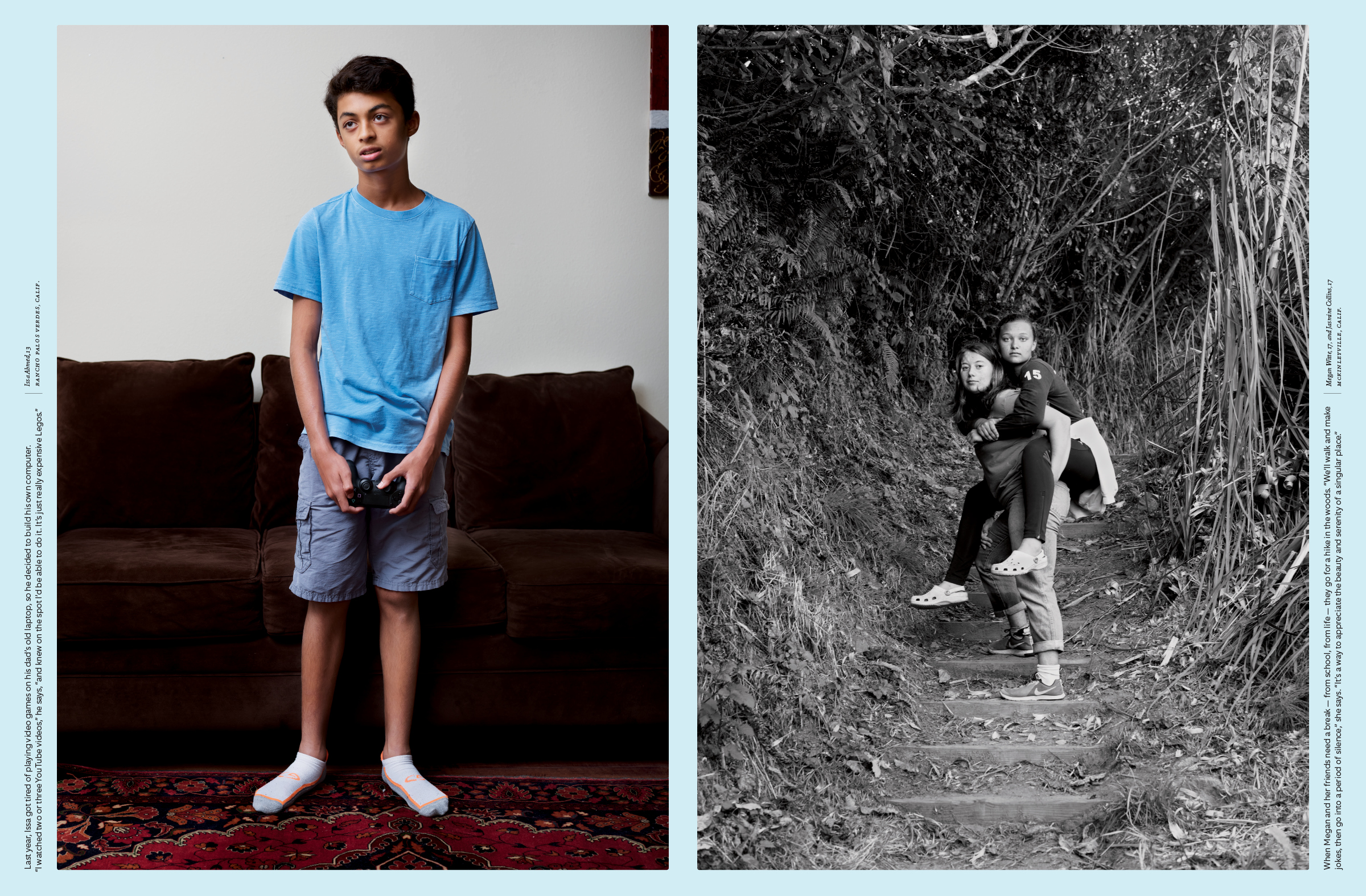
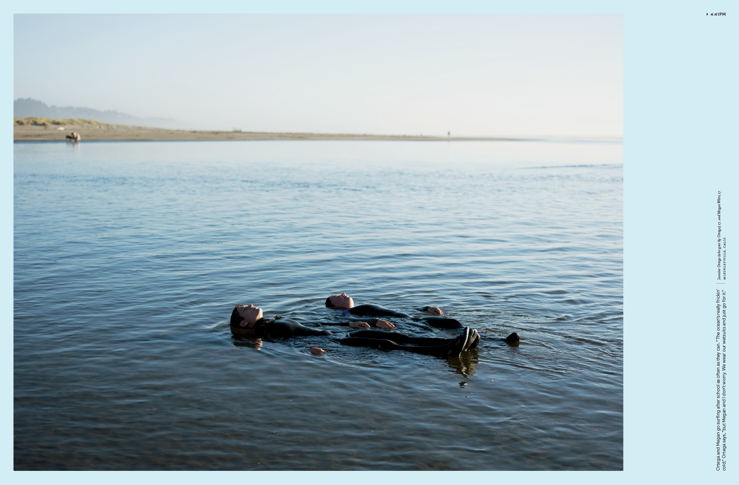
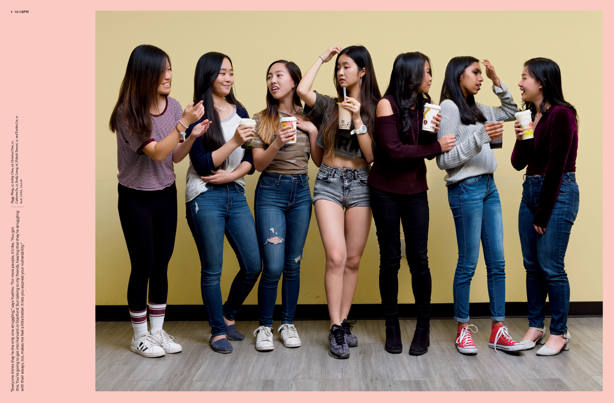
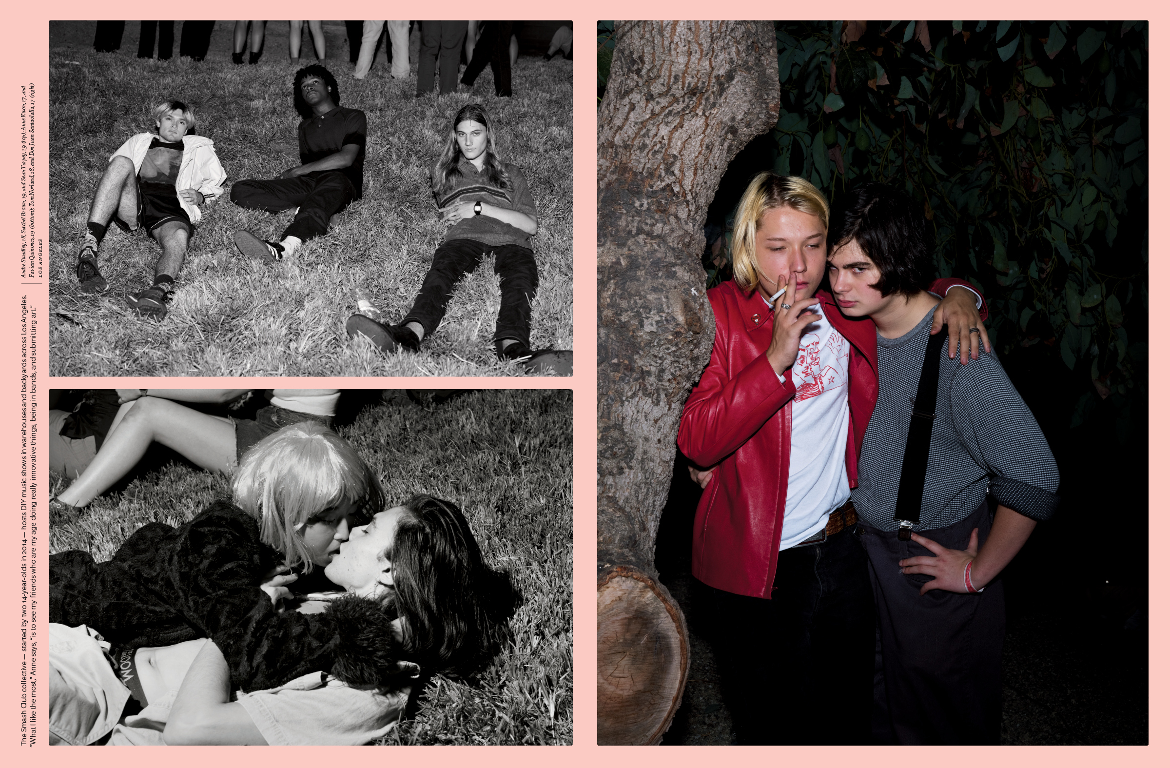
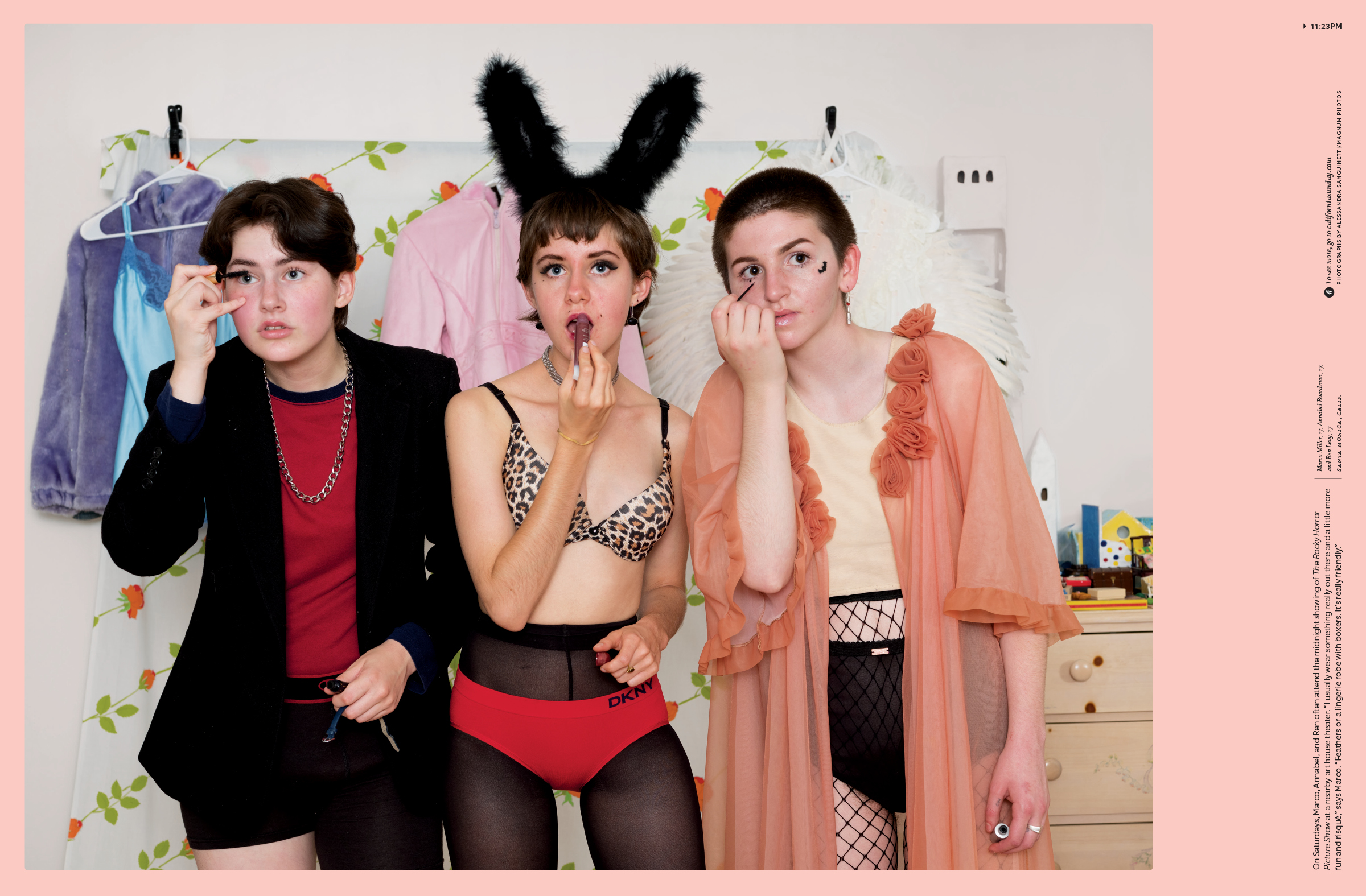
JB: No surprise here! My favorite story in the issue is the 20-page photo essay “Hanging Out” with Magnum photographer Alessandra Sanguinetti. Her photographs feature a sweeping look at the way teens across California spend time together. Alessandra photographed for two months, and assistant editor Joy Shan interviewed hundreds of teens. I think Alessandra captured the moments on the cusp of adulthood so brilliantly. We're so honored to have her photographs appear in the issue.
LJ: I agree — Alessandra's photos were amazing. I love how expansive and diverse the group of teens are. Some photos feel like they could’ve been taken from another time while others feel very rooted in today. I especially love how intimate her photos are. Some of the teens’ gazes reminded me of just how intimidating it was back in high school — and how it still is! Others made me feel like I was witness to a very special moment that they'd undoubtedly look back on one day.
Taken as a whole, I'm really proud of the idea of organizing the issue around a 24-hour day in the life of a teen. Given how much a teen goes through in a typical day, it made a lot of sense conceptually. That naturally led to the time-stamping of each story, which led to questioning the need for page numbers at all. It's a simple idea, but one that gives the reader some context and order. Without it, I think the stories would feel a bit random. As a designer, you're always looking for moments like that: when it's not just about a new paint job, it’s an opportunity to rethink the mechanics of how the car runs.
The time stamp also gives the reader perspective. Teenagers are so malleable and impressionable. To think that in one place a teen could be experiencing his first kiss while in another a teen is escaping a fire — it's enough to make you realize that these are moments that could define their youth and inform who they are as they mature.