Eye 96 and Eye 97: Inside Eye's Two-Part Magazine Special with John L. Walters and Simon Esterson
/
Eye Magazine’s latest two issues, Eye 96 and Eye 97, centered around art direction and magazine design. We chatted with Editor, John L. Walters and Art Director, Simon Esterson about this two-part special.
SPD: What inspired you to focus on magazine design for Eye 96 and Eye 97?
John L. Walters: Eye has always published articles about editorial design, including pieces about titles such as the Architectural Review, Semina and Bloomberg Businessweek. It’s a subject of enduring interest – with plenty of great examples, both contemporary and historical – so we thought it a good idea for a special.
SPD: Why did you decide to split the magazine special into two issues? How did you determine what would go in Eye 96 versus Eye 97?
JLW: There were so many potential subjects that we thought it would be better for our readers – and for our sanity – to do it over two issues, rather than crowd too much in.
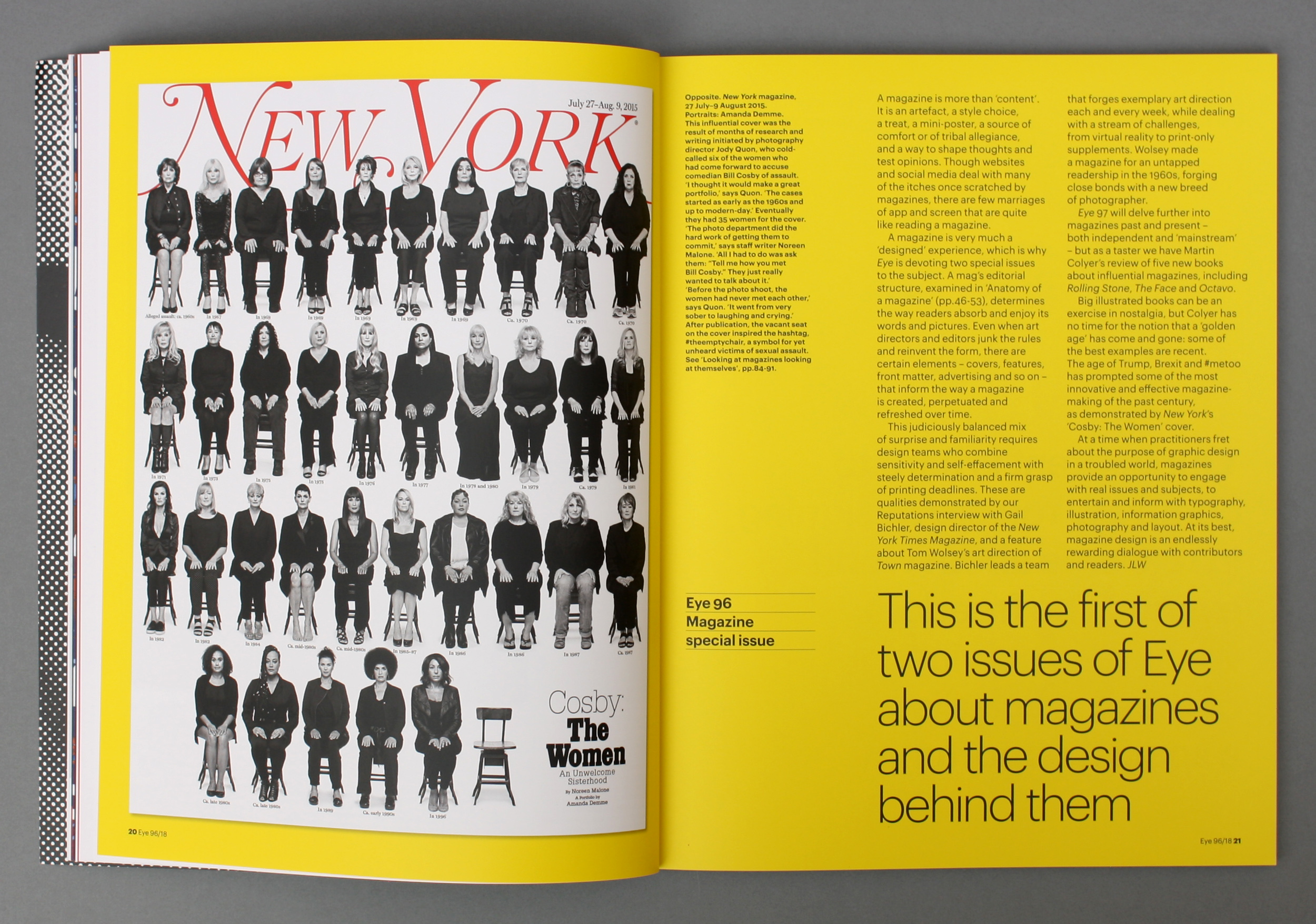
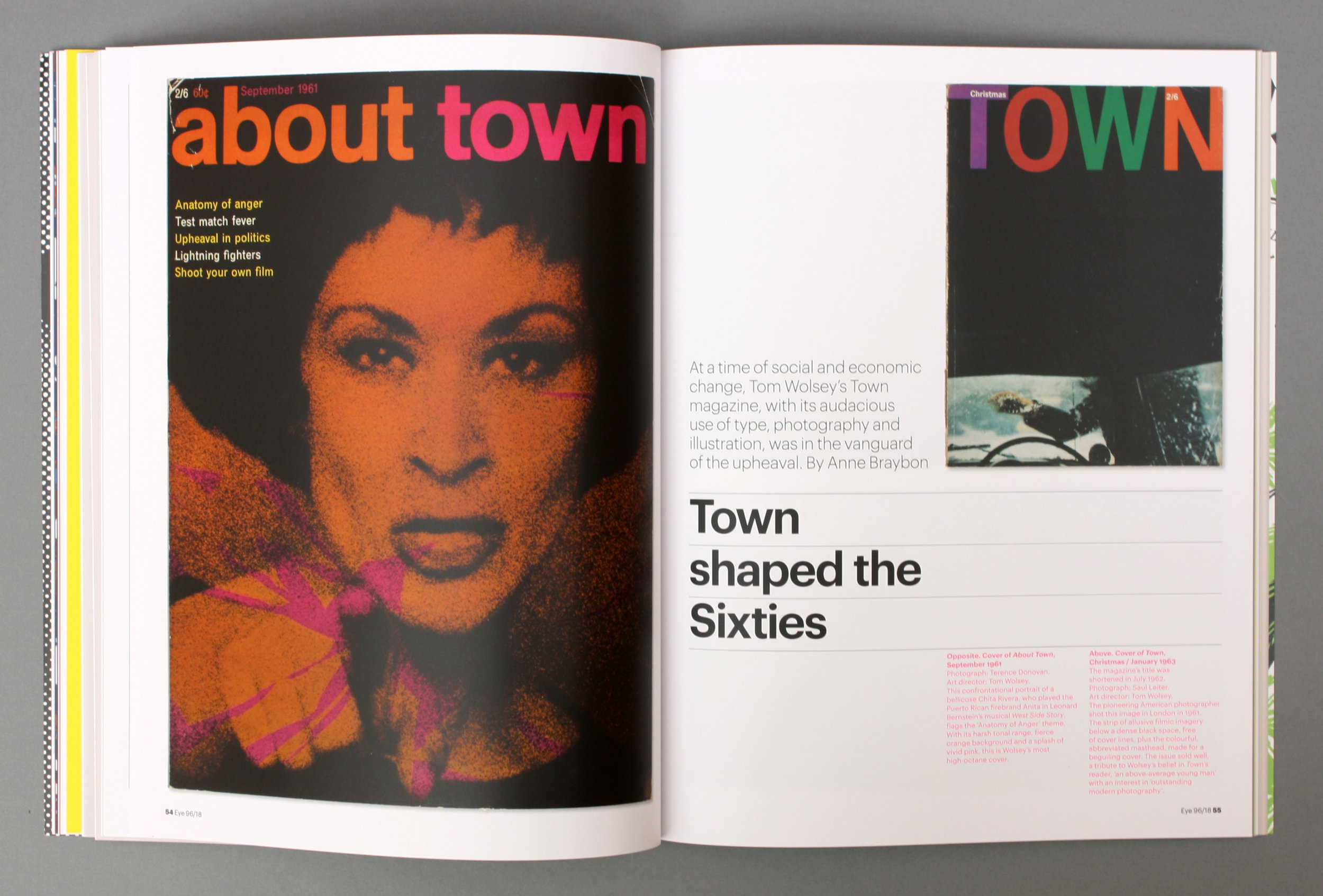
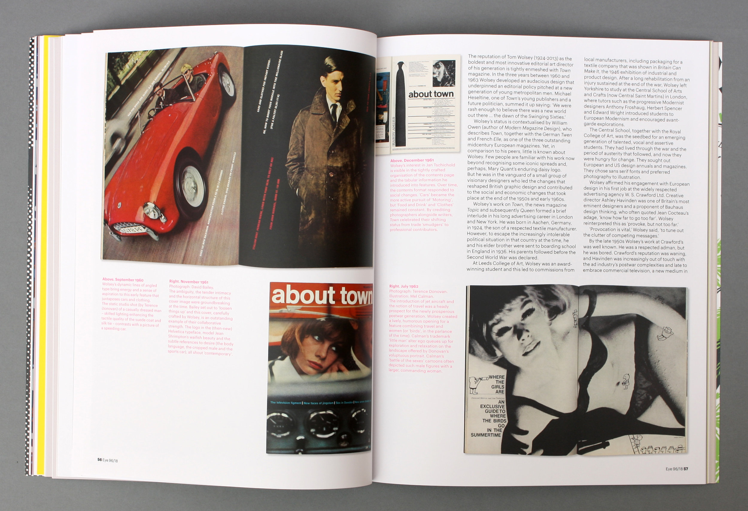
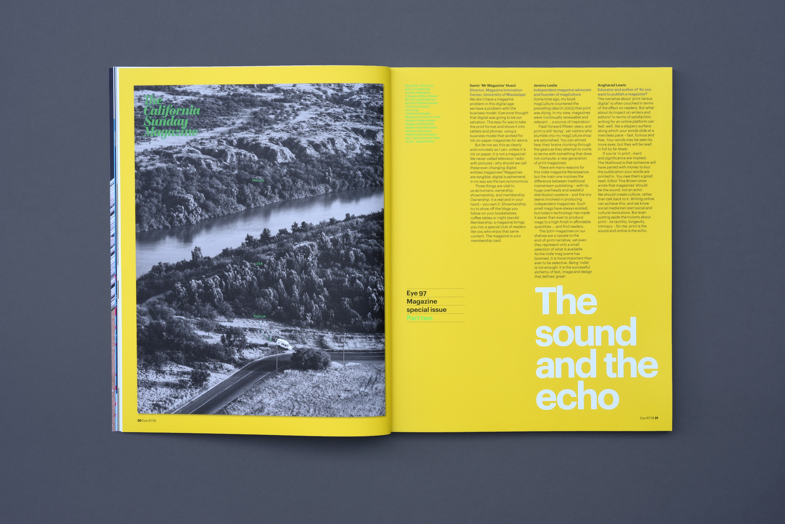
Simon Esterson: Eye 96 had two very big features: about the contemporary The New York Times Magazine and the historic British Town magazine of the 1960s. It was important in Eye 97 to have more, shorter features to make sure we covered lots of other magazine stories.
SPD: What was the brainstorming process like for these issues? Did you have a particular vision in mind?
JLW: There is never a single brainstorming session for a magazine such as Eye. (I tend to think that ‘brainstorming’ is better for things like marketing campaigns rather than deciding upon editorial contents.)
The ‘vision’, such as it is, is to make another great issue of our magazine – one that is equivalent to earlier issues in editorial quality, visual materials and art direction, but that is different – we try hard not to repeat ourselves within Eye’s usual structure for Front Matter/Feature Well/Reviews. Simon changes the typefaces (display and body text) with each issue, so each issue has a subtly different character, but the emphasis is always on the subject matter rather the way we present it. (However because this was a double issue, Simon decided to use Commercial Type’s Graphik for both 96 and 97.)
I usually start with a list of features which is a mixture of things I want to include, proposals made by writers and a few subjects that Simon and I have discussed while working on an earlier issue. Some ideas (like Anne Braybon’s profile of Tom Wolsey and Town) have been hanging around on the server for several years, waiting for the right issue, and enough pages to do it justice. Sometimes an idea will pop up from a general chat in the studio – for instance Holly Catford mentioned Michele Outland as a possible subject for a feature, and we immediately followed up. Usually it takes a little longer for a strong feature to emerge.
SE: I like the juxtaposition of old and new.

SPD: How did you decide on each cover?
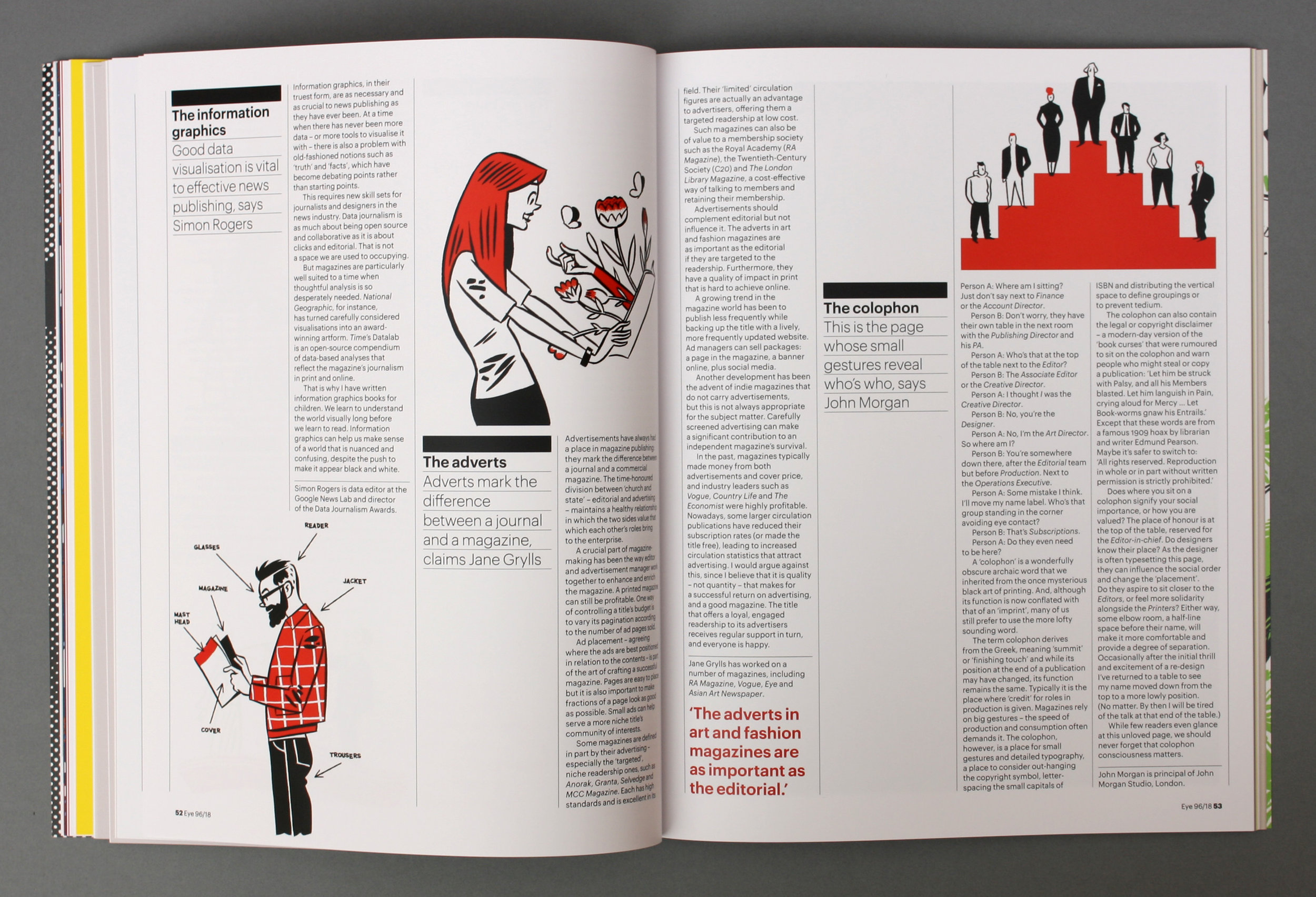
JLW: The Eye covers are usually decided on quite late in the production cycle. For 96, Simon commissioned our friend and studio neighbour Jason Ford to draw the spot illustrations for ‘Anatomy of a Magazine’, a multi-author article that I commissioned to cover the different elements that make a magazine a magazine: the cover, the adverts, the colophon, the features, etc. Jason’s spot illustration for the ‘advertisement’ article showed a person opening up a magazine to be delighted by flowers, and a beckoning hand springing out of a spread. Simon suggested to Jason that he adapt and simplify the drawing to make a cover image, and after a small number of drafts we had a terrific cover, which was printed on the ‘wrong’ (i.e. grey uncoated) side of 300 g/m2 Uniboard S board.
When it came to the cover of 97 (part two), Simon commissioned Tom Gauld – another studio friend and neighbour – to draw a cover that would represent the contents of the issue: Simon told Tom what would be in the issue, and left him to it. Tom came back to us with a brilliant sketch, and after a few drafts he had the cover you see on Eye 97, also printed on Uniboard. Tom’s design alludes wittily to the enormous range of subjects covered by print magazines, with a fanciful array of fictional* mags whose titles rhyme with Eye– Pie, Try, Why and so on. Each little titlepiece is a variation on Magnus Rakeng’s longstanding Eyelogo.
*(Our followers on social media quickly pointed out that all these titles exist, or have existed.)
SPD: What was your favorite part of editing/designing these issues?
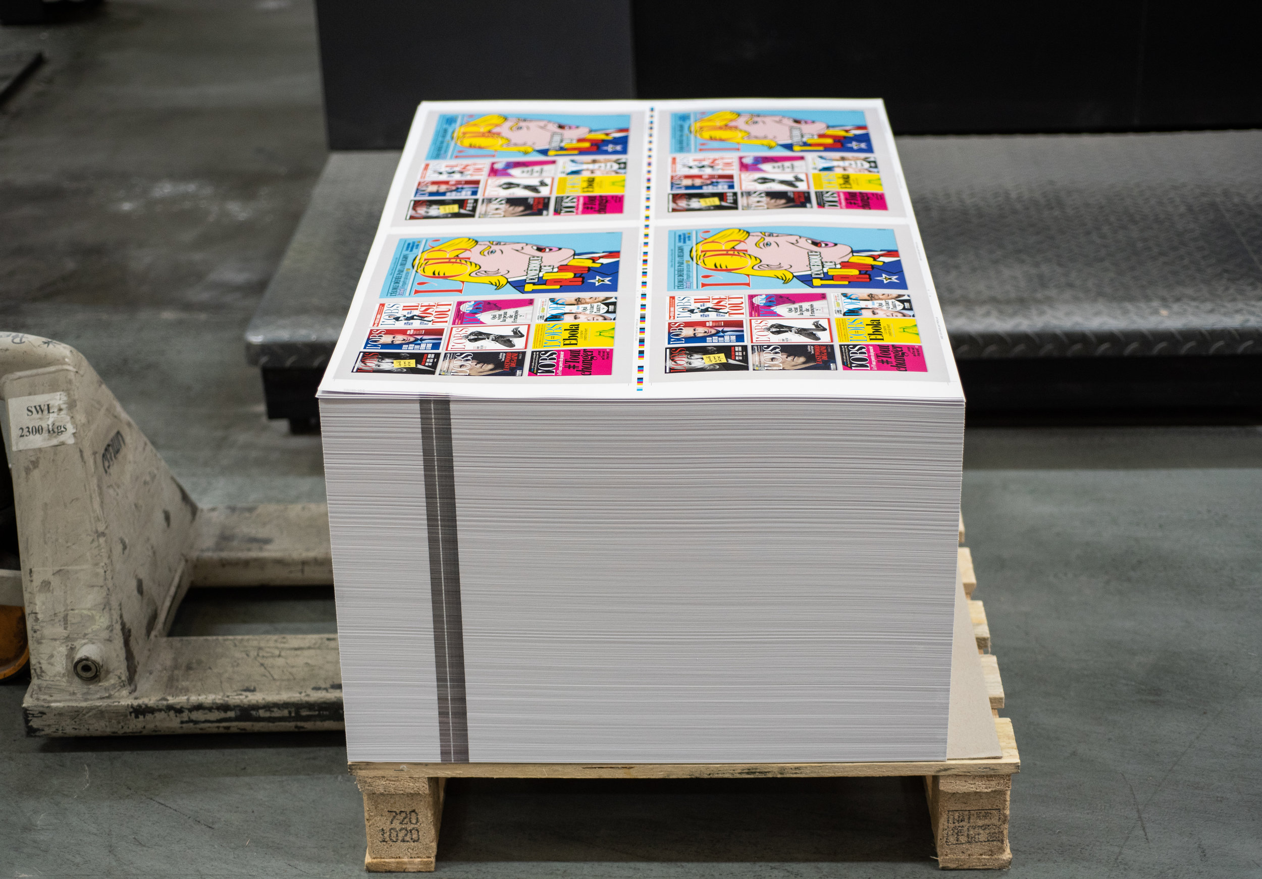
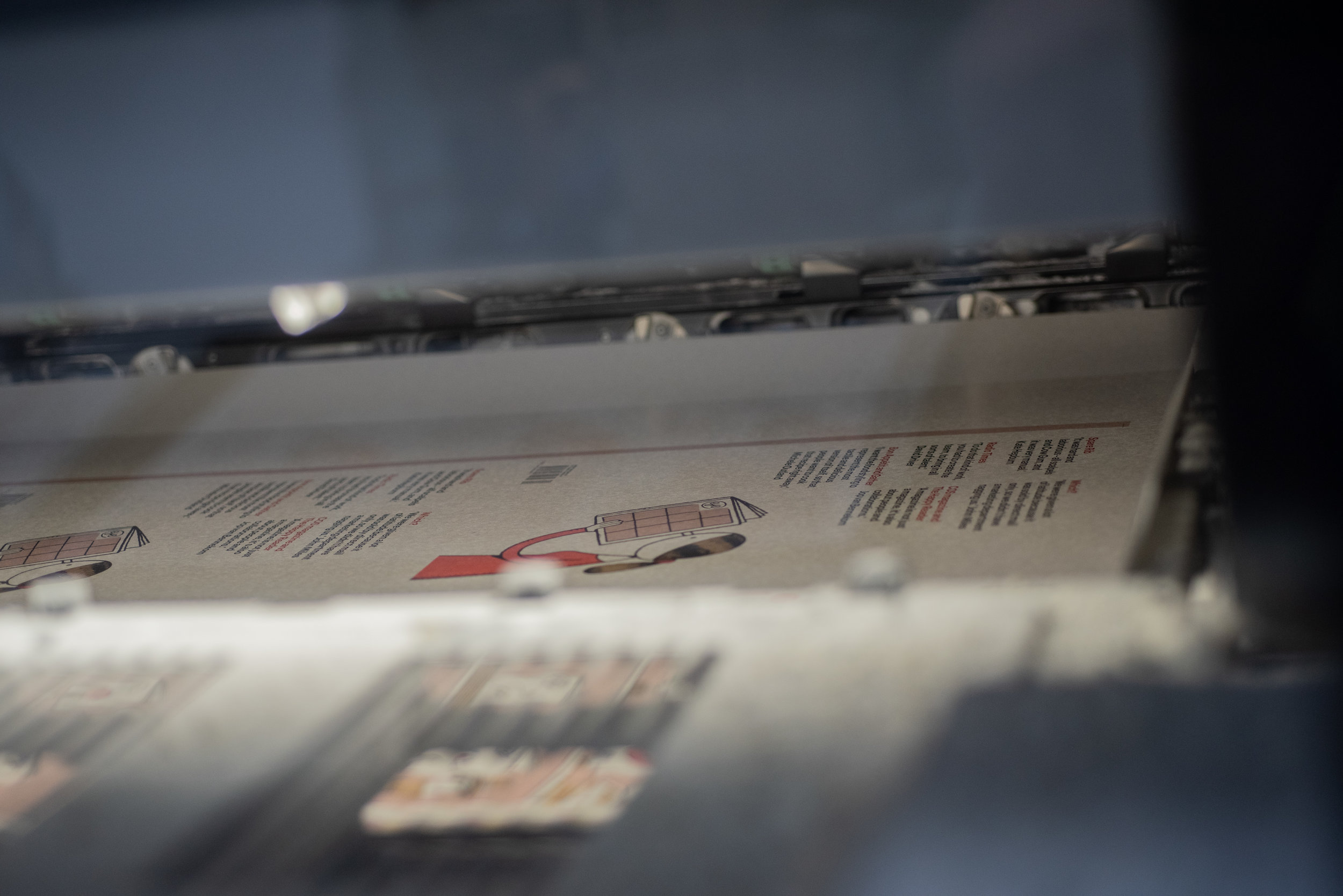
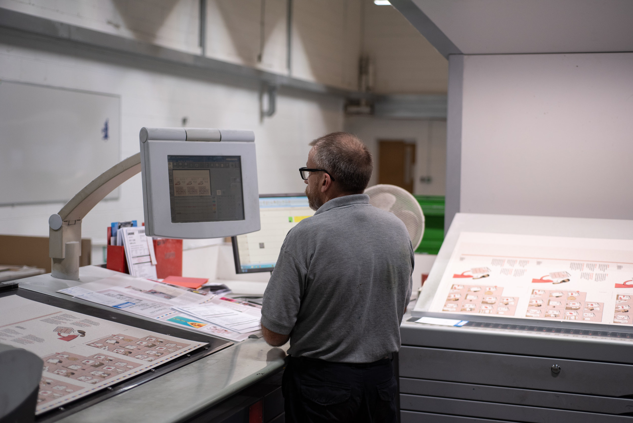
JLW: That’s difficult to answer. I relish the whole business of tracking down the best writer for each piece, commissioning, editing, cutting, expanding and writing extra copy such as captions and display. But the whole process can drive you crazy when there’s not enough time, or people don’t get back to you, or a piece isn’t quite what you expected, or things go wrong. So my favourite parts are probably right at the beginning, when it’s just a list; near at the end, when the finished files go off to print; and right at the end, when the bound copies (which have all been supervised on press by Simon) arrive at the studio.
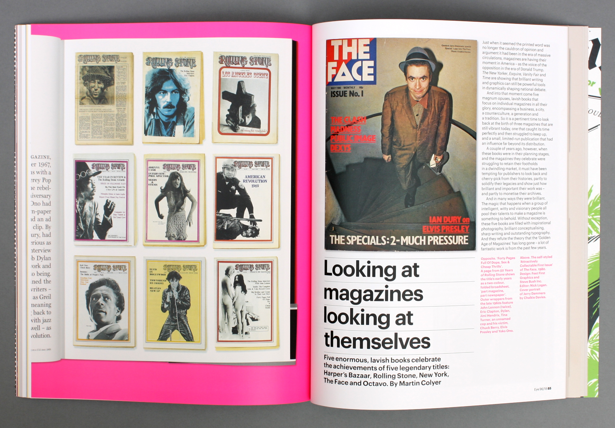
SPD: Were there any magazines that you wished you could have included but didn't have space for?
JLW: There were several mags, both contemporary and historical, that didn’t make the final mix, in one case because the writer (who had been working on this for years) just ran out of time. Maybe I should have chased them harder. There were a few stories that we felt needed more pages than we could spare for the specials, so they may resurface in a later, non-special issue…in some cases, the ‘magazine’ angle was less important.
SPD: What magazines are you currently reading?
JLW: I devour The New Yorker for its editing, and breadth of subject matter and its superb writers and I have long enjoyed Sight & Sound for its steadfast coverage of cinema. I enjoy the Guardian’s new Review. Electronic Music is a fun read for those of us interested in computer-driven pop and I like the global music magazine Songlines, too.
When possible, I like to see all the international graphic design mags, such as IDEA and Progetto Grafico and Experimenta. And we’ve just received the new issue of Gym Class, which is all about…magazines!
SE: I like magazine design that has character…there’s lots of magazines where a full page image faces some centered headline type. Unless it’s wonderfully executed, I’m afraid that’s a bit too neutral for me.

SPD: What's next for Eye magazine?
JLW: The next issue, Eye 98, is a type special, followed by a ‘non-special issue’, Eye 99.
We’re also continuing to hold our Type Tuesday Events at St Bride Library. And we’re looking forward to doing more screenings of our short film 94 [8000 One-Offs], , either on its own or as part of an Eye Film Night (which we’ve held in Leeds and London).
Then we have Eye 100, which will be a very different kind of celebratory special issue…unique, unmissable, etc. etc.