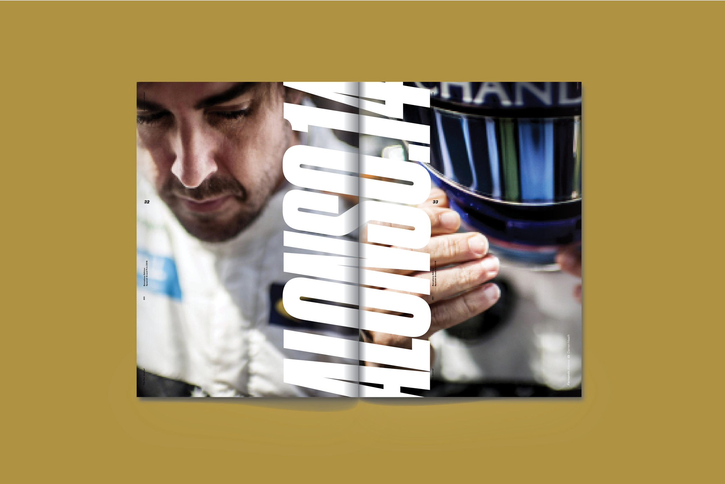
The Rev Journal 001: Barcelona
/
This summer, The Rev Journal debuted a brand new redesign and business model to go along with the 2018 Grand Prix Season of Formula 1. They kicked off their relaunch by focusing on the city of Barcelona. We chatted with a few key members of The Rev Journal team to give us an in-depth look into the relaunch, how their first issue of the season came together, and what's next for the journal. Thanks to Fredrik Brodén, Tom Brown, Emily Chavous, Magnus Greaves, and Neil Jamieson for walking us through this issue.
SPD: For someone who isn’t familiar, how would you describe The Rev Journal in one sentence?
Tom Brown, Content and Branding Creative Director:The Rev Journal is a large format collection of curated travel memories representing the three day weekend of a Formula 1 race.
Fredrik Brodén, Chief Photographer: A fresh new perspective connecting lifestyle and F1 with a unique point of view.
Emily Chavous, Lifestyle Editor & Social Media Strategist: Rev is a concept journal that deep-dives into the global culture and general nostalgia of Formula 1 with eight editions in a season that each include a limited-run art print and exclusive Rev merch (Barcelona comes with a Fernando Alonso art print by Neil Jamieson and an embroidered Rev Journal racing patch).
Magnus Greaves, Publisher/Editor-In-Chief: Rev explores the culture of Formula 1- the people, cities and traditions- through a collection of journals, art prints and merchandise.
SPD: Tell us how The Rev Journal works.
MG: Formula 1 is a truly global sport; each season puts on 21 races in 21 different countries. Our goal with Rev is to explore the culture of F1 through the lens of the international cities that host these events. So while each edition of Rev offers insight into the sport, the overall picture becomes even more clear when you put all eight editions together, seeing the themes that emerge as well as the differences between the locations. For this reason The Rev Journal is only available as a collection, made up of eight packages, each one containing a journal, a limited-edition art print, and a piece of Rev-branded merchandise.
SPD: Some of you recently got back from a whirlwind trip capturing and creating content for upcoming issues of The Rev Journal. Where did you go and can you tell us more about the trip?
TB: Award-winning photographer Fredrik Broden and I were in Europe for 16 days earlier this year to create content for the first three editions of the Journal as well as imagery for our social media efforts. Our first stop was Barcelona, then we moved on to southern France and Monaco for a few fast and furious days covering the Cote d’Azur from Nice to Menton. The last leg of the trip was spent in Budapest. Our remote producer, Helen Archer at Miss Archer Ltd. is a key member on our travels providing us with on-the-ground producers and fixers in each city who allow us to quickly get our bearings in the city and to provide translation in some cases in the trickier arrangement details of what we are photographing.
FB: We bundled together Barcelona, Monaco and Budapest. Shot it in that order. Our off location and on location producers worked with the editorial dept to have our content and shot list ready once we got there. Sometimes we stumble on something on the spot that decide right there that we explore, it can just be a side bar or occasionally become a big story as with Maison Noir at Lull boutique in the upcoming Monaco issue. We came across it and it was a great fit for Rev, chic local clothing design and owners with a passion for the race... Long shooting days but very exciting project to be a part of.
SPD: While you weren’t on the trip, as the publication’s lifestyle editor, how did you help prepare for the trip from an editorial point of view?
EC: I’m a wanderer at heart and notoriously overplan vacations, which means we’ve always got an itinerary chock full of sights. I wanted to offer Tom and Fredrik the same full schedule for their content-gathering trip in Barcelona (plus Monaco and Budapest, future issues they photographed on the same trip). Editorially, I looked for locations to feature that would be worth the visit while in Barcelona for the race weekend, from a karting track near the circuit to a great little ham shop in the city center.
SPD: Why did you decide to pick Barcelona as the focus of the first issue in the 2018 Grand Prix Season? How did you choose what cities to cover for the rest of the season (Monaco, Budapest, Singapore, Suzuka, Austin, Mexico City, and Abu Dhabi)?
MG: We selected these eight cities as they each offer a unique F1 Grand Prix experience and therefore a different angle to examine the sport’s culture and traditions. Some of these cities are longstanding locations while others are newer additions to the F1 schedule. But they all have an exciting mix of racing history and regional lifestyle specialities offering visiting F1 fans an amazing race weekend experience. Fans will get a great picture of F1 through these eight cities.
SPD: Did you have a particular vision that you wanted to achieve prior to arriving in Barcelona?
FB: Our goal and conversation about the approach to Rev was to try to be less structured and explore more than usual. The magazine is very visual both graphic design wise and photographically. So we wanted each page to be more impactful than a usual editorial of a city. So that was always something in the back of my mind.
SPD: When you first started brainstorming the Barcelona issue, what ideas came to mind? Were there any ideas you loved that didn’t make the final cut?
MG: Everyone on the team has a different level of experience with watching/attending Formula 1 Grand Prix and also with the city of Barcelona itself (whether traveling there for F1 or for other reasons). So this allows us to come at it from many different angles. Barcelona is one of the world’s great cities and the circuit has been a staple of the F1 schedule for some time- so we look at both the history of the event and the experience of someone visiting today. What’s great about the collection is that someone will get a particular view of the Barcelona F1 experience after they read the issue, but that view might change somewhat once they’ve seen Barcelona in the context of the other seven F1 race weekend experiences in the collection. Our goal is to provide context the F1 fan will not get anywhere else.
EC: Absolutely love the turnout. There were certainly a few spots that didn’t make the cut, but that’s the thing with editing ... once you chop things down, it’s hard to imagine how adding those pieces back into the content lineup could make it better. On the flip side, we added in a mention of the Primero Primera Hotel & Club, owned by the Pérez-Sala family, which has been part of the Formula 1 world since the 1950s — I discovered the hotel after the guys had returned from Barcelona, so there was no opportunity to shoot there ... but there’s always next year!
FB: There’s always photos that don’t make it. Because of page count restraints. I think the overarching idea was to think differently in all aspects and try new things. We wanted to throw a lot of things out the window and end up with new angles and solutions.
TB: Our Editor-in-Chief Magnus Greaves and Lifestyle Editor Emily Chavous provide Fredrik and I with a full TOC of ideas and contacts to explore when we hit the ground in each city. Fredrik and I spend most of time observing and looking for ways for topics to either dove-tail into the race weekend experience or to purposefully contrast and provide a surprising switch up. Fredrik is a master at solving any lighting situation we come across but its his stylistic and compositional eye that makes his work so great. We have worked to gather for over 20 years on various projects and publications so we know each other very well and how to push each other’s work. These trips are exhausting and we are constantly on the move but we love it, especially going off script and finding real-time stories in each city that provide authentic moments in the Journal. But the content trips are only part of our image gathering procedure—our F1 story editor Paul Weaver gets us full access into team garages and behind-the-scenes angles from within the sport which is extremely vital for our unique approach
A great story that we came across too late to follow up on involved a family outside of Barcelona that we met (by chance during a shoot set up by our on-the-ground producer Joanna Burgues) who happen to own the first Grand Prix circuit that was used in Southern Spain. The family patriarch bought the race circuit for his wife as a wedding gift. We discovered this gem of a story on our last day of our trip, so you can imagine how disappointed I was to leave before we had a chance to photograph the location and explore it closely. We will return to shoot the story on our next European swing.
SPD: Tell us about shooting in Barcelona.
FB: It was pretty intense. Long days. Very thrilling and fast paced. We had a great local producer, Joanna Burgues, who was able to steer us onto things that we normally would never have found. Local gems and interesting locations. Tom and I were there together so his art direction on the spot was very valuable. He always pushes me and encourages me to think differently. We were also able to pace and think about the content at night. Talk about what we can do the next day to help the flow, etc. A very ideal way to work on a project like this.
SPD: How many photos did you take and what was the process of editing down the photos?
FB: I don’t shoot that many frames. Maybe it’s from the old shooting film days… but editing is usually pretty easy. I usually know which frame is going to work before I look at the files. Also being in a hotel with Tom was a great process as we reviewed the day and pretty much knew what was going in the magazine from that day. So at the end of the trip we knew roughly how the magazine was looking which is really nice.
SPD: Were there any challenges during your shoots?
FB: Not really. Surprisingly smooth and relaxed. The only thing that comes to mind which was a minor kink was a motorcycle part accessories place that we couldn’t get in touch with and ended up driving to a place that must have been closed down. But that was a minor kink and not a big part of what we needed anyways. Other than that and Tom’s luggage being delayed it was a really great week.
SPD: How was your design influenced by Barcelona?
TB: Each city we travel to poses the challenge of absorbing certain sensations in order to reflect them in the imagery and ultimately on page. Barcelona, to me has a colour palette to it that I find connects me to the place. I love the golden, tobacco-like tone of the light there which I also see in the architecture. It all has a dusty, exotic feel to me.
SPD: What’s your design process like?
TB: In an effort to keep the design spontaneous and up tempo I try to design and edit each issue as fast as I can. It typically takes me a day to put the entire photo edit together and then once the rhythm and pace is established I then go in deeper to refine and create specific treatments. I print the entire 64 page journal out full size and arrange it all on the floor of my studio to live with it for a day or so.
The process of doing this all as fast as possible is an old trick that David Armario and I used to do when we were at Men’s Journal together. Back then, David and I would push our page design and typography explorations by sitting at one screen and sharing the mouse in timed intervals (30 seconds, one minute etc.) so that we did not allow our thinking to be predetermined and repetitive. Its a process that I still use to move my thinking to unknown territory. Publication design is probably one of the only arenas where you can get away with this kind of procedure because of the ever present spirit of change magazines are expected to have. In Rev’s case the design direction is purposely built on single temporary moments on page and this process helps to create that.
SPD: The relaunch of The Rev Journal with the Barcelona edition features a redesign of the publication. Why did you decide to undertake a redesign and what were the major changes?
TB: Yes. A completely new mission for Rev required a top to bottom re-imagining. We had explored numerous ways in the past to bring the hardcore, authentic, fan closer to the sport and along the way learned a great deal. We decided in the end to proceed in a direction that allowed us to control what we showcase in a less formal format where each edition is a unique piece of a larger eight-part collection. This new model fits closely with our original vision which is to create the most engaging and eye-catching independent publication about the cultural charisma surrounding F1 racing.
Traditionally my studio would embark on a brand or publishing title’s redesign where consistency and thoughtful organization would be key—with generous amounts of white space and a limited and purposely reserved colour palette. But for The Rev Journal this was completely abandoned in order to create a fast-paced, singular experience on each spread, taking advantage of the large format to deliver full bleed imagery and a lot of colour—we really pour on the ink. The uninterrupted barrage of image laden pages is likened to a film strip or the flashing by of a particular life experience…quick, momentary, and abrupt—much like the attributes of an F1 race which is exhilarating to take in. Because the majority of F1 fans get their grand prix weekend fix via a controlled television feed, and typically sitting alone at that. We wanted to make a lasting, collectible print vehicle specifically designed for hardcore fans showcasing a curated 360 degree experience of the jetset and exotic world of the F1 race weekend—to bring them closer to the sport we love.
The redesign employs big photography, big typography and bold colours. We are very passionate about the sport and are determined to express a unique point-of-view. The reading is quick and purposely direct. Each issue’s design and assembly is approached singularly in reaction to the city, the images and the content categories covered. We do not have any navigation, regular columns, departments or a feature well…and best of all no advertising to disrupt the full on engagement with the reader. We made this decision as we discussed the new mission of The Rev Journal and likened it to the days when movie theatres once upon a time were the one place we could all escape from advertising and sponsored messages. We want our readers to feel that they are in a purist's environment, nothing but experiential F1 content and race weekend related juxtapositions.

SPD: Since you redesigned the website, how did you coordinate with Tom as he redesigned the publication?
EC: In redesigning the site, our focus was on fonts, content display, and sharp imagery, much like the overhaul of the journal. Tom approached the journal with a cinematic design style — fast-paced content with big, splashy design moments, much like an F1 race. We attempted something similar on the site with a warp-speed banner image on the homepage and bite-sized chunks of text to maintain the pace.

SPD: What’s the collaboration process like between The Rev Journal team?
EC: We are a ragtag bunch of F1-loving folks, and everyone brings great ideas to the table. Because our team is dispersed around the globe, there are a lot of emails and WhatsApp conversations going back and forth ... Contrary to most publications, Rev does things backwards — we design pages first (this, with plenty of discussion about it, determines what content will be cut), then we write.
SPD: Tell us about the limited-edition print that comes with the issue when you subscribe. How do you choose the artist?
TB: Each edition of The Rev Journal comes with a limited-edition print created by an artist or (eventually) a photographer who’s work we love that brings another perspective to the sport. For the Barcelona edition we tapped Neil Jamieson’s the_sporting_press to create a dynamic take on one of our Barcelona driver personality profiles Fernando Alonso. For the Monaco edition we have a profile on the bad boy Ferrari pilot Eddie Irvine from the 1990’s era of F1 illustrated by Jimmy Turrell. Both pieces are world class and add another dimension to the package. I choose the artists and art print creators by their ability to create F1 related imagery in a completely unique and untraditional way.
SPD: How did you get involved with The Rev Journal?
Neil Jamieson, The Sporting Press: Tom Brown has been one of my design heroes for as long as I can remember! (His Project LeTour has basically informed everything i've done since 2008!). He was one of the first guys I reached out to when I started my @the_sporting_press insta handle...I knew we both liked cycling, fast cars and football (the other one!) so figured he'd get a kick out of it! I was delighted when he asked if I'd be up for doing a poster for his "Barcelona" issue of Rev.
SPD: Can you walk us through the process of designing this limited-edition print?
NJ: The process was awesome. After a few messages on insta about our shared passion for F1 of the 70s and 80s (and the Uh. mayzin' documentary "The Quick and The Dead") The Rev crew basically trusted me not to screw it up and let me at it!
We focused on two time F1 champ and Spanish legend Fernando Alonso. Tom was really into the more simple figurative stuff I'd been featuring on the feed so I took it from there.
SPD: Tell us about the collaboration process with The Rev Journal team.
NJ: I did a few options that were super simple...focusing on the four stripes of the Catalan flag and some famous shots of Zo goin nuts. They were kinda working but we wanted to be a bit more direct so we tried some language...and bosh. Really happy with how it came out...sooooo many textures and details and bits of noise. All adds to that vintage F-1 spirit of being covered in oil, sweat and grime while fearlessly hauling ass at 330km/h in the cockpit of a 733kg rocketship.
SPD: How did you decide on the cover?
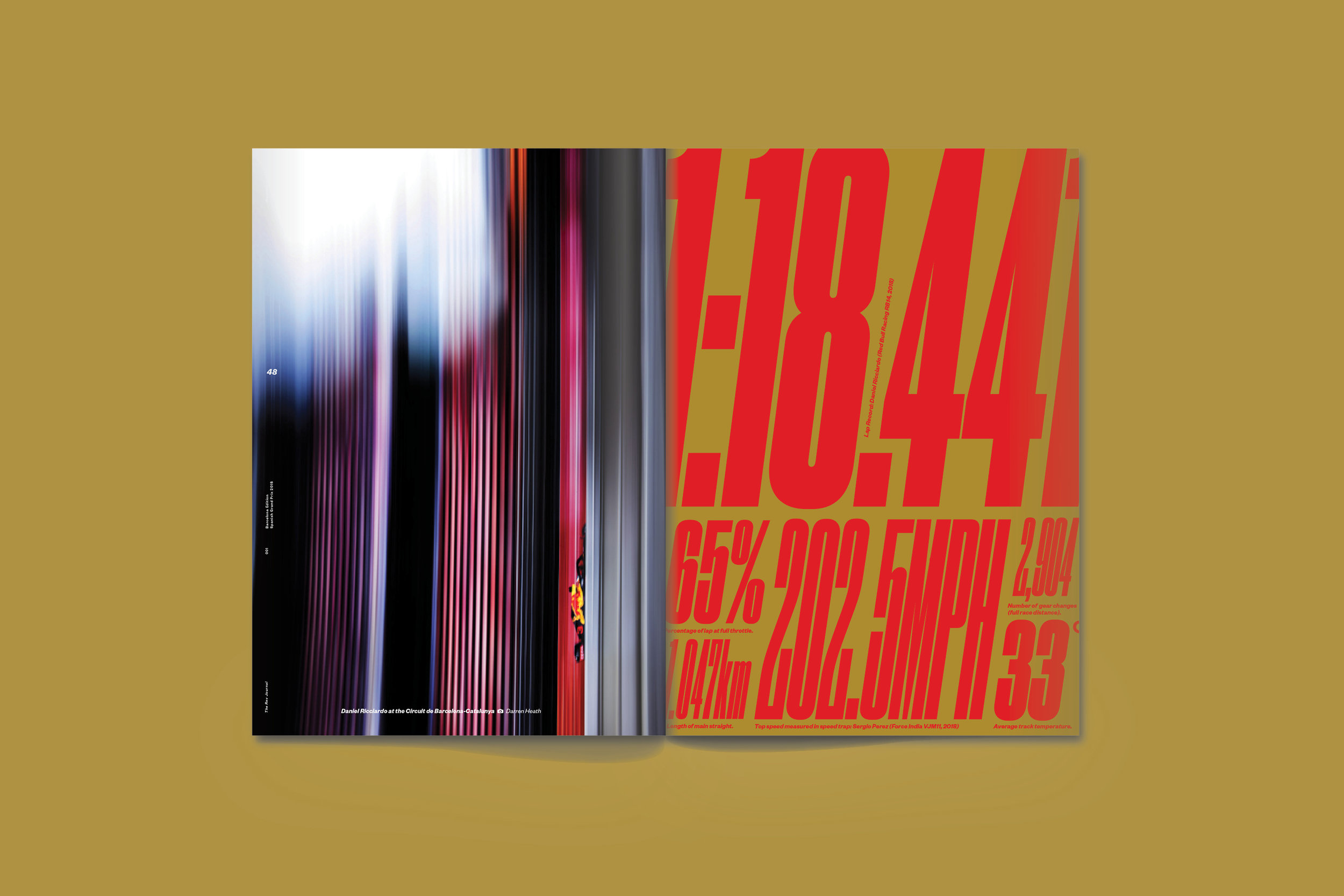
TB: All of The Rev Journal covers are designed with consideration to how they fit into the eight-piece collection. The covers are relatively spartan apart from the large Rev masthead to allow the impact of photography to take centre stage and to maximize the individuality of the editions over the roll out of the full collection. Famed F1 and sports photographer, Darren Heath shoots all of our covers or provides a particular image from his vast archive. Attending every race on the F1 calendar to provide content for The Rev Journal. Before the season began we provided Darren with an overview of subjects that we wanted him to begin focussing on. Because we publish a select number of the Journals specific to certain destinations, the process works ideally for Darren who can plan how he will create the images we need over the course of a number of races leading up to our production deadlines. Darren’s work is stunning, and he is constantly looking to push how his lens sees the sport—which is very difficult task when the subject is constantly at speed and only provides momentary opportunities of access. He’s a master of making art out of virtually nothing. But more importantly Darren was chosen because of his experimental drive which is right in line with our Rev’s point of view.
SPD: What’s your favorite photo or story from this issue?
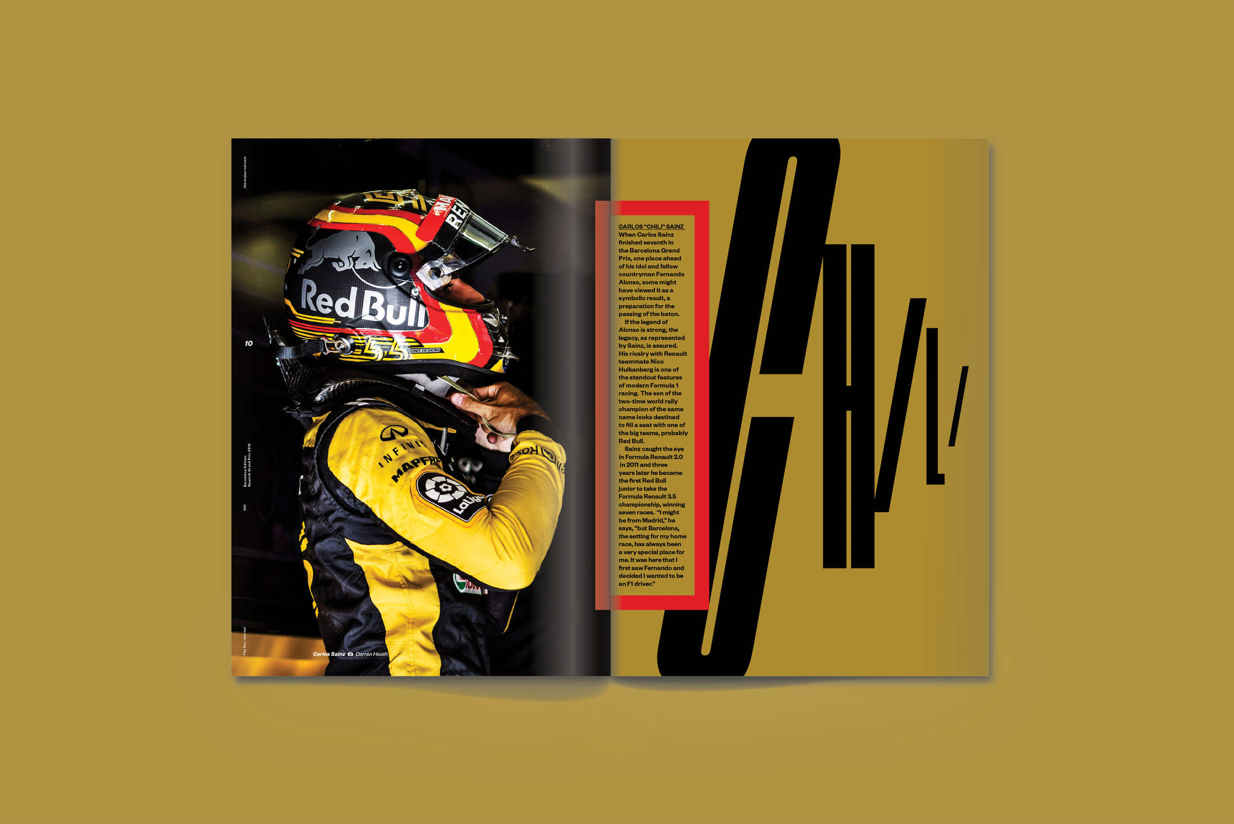
EC: I love the second spread with the Carlos Sainz quote. We wanted to illustrate Sainz’ good-luck charm in an unexpected way, and the dashboard statue the guys found on the ground in Barcelona was the perfect fit. You get the sense of driving into the city with the street blurred out behind it, and the juxtaposition with the sparks flying off the Renault is pretty dynamite. Also love Paul Weaver’s story on Jack Aitken.
MG: I love the spreads that highlight the juxtaposition of racing and lifestyle that you encounter on a Formula 1 race weekend, such as the spark plug montage against the rooftop pools which are a great feature of some hotels in Barcelona.
FB: Probably the go-carting track. It was very rich in both colors, content and history and tie in with F1.
TB: Oh thats a tough question to answer. I will say this: Rev is a collection of purpose-built journals, each limited to 64 pages to allow me to create the right amount of “movie-like” coverage of each city we visit and the racing culture within and that means a great deal of imagery from Fredrik and Darren is collected and has to be experimented with and edited. This is probably the most difficult luxury I have, too much good stuff and trying to decide what stays in and what sadly has to fall out. But I will admit, we have some incredible portraits coming up as the collection unfolds that I’m very excited to see in print.
SPD: How has the magazine transformed since you first founded it a few years ago?
MG: It’s changed quite a bit on a few levels. Editorially, we started out with a more detailed look at the local lifestyle options geared towards people attending the race. That was tied to our distribution model of giving the journal away for free in the host city leading up to, and during, the Grand Prix weekend. We had a fairly typical business model to support this, meaning we sold advertising. However, realizing 99% of F1 fans aren’t at the race lead us to change our approach. Now we are taking a wider look at the culture of F1 and its cities, people and traditions, so it’s more interesting to a wider range of Formula 1 fan, plus you don’t have to be in the host city during the race to get the most out of it. In fact, if you’re not there, our goal is to bring the experience to you, and perhaps you’ll get turned on and decide to go next year. This approach allowed us to add more to the package so we introduced limited edition art prints and merchandise inspired by the golden years of the sport. Our distribution model is now to send Rev directly to fans around the world. This has also allowed us to completely change our business model by no longer selling ads and focusing purely on creating the most exciting content and collateral items that people will be happy to pay for. And that makes us happy too.


SPD: What’s next for The Rev Journal?
EC: Our third edition, Budapest, is coming up quick! Then it’s Singapore, Suzuka, Austin, Mexico City, and Abu Dhabi.
MG: This first edition has already generated an enthusiastic response from a wide range of potential collaborators which is very exciting. We have our general approach set for the season but adding in new voices and perspectives can add so much to the collection. Having a physical package that goes out to subscribers really helps as there’s room to add other items so that will be fully explored. We are developing a pop-up concept for a few of the Grand Prix weekends which will allow us to collaborate with local designers and entrepreneurs and meet with like-minded F1 fans in town for the race. Next season can go in so many different directions, from exploring eight new Grand Prix destinations in the same way, to deciding on a completely new format to capture the culture of Formula 1. It’s a very exciting time to be the only media outlet taking this approach to such a dynamic sport!
FB: Next is Japan and Singapore. It should be very exciting and different from each other and the previous issues. In Singapore it’s the 10 year anniversary of F1’s original night race. Shortly after that we go home to US to shoot Austin and travel on to Mexico City. Ending the year in Abu Dhabi. Should be a great variety.
TB: Currently we are preparing for our next content creation trip overseas. This time we are heading to Singapore where Fredrik and I photographed the inaugural race in 2008 and then on to Japan where we will be showcasing Honda’s historic participation in Formula 1.
Buy The Rev Journal here: www.therevjournal.com/shop
CREDITS
Content and Branding Creative Director: Tom Brown
Designer and Print Production: Jenn Roberts
Chief Photographer: Fredrik Brodén
Race Weekend Photographer: Darren Heath
Executive Photography Producer: Helen Archer (Miss Archer)
Lifestyle Editor and Social Media Strategist: Emily Chavous
Formula1 and Technical Editor: Paul Weaver
Publisher/Editor-in-Chief: Magnus Greaves


