Nichole Washington, Visual Artist

05c5f210-3576-0134-0aea-0629623c6db9.jpg

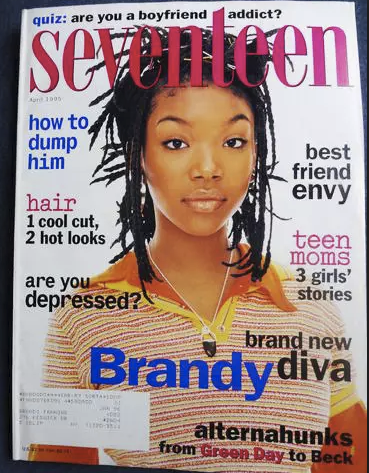
Nichole Washington: As a young girl I loved the experience of reading a magazine from start to finish in one sitting. I would wait for the perfect time to lay out on my bed, turn on my radio and have a solo chill session. I always started at the beginning and gave my attention to every page, even the ads. Magazines like Seventeen were really great because there was loads of entertaining info packed in each issue. I could read a personal interview on the cover star, check out the latest fashion trends, and take a fun quiz at the end!

Screen Shot 2018-02-19 at 9.37.50 PM.png
Screen Shot 2018-02-19 at 9.38.42 PM.png

SPD: What year?
NW: 
Mid to late 90s

SPD: What were you up to?
NW:
I was a young girl day dreaming of leaving Minnesota to finally live a cool and confident life.

SPD: What magazine?
NW: 
Seventeen

Screen Shot 2018-02-19 at 9.50.36 PM.png
0e1929f72659d9b549c432e5455e817c--claire-danes-fashion-magazines.jpg
54ee70fc7e114_-_sev-january-2004-de.jpg

SPD: What was it that so enthralled you?
NW: 
I loved how fun and casual the magazine was and there would always be a cool pop star on the cover. The inside layout had a cut and paste feel and there were a lot of exciting things to look at on just one page. Every element was a part of the design from brightly colored text to the cut out images. 

SPD: Do you know now who the creatives were?
NW: 
No, not at the time. 

7219146460_3be937b938_c.jpg
26.jpg

SPD: How does that inform your creative now?
NW: 
Having obsessively flipped through pages of Seventeen Magazine for at least 10 years of my life has definitely influenced my creative aesthetic. My color palettes is usually very bright and I am more interested in the unique expression of a design rather than it being technically perfect. It is most important that my spirit and identity are present in my work. 

www.nicholewashington.com

Matthew Salacuse, Photographer

 
IMG_4250.jpg
 

Matthew Salacuse: The very first subscription I had was when I was 11 years old and it was to JET Magazine.  It may have looked a bit strange for a little white boy thumbing through Chaka Khan stories on his Brooklyn stoop in the 1980s, but to me it made the most sense.  This is what I was into and I wanted to know more about it on a weekly basis.  There was a list in the back called “JET’s Top 20 Singles” where I would get to see all the music that I heard on the radio but was being left off the Rolling Stone Top 40 chart and totally ignored by MTV video rotation.  (Do you remember seeing THIS on MTV? I don’t, but I learned about it in JET)  For the advertisers, I was a swing and a miss, but for finding out Lionel Richie’s tour was rewarding students with good grades, it was a home run.

janet jackson jet magazine march 1987 1.jpg
IMG_4253.jpg

SPD: What year?
BO: 
1984-1987

SPD: What were you up to?
BO: 
Breakdancing in the lunch room. Homework. 

SPD: What magazine?
BO: 
JET

jet.jpg
Jet copy.jpg

SPD: What was it that so enthralled you?
BO: 
Growing up in Brooklyn, I was exposed to a lot of black culture in the streets and from friends but it was not well represented in the media.  JET literally had a page called TELEVISION that alerted you to which shows black actors would be appearing on.  

IMG_4251.jpg

SPD: Do you know now who the creatives were?
BO: 
I had to go buy an old issue to dig this up because back then I had no concept that people made magazines:

Art Director: Norman L. Hunter; Staff Photographers: Vandell Cobb, James Mitchell, Maurice Sorrell, Fred Watkins

SPD: How does that inform your creative now?
BO:
When I came out of college I immediately gravitated to photographing the underrepresented side of culture; whether it be small biker rallies in Iowa or rappers in the Queens Bridge Housing Projects. By the mid 2000s I had made quite a strong reputation in the hip hop world by shooting for XXL, Vibe, The FADER, Blaze, King Mag, Rides and others.  I am still waiting for that call JET.

www.salacuse.com/

IMG_4255.jpg

Abbey Kuster-Prokell, Creative Director at Martha Stewart Living

 
RealSimple_cover.jpg
 

SPD: What year?
Abbey Kuster-Prokell: April 2000

SPD: What magazine?
AKP: 
The launch of Real Simple Magazine

SPD: What were you up to?
AKP: Truth: I never set out to be an editorial designer. I moved to NYC in 1999, and I was a young designer working for Louise Fili LTD. I was spending my days (and some nights) drawing typefaces from scratch out of vintage type books where I might only have a few characters for the entire alphabet. I was printing everything on 8.5 x 11, because that is what we had and comping it together with a waxer. Oh, how I loved the smell of that waxer. I was part of 2-person team at her studio, which was more like an apprenticeship then a job. This job, which I loved dearly, could not have been further from the glossy, glitzy world of editorial. Hence, why I didn’t know much about it. All of this changed, however, when I picked up the first issue of Real Simple magazine in the spring of 2000 and I was awestruck.

SPD: What was it that so enthralled you?
AKP: 
I loved the tactile quality of the matte paper and square-ish format. To me, it was a complete departure from other magazines on the newsstand, it felt more like an art book than a magazine. I fell in love with the rich, sophisticated photography. Martyn Thompson shot the entire issue, and at the time, he was a new name to me. It was like dipping my toe into a world that I had no idea ever existed. I suddenly became aware of incredibly talented photographers and the magical role of prop and food stylists.  In addition to the stunning photography, I loved the gratuitous amount of white space, the wide margins and clean, modernist design. The typography, while I would want it to be more refined today, used a slab and a san-serif, which was also a departure from what I was used to seeing traditionally on the newsstand.

SPD: Do you know now who the creatives were?
AKP:
Robert Valentine from The Valentine Group designed the launch issue and Martyn Thompson was the sole photographer for the issue.

SPD: How does that inform your creative now?
AKP:
 Clean, graphic and modern have always been guiding principles in my work. I tend to gravitate towards things that have a refined sensibility to them and I’m a sucker for a strong grid. I always try to include negative space in my work, for it allows you to focus your attention on the actual design.

Brad Ogbonna, Photographer

 
cover.jpg
 

Brad Ogbonna: I remember buying my first NYLON Magazine at the Walgreens in River Falls, Wisconsin in 2007 — my sophomore year of college. River Falls was a fun little college town nestled in a rural area outside of the Twin Cities. I really liked it there, but at the same time I felt so detached from my surroundings and had my eyes set on things happening in bigger cities like NYC, London, Los Angeles, etc...Especially the pockets of counter-culture starting to emerge. 

In my free time I would check out blogs from people in bigger cities as an escape and for inspiration. There was this great one I particularly enjoyed called "The Skullset" by this photographer Jack Siegel. I was always drawn to the tangible, so every month I would run to Walgreens to peruse their magazine aisle, and flip through everything they had to offer. I remember coming across a magazine called NYLON that I hadn't noticed before. The artwork on the cover stood out and felt so much different than the magazines next to it like Elle, Glamour, Vogue, GQ, and I even recognized Cory Kennedy on the cover from the Skullset blog. I was so excited that I immediately spent $5 on it, which may not seem like a significant amount, but at the time I was so broke I was literally splitting $5 footlongs with my roommate. 

The articles were generally geared to young women, but I was really drawn to the aesthetic and the imagery. The photos looked like the ones I'd seen on my favorite blogs and they covered a lot of unique people from cities all around the world. I don't remember who shot the cover, but I still have this copy and almost each one thereafter up until 2009, stored at my mom's house in Minnesota. 

I feel like my own work isn't that much different than a lot of the stuff I loved back then. Similar aesthetic but hopefully with my own twist. I try to focus more on the people that shape my world and what it looks like today. 

www.bradogbonna.com

Anais Maroon, Photo Director at The Future of Everything

Diana Ross-Vintage Photo.jpg

SPD: What year?
Anais Maroon: 
As long as I can remember. But maybe around 1988 I started becoming aware and absorbing it, all through the time I left home. 

SPD: What were you up to?
AM: 
Being a little girl, fascinated by all my mother's things, turning into a precocious teen. 

SPD: What magazine?
AM:
Vanity Fair

a8e466b85b7f49279fb8d4c3bde0129f.jpg
herb-kd.jpg

SPD: What was it that so enthralled you?
AM:
My mom had a subscription to Vanity Fair from before I can remember. Issues were a staple in the house. One or more was always either next to her bed, in the living room, or out on the deck. I was fascinated by the beautiful people, the glamour, the shocking pictures, and I was also introduced to timeless photography like Herb Ritts, Helmut Newton & Annie Leibovitz. I think I learned what being controversial meant from Vanity Fair. The exposure opened the door to an obsessive interest in wild, humorous, unrestrained beauty within all sorts of magazines. I pasted a rotating assortment of tear sheets all over my bedroom walls and discovered photography as an amazing and delicious way to push conversations and boundaries forward. I graduated to other magazines by high school, but the Vanity Fair's were always in the house, always on my mother's lap, always making an impact on my young, formidable, creative brain. 

e542078f930dd2d0ce3062eed43c2550.jpg

SPD: Do you know now who the creatives were?
AM: 
I do now from investigating later in life: Ruth Ansel, David Friend, Charles Churchward.

demimoore_vanityfair_agostinoarts.jpg
image-2.jpg
image-3.jpg

SPD: How does that inform your creative now?
AM: 
Vanity Fair tried to push the boundaries, while combining timeless beauty and humor. This was something I was exposed to through so much of my young life, which occupies such a sentimental place in my memories. I'm always striving to create work that is beautiful, dynamic, thoughtful and timeless *which is the extremely difficult trick*.

www.anaismaroon.com

Jackie-Collins-Joan-Collins-disco-London-Sheen-Resistance.jpg

Mike Schnaidt, Creative Director

 
656- Summer Music Preview.jpg
 

Mike Schnaidt: I fell in love at my dentist’s office. No, not with Dr. Bernstein, but rather with a copy of Entertainment Weekly.

It was 2002, and I was pursuing a B.F.A. in graphic design at C.W. Post. My parents were grateful that I even went to college, as I was a bit thick-headed in high school. But, by studying design, I was able to knock down a few walls in my brain. When I discovered Entertainment Weekly, it shed light on which direction to go.

The treasure I found at Dr. Bernstein’s office was the Summer Music Preview issue. David Bowie and Moby were on the cover. The photography pinched your cheeks, and the design smacked you in the face. The gestalt: a magazine cover that felt poster-size. Open it up, and every square pica was designed to maximum volume. As a fanboy of comics, music, and movies, I understood why. EW’s design had to express the content with the same geeky excitement as readers would consume it. Once I came to that conclusion, I came to understand a larger lesson in graphic design: form follows function.

Soon after, I ordered a subscription for my Weekly jolt of design inspiration.

Schnaidt_FirstLove1.jpg
Schnaidt_FirstLove2.jpg

As a design student, I worked at a glacial pace. It took me months to get a single magazine opener right. Therefore, I was perplexed at how the EW art department could produce a magazine at the rapid fire pace of a weekly. But what seemed like an impossible feat were EW’s packages. For each Fall TV preview, Summer Movie Preview, and IT List, the design team conjured up an intricate structure that somehow spanned across 50+ pages.

By studying these packages, I came to understand the art of larger design systems. As a whole, these magazine packages were beautiful. But like a Lego block, the ingenuity was in the design of the modular– the core design pieces of the package had to be simple enough in order to build a seemingly complex system.

Throughout college and my first job at Network Computing magazine (long gone), I made many attempts to mimic whatever design nuances I learned from EW. But one night, while up late doing work for grad school, I saw a listing for a designer position at my favorite mag. I applied to Entertainment Weekly, although I was fairly confident I wouldn’t get a call back.

Well I did.

I was totally unprepared for an interview that week, but of course took it anyway. So, I pulled an all-nighter, where I cut and mounted an oversized black print portfolio (remember those?) to perfection. I’m pretty sure I was high off 3M spray adhesive during my interview.

The rest is history. I was hired by my design heroine, Geraldine Hessler, and was put through bootcamp. I learned how those packages were put together: teamwork from some of the most talented designers out there. Geraldine’s direction was tenacious, and I’m grateful I had the opportunity to learn from her, Brian Anstey, and Amid Capeci.

Today, I exercise what I was taught at the breakneck pace of a weekly. And it wasn’t until I finally became a Creative Director that I fully understood those lessons.

I wonder what magazines Dr. Bernstein has in his office today?

Schnaidt_FirstLove3.jpg
Schnaidt_FirstLove4.jpg

Sam Cannon, Artist and Director

 
1.jpg
 

Sam Cannon: As a kid, I would spend every summer with my grandma (Mema) in South Carolina. Mema was my favorite person in the entire world, and her hobbies included chain-smoking, vehemently denying her age, and watching Days of our Lives. By the time I was 8 I knew I wanted to be an artist, and Mema had offered a jump start by getting me addicted to coffee. I remember she had this huge stack of supermarket tabloids that I used to sift through when I was bored. 

SPD: What year?
SC:
1999

SPD: What were you up to?
SC
: Making unintelligible movies with my first compact VHS camera and getting on Mema’s “last nerve”. 

SPD: What magazine?
SC: 
Weekly World News

 
4.jpg
 

SPD: What was it that so enthralled you?
SC: 
I was a very imaginative kid, and I had this fear that when you grow up your imagination dies. I remember wondering what my life would be like when I was no longer able to play or make-believe and it caused me a lot of anxiety. I was old enough to understand that the stories in Weekly World News were fictional, but it didn’t offer any kind of disclaimer which I loved. It was silly and fantastic but most importantly it was made by and purchased by adults. It made me less scared of growing up. 

 
2.jpg
 

SPD: Do you know now who the creatives were?
SC:
At the time the editor was Eddie Clontz, a 10th grade dropout from North Carolina. WWN was only created to make use of the black-and-white presses after its sister publication, The National Enquirer began being printed in color. It started out as another source of celebrity gossip but began running stories about alien abductions, merfolk, and Elvis still being alive. It was the OG of fake news. 

 
3.jpg
 

SPD: How does that inform your creative now?
SC: 
It was the first time I realized images could be doctored, which had a big impact on the way I understood photography from a young age. I think a lot of people see a camera as a way to capture and reflect the world but for me it was just a way to gather the footage I needed to make something new.  

sam-cannon.com | instagram.com/samcannon

Chin Wang, Creative Director at ESPN.com and ESPN The Magazine

BigWig.jpg

SPD: What year?
Chin Wang: Around 1998 

SPD: What were you up to? 
CW: My first job was at a newspaper in Florida doing mundane production work (coloring in the Sunday comics!).

SPD: What magazine?
CW: 
Entertainment Weekly

FallPreview.JPG
ItList.JPG

SPD: What was it that so enthralled you?
CW: 
Back then, I found anything on nice paper glamorous and loved so many magazines, but especially Entertainment Weekly. Every page was a treat and I devoured everything – from the bold illustrations to the expressive typography. One particular layout I remember: Jennifer Aniston's disembodied head set up like a mannequin in a row of dummy heads, opposite the headline “Big Wig” on an illustrated can of hairspray. All the elements seemed to work so harmoniously together: the image, the design, the words. Even now, I wonder about the editor who wrote the headline and imagine that person saying, “Oh yeah? You've got an amazingly styled photo of a breakout star with a cult haircut? And you came up with a hairspray can design and want me to come up with a headline that’s six letters or less? (Dramatic pause) Yup, I got it! It’s … BIG WIG!” 

AlGreen.jpg

SPD: Do you know now who the creatives were?
CW: Robert Newman, then John Korpics. I am such a huge fan of both. Years later, when John offered me a job as the art director at ESPN the Magazine, I jumped at the chance. Working for him was equal parts inspiration and hilarity. When I expressed some trepidation about taking over the magazine after he got a bigger job at the company, he shooed me away and laughed, “Chin, get the f*ck out of my office!” It was exactly the kind of Tiger Boss vote of confidence I needed.

SPD: How does that inform your creative now?
CW: 
Well, I stopped doing text on a curved path years ago, but haven’t forgotten that all the things on a page have to speak to each other and that everyone on the masthead has a job to do. It’s nauseatingly sentimental, I know, but I really do believe creativity doesn’t happen without a good mix of people who champion one another.

Travolta.jpg