Abbey Kuster-Prokell, Creative Director at Martha Stewart Living
/
SPD: What year?
Abbey Kuster-Prokell: April 2000
SPD: What magazine?
AKP: The launch of Real Simple Magazine
SPD: What were you up to?
AKP: Truth: I never set out to be an editorial designer. I moved to NYC in 1999, and I was a young designer working for Louise Fili LTD. I was spending my days (and some nights) drawing typefaces from scratch out of vintage type books where I might only have a few characters for the entire alphabet. I was printing everything on 8.5 x 11, because that is what we had and comping it together with a waxer. Oh, how I loved the smell of that waxer. I was part of 2-person team at her studio, which was more like an apprenticeship then a job. This job, which I loved dearly, could not have been further from the glossy, glitzy world of editorial. Hence, why I didn’t know much about it. All of this changed, however, when I picked up the first issue of Real Simple magazine in the spring of 2000 and I was awestruck.
SPD: What was it that so enthralled you?
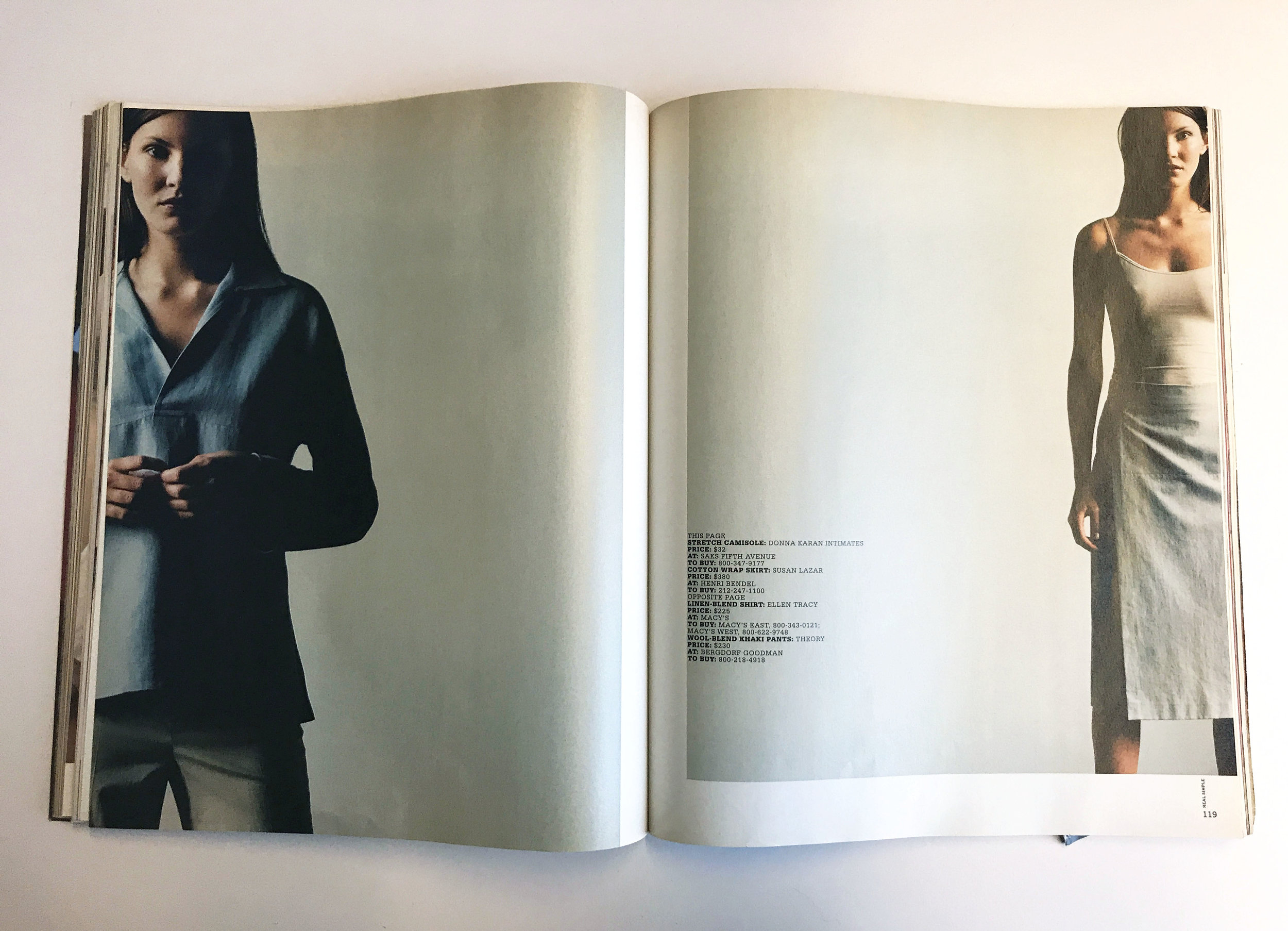
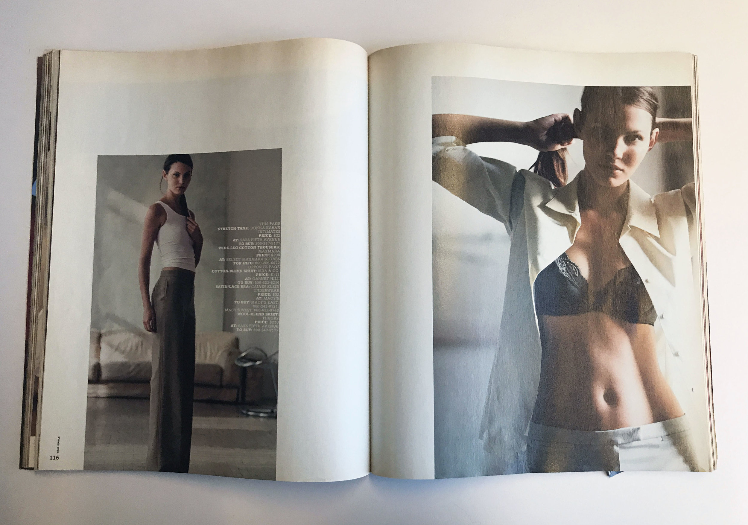
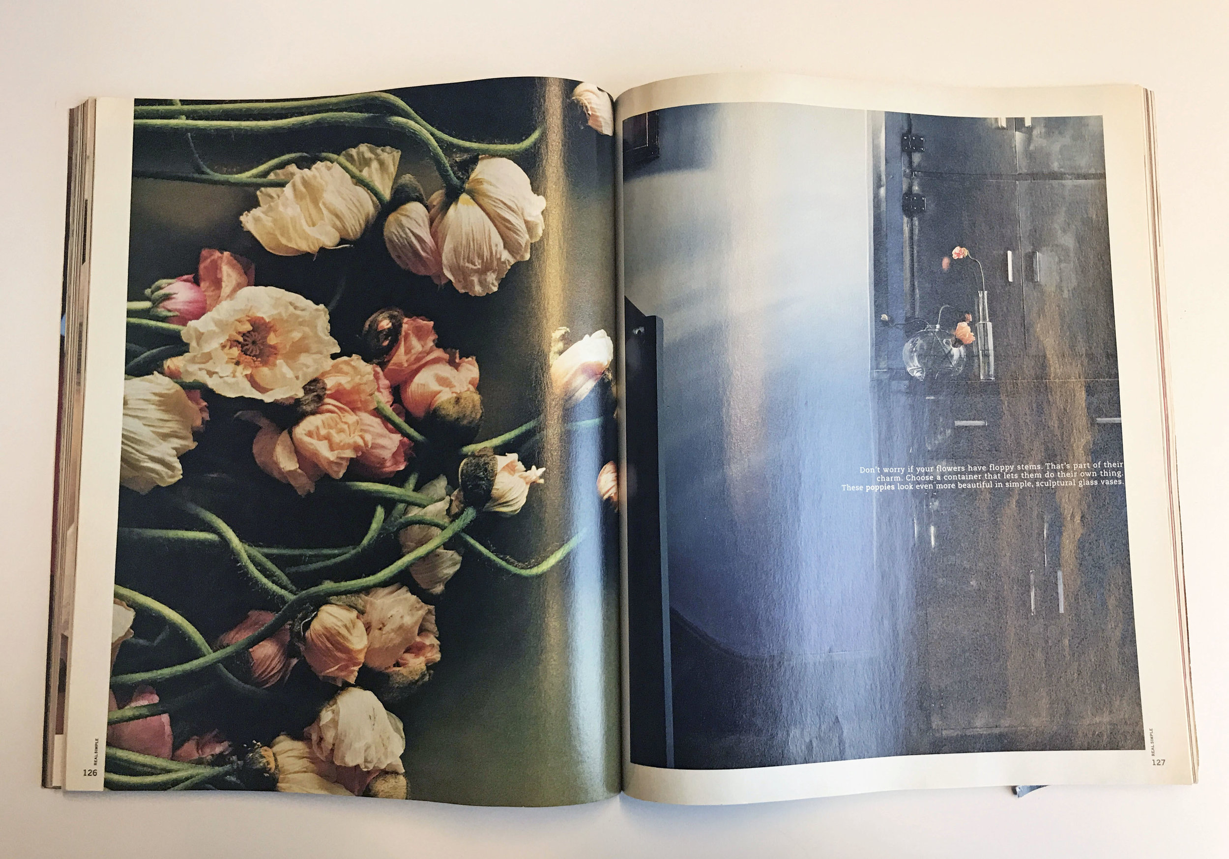
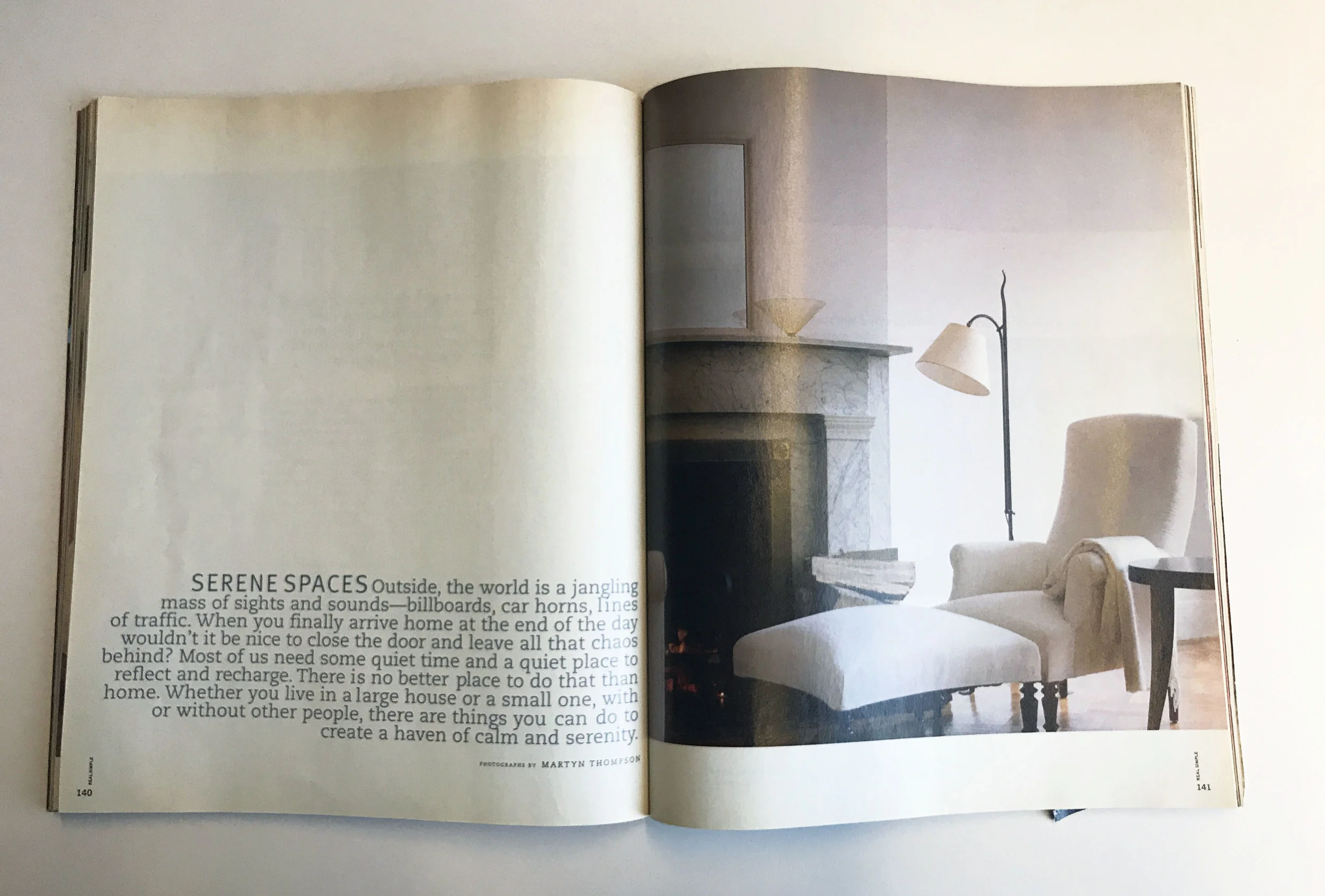
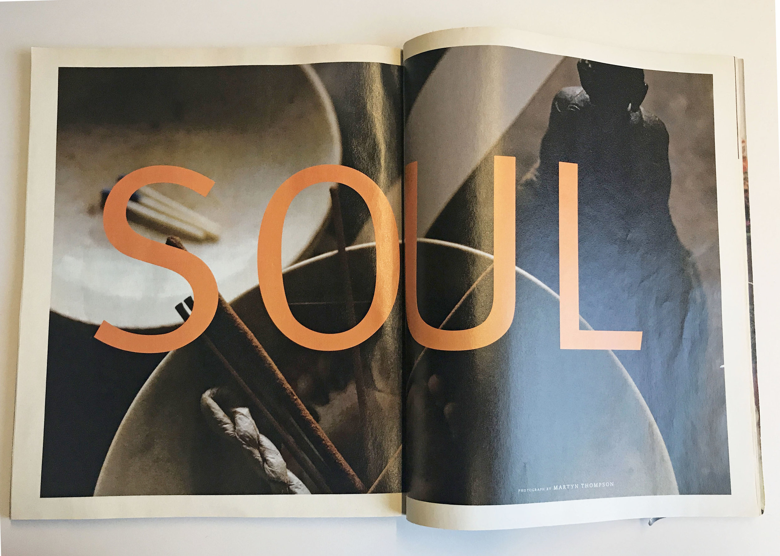
AKP: I loved the tactile quality of the matte paper and square-ish format. To me, it was a complete departure from other magazines on the newsstand, it felt more like an art book than a magazine. I fell in love with the rich, sophisticated photography. Martyn Thompson shot the entire issue, and at the time, he was a new name to me. It was like dipping my toe into a world that I had no idea ever existed. I suddenly became aware of incredibly talented photographers and the magical role of prop and food stylists. In addition to the stunning photography, I loved the gratuitous amount of white space, the wide margins and clean, modernist design. The typography, while I would want it to be more refined today, used a slab and a san-serif, which was also a departure from what I was used to seeing traditionally on the newsstand.
SPD: Do you know now who the creatives were?
AKP: Robert Valentine from The Valentine Group designed the launch issue and Martyn Thompson was the sole photographer for the issue.
SPD: How does that inform your creative now?
AKP: Clean, graphic and modern have always been guiding principles in my work. I tend to gravitate towards things that have a refined sensibility to them and I’m a sucker for a strong grid. I always try to include negative space in my work, for it allows you to focus your attention on the actual design.