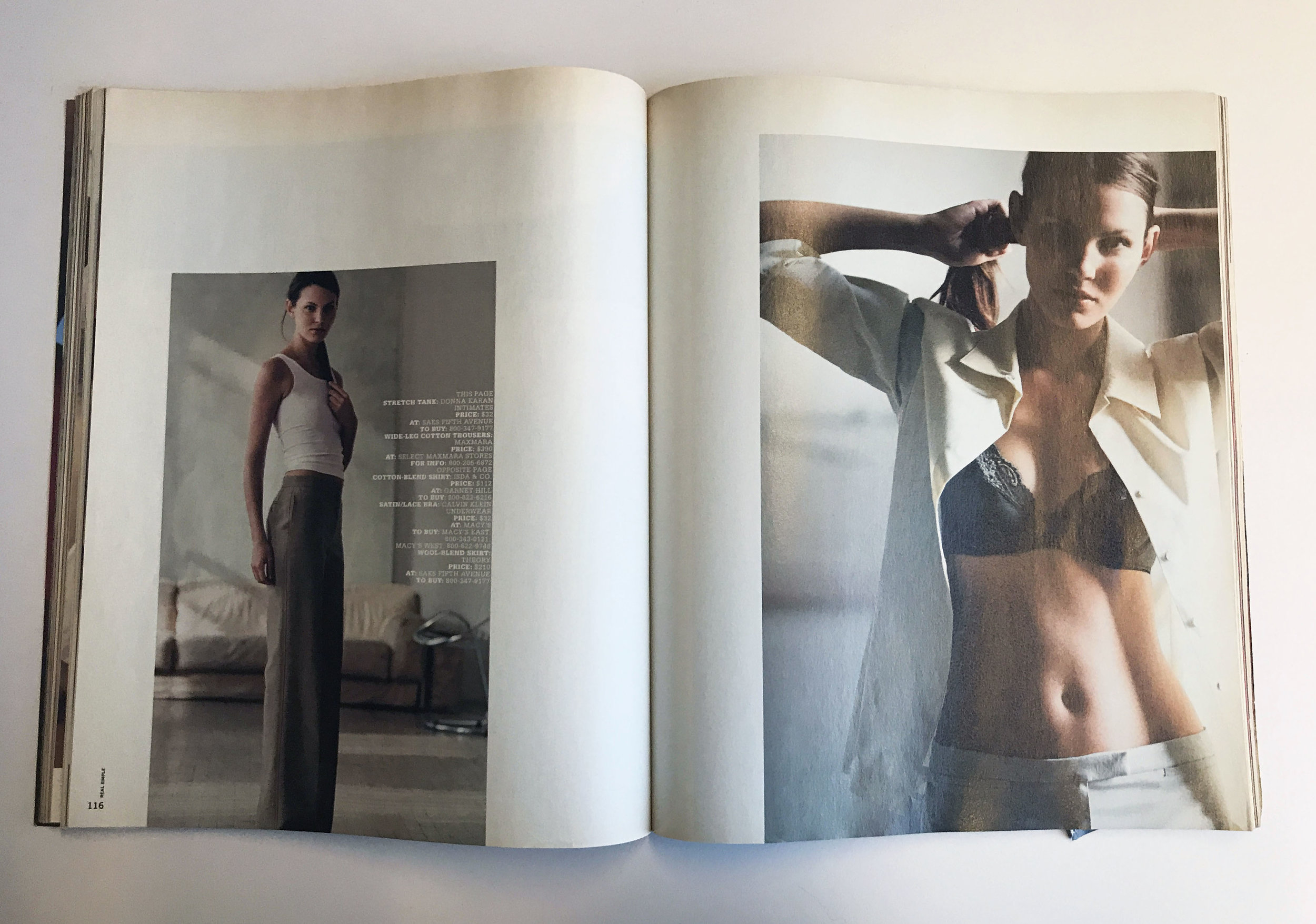
Robert Newman, Creative Director at This Old House

 
BN Ramparts1.jpg
 

Robert Newman: Ramparts was the first magazine I ever bought that wasn’t MadCreepy, or a comic book. Almost 50 years later, I still have that issue and I still draw on it for inspiration. Ramparts was like no magazine I had ever seen. Underground and political newspapers and publications from that time were filled with passionate, riotous design, multiple typefaces, scratchy artwork, and muddy photographs. This issue of Ramparts was simple, cool, and understated, using just one typeface and a generous amount of white space. The design seemed at odds with the magazine’ edgy political editorial content. To a 16-year-old infatuated with the New Left and the student revolution, this was a heady and intoxicating mix. I fell in love with the magazine and especially with art director Dugald Stermer’s strong, simple design and powerful graphics. It was the first real magazine that spoke to me and the first one that made me notice its design.

SPD: What year?
RN: 1969

SPD: What were you up to?
RN: I was in high school, in the suburbs outside of Buffalo. In my head I was wrestling with the big issues of the day—the Vietnam War, black power. And trying to reconcile the liberal beliefs I had inherited from my parents with the radical movements that were shaking things up. In a few months I was organizing anti-war protests and marches at school with my friends.

BN Ramparts2.jpg

SPD: What magazine?
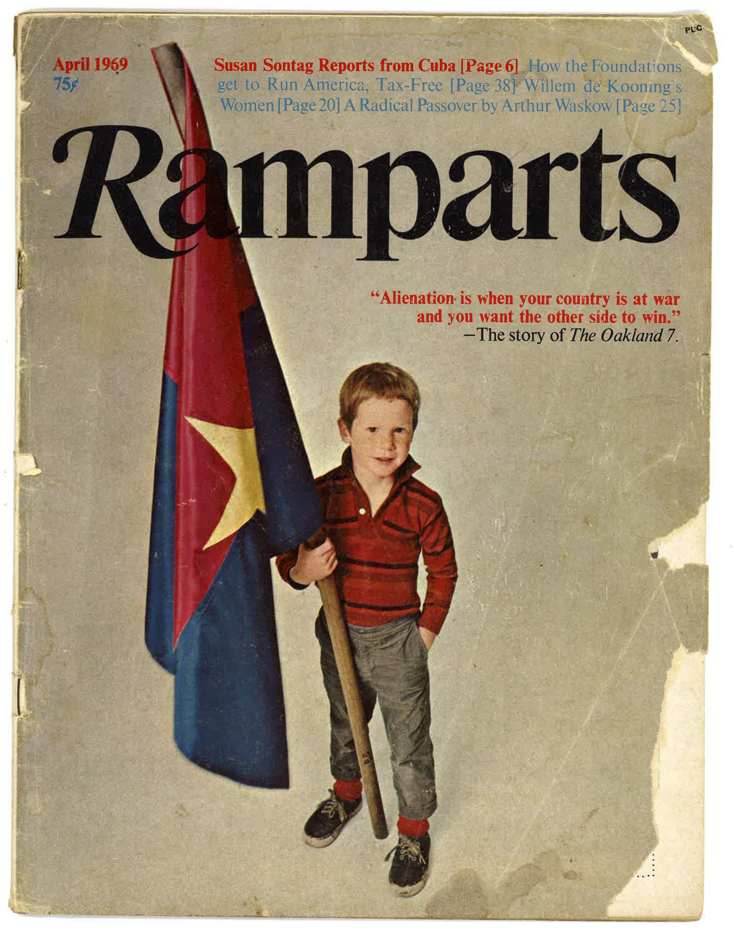
RN: Ramparts. The first issue I bought featured a young kid on the cover holding a Vietcong flag and a headline that said “Alienation is when your country is at war and you want the other side to win.” I later found out that the boy on the cover was the son of the magazine’s art director, Dugald Stermer. The magazine blew my mind (as we said back then). But it was really hard to find anywhere in my town; nobody would carry it because it was such a radical magazine. So I went downtown to one of the cutout bookstores, a place where newsstands dumped their magazines after they went off sale. The news agents would rip off the front cover logo/masthead and return it to the distributors for credit, then they’d sell the magazines for pennies to the cutout store, who would sell back issues for 10 cents or a quarter. I bought all the old copies of Ramparts that they had, most of them luckily still with the cover logos. And I started my subscription a couple months later. [You can see one of those cutout issues here, featuring the Diary of Che Guevara and a cover illustration by Milton Glaser.]

BN Ramparts3.jpg

SPD: What was it that so enthralled you?
RN: The Black Panthers, the Young Lords, the Chicago 8, Che, women’s liberation… I didn’t understand all of Ramparts, including the design, but I spent hours and hours reading it and trying to deconstruct what they were trying to say. The design was probably the most disconcerting part of the magazine for me. All the examples of underground and radical newspapers and magazines that I had seen at the time were raw and funky, with edgy (or untrained) design and imagery that matched the passionate content. Radical publications were supposed to look like The Black Panther newspaper or the East Village Other. Ramparts was the opposite—totally understated and sedate. Stermer used only one typeface—Times Roman—throughout the entire magazine. The cover headlines were quiet; sometimes they appeared in small type above the logo. And there was a generous use of white space on the feature openers. The result was a simple, powerful design where the text and images felt heavy by comparison.

BN Ramparts4.jpg

SPD: Do you know now who the creatives were?
RN: Dugald Stermer was the art director until mid-1970. His deputy/production manager was John Williams, who became consulting AD after Stermer left, and produced some striking covers. Williams went on to be the first art director of Rolling Stone, and did a lot to establish the basic DNA of that magazine. Rolling Stone’s studied (and limited) range of typography posited against bold photos and illustrations is straight out of the Ramparts design playbook. Williams’ assistant AD was Louise Kollenbaum, who went on to be the founding art director of Mother Jones. Of course it was only years later that I discovered Stermer’s earlier Ramparts work, from 1966-68. His covers rivaled George Lois at Esquire for creativity and provocation, although his were done with a fraction of the budget. Great illustrators graced the pages of Ramparts: Milton Glaser, Ed Sorel, Paul Davis, even Norman Rockwell. And Stermer did illustrations himself, including a cool cover portrait of Huey Newton. 

SPD: How does that inform your creative now?
RN: I’d like to say that everything I do has felt Ramparts’ influence, but realistically you go where the magazine and circumstances (and the editors) take you. However, left to my own devices I do go back to that simple design palette of type, color, and design that Stermer developed at Ramparts. And the idea that a magazine’s design is so essential to its overall voice and identity (or what we call “the brand” today). More importantly, I think Ramparts inspired me to realize that working with magazines gives you the chance to reach an audience with a message, to do something groundbreaking and provocative and maybe even change the world for the better. And times being what they are right now I think the magazine world could use more examples like Ramparts. We need all the inspiration we can get!

Follow Robert Newman on Twitter: @Newmanology

BN Ramparts5.jpg

Dawn Sinkowski, Photography Director at Martha Stewart

nest-interior-magazine-covers-trendland.jpg

SPD: What year?
Dawn Sinkowski: 
1999

SPD: What were you up to?
DS: 
I was in New York, living on 21st St & 10th Ave. This was my sophomore year at Parsons. I would've been working three jobs, hanging at Mona's and Max Fish and dragging myself to class on occasion.

SPD: What magazine?
DS:
Nest

s-l400.jpg

SPD: What was it that so enthralled you?
DS: 
I loved that this publication was wholly unconcerned with depicting sanity.

It was an unbridled celebration of eccentric living. The images and stories did not anesthetize their subject's aesthetics and did not pander to taste. It was decidedly not about decor. Each story was like peeking in the window of a crazy, fascinating character's home. There was commitment on every page. I love the energy in the pages and how it didn't try to appeal to everyone. In a way, I think it would be right at home with the niche journals being published today. I have to mention the physical, printed object of it: die cut pages, abnormal, irregular shapes that would never fit into pockets. Luscious thick issues with scant ads to be found. The whole venture was decadent and completely over the top.

SPD: Do you know now who the creatives were?
DS: Joseph Holtzman
drove the bus, he was the founder, EIC and art director. Contributing editors included Simon Doonan, Todd Oldham, Catherine Opie, Martin Parr, Richard Tuttle and DJ Spooky, to name a few.

SPD: How does that inform your creative now?
DS: 
Wow. Well, Nest sets a high bar. It feels like part of the philosophy was to work with dynamic, talented people and get out of their way- to give creatives enough space to create. I strive for that when commissioning work.

Lia Clay, Photographer

 
$_57-1.jpg
 

Lia Clay: I started reading TAR Magazine when I was 17 years old. A person that I had a rather romantic pen pal relationship with used to send me it from New York. As many teenagers finding their way into the spectrum of other artists and photographers, Ryan McGinley was god. Part of Ryan’s initial series “Everybody Knows This Is Nowhere” was in the first issue. I remember associating with the types of models he used — often with androgynous features. As someone struggling with gender identity, this new found rebellion against conservative body standards that I was taught growing up with in the South was sort of a revelation. In the spring of 2009, Tar released a cover with Kate Moss by Damien Hirst. It was a photograph of Kate with half of her face, revealing the muscles and tendons underneath her skin. It went along with this article that stated something like “Kate Moss is Never Going To Die.” It was a satirical piece on how Kate had an underground laboratory that was keeping her young forever. It was my last few months before I graduated high school, and immortalized the feeling of being young in the time right before I left home for college. It’s been almost a decade since I first started reading Tar, and even though I am looking forward more and more to growing older,  I will forever remember the feeling that magazine gave me as a teenager. 

CCF03092013_0007.jpg

SPD: What year? 
LC:
2008/09

SPD: What were you up to? 
LC:
I was a teenager, wrestling with the ideas of gender, sexuality, and leaving home.

SPD: What magazine?
LC:
Tar Magazine

Tar.jpg

SPD: What was it that so enthralled you? 
LC:
There was a resonance of youth that I was drawn to. It really epitomized a lot of the things I was feeling, and gave me an association to something outside of what I grew up with. Growing up, I always felt out of place. I was grasping on to everything I could to help me find a sense of attachment to another world where I could start to understand myself. 

SPD: Do you know now who the creatives were? 
LC: Evanly Schindler
+ Maurizio Marchiori

SPD: How does that inform your creative now? 
LC: 
It was definitely a beginning. To be honest, I’m not entirely sure. There’s representations of things I did when I was taking pictures at 17 because it’s where I began to grow artistically, but I think over the past decade, my work has changed so much that maybe it’s best as something to be nostalgic about, rather than inform what I do now. As much as I gravitated towards those images because it was similar to my body type, which ironically was categorized as ‘different’ from growing up in North Carolina, it also glorified an idealized version of youth and representation that is something we are trying to change now. 

www.liaclay.com/

$_57.jpg

Tom O'Quinn, Creative Director at Thrillist

3f4ad20829d6b07955e08787b6af1365.jpg

SPD: What year?
Tom O'Quinn: 1986

SPD: What were you up to?
TO: 15 years-old. Living in Red Deer, Alberta, dying my hair black and sneaking into punk clubs with my older sister in Edmonton. Keep in mind the legal drinking age in Alberta is 18, so it really wasn’t that big of a deal.

SPD: What magazine?
TO: SMASH HITS

77b23dca8082fdf21b1bf918a2e47fa5.jpg
www.tilleysmagazines.com-Magazines-Comics-SMASH-HITS-14.jpg

SPD: What was it that so enthralled you?
TO: At that age, all you care about is defining your identity. SMASH HITS was a UK magazine but we got it in Canada as well. It was so much cooler than any American magazine available to me at the time and was really cutting edge in terms of photography and type. The subject matter was mostly popular British bands with some American stuff thrown in. Looking at it today it seems almost cute, but at the time it was very “insider”. I found my escape from small-town life through this magazine and also through MuchMusic and MusiquePLus, the Canadian equivalent to MTV. Toronto was where it was all happening back then…but I ended up in Vancouver and then Los Angeles before coming to NYC.

SPD: Do you know now who the creatives were?
TO: I have no idea, but it would be so interesting to talk to them. Patrick Nagel did Duran Duran’s Rio cover and had a huge influence on 80s design, so he was probably the first illustrator/designer that made me want to have a creative career. In the late 80s and early 90s, I started reading The Face, which was my second love…so Neville Brody was probably the first magazine designer I can identify who had an impact on me. And Vaughn Oliver of course for music packaging….

www.tilleysmagazines.com-Magazines-Comics-SMASH-HITS-7.jpg
smash-hits-1981-01-08_0000.jpg
2083d93874bb6a85314542f1e5de7d85.jpg

SPD: How does that inform your creative now?
TO: I tend to design big with lots of dramatic type and color… and then pull back. There was a period before magazines where I designed corporate annual reports, so I learned refined typography by reading The Elements of Typographic Style and by designing lots of financial charts printed on 100% cotton paper. My first Art Director job was with Out magazine, and that’s when I knew I loved working in pop culture and entertainment more than anything else. Now I am working 100% in the digital space, with a growing focus on video. So it some ways it’s come back full circle for me, using those initial inspirations of music videos to inform what I do now. Not a lot of typesetting beautiful paragraphs of copy anymore, but using type, image and motion to tell stories in different, exciting ways.

bd41dd1c0573ac38d9ed2ae6eaed6036.jpg
fit-520x390.jpg
Smash-Hits-Covers-from-The-80s-8.jpg
tumblr_nyvyzsLaWl1udnvfeo1_500.jpg

Rachel Gogel, Creative Director

Rachel Gogel: I fell in love with GQ Magazine in 2005.

Who would have thought that six years later I would land a job at this iconic publication?

The truth is, I've always been drawn to editorial design, typography and layout. Since I traveled a lot with my family growing up, purchasing magazines at airports for long-distance flights happened often. In high school, designing covers and pages for our annual Yearbook was the next best thing to working in publishing.

Once I moved to the United States from France in 2005 to attend university, I read all kinds of magazines — Wired, Vanity Fair, The New Yorker and New York Magazine — but my all time favorite was always GQ for its cool visualizations, bold colors and witty custom letteringAnd you may have guessed by now, but I chose to major in Communication Design.

gq-truelove-1.jpg

I aspired to work for a magazine one day and became fascinated by Fred Woodward, who is being honored at this year's SPD Gala. In 2001, Woodward moved from Rolling Stone and became editorial design director of GQ, instantly transforming the publication and injecting his delightful, creative and innovative work into the brand's look and feel. I was lucky to land a few internships in publishing throughout my college years that would hopefully bring me closer to that dream.

gq-truelove-2.jpg

When I graduated in 2009, I moved to New York without a job and spent hours in a Borders bookstore (RIP *sad face*) looking at mastheads and writing down designers’ and art directors’ names from my favorite magazines. GQ was my main target but the job market that year was not great and I had to keep my options open. (The best part about this sheet of paper is that I recognize or have met several of these people since, thanks to SPD and my work in the industry.)

gq-truelove-3.jpg

Unfortunately though, after reaching out to as many people as I could, I only heard back from a handful. While disappointed, I remained optimistic. I worked at DVF and Travel + Leisure before GQ became a freelance client of mine (I built a site for them in Wordpress!) thanks to old contacts on the marketing team. Suddenly, I felt like I was getting closer to my teenage ambition.

gq-truelove-4.jpg

Flash forward to summer of 2011: a former boss of mine from a Condé Nast internship had left GQ and there was suddenly an opening. I put my name in the hat, and soon after was hired as Associate Art Director on the business side. The role came with high expectations for quality and Woodward-like executions. Our clients came to us for what our sales team pitched as editorial-caliber branded content and infographics. My goal was to find a balance and create a complementary aesthetic that put our advertorials on the map without confusing our readers.

Other than Fred Woodward, who left the title last year after sixteen years, I now know that other creatives involved on the editorial side were Anton IoukhnovetsChelsea CardinalDrue WagnerMichael PangilinanRob HewittBenjamin BoursAndre JointeDelgis CanahuateEve Binder and many more. I learned so much and was inspired every day until I left as design director of marketing in 2014 for a new gig at The New York Times

Needless to say, I'll never forget my first crush, GQ Magazine, since it kickstarted my lifelong love of design.

Follow Rachel on Instagram

gq-truelove-5.jpg

Nichole Washington, Visual Artist

05c5f210-3576-0134-0aea-0629623c6db9.jpg

Nichole Washington: As a young girl I loved the experience of reading a magazine from start to finish in one sitting. I would wait for the perfect time to lay out on my bed, turn on my radio and have a solo chill session. I always started at the beginning and gave my attention to every page, even the ads. Magazines like Seventeen were really great because there was loads of entertaining info packed in each issue. I could read a personal interview on the cover star, check out the latest fashion trends, and take a fun quiz at the end!

Screen Shot 2018-02-19 at 9.37.50 PM.png
Screen Shot 2018-02-19 at 9.38.42 PM.png

SPD: What year?
NW: 
Mid to late 90s

SPD: What were you up to?
NW:
I was a young girl day dreaming of leaving Minnesota to finally live a cool and confident life.

SPD: What magazine?
NW: 
Seventeen

Screen Shot 2018-02-19 at 9.50.36 PM.png
0e1929f72659d9b549c432e5455e817c--claire-danes-fashion-magazines.jpg
54ee70fc7e114_-_sev-january-2004-de.jpg

SPD: What was it that so enthralled you?
NW: 
I loved how fun and casual the magazine was and there would always be a cool pop star on the cover. The inside layout had a cut and paste feel and there were a lot of exciting things to look at on just one page. Every element was a part of the design from brightly colored text to the cut out images. 

SPD: Do you know now who the creatives were?
NW: 
No, not at the time. 

7219146460_3be937b938_c.jpg
26.jpg

SPD: How does that inform your creative now?
NW: 
Having obsessively flipped through pages of Seventeen Magazine for at least 10 years of my life has definitely influenced my creative aesthetic. My color palettes is usually very bright and I am more interested in the unique expression of a design rather than it being technically perfect. It is most important that my spirit and identity are present in my work. 

www.nicholewashington.com

Matthew Salacuse, Photographer

 
IMG_4250.jpg
 

Matthew Salacuse: The very first subscription I had was when I was 11 years old and it was to JET Magazine.  It may have looked a bit strange for a little white boy thumbing through Chaka Khan stories on his Brooklyn stoop in the 1980s, but to me it made the most sense.  This is what I was into and I wanted to know more about it on a weekly basis.  There was a list in the back called “JET’s Top 20 Singles” where I would get to see all the music that I heard on the radio but was being left off the Rolling Stone Top 40 chart and totally ignored by MTV video rotation.  (Do you remember seeing THIS on MTV? I don’t, but I learned about it in JET)  For the advertisers, I was a swing and a miss, but for finding out Lionel Richie’s tour was rewarding students with good grades, it was a home run.

janet jackson jet magazine march 1987 1.jpg
IMG_4253.jpg

SPD: What year?
BO: 
1984-1987

SPD: What were you up to?
BO: 
Breakdancing in the lunch room. Homework. 

SPD: What magazine?
BO: 
JET

jet.jpg
Jet copy.jpg

SPD: What was it that so enthralled you?
BO: 
Growing up in Brooklyn, I was exposed to a lot of black culture in the streets and from friends but it was not well represented in the media.  JET literally had a page called TELEVISION that alerted you to which shows black actors would be appearing on.  

IMG_4251.jpg

SPD: Do you know now who the creatives were?
BO: 
I had to go buy an old issue to dig this up because back then I had no concept that people made magazines:

Art Director: Norman L. Hunter; Staff Photographers: Vandell Cobb, James Mitchell, Maurice Sorrell, Fred Watkins

SPD: How does that inform your creative now?
BO:
When I came out of college I immediately gravitated to photographing the underrepresented side of culture; whether it be small biker rallies in Iowa or rappers in the Queens Bridge Housing Projects. By the mid 2000s I had made quite a strong reputation in the hip hop world by shooting for XXL, Vibe, The FADER, Blaze, King Mag, Rides and others.  I am still waiting for that call JET.

www.salacuse.com/

IMG_4255.jpg

Abbey Kuster-Prokell, Creative Director at Martha Stewart Living

 
RealSimple_cover.jpg
 

SPD: What year?
Abbey Kuster-Prokell: April 2000

SPD: What magazine?
AKP: 
The launch of Real Simple Magazine

SPD: What were you up to?
AKP: Truth: I never set out to be an editorial designer. I moved to NYC in 1999, and I was a young designer working for Louise Fili LTD. I was spending my days (and some nights) drawing typefaces from scratch out of vintage type books where I might only have a few characters for the entire alphabet. I was printing everything on 8.5 x 11, because that is what we had and comping it together with a waxer. Oh, how I loved the smell of that waxer. I was part of 2-person team at her studio, which was more like an apprenticeship then a job. This job, which I loved dearly, could not have been further from the glossy, glitzy world of editorial. Hence, why I didn’t know much about it. All of this changed, however, when I picked up the first issue of Real Simple magazine in the spring of 2000 and I was awestruck.

SPD: What was it that so enthralled you?
AKP: 
I loved the tactile quality of the matte paper and square-ish format. To me, it was a complete departure from other magazines on the newsstand, it felt more like an art book than a magazine. I fell in love with the rich, sophisticated photography. Martyn Thompson shot the entire issue, and at the time, he was a new name to me. It was like dipping my toe into a world that I had no idea ever existed. I suddenly became aware of incredibly talented photographers and the magical role of prop and food stylists.  In addition to the stunning photography, I loved the gratuitous amount of white space, the wide margins and clean, modernist design. The typography, while I would want it to be more refined today, used a slab and a san-serif, which was also a departure from what I was used to seeing traditionally on the newsstand.

SPD: Do you know now who the creatives were?
AKP:
Robert Valentine from The Valentine Group designed the launch issue and Martyn Thompson was the sole photographer for the issue.

SPD: How does that inform your creative now?
AKP:
 Clean, graphic and modern have always been guiding principles in my work. I tend to gravitate towards things that have a refined sensibility to them and I’m a sucker for a strong grid. I always try to include negative space in my work, for it allows you to focus your attention on the actual design.