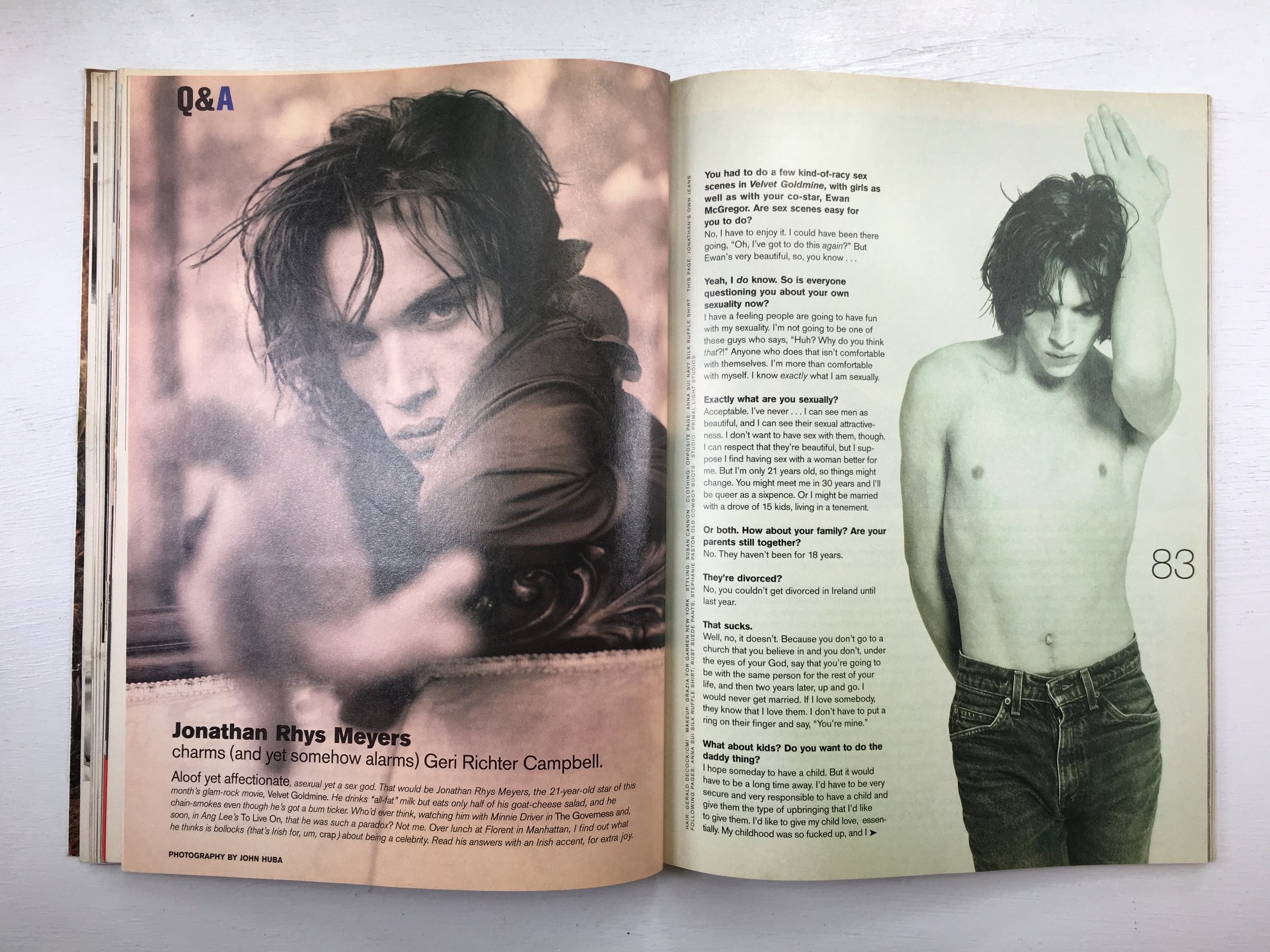
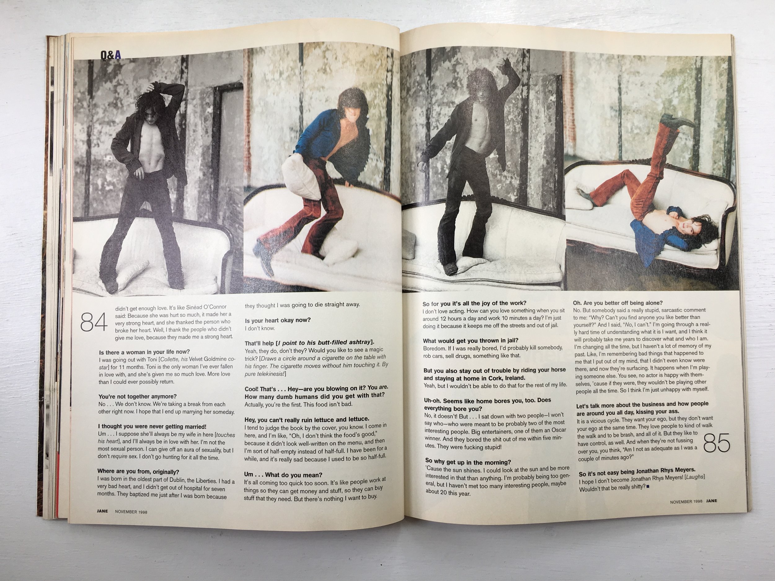
Carla Frank, Creative Director & Brand Strategist

2fb33e081205a2bb595ccf1cf8c85202.jpg

SPD: What were you up to? 
Carla Frank:
I was young and I was always trying to gain my mother’s love and attention. Achieving such interactions though was nearly impossible – which is how I came to be a dedicated observer of my very pretty yet distant mother. 

Particularly of note in my onlookings, were evident mood shifts when she read magazines. My overwhelmed and stern mother transformed before my eyes into a happy, light-hearted, fulfilled and engaged young woman. She looked so beautiful and carefree in those moments as I sat quietly beside her to see what she was seeing. Sometimes she would walk me through her favorite sections of the magazine and the spectacular features. Sometimes she would laugh aloud at the articles, sometimes call out celebrity names as if she was saying hello to them at a chic cafe. Sometimes she would finger tap outfits she liked while carefully studying them and sometimes she would hug the magazine to her chest when her delightful pastime was interrupted. 

Being an avid reader and born stylist, she created captivating vignettes in small spaces throughout the house. One of her signature styling looks consisted of neat and inviting stacks of her all-time favorite magazines carefully placed reverently. To her they were divine objects. She saved only the finest of her collection for years. 

SPD: What magazine? 
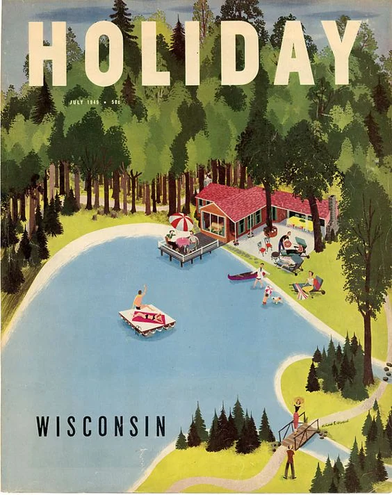
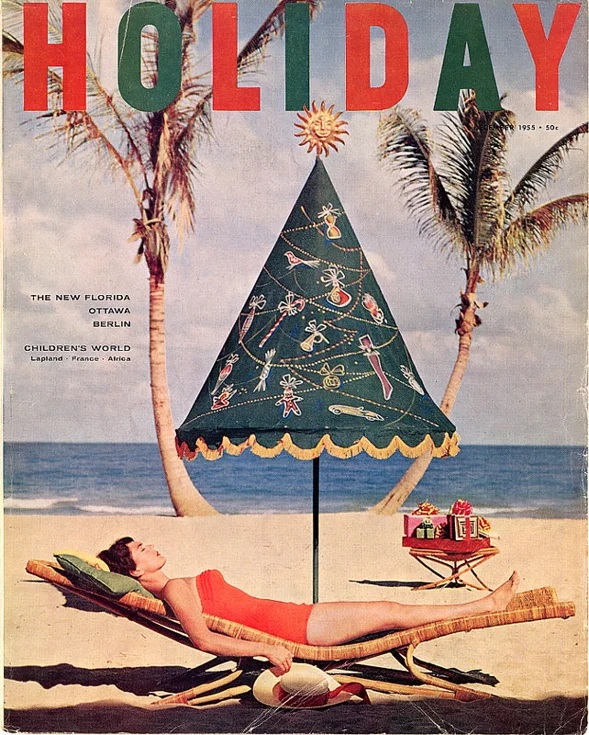
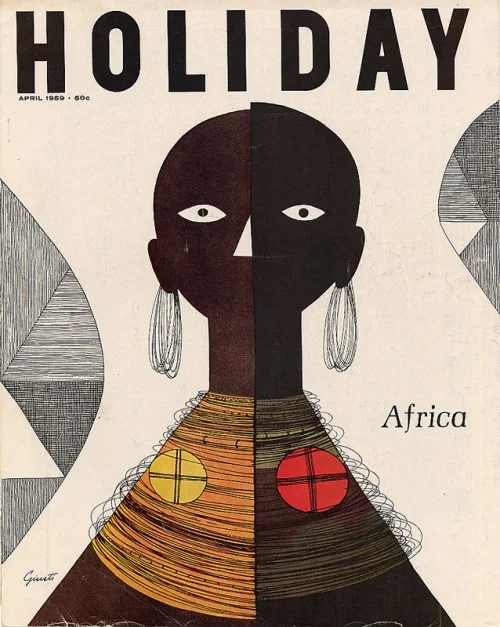
CF:
There was one stack I consistently secretly snuck quiet moments with – Holiday Magazine

SPD: Do you know now who the creatives were?  
CF:
Yes. They were legendary. Editor Ted Patrick and art director Frank Zachary

b747d4bea82575b1e4d7e040c16acba2.jpg
cf30d2aa68ffc47c765f1c01a2ad29b4.jpg
dc7dc78820f09b87173d2810c1f1e4b2.jpg

SPD: What was it that so enthralled you? 
CF:
EVERYTHING. The overall wit, wisdom and exotic insights. The daring covers, the transporting photos, the stylish illustrations, the strong type and the use of white space. It was a monthly travel bible created by a group of sophisticates who didn’t necessarily take it all too seriously, which allowed a certain sense of freedom. 

There were two deeply notable characteristics defining Holiday Magazine. The first was that they hired the most famous writers, to travel and write glorious pieces about places. For instance, James Michener on the south pacific, Colette on love in Paris, William Saroyan on Fresno, Ian Fleming on London, Joan Didion on Sacramento and so many more by the likes of Paul Bowles, Jack Kerouac, M.F.K. Fisher, Ogden Nash, Arthur Miller, James Thurber, and Alistair Cooke to name only a few. 

The second notable characteristic was the vision of Art Director Frank Zachary, who became a publishing icon himself. Frank brought together a distinguished group of photographers such as Cartier-Bresson, Steichen, Aarons and illustrators such as Arnold Roth, Ronald Searle, Edward Gorey and John Rombola. With fusion of real editorial backbone, mischievousness and impeccable taste, Frank basically reinvented the modern leisure magazine in America 

tumblr_ly5zep8nut1qatsq6o1_500.jpg
DSC_2493.jpg
ea1a3899addacac95f1da7594dbdcdf9.jpg
ec628126a33860e671e29ff3ab263079.jpg

Every issue was packed with dazzle, surprise and seduction. Holiday had an insatiable curiosity that created a wide breadth of subjects so it wasn’t just travel it was culture too. There was also a sense of mission, in that Holiday promoted an idea for Americans to make the most out of the advantages they had in prosperity, productivity and happiness. The magazine was pure discovery from cover to cover. 

No wonder why I had the curiosity to travel the world and ended up working at a top travel magazine early in my career. Yet it occurs to me only now, years after becoming a Creative Director in magazines, the deepest subconscious reasons that drove me to magazines in the first place. They brought a world of imagination, delight and refinement to our doorsteps. I wanted to be a part of an elite group who created magazines which could move people the way they did my mother. To be able to produce an enchanting world in which someone could become immersed and seduced into reading the pages and emerge feeling smarter, brighter, and happier was a lot of magic and responsibility at my finger tips. This aspiration and inspiration is perhaps why I’ve poured so much love into every pixel and page I’ve worked on. Perhaps it’s why we all do. 

Holiday-April-1957.jpg
HolidayMagazine.png
edcacb451eed7e32c181a359bf6a9ff6.jpg
holiday-april-1960.jpg
image.png

Jamie Prokell, Creative Director at Men’s Health

Jamie Prokell: It was 1991 and bundled free with my sister’s issue of Sassy magazine came one of the best things to ever make its way through the US Postal system, or at least that is what it meant to me that year. Here was Dirt Magazine, and on its pages were the weird mix of everything that I was searching for, years before the Internet provided a voice for every disenfranchised youth. I was a young boy in High School, awkward and interested in just about anything  outside of the mainstream. Music, can’t find it on the radio? Let me listen. Clothes, only available by mail order from the other side of the United States in a size fives times what it should be? Where do I send the check? Dirt showed up and seemed to hold the answer to all of that. It was put together by a bunch of skaters just a few years older than myself, and with all of the same interests.

It only ran for 7 issues, but in those few issues they had the Beastie Boys, Mr. T, Crispin Glover and a then unknown Jason Lee getting punched in the face on their covers. It was original and was everything I was into.

SPD: What year?
JP:
1991-1993, it only published seven issues. Most of it came as a supplement to Sassy magazine.

SPD: What were you up to? 
JP:
I was a kid in a western Pennsylvania Catholic high school. One of three kids in the entire school who skateboarded. Awkward, unsure, and ready to rebel against anything. I was looking for anything that went against the “man,” who to me at that time was mainstream media and organized sports. I had been going through a steady diet of Thrasher, Transworld Skateboarding, Poweredge magazine, and anything printed that mentioned or pictured a skateboard. A world that existed across the United States in California and miles away from where I was at.

SPD: What magazine? 
JP: The magazine was Dirt. A free supplement that originally came poly-bagged with an issue of Sassy. This was the first time I felt, how do these people have all of the answers to all of my questions and interests. Years later I came to understand that something this special comes from a staff of interested and interesting people all working together to answer these questions for themselves. But at that time, this magazine was like a peek into the bigger world, a world beyond Pittsburgh.

SPD: What was it that so enthralled you? 
JP:
I had been stealing my sister’s Sassy magazine for awhile, trying to figure out how I could understand girls, and where exactly I could find ones that were as cool as the ones in the pages of Sassy magazine. When just like a wish granted, came the answer I was looking for. Here was a magazine that was all about my life. It talked about clothes, haircuts, music, skateboarding, and girls. But the pages were filled with people who I had become familiar with from skate shops, Thrasher and Transworld Skateboarding. Yes, I thought! This was another skateboard magazine. But this one covered everything that you did while you were not skateboarding. One of my favorite articles, that I still remember today, took Jeff Tremain (who later became famous for producing the Jackass franchise) and slowly cut his long hair into 8 different hair lengths and gave names to each style. They reviewed things no other magazine at that time were: Candy, Shoes, Swatches, comics, hair and girls. And somehow this first issue came to my house, and for free. I felt like I had been chosen. From that point on every time I went to the mall I would go to the small newsstand near the exit and check for the next issue. At this point in my life I had no idea that there was any sort of publishing schedule. So five times a week, I would be scouring the newsstand, for any clue a new issue was on its way. 

Dirt_3A.jpg

SPD: Do you know now who the creatives were? 
JP:
I’m not sure I totally understood that all of the people featured in the pages weren’t involved with creating the issue. But I was aware Andy Jenkins, Spike Jonze, and Mark Lewman were leading the charge. These were the same names that I had been seeing in every issue of Transworld Skateboarding, and Thrasher each month. They were putting their friends in fashion shoots and other stories. It was amazing to see Natas Kaupus, Jason Lee, Ray Barbee, all of these skateboarders just doing things that I was not seeing anywhere else. It made the lifestyle real to me, and that was what I fell in love with. Looking back at the old issue now, I’m not sure the design was what grabbed me, but the sincerity and intention is still as real as it was all of those years ago. And that’s what spoke to me. 

staff photo of mark lewman, andy jenkins, and spike jonze

staff photo of mark lewman, andy jenkins, and spike jonze

SPD: How does that inform your creative now? 
JP:
I can still remember the feeling of reading those pages. It was the realness of the stories. Today I try to put myself in the place of the reader and ask myself what would I want this story to be. What do I want to see. What would excite me. And I try to create/design stories to answer that. What would get me excited? Sometimes it works out, sometimes it doesn’t. But at least I feel I am trying to create something I would spend time exploring. 

Isabel Castillo Guijarro, Art Director Refinery29 / Designer & Illustrator

a8d8e79e8f2e597247fd22b7a14b6d78.jpg

SPD: What year?
Isabel Castillo Guijarro:
1998-99

SPD: What were you up to?
ICG:
I grew up in the publishing world. My great-grandfather owned a printer in Madrid, Spain during the early 20s, working mostly on embossing books; my grandfather worked for him as a typist since his early teens before going on to designing some of the big magazines and newspapers in Spain at that time — Marca, ABC, As and even special projects for Francisco Franco— my uncle was the Creative Director at Hachette. My point is, that there where always magazines around.

 
3034eb04844f72bf233bc98544b3f469---s-nostalgia.jpg
 

SPD: What magazine?
ICG:
My first real understanding of a magazine was Ragazza, a Spanish fashion magazine that closed doors in 2008. Only because I was in one of the early issues as a baby in 1990. My mom still has that entire year saved somewhere. When I was 8 or 9, she showed my uncle's name on the masthead as the Art Director so I've subconsciously always looked, thinking he would be there. To this day, I'm always curious to see who are the creatives behind it. Before even reading the actual magazine.

SPD: What was it that so enthralled you?
ICG:
Ragazza had no appeal to me but introduced me to magazines. My teens were spent looking at Print, Wallpaper, Rolling Stone and Squire until I became obsessed with Italian Vogue as an intern at Vogue Spain. I had the side job of organizing their archive. Italian Vogue always had the most elegant, simple, and clean but bold covers.

vogue-italy-may-1993-supermodels-best-covers.jpg
gs_571f33fb-e2c0-4b8e-b9ad-4f090a9620a7.jpg

SPD: Do you know now who the creatives were?
ICG:
For a while, I was obsessed with Franca Sozzani + George Louis

SPD: How does that inform your creative now? 
ICG:
Even though I work in media and mostly do digital, I inevitably crave print.

cover1.jpg

Amy Wolff, Photo Director at Hearst Enthusiast Group (Bicycling, Runner's World)

 
RS_FionaApple.jpg
 

Amy Wolff: I spent my teenage years listening to music and sneaking out of the house to see punk, hardcore and ska bands at the Trocadero in Philly, Spankys in East Stroudsburg, and abandoned warehouses around Pennsylvania. I photographed the bands playing, too, but it was always a choice. Enjoy the show or work the show. 

Art played a huge role within my love for music. I collected album artwork, posters, flyers and zines. Small in size, self-published and generally free or a few dollars at most, zines were raw and unpolished, much like the music I liked at the time. Photocopied on plain white paper, folded in half, bound by staples, zines were distributed by hand at shows or purchased in indie music stores. Zines like riot grrrl covered and celebrated the feminist movement in music and society. Even Bust and Bitch began as zines. For a short time, my friend and I made a zine called “Nailbiter.” Without social media, these tangible objects were all I had to get an insider look and stay connected to the niche community I loved.

Zines_Google_screenshot.jpg

Rolling Stone, however, provided a much broader look at the music community. In the late 90s, this monthly, over-sized, 10”x12”, colorful, glossy, artfully designed magazine gave me news, gossip, in-depth story-telling and lots of photos. I had a love/hate relationship with the cover photography, but they were memorable. In 1998, David LaChapelle’s image of Madonna fully encapsulated her “Ray of Light” phase. I didn’t understand this phase of hers, but there it was. He got it.

RS had memorable ads, too. Think of the last magazine article you read? Do you remember any of the adjacent full-page ads? I remember paging through RS looking for Absolut Vodka ads. Developed by TBWA, that is one of the most iconic campaigns ever. I can still picture my young teenage self, sitting in my bedroom, flipping through the magazine dreaming of traveling the world shooting bands or producing ad campaigns and seeing my work in the pages of RS.

AbsolutMagnetism.jpg

Toni Paciello Loggia, Photo Director at Shape Magazine

IMG_7291.JPG
IMG_7310.JPG

Toni Paciello Loggia: My career in magazines started nearly 20 years ago to the day, in August of 1998. I was hired fresh out of Parsons where I had studied Photography and became the Photo Assistant at Redbook magazine. As a newbie in publishing, I ate, drank and slept magazines. I loved (and still do) flipping through magazines, acquainting myself with photographers, getting inspired by the photography and tearing out pages and pinning them to my wall. One of the magazines that I was always drawn to made its debut the year before--- JANE. It was different from all of the other glossy beauty and fashion books. While it was still gorgeous to look at, it was real. The photographs felt casual and spontaneous.  They were not overly retouched and unattainable. The celebrity features were particularly candid. You truly felt like you were being granted a glimpse into someone’s life; not a glossed-up version of who they wanted you to think they were. The premiere issue featured Drew Barrymore, photographed by Carter Smith. She truly was the perfect cover girl for the first issue. There was movement in the photos as she laughed, tumbled, and strolled. You could see the grain in the film and could feel the movement of the photographer following his subject. The photographs drew you in and included you in the experience. I distinctly remember a later cover the following year with Reese Witherspoon. It was a black and white portrait of her squinting one eye with a wrinkle in her nose and curled up lip, shot by Robert Erdmann. It grabbed your attention because it had a voice and an opinion—all without saying a word. That truly is the mark of a great photograph. So much talent graced the pages—Terry Richardson, Pamela Hanson, Francois Nars—names that became synonymous with fashion editorials of that time—and still are. 

Aside from the gorgeous visuals, JANE had a distinct voice—one that was strong and powerful, and feminist. It didn’t shy away from controversial editorial. Some of my favorite headlines: “No Women Allowed. The Promise Keepers is a right-wing Christian group that bans women and preaches that man is the boss. Our writer joined up and found out it’s not as good as it sounds.”; “Pigs in Space. Picture Yourself Here? Don’t count on it- only about 20 percent of astronauts are women. But that beats the years when John Glenn helped to keep us completely out. Some Hero.”; “Sex Can Make You Nervous. He’s supposed to be the stiff one, not you. If you’ve got performance anxiety, turn the page and calm yourself.”; “I Went Undercover as A White Supremacist. The Aryan Nations is a racist, hate-filled world where white males dominate. Paige Jarrett attends the World Congress to try to find out why any woman in her right mind would join.” JANE was smart, and provocative and challenged its readers to be the same. It’s sad to think that so many of these topics are still “current” events twenty years later…

SPD: Do you know now who the creatives were?:
TPL: JANE PRATT, Editor-In-Chief; EDWARD LEIDA, Design Director; CARY ESTES LEITZES, Photo Editor; ELIZABETH RODRIGUEZ, Art Director.

Joe Rodriguez, Senior Associate Photo Editor at People and Entertainment Weekly


Joe Rodriguez: Growing up, my grandmother bought me subscriptions to tons of magazines.  I always read magazines. My love of magazines didn’t turn into a full-blown addiction until 2005, my junior year at the School of Visual Arts. That year, I took Sarah A. Friedman’s editorial photography class. Sarah knew I loved ESPN the Magazine and she just happened to create some of my favorite images that they’ve ever run. Sarah also helped me get an internship there. Following my internship, I was hired on and stayed for 6 years. Catriona Ni Aolain, the Director of Photography let me run wild! I was able to learn about how magazines worked, who did what, why and how the end product came about.

To me, ESPN the Magazine is what a magazine should be: Big, shiny, beautiful, and full of information and opinions. It made me feel ready to debate anyone about the topics covered inside. But most importantly it is FULL OF AWESOME PORTRAITS. The Mag’s photography was always ahead of the curve. The portraits were always dynamic or when needed beautifully lit and quiet. I’d never seen a magazine that let photos breathe as much as ESPN did. For the first time, I saw an art department (led by then creative director Siung Tjia) show how design elements could interact with photographs without stifling them or sometimes making up for a lackluster photograph altogether.

Noah Fecks, Photographer

GOURMET_NF_50_1.jpg

SPD: What year?
Noah Fecks: January 1991

SPD: What were you up to?
NF: I’m a very pudgy awkward gay kid in 11th grade. I’m obsessed with photography, and as much as I love art and experimental photography, i’m obsessed with the concepts of strobe, lighting and making “professional” type images.

SPD: What magazine?
NF: 
It’s gonna come as NO surprise here, but of course, it was GOURMET magazine…

SPD: What was it that so enthralled you?
NF: 
I never knew before this that food could be presented “artfully."
Before this all I knew was my mother’s Betty Crocker and Ladies’ Home Journal cookbooks from the 60’s and 70s.
The food imagery in those were so dated and just seemed corny and ridiculous to me then.
Here was the 50th anniversay issue of Gourmet that had (to me at that time) all the luster, glamour and high fashion of a Claude Montana shoulder padded pant suit!!!!
It had a gallery of past covers that I literally could not get enough of.
It began my quest to start getting my paws on as many issues of the magazine I could get my hands on to pour over all the images.

SPD: Do you know now who the creatives were?
NF: 
At this time the EIC was the venerable Jane Montant. Jane began at Gourmet way way way back in 1953 and rose to the top position after the death of founder Earle MacAusland in 1980. She remained editor until 1991 when she was replaced by the legendary Gail Zweigenthal (both of whom were previous to the quite famous Ruth Reichl). Also at this time, the majority of the photography was created by Romulo Yanes (under Art Director Irwin Glusker), who remains an in demand and popular food and dining photographer to the present day.

SPD: How does that inform your creative now?
NF: 
The big impact was that Gourmet showed me that it COULD be done. Food could be exciting, vibrant, and MODERN. The spark that got lit then is still there for me; since then I’m always trying to push myself to say “is this modern?” or “is this THE FUTURE…?”

I remind myself to make images that I want to see in the world, and to literally do my best to shape the future.

https://www.noahfecks.com/

GOURMET_NF_50_10.jpg

Trevett McCandliss, Creative Director at Earnshaw’s & Footwear Plus

MRR_Cover_July_1988.jpg
MRR_Cover_September_1988 copy.jpg

SPD: What year? 
Trevett McCandliss: 1989-90

SPD: What were you up to? 
TM: I was discovering punk rock and learning to play the bass. The Germs, Subhumans, Misfits and Dead Kennedys were my favorite bands at the time. My friend’s sister’s boyfriend indoctrinated me into the mystries of loud guitar music in their suburban basement. He would sit with me for hours showing me the proper way to set up a Fender Twin, how to restring a guitar and instructing me as to why high action was better. The following year (in ninth grade) I had my own band that played one gig at our high school talent show. I had painted punk rock logos on my black army jacket and was sporting a mohawk that my friend gave me over the summer. (My mom was extremely displeased with my choice of haircut.)

a2827975541_10.jpg
This_Is_Boston_Not_LA_vinyl_Record_LPIMG_0880_1024x1024.jpg
album_cover_crass_the_feeding_of_the_5000.jpg

SPD: What magazine? 
TM: 
Maximum Rocknroll, which started its print run in 1982 as a booklet inside the Dead Kennedys double-LP “Not So Quiet on the Western Front”, released by Alternative Tentacles. The Maximum Rocknroll staff was all volunteer (still is), espoused radical politics, and covered the regional punk rock scenes around America and the world. It was pretty much cut-and-paste collage, black-and-white and made on a copier. It perfectly encapsulated the cheap, DIY, no frills, no budget, all-volunteer idealism that punk music represented. Being associated with this world, however tangentially, held the promise of personal transformation through creativity.

mrr_cover_feb_91.jpg
MRR_cover_Dec_1993.jpg

SPD: What was it that so enthralled you? 
TM:
 The visual language of Maximum Rocknroll was expressive and direct with a purity and brutality that appealed to my aesthetic sense at the time. The same visual ideas seen on the covers of my favorite punk records—Bedtime for Democracy, Give Me Convenience or Give Me Death, This Is Boston, Not LA, The Feeding of the 5000, etc.—were the same ones being used in their editorial design. I could also easily grasp how it was made. Everything was black-and-white, mostly hand-done, typed on a typewriter (or what I thought was a typewriter) and collaged. The world it opened to me was exciting and exotic—teenagers in bands living together in a cheap house, skateboarding and making records.  It seemed like an amazing way to live. Maximum Rocknroll also formed the visual template for a poetry magazine, Fever Dream, that my friend and I created on a copier. He was the editor-in-chief and I was the art director—not that I knew what an art director was back then.

Collecting punk records became a big pastime for me, and Maximum Rocknroll was the only real link to the world that those records came from. There were no band websites or blogs back then. MTV didn’t feature them either. These bands were too cool and controversial for the mainstream, which is just what I loved. The only way to get punk records was to send away for them in the mail or buy them from Newbury Comics in Boston. For a teen from a sleepy New Hampshire town, Boston was the big city. It was always very exciting to visit and check things out.  I would peruse other indie magazines, like Transworld SkateboardingThrasher and Spin. They were all awesome, but they weren’t made with a language that spoke as directly to me as Maximum Rocknroll. And while those magazines featured beautifully lit skateboard sequences, celebrity portraits and professional illustrations, none of that was something I could create or commission. Give me grainy black-and-white photos that have been photocopied a hundred times any day! Maximum Rocknroll represented a world filled with passionate, creative people living the art life, and I wanted to be a part of it.  

MRR_inside_spread_02_late_1980s.jpg

SPD: Do you know who the creatives were? 
TM:
 Tim Yohannan (Aug. 15, 1945 – Apr. 3, 1998) was the founder of Maximum Rocknroll. Yohannan, also known as Tim Yo, was a 1960s counterculture leftist, before shifting this ideology to the punk scene.

SPD: How does that inform your creative now? 
TM:
 I don’t really get a chance to use the raw visual design aesthetic of ’80s punk and hardcore anymore. (That would be so cool!) But I still feel strongly grounded in the DIY approach to design. In that sense, I like to think of a magazine as a group of friends who are dedicated to an idealistic cause and use their limited resources to make something fresh, beautiful, exciting and true to life. I see the punk scene and Maximum Rocknroll as that same arrangement. Deep down I am still as committed as ever to this way of thinking.  I like to do things by hand, and I like stuff that is kind of beat up and messy. I like things that are directly expressive and unpretentious. I like starkness. I’m still an idealist. I’m still a punk rocker at heart—even though I let my mohawk grow out years ago!

mccandlissandcampbell.com

MRR_inside_spread_late_1980s.jpg