Austin Monthly's Redesign with Creative Director, Sara D'Eugenio
/


Earlier this Fall, Austin Monthly unveiled their redesign. SPD spoke with Creative Director, Sara D’Eugenio about the process of completing a redesign during a pandemic.
SPD: What was the brainstorming process like for the redesign? What did you look to for inspiration for the new look?
Sara D'Eugenio, Creative Director: In a way, I had been researching for this redesign for years. My hobby Instagram (@arteditdesign) was essentially bookmarking elements I love. The biggest inspiration was Fast Company. We like how their section openers are not full page images. With full page imagery, you have to shoot or illustrate the image in a certain way to allow text to read. And when you take that image off the page and onto the web, it often looks unbalanced. I also love their grid, allowing multiple skinny columns of text with a dead column of whitespace. Apart from FC, we looked to Bon Appétit for their more graphic pages and running head styles, and Entertainment Weekly for their gorgeous, bold typefaces.

I love thick serifs (Noe is probably still my favorite font out there) so here are a couple examples I sent to Pentagram. We ultimately did end up going with Wulkan, which I found via the foundries Instagram last year.
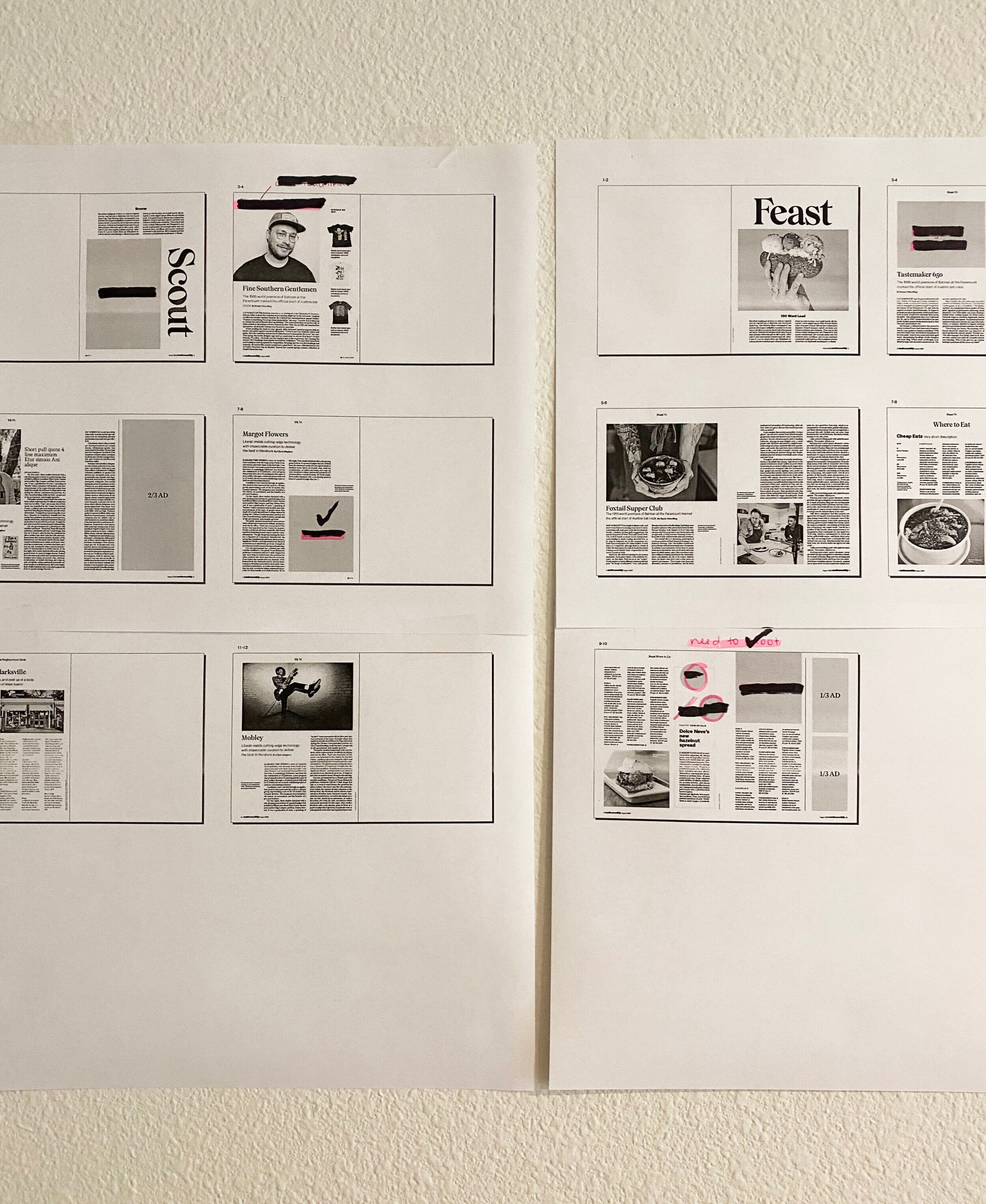
The only process photo I have; since I'm a one person art department, I essentially lay everything out, plug in holes of missing art and then go back and revisit each page to tweak the design.

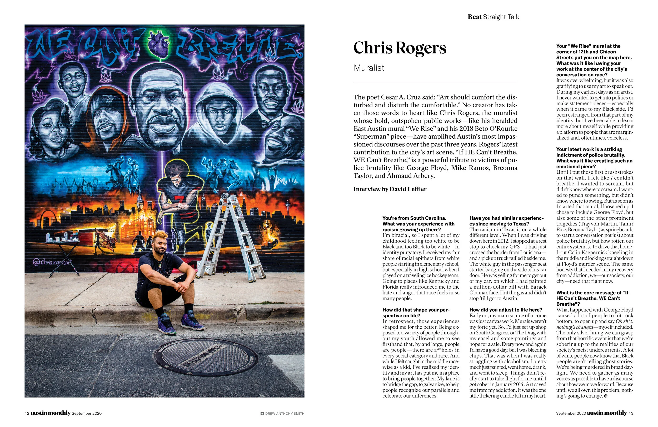
I have to use our budget strategically so I try to pour it into hiring top talent, like Rami Niemi
A more text heavy page example
SPD: Tell us about the redesign process.
SD: Austin is one of the fastest growing metro cities in the United States, and with that growth comes change. The old typefaces (Tungsten, Sentinel and Verb) felt disconnected from the Austin I came to know when I moved here in early 2019. There was also too much competition between the business of the advertising against the editorial. It felt like our content was getting swallowed up.
Editor in Chief Chris Hughes and I were brought on at the same time to spearhead the redesign, so it started only four months after we were hired. Our first step was working with Scout Story Lab, out of Portland, Oregon. They helped us define our editorial pillars, or the four main channels where we focus our content. We did not start working on the design portion until mid-December when we began shopping for someone to collaborate with. When moving to Austin, one of the exciting points for me, was to be in a place that produced such renowned editorial designers, like Scott Dadich, Caleb Bennett, T.J. Tucker and of course DJ Stout. We began working with Stout and designer Haley Taylor at Pentagram shortly thereafter. While I continued to produce the monthly issue, Stout and his team helped bring together all the various elements we were aiming for through regular presentations with the editorial staff and myself.
SPD: How did you tackle the additional challenge of redesigning during a pandemic?
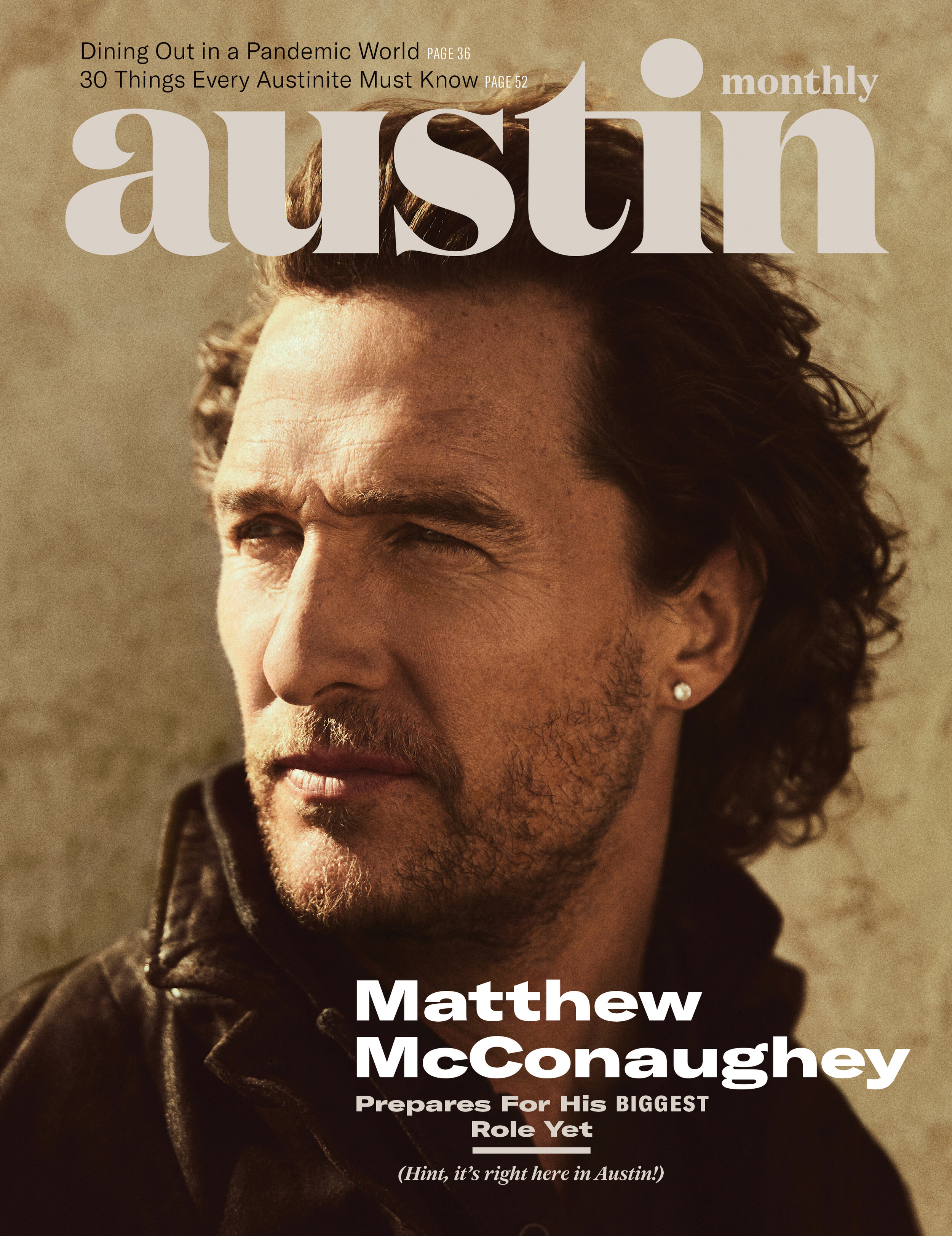
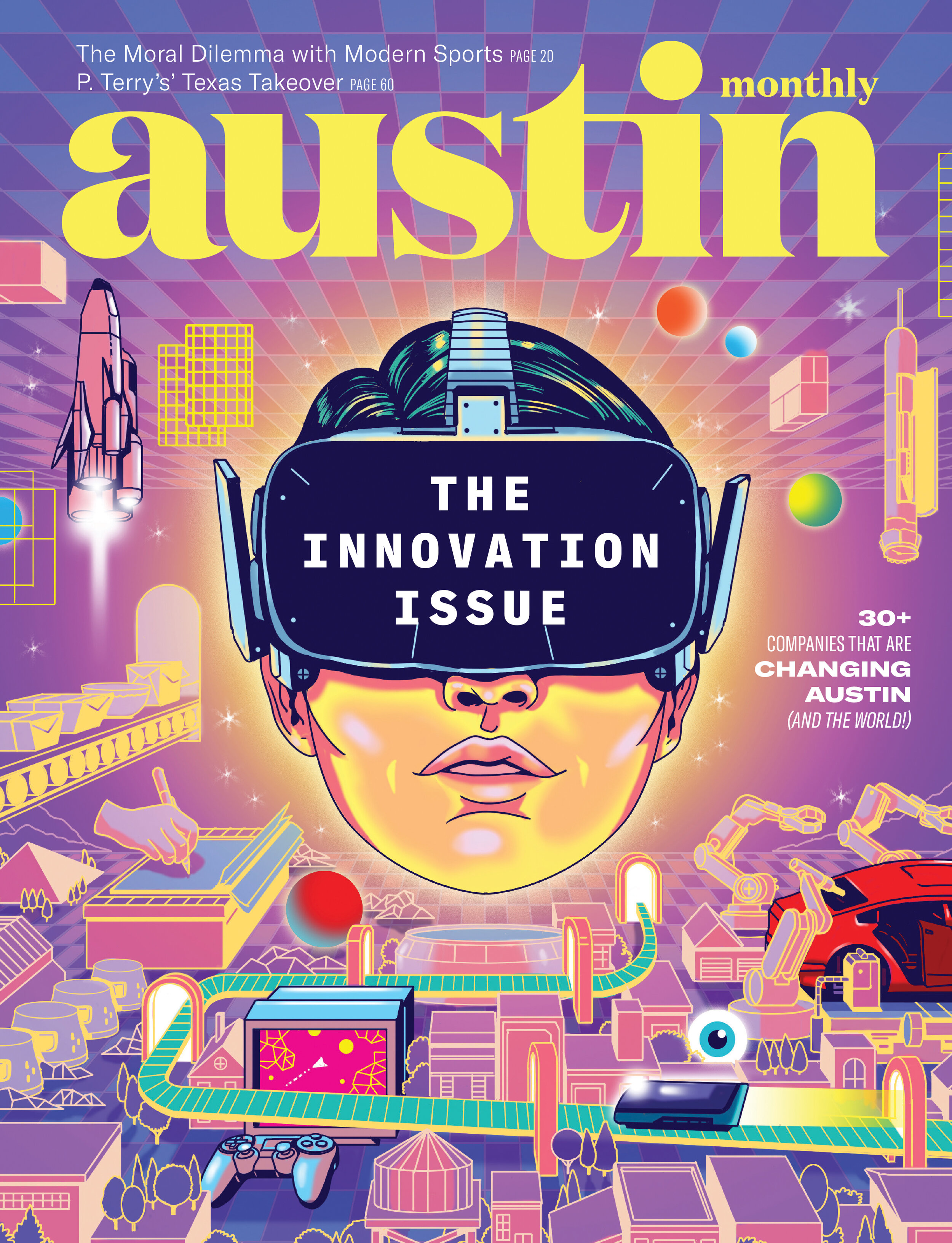
SD: Luckily, our time with Pentagram had wrapped up for the most part before the pandemic hit. Once shelter in place started, our logo was done and we had templates that served as jumping off points. I spent about a month, tweaking and perfecting layouts with my little black and white printer, and a blank wall where I taped up a makeshift miniboard. The most challenging part was not having the ability to pull the editors over and get their feedback. Instead, it all had to be done through Slack. By this point, we had planned on the September “Innovation” issue as our launch, but anticipating the press that our Matthew McConaughey issue would bring, I wanted to push it up to August. With the date moved up, the creative side of the redesign took six months to complete.


SPD: One of the major changes is the logo, can you walk us through the process of updating it?
SD: This portion took the longest. We knew one thing for sure, the logo needed to keep “Austin” large, with “Monthly” playing a smaller role, as to not compete with our newsstand neighbors, Texas Monthly. Initially, we hadn’t given Pentagram too much direction on the new logo, just a few examples of what we liked. I think I gave them Atlanta and Bon Appétit as reference, so two fairly different styles. My specific taste leaned toward serif typefaces, but we wanted to see everything. So, Pentagram gave us options. Austin with a capital “a,” all lowercase, serif, sans serif, script, even a sci-fi cowboy option. We landed on all lowercase, as to have a spot where secondary coverlines had a natural place to nestle. Once decided, Pentagram’s team began to offer various ligature adjustments to customize the typeface (Domaine). We ended up going more subtle, while still giving it a quirky vibe with adjustments to the “u” “t-i” and “n.” There’s just something so beautiful about the lowercase “a” that we now use in our social spaces and as our endbug. (See Haley Taylor’s Instagram post about one of the options they provided below).
Showcases that section’s color theme (Scout's is deep blue) and flexibility of the grid
Before: I included these with the ads so you can see how overwhelming the full page illustration was, against these busy ads. This is our news section, now renamed Beat.

After: Included with the ad to see how much better it stands out
SPD: What were the other major differences?
SD: One big change was rearranging and clarifying the sections by changing their names. For example, in the past our section named “A-List” focused on local topics like politics, tech, and business innovations. But the name was a bit misleading. So it was renamed “Beat” – to signify the heartbeat of the city – or a newsbeat. A-List was also what kicked off the magazine. Oftentimes, the opening story would be on weighty topics which felt more approachable closer to the well, so we moved it back. Now we open the magazine with more approachable content like our arts, culture, style, design, and travel section: Scout. Renaming the sections did not inform my design, but the pacing definitely did. Though no one would likely pick up on it, each section has its own color palette to create cohesiveness throughout the sections since we’re often working with provided art--and you never know what style you’re going to get.
SPD: Tell us the story behind the cover shoot for your first redesigned issue.
SD: Our article with McConaughey had been in the works for awhile. His team wanted to tie a special announcement to a specific issue month, so it sat on our calendar for over six months. Around February, we started communicating more with his team and decided to get things moving, even though it was early for the August issue. I had a photographer from San Antonio ready to come up and we were hoping to do a couple location shoots with him on UT’s campus. I had just started to come up with concepts for the cover when COVID-19 started to become something people were taking more seriously. By March, it was clear a photo shoot was officially off the table. Around that same time, GQ’s cover with Robert Pattinson shooting his own images had just come out and I remembered his agent had said one of McConaughey’s kids was really into photography. I remember asking my editor, “Should we do this?” – I’m not a fan of the unexpected. So, I sent his kids a ridiculous mood board of what I wanted, but I’m glad they ignored it. Instead we got an intimate look at their life and how they see their dad. Not only that, but they spent days producing these images. I’m glad that in some tiny way, we got to play a part in them making fun memories together. The only shot that wasn't taken by his kids was the cover shot, which we purchased from his friend and frequent collaborator, Miller Mobley.

More examples of flexibility with house fonts; also showcases a photo his kids took for the magazine

Shows the flexibility of one of our house fonts (GT America) in mono
SPD: What's your favorite part of the redesign?
SD: The white space. Thankfully, I have a really great team of editors who also appreciate the power of white space, so it didn’t take a lot of convincing to adjust word counts to accommodate. I also love how our content stands out from advertising now. In a very nerdy way, I really love our body copy (Independent) and how it adapts so well to any column width.
SPD: What's next for Austin Monthly?
SD: Creatively, I want to push the magazine more, to be less standard than what’s in the city/regional publication realm. We cannot avoid the necessity of using provided photography for some pieces. But for anything original, we need to embrace the “weirdness” this city is known for.
Example of page using grid and ample white space.
Instead of telling stories through secondary photos, we're trying to incorporate quick bites of info via infographics and stat sidebars; the more entry points, the better

Before: I included these with the ads so you can see how overwhelming the full page image was, against these busy ads. This is our living section, now renamed Scout.

After: Included with ad to see how much better it stands out