Garden & Gun’s Redesign with Design Director, Marshall McKinney
/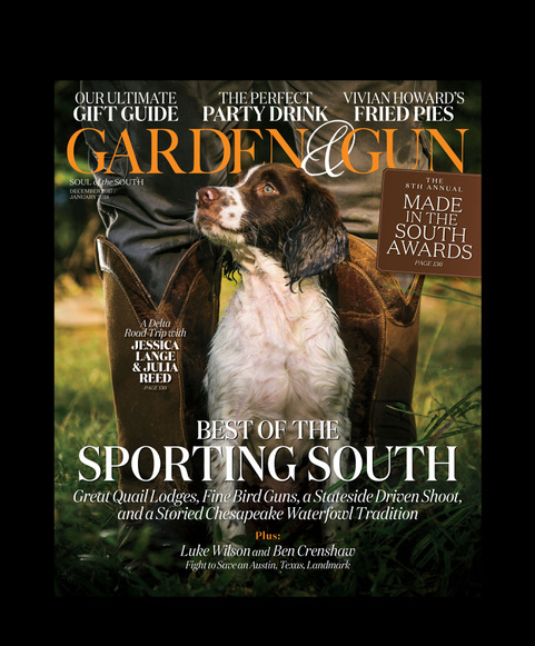
With the close of Garden & Gun's tenth anniversary year, the publication recently debuted a new redesign with their latest December 2017/January 2018 issue. We spoke with G&G's Design Director, Marshall McKinney, about the redesign, how Garden & Gun has evolved in the last ten years, and who he'd let punch him in the face.
Read on for Marshall's answers and see more from the redesign after the jump!

Here we have our TOCs. TOC 1 has the flexibility to become a full page photo if/when appropriate.
SPD: You've been with Garden & Gun since the beginning, how has the magazine evolved in the last 10 years?
Marshall McKinney: For the record, I came to Garden & Gun toward the end of its 5th issue, one issue into its second year (2008). I'd be the fourth art director to take the helm.
I'd contend our magazine evolves slowly and deliberately, aesthetically speaking. But that's evolution for you. Things move at a glacial pace and perhaps that's for the best. I think in the early years there were some differing ideas on what the magazine's core values and pillars should be--specifically, luxury versus lifestyle. However, shortly after former EIC Sid Evans arrived from Field & Stream in 2008, our focus sharpened. Sid lured me to Charleston from Outside's Go (launched in 2007) in Santa Fe and we set out to re-tune G&G's content and hone our editorial direction alongside current EIC and Senior VP David DiBenedetto and Photography Director Maggie Kennedy.
The base layer of the design that I inherited felt--to my eye at least--thoughtful enough, well-crafted and something that with a bit of effort could be coaxed into a lifestyle product. But, it was clear that G&G would be wearing muddy field boots and not Prada heels when it finally hit its stride toward the end of 2008. All that said, launching a new magazine brand while stressful is great fun! At least in the soft glow of hindsight. I'd certainly recommend the challenge to anyone who loves them.
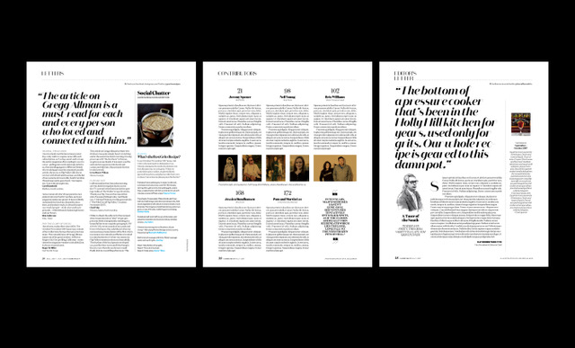
Letters / Contributors/ Editor's Letter. Oftentimes these pages are required to accomodate fractional ads.
Given the fact that the economy would totally implode in the latter part of '08, becoming a lifestyle focused brand kind of proved to be a stroke of genius. Suddenly there was this passionate return to authenticity. Folks craved things made locally by hand, with heart and with soul. There was an almost instantaneous aversion to vapid consumerism, and Euro-vacationing fell out of vogue. Southerners were turning more inward I think, as was the entire country, and there seemed to be this resurgence in pride of place and love of all things Americana. Our readers wanted to be inspired by happenings in their own backyards. You could hear it in the music (cue the Avett Bros.) and feel it in your tight, scratchy, 20 oz-weight Cone Mills denim selvedge jeans that never quite felt comfortable but who cares. Selvedge! All of a sudden people were pickling stuff in Mason jars and the farm-to-table dream became some kind of aspirational ethos. Beards got long and everyone looked like they were headed to the hoedown. Chefs became rock stars, with groupies! Cocktails with no less than 16 ingredients! Reclaimed wood, EVERYWHERE! So yeah, we found traction.

This is how our section openers shake out.
My favorite brands have always been The New Yorker, Vogue, Vanity Fair, Rolling Stone, New York, Texas Monthly, GQ and Esquire. All of them put a premium on crafting a solid narrative arc paired with great photography. Though some tinker with their designs more than others, they possess a quality of "being-ness" that I admire. By that I mean they're comfortable in their own skin, confident in their identity and as a result project originality. That's something we aspire to here at Garden & Gun.
I bring all that up because:
A) It took a minute for the brand to suss out how best to project itself.
B) I don't believe one should willy-nilly make sweeping aesthetic changes to a brand that's just starting out--that betrays the reader's confidence in what you're doing. Rather make clever changes and move slow.
C) Having a good foundation, we refined our approach to pacing and emboldened our signposts and section openers.
D) Sensing we were resonating with our readers, we stayed focused on photography and crafting solid storytelling. That should take precedence over pyrotechnic design shit. Besides, I'm not sure I'm capable of that stuff anyway. So yeah, we evolved the design of G&G carefully and steadily.

Talk of the South section
SPD: Why was it time for a redesign?
MM: I was spinning out of control in a Caslon induced paranoia (with apologies to typographer Matthew Carter who is unquestionably brilliant). Because our body copy felt way too clunky as it was set a decade earlier. Because our pages felt too dense, too boxy. Because our design had grown too complicated for a two-person art team. Because every trick I could come up with had already been done. Because after ten years, you end up with a lot of layers of paint on the walls whether intended or not. Because after establishing a successful, recognizable brand it was time to reimagine what is relevant in southern culture and how to present it to a wider audience outside of the South. It was time to strip away what's no longer needed and keep only that which is necessary or purposeful. It felt like, after a decade, it was just time to try something new.
The South is a fantastically dynamic region. One that gets a bad rap on occasion and sometimes for good reason, but cliches aside we recognize it's impact as a vital place full of incredible talent. You don't have to go to London, L.A. or New York to find culturally kick-ass happenings in food, style, music, literature and art. I'm in awe of what's going on all around us down here. It's my hope that the redesign is in tune with that fresh energy and will amplify the magic for our readers--those in the South and beyond.
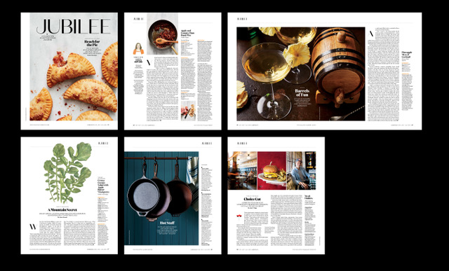
This is our newest section, Jubilee. It celebrates all things food related going on in the South and beyond. More often than not we'll lead with our Anatomy of a Classic (unique southern recipe) or Drinks page. That said, there's tremendous flexibility to change the paradigm depending on the content. I foresee this section expanding over the course of the year to include chef profiles and a few other bits we're still kicking the tires on. It's certainly one of my favorites and I can't wait to see how it evolves.
In 2011 we undertook a refresh as Dave DiBenedetto took over the helm as EIC. What that means is we did a lot of housekeeping. We cleaned up the place. Introduced a couple of new fonts in the process and tried to breathe a little more whitespace into the departments. I think the magazine was better for it but, in doing so, I errantly added some elements (rules, colored devices that differentiated sections, etc) that made the day-to-day design of the magazine way too arduous for our small team.
So with the 10 year anniversary on the horizon, I knew what I had to do. The same thing I always do when I need valuable insights on "Southern" design: call a Canadian! In this case it was Tom Brown in Vancouver. I spoke with Tom at length about our design challenges and about how I thought, after a decade, Southern culture was shifting. I brought him down to see it all with his own eyes. Tom is whip smart. He's a joy to be around and is among the most creative magazine minds on the planet. Publishing from Charleston is utterly delicious, but there are times when you feel like you're on a remote island. It helps immensely to have someone you trust and respect to bounce ideas around. Between Tom and long creative sessions with Dave DiBenedetto I knew we'd land on something great.
Once our research here was complete, I lit out of Dixie and joined him at his studio in Vancouver. There are no clocks on the walls there. There are no windows. It's like a funhouse for designers. A hole in the space-time continuum gobbles you up upon entry. Carefully curated design books cling to modern shelving in military salute, nary a speck of dust. Brilliant posters from around the world hug the walls. Models of Formula One cars are parked everywhere. Beguiling down beat house music flows from speakers and you think to yourself, I don't even like house music but I could listen to this shit for days. And you do. Almost instantly five days pass. You're only aware of that because when you're spit out, you find yourself standing in front of a Delta kiosk headed home. You feel intensely recharged. It's a sublime creative hive to be sure.

Good Hunting is where we house our style and design content. Here you'll find anything from a one-of-a-kind garden to unique architectural gems to weirdly wonderful collections--in this instance oyster plates. This is also where our more service-y product pages are housed. For the December/January issue it's home to our holiday gift guide.
SPD: Was the redesign planned for the 10th anniversary issue?
MM: Yes. And then no. And then yes and then no and then maybe. The anniversary issue was April/May but there was a lot of extracurricular programming going on around that time--a book project with Harper Collins to complete, SIPs (special interest publications) and marketing programs galore. Our company has grown so fast, and success comes with its own set of challenges. We were stretched thin. We eventually landed on the Dec/Jan issue, which was sort of painful. Mainly, because any time a kid has a new toy, he wants to show it off as soon as possible. Plus, the pressure of having a redesign looming on the horizon is stressful for any staff.
Still, nothing worth doing ever comes easy. We forged through three issues and got the redesign out on the heels of our Southern Gardens SIP. It still amazes me how we're able to produce a magazine of this quality with such a compact editorial staff. It makes me very proud of my team. Speaking of which I couldn't have done the redesign without the help of production manager Jenna Bruce Todd and my new art director, Julia Knetzer--who arrived just in the nick of time.

Due South is our travel section. It usually contains some eight to ten pages of content. Bookending it is The Southern Agenda. Ostensibly it's a kind of sub section within Due South that serves as a roundup of the best happenings in each Southern state. The material there is asked to absorb a lot of fractional ads as we rarely jump features.
SPD: What were the major changes?
MM: We rebranded our identity with a new font family called Domaine by Klim Type Foundry. We added a wider margin around the entire page. There's far more attic space than before. We went with Founders Grotesk as our sans. Then we stripped away as many extraneous fonts, design do-dads, and gadgets as we could. One of the main goals: Efficiency. If we're going to run this department lean, then we're going to have a design that reflects that fact. I even lobbied to get rid of caption slugs. I like them but they suck up way too much time in the production phase. We threw out anything and everything that felt like it was creating drag on the ride. We crave speed and elegance. Period.

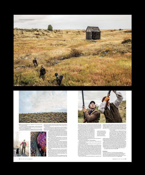
Here's a straight over home plate G&G feature shot by Andy Anderson
The inspiration for the redesign comes from the French cultural thread that weaves through the South's Crown Jewels: Charleston, Savannah, and New Orleans. Our old design rested heavily on the Caslon family and its connection to Americana. Little known fact, William Caslon was a gun engraver long before he set to work as a typographer. Heck, The Declaration of Independence was set in Caslon when first printed.
One of our magazine's owners, Pierre Manigault, can trace his history back some 300 years here in Charleston and far beyond that in France. When you ponder places like Charleston, Savannah, and NOLA they're synonymous with culture, food, music, architecture, and festivals. They aren't the richest cities in the South, they aren't economic powerhouses, but rather bastions of history and culture and reinvention, the kinds of places people want to find themselves. The wrought iron work, the cobblestone, the port city vibes, the decadent decay and the festivals. Especially the festivals! That then pointed us to celebration as an important theme. Celebration pointed us to Champagne. Champagne took us back to France, where we geeked out over old bottle labels. That label research led us to Klim and specifically to the font family Domaine. Voila! We now had function and form.
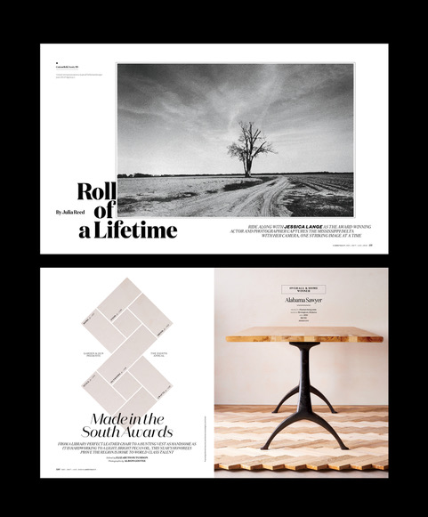
Here are a few more feature openers that round out the December/January issue.
"Roll of a Lifetime" photographed by actress Jessica Lange
"Made in the South Awards" photographed by Allison Gootee
SPD Bonus Question: Who would you let punch you directly in the face?
MM: Line them all up! T'would make a great carnival attraction next to the photo booth at SPD 53. In this industry I'd let Nathalie Kirsheh, Carla Frank and Tom Brown. Pretty much anyone except Keisha Dean. I get the feeling Keisha hits like Mike Tyson in his prime. She'd take the entire head off at the neck. That would really affect my part.
SPD Bonus Question: What's the most useless talent you have?
MM: Writing bitchin' HEDs and DEKs and caption slugs that usually never see the light of day (another reason those damn things had to go). I also excel at coming up with all kinds of wacky magazine related concepts and apps. I'm forever pondering a better medium than print. But, it's just useless to even try. Is there really a better medium than print? Why do I get the feeling that somewhere in California all those former magazine design gods working at Apple are smiling with a sinister grin. Thank god ignorance is bliss or I'd never get out of bed in the morning.
Lately I'm intrigued by newsstands. It's a symbiotic thing. Magazines and newsstands go together like pork ribs and wood-smoke. Can't have one without the other and it seems, outside of NYC, they're becoming increasingly harder to find. If there's some enterprising young tech-geek out there that wants to help me digitally solve this analog problem please call me. Happy to help us spend the first few rounds of angel investment on records, foosball tables, surf trips and bourbon. Hollar at your boy.

C R E D I T S
Design Director: Marshall McKinney
Art Director: Julia Knetzer
Photography Director: Maggie Brett Kennedy
Associate Photo Editor: Margaret Houston
Production Manager: Jenna Bruce