California Sunday's Redesigned Shorts Section
/
Photography by Joshua Dudley Greer for The California Sunday Magazine
Our SPD53 Magazine of the Year winner, The California Sunday Magazine, recently debuted a redesigned Shorts section in their June 2018 issue. The new themed section takes an in-depth look at the tech pipeline and the lack of diversity in the tech world. We chatted with the California Sunday team about the inspiration behind the new look.
SPD: Why did California Sunday decide to update the front-of-book shorts section?
Raha Naddaf, Executive Editor: The Shorts section is something we've always loved and have done some really great work in. But it felt like a place, due to its very structure (four or five pieces that are roughly 1,000 words each), where we couldn't go deep on any one subject. So we wanted to rethink what a front-of-the-book section could be, and we landed on the idea of a themed Shorts sections that allows us to play with formats and find different ways of telling stories; they'll feel both reported and narrative, all while focusing on single subjects that feel big and topical and relevant to the region we cover.
Francesca Mari, Senior Editor: Plus, we always have so much fun putting together our themed issues (in 2016, we produced a sound-themed issue; in 2017, one focused on teenagers) and reimagining what a magazine can be. A themed front of the book allows us to do that sort of reimagining more frequently; we get to reinvent the first third of the magazine every issue. And by focusing on a single subject, we get to say more, to explore an issue more fully, and to make a more meaningful contribution to a national discussion.

Photograph by Erica Deeman; Illustration by Jing Wei
SPD: What’s different about the section, from a design perspective? What stayed the same?
Leo Jung, Creative Director: We didn’t want to completely reinvent the wheel. There was no need to abandon the principles we held closely over the last few years. It was more about adapting our philosophy to a different design problem: a section of stories about the same topic. In discussions with edit, it was clear that they didn’t want to be restricted to a set number of stories and formats. Depending on the topic, they wanted the flexibility to tell a few longer pieces, a lot of shorter pieces, or a mix of both. For this reason, the section was templated but with enough flex to accommodate those needs.
Annie Jen, Art Director: As Leo mentioned, we don't want to completely reinvent the wheel, but we do want to rethink the existing template and what we can do to better reflect the themed aspect. One thing we decided early on is that we will always have an opener with big visual moments to introduce the section. We want the readers to feel excited about getting into the section and to be more engaged.
SPD: How did you decide that the Tech Pipeline should be the first themed Shorts section?
FM: The lack of diversity in tech—be it gender, socioeconomic, ethnic, racial, etc.—is a complicated problem, one without an easy answer. We wanted to get to the bottom of it, or at least to hear out as many people in the industry as possible.
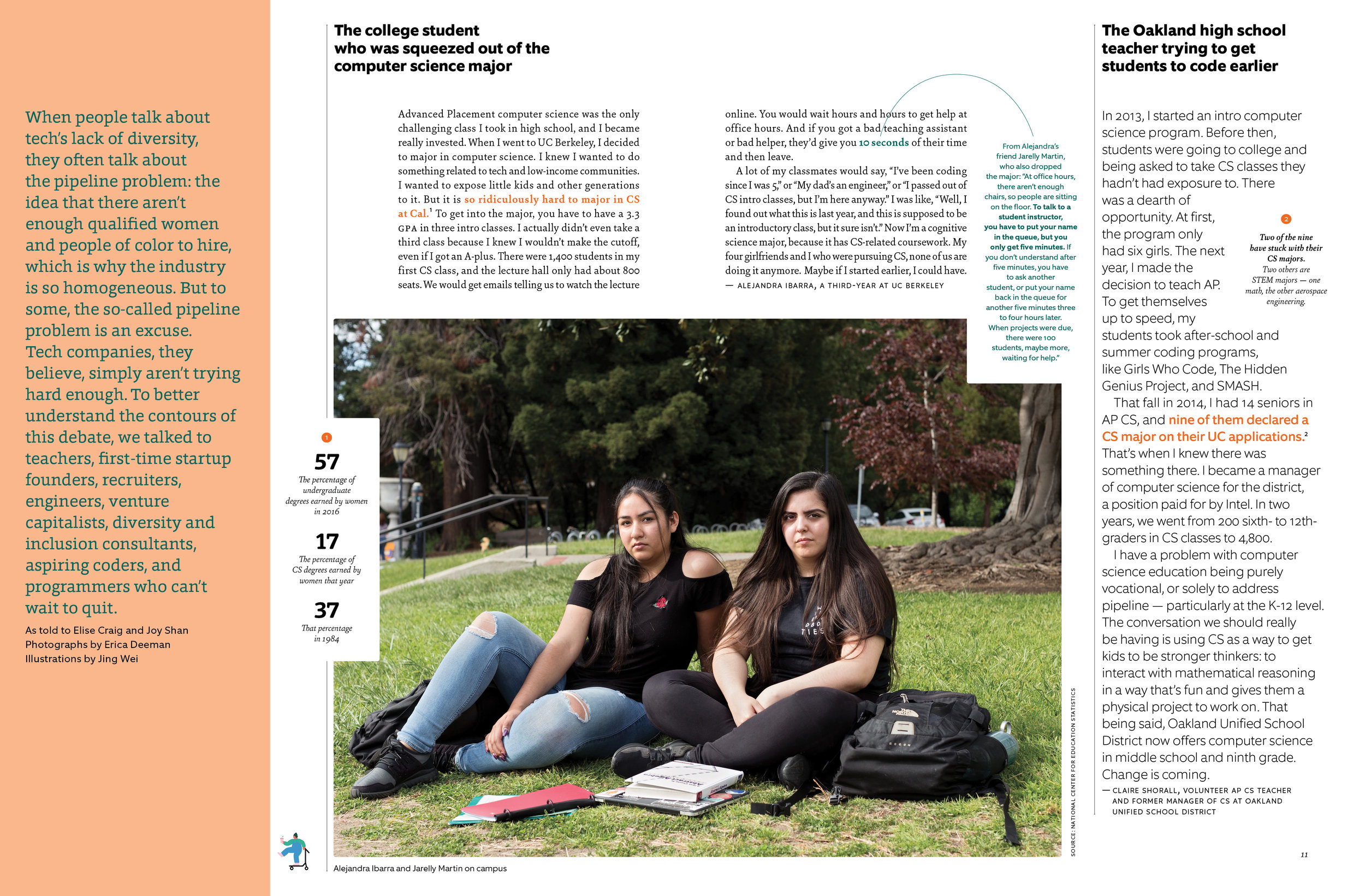
Photograph by Erica Deeman; Illustration by Jing Wei
SPD: How was your design influenced by this issue’s theme?
AJ: How we approach the illustrations for the Shorts section will be based on each different theme. Whether we have one person working on the whole section, or have a variety of style, it really depends on the format of writing and the tone we want to express. For the tech pipeline, the format is mostly bitsy pieces (16 as-tolds-to plus annotations for each one); to avoid overwhelming the reader, we decided to have one person working on the whole package to provide a constant visual look throughout the Shorts section. Jing Wei's work came to mind. She has a smart, conceptual approach that would tackle the different racial/gender/income issues that are presented in the tech pipeline. Her graphic style provides strong anchor moments on the spread, and it's a good contrast to Erica Deeman's photographs. Her choice of colors for these illustrations complements the design nicely.
Jacqueline Bates, Photography Director and Paloma Shutes, Photography Editor: We had the pleasure of working with Erica Deeman for the new themed section. Since the topic for the section is about the lack of diversity in the tech pipeline, we thought of Erica immediately. Her work deals with identity, gender, and race, and she has been exhibited around the U.S. She photographed her first editorial piece for our April 2017 cover story about Gwen Woods and what happens to a mother after her son is killed by law enforcement.
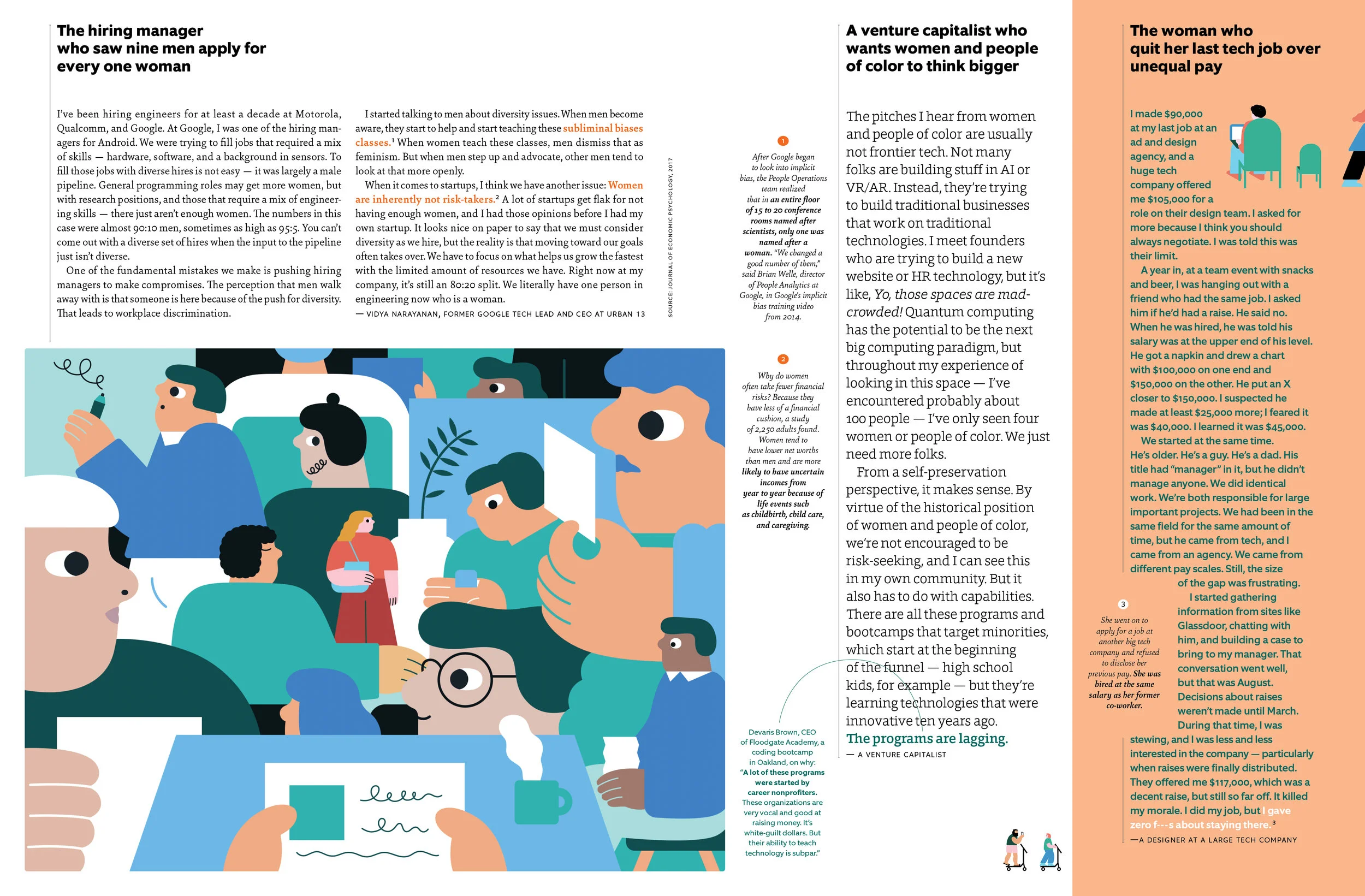
Illustrations by Jing Wei
SPD: What are the biggest challenges of reinventing a section? What are your favorite parts about it?
LJ: The biggest challenge was designing a grid and structure that gave us enough rigidity to be distinctive but also enough flexibility to be adaptive. When it comes to designing packages, we’re always looking to create systems and rules. Too many rules make the page-turning experience predictable and too few make it chaotic. Finding that balance is the sweet spot. I’m particularly fond of the decision to have the heds all along the top. It’s a strategy that adapts easily to the length of stories and is a simple but consistent mark that anchors the look of the section.
AJ: Besides the interior, we also need to think about how flexible we can be with the opener and the intro based on different themes, and these decisions will also need to implement into our website. We want to let people feel surprised, engaged, and excited about the Shorts section each time, but still provide a foundation so it doesn't feel random.