The SPD 61 Interview:
Rui Abreu & Mike Schnaidt
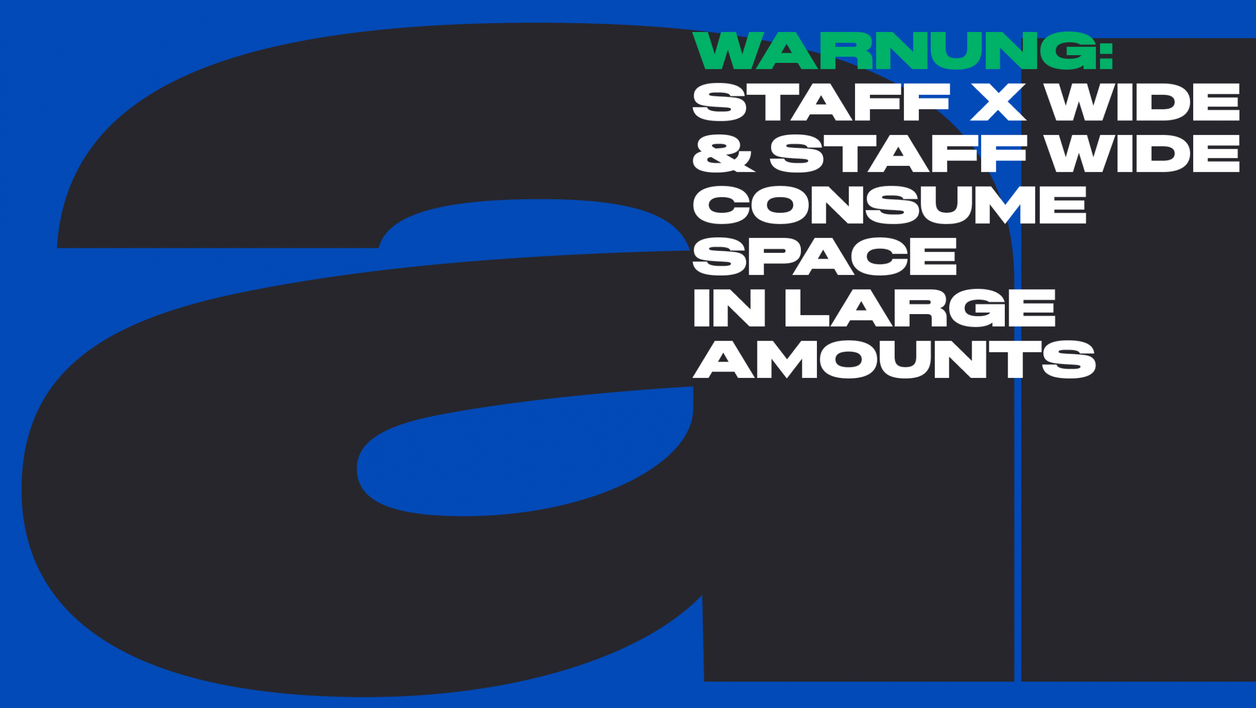
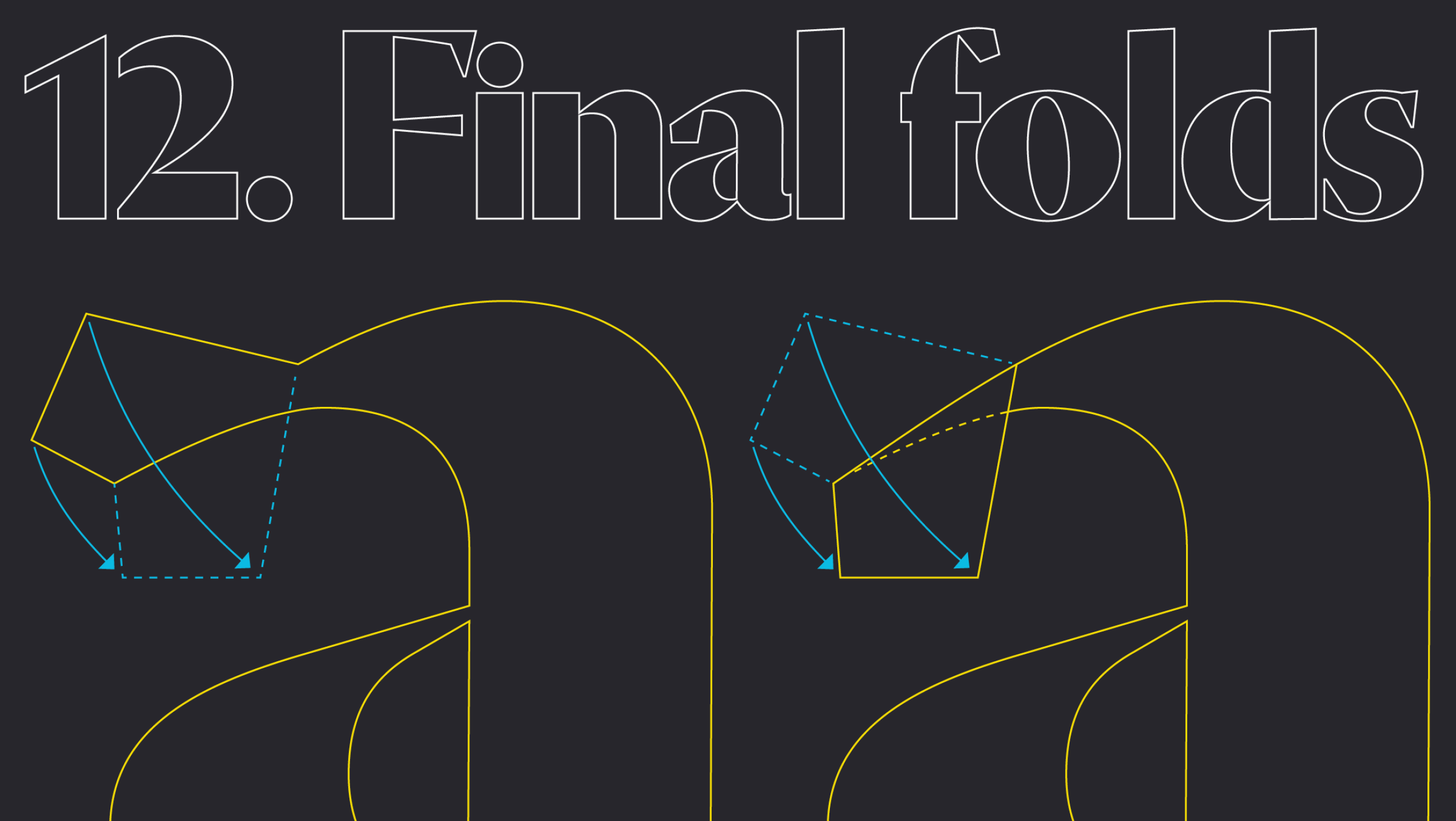
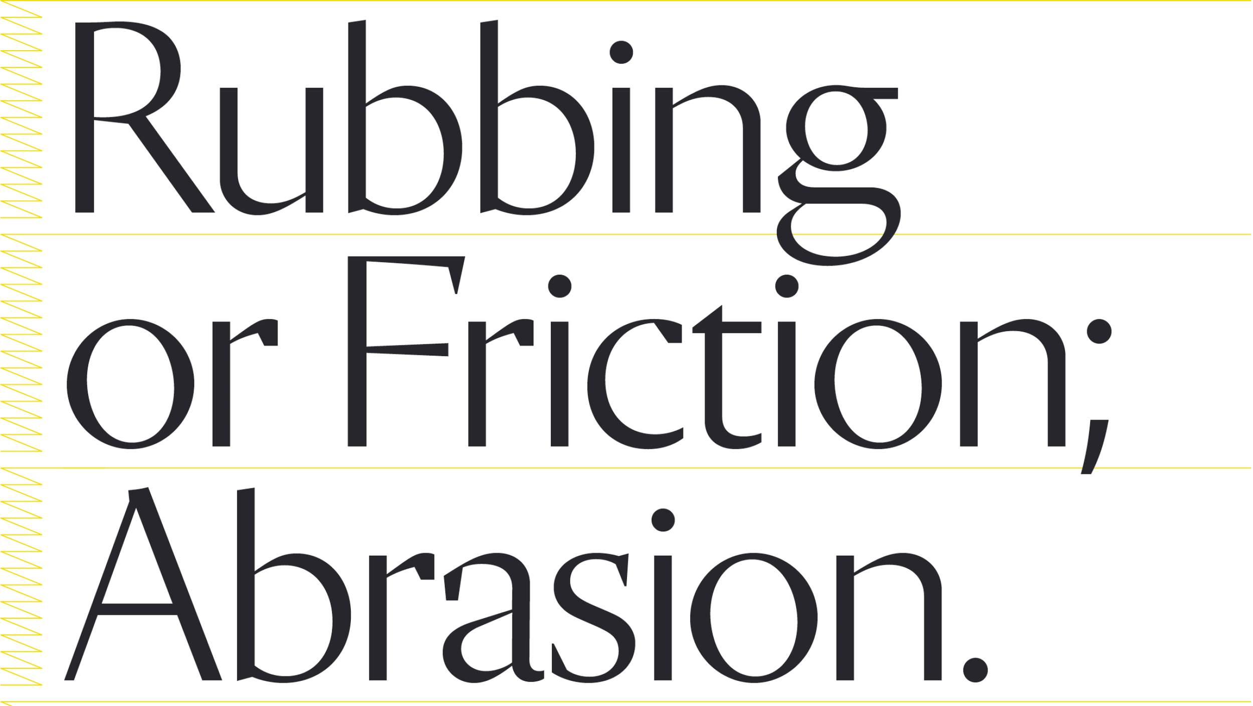
SPD 61 Chair Mike Schnaidt chats with Rui Abreu about his work and process as a typographer. See his typography in the SPD 61 Call for Entries and enter before January 23, 2026!
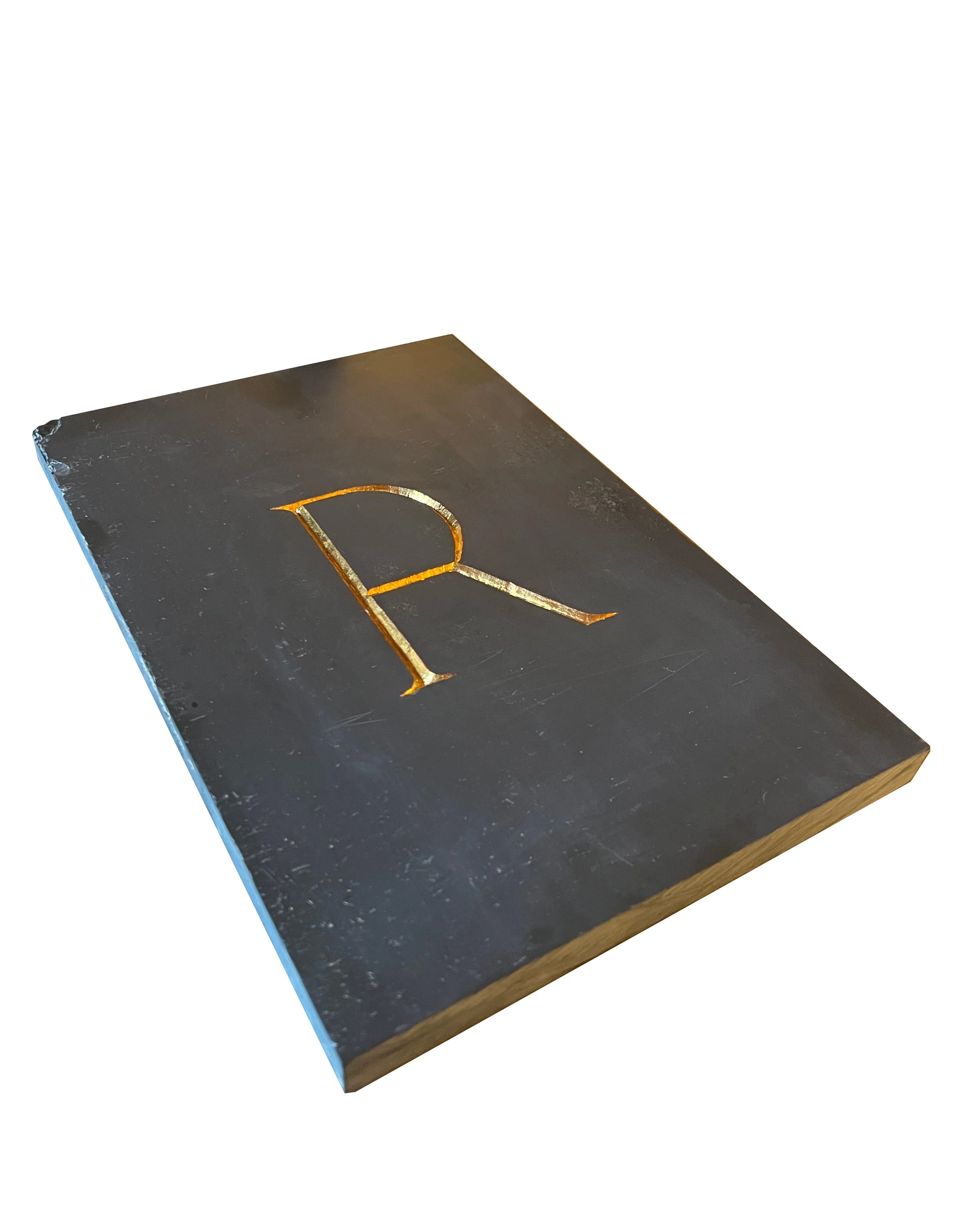
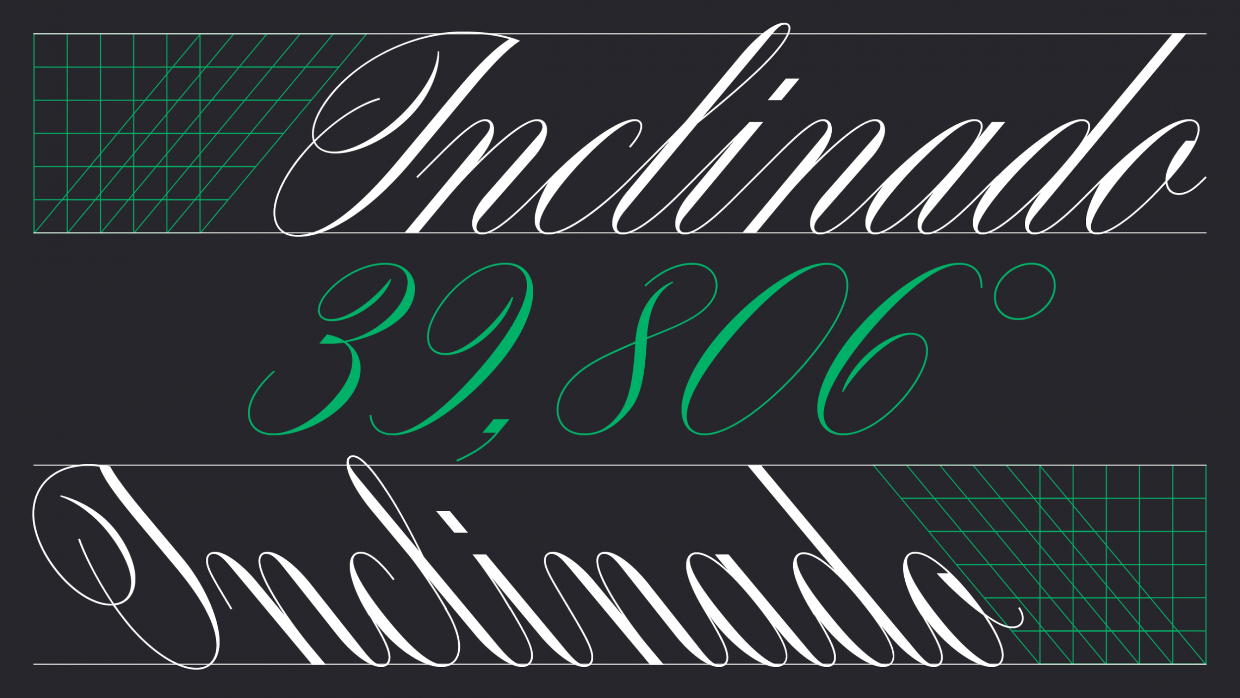
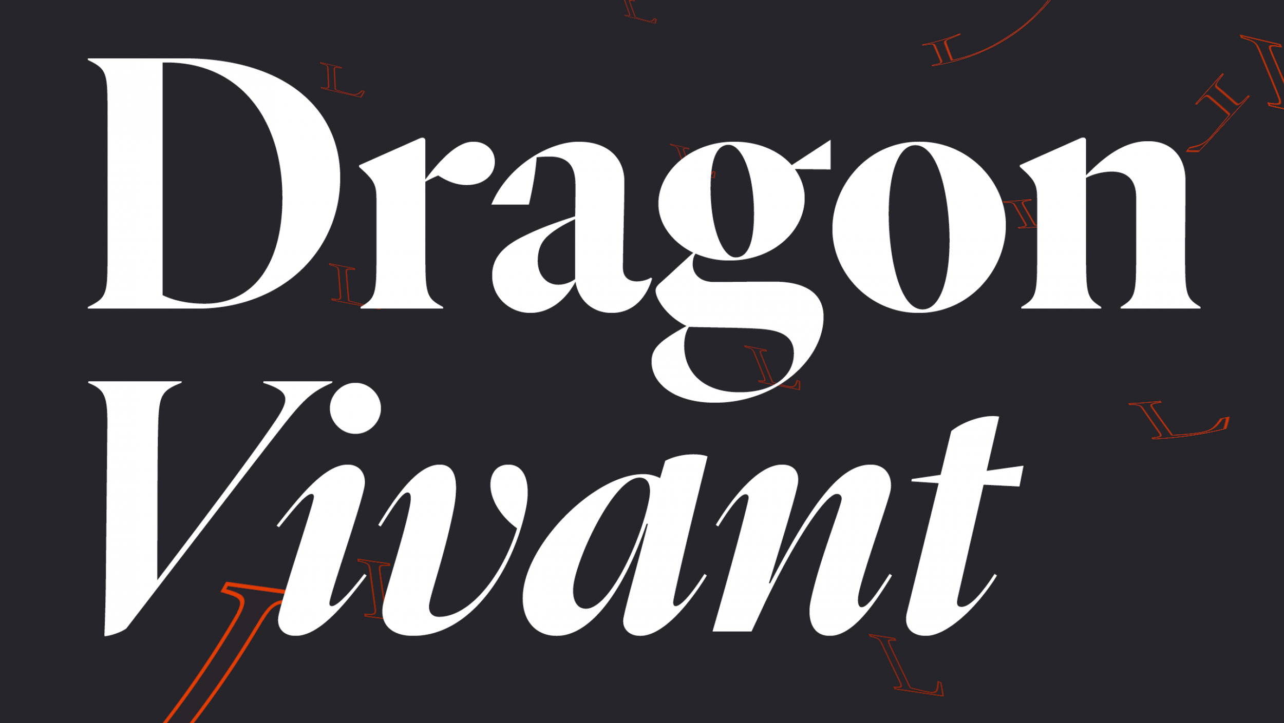
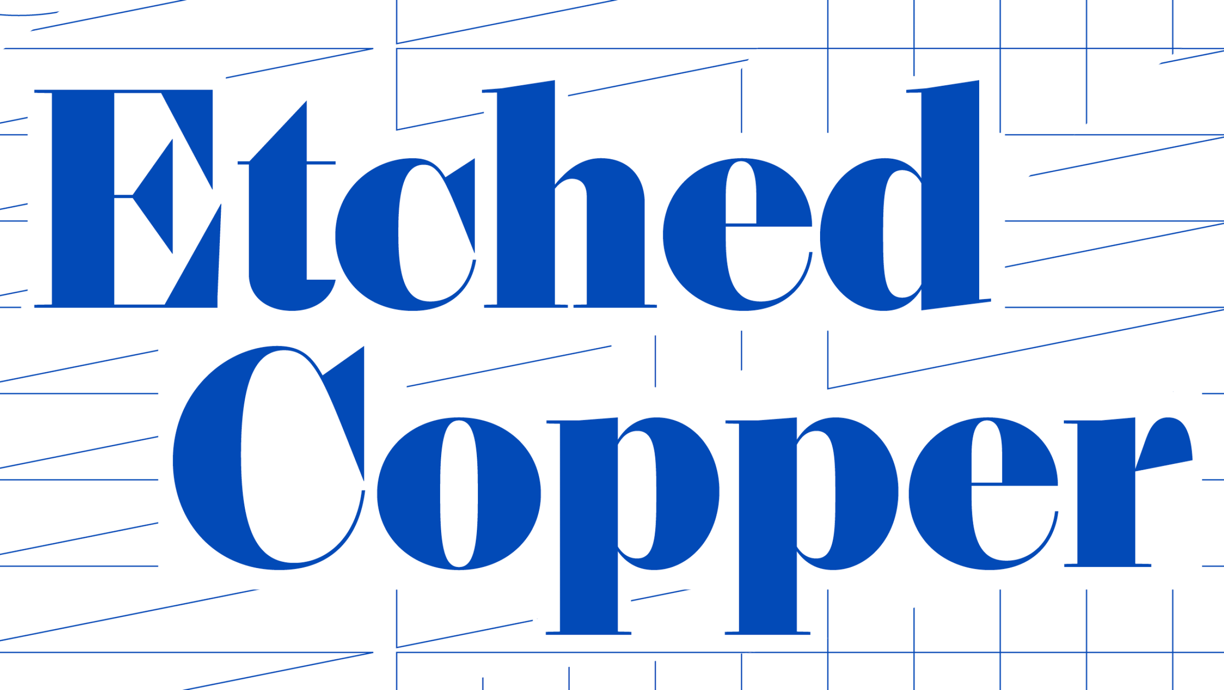
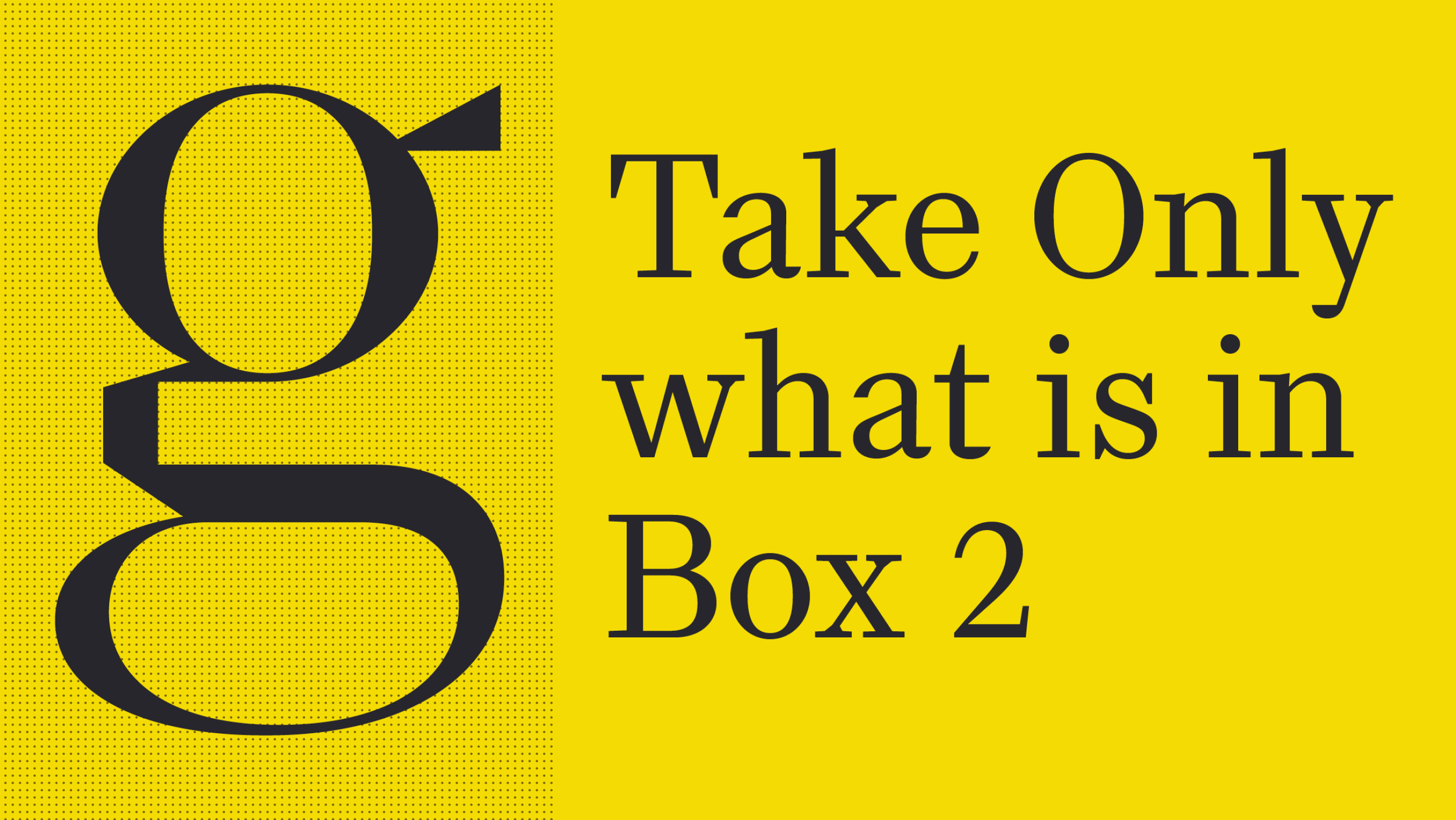
Read on below for the full interview and check out more of his typography at R-Typography.
Mike Schnaidt: When did you realize typography was the career for you?
Rui Abreu: I started my career interested in many things related to visual communication: animation, video, type design, typography, photography, printing, and drawing. Type design was the one thing that kept inviting me to dive deeper. It was thrilling to see words built with my own building blocks. But I also wanted to make fonts that could be used by other people—that’s when a typeface becomes real.
Eventually, with other designers using my fonts, I became confident enough that I was a professional. Each license was like receiving a bit of love, which made me want to improve with future fonts.
MS: Tell me about the first typeface you designed.
RA: My first typeface was Foral, a slab-serif family with deep ink traps. I managed to get it accepted for publication by Fountain, a Swedish type foundry, back in 2008. It was a long and painful experience because I was still learning almost everything about letterforms and how to draw in FontLab.
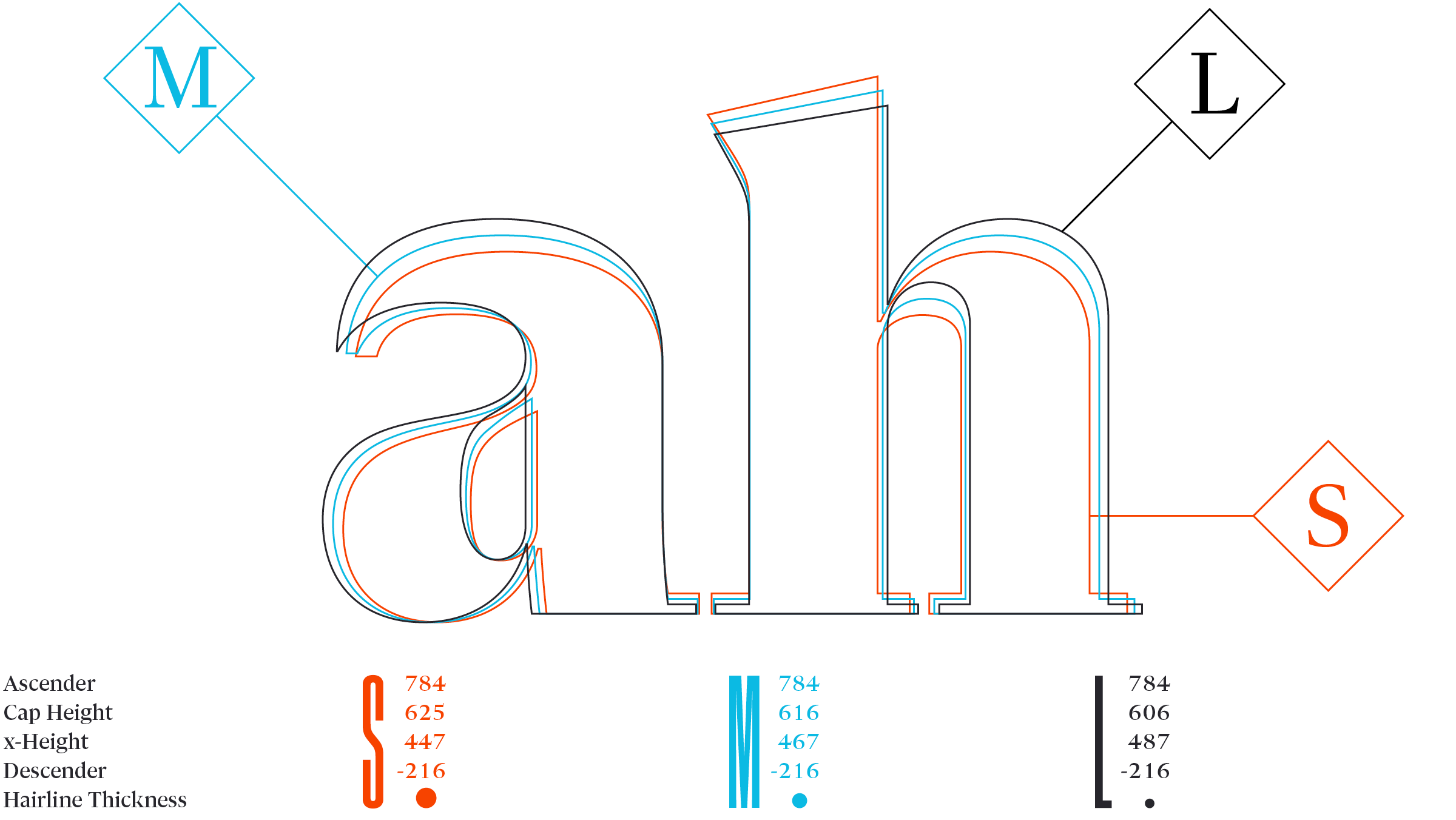
I redesigned the fonts several times, often when I was already deep into the character set. It was a four-weight family with italics. If I knew more about interpolation—the generation of a weight between a heavier and a lighter one—I could’ve designed the font quicker. When I started it, I had no idea it would end up taking four years, working in my free time. I learned all the basics through that experience, and it made me curious about how to make the whole process easier and more controlled. Looking back, I’m amazed by the patience Peter Bruhn from Fountain had with me.
MS: When you’re stuck on a piece, what’s your first move?
RA: I look at historical type. Not just to use its ideas, but also to innovate on its models. I like the fonts cut by Garamond and other renaissance punch cutters, as well as Jean Jannon, the Didots, and Fleischman.
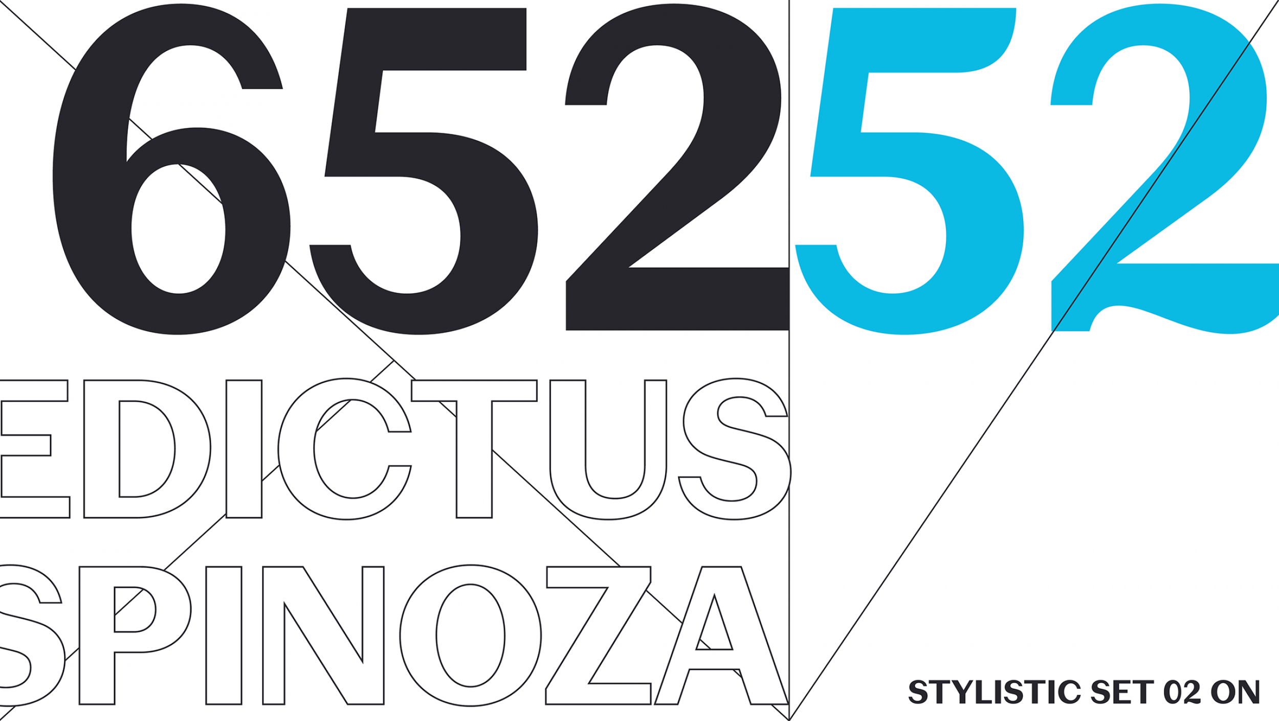
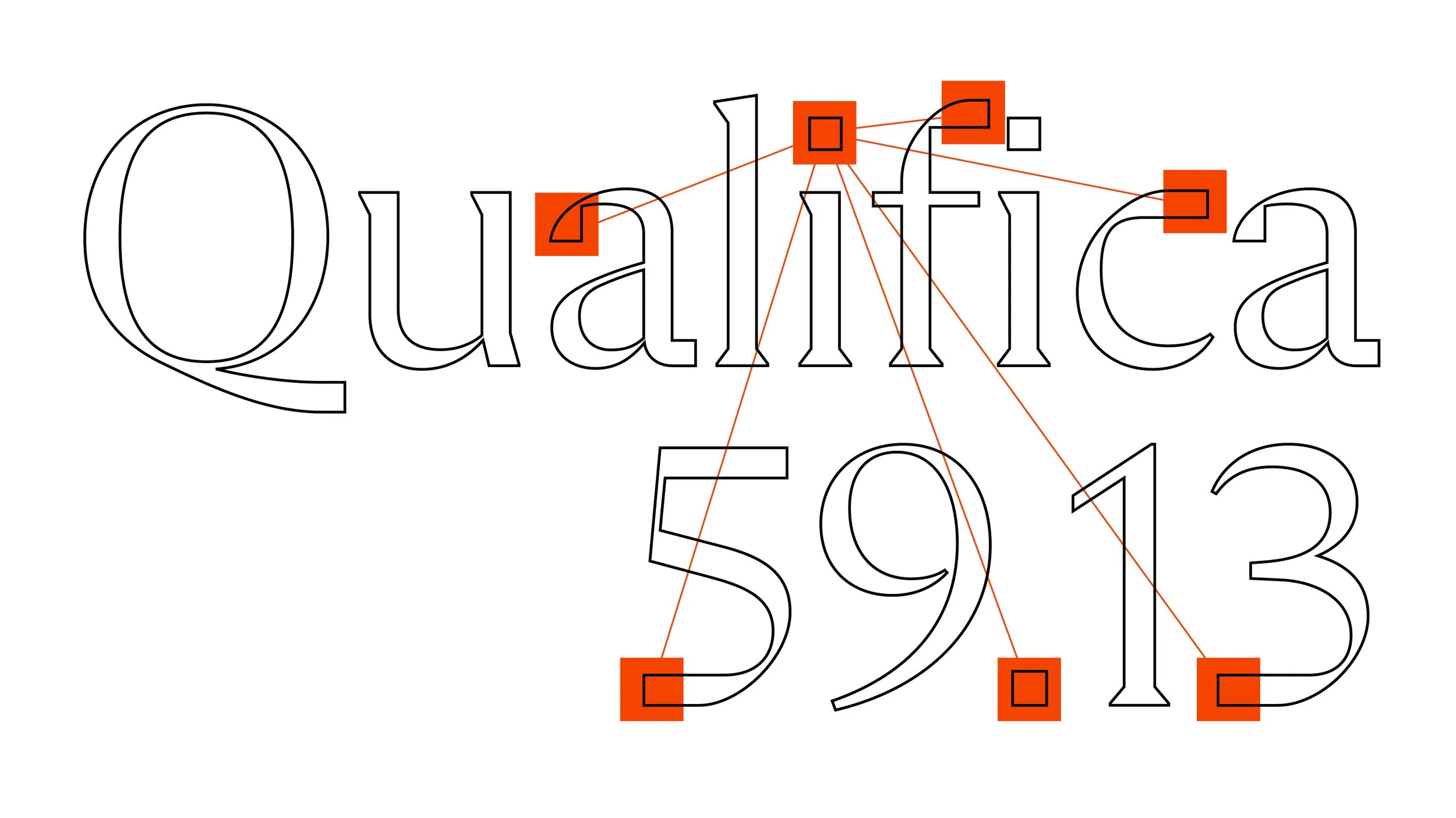
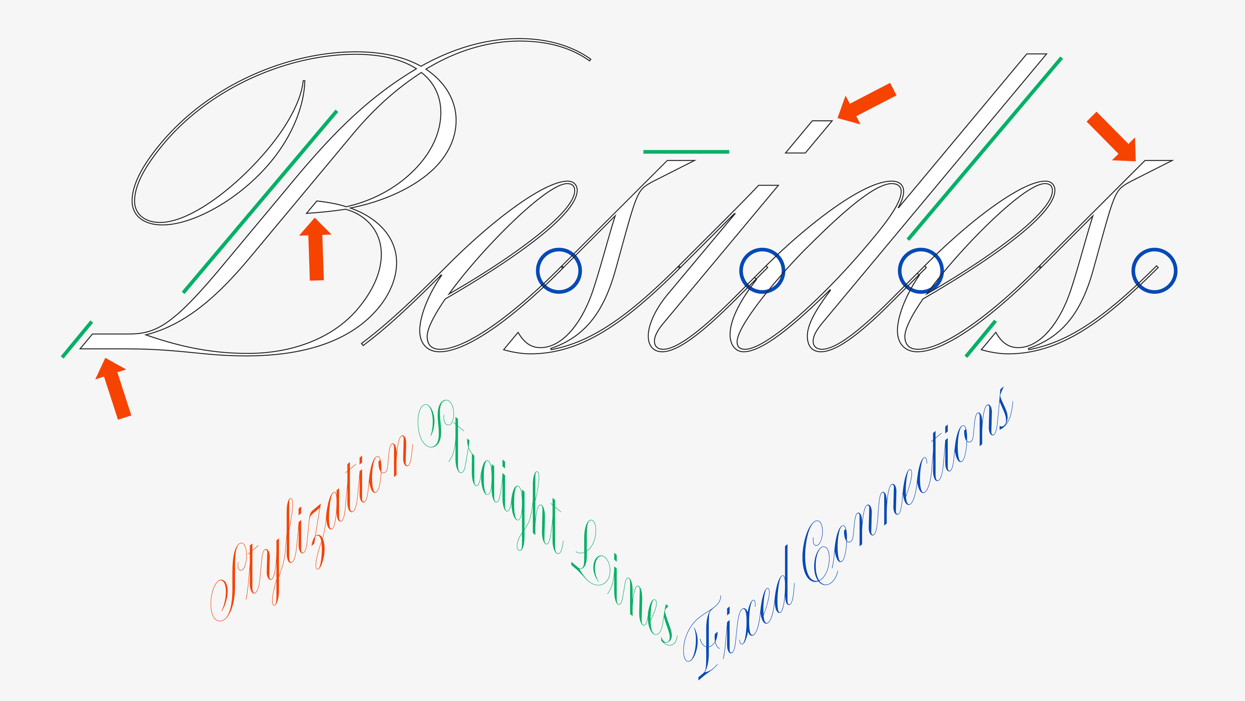
When I began Flecha, my starting point was the 18th century cut of Fleischman’s Roman. I liked the crispiness, the straight lines, and the angularity. Also, some of its capital letters have these bifurcated serifs, which I liked, but they didn’t fit my design. They are a decorative detail that in Flecha would only be a nerdy citation of that particular historical type. I wanted Flecha to be strong in its own internal logic. Not everything in historical models is necessarily right, either.
MS: Describe the moment you first felt like your work actually looked like you.
RA: I have never had that feeling actually. When a font becomes too much about me, or too experimental, it is not actually a typeface; it’s something I want to do as a graphic designer for a specific project. For example: if my font, intentionally or unintentionally, reminds you of beer labels, it means it’s only usable ironically, or on actual beer labels. When that happens, it’s better to wait for a project where that reference makes sense.
Having said this, I do insert experimentation in my fonts, and that’s where the personal side leaves its mark. I try to do it in a way that is subtle, and hopefully in favor of the character and usability of the typeface.
MS: What’s one thing clients always get wrong about type designers?
RA: I think many assume the work of a type designer is merely technical, or on the other extreme, that we can transform any random idea into typographic form.
For me a good typeface—one that is worthy of publishing—is something that is strong and cohesive in its internal logic and articulation of ideas. It has to stand on its own, but also propose an interesting dialogue with history. My approach is to develop a specific set of rules for each typeface, and put functionality and assertiveness at the forefront. If, in that process, the alphabet comes alive in some way, then it's worth developing and publishing.
MS: If you weren’t doing this, what job would you be terrible at—but secretly want to try anyway?
RA: I would love to do comics: like gag strips, sci-fi or children's comics. I’d definitely love to draw characters (I mean human characters), and use lots of color. I suspect I am not good at it, but still would love to find a way to try and put it out there.