California Sunday's Escape Issue with Leo Jung, Jacqueline Bates, Annie Jen, and Raha Naddaf
/
Photograph: Peng Ke
Sibling publications, The California Sunday Magazine and Pop-Up Magazine, devoted their most recent issue and tour around the theme of escape. After we spoke with Art Director Supriya Kalidas about the design elements of the live-magazine event, we chatted with Leo Jung, Creative Director; Jacqueline Bates, Photography Director; Annie Jen, Art Director; and Raha Naddaf, Executive Editor about how California Sunday incorporated the theme into the magazine’s design.
SPD: How does escape play a role in the October issue of California Sunday? What was the brainstorming process like for this themed issue?
Raha Naddaf, Executive Editor: This is our fourth themed issue (in the past, we’ve produced special issues on sound, teenagers, and an all-photography issue focused on home). When we started brainstorming what this year’s theme should be — along with our colleagues at Pop-Up Magazine, since this issue is our first formal collaboration — Escape stood out. It’s been on our minds all year, and we started seeing stories of escapes — big and small, literal and figurative, exhilarating and mundane — all around us. From politics and the news, from the internet, a prison cell, a climate crisis, a job, or a relationship. It’s also a theme that allows us to tackle so many different stories — in this issue, you’ll read about escapes related to immigration, guns, and the criminal justice system, alongside stories that touch on escaping your meme, a father’s escape in the aisles of Whole Foods, and the long, loving search for Betsy the Cow.

Illustration: Julian Gallese

Photograph: Ash Adams
SPD: We recently chatted with Art Director Supriya Kalidas about how the theme of escape impacted the design of Pop-Up Magazine. Pop-Up and California Sunday share an art and photo department. What was the collaboration process like as the team designed both projects in tandem?
Leo Jung, Creative Director: Pop-Up Magazine and California Sunday have two distinct visual identities. Finding a way to bring the two magazines — and a joint theme — together, without losing that distinctiveness, was an exciting challenge for the art department.
My team is quite versatile in its ability to work on both California Sunday and Pop-Up. Nobody specializes in one title exclusively. I think it’s also what keeps them interested and inspired — the work is related but different. Since we have a small team and these special issues were happening simultaneously, I knew we had to divide and conquer. I couldn’t have the whole team focusing on both. Annie Jen led the charge on the California Sunday Escape Issue, while Supriya Kalidas led the way on defining the identity for Pop-Up Magazine’s Escape Issue. We also wouldn’t have been able to pull it off without some big assists from Raul Aguila, Alyssa Foote, and Megan Lotter.
For the most part, the two teams worked independently. As I was seeing how things were developing in both, I’d latch onto elements/ideas that naturally overlapped the two explorations so that they could be the bridge that would tie the two brands together.
There were a number of stories that appeared in both Pop-Up and California Sunday. We thought this was also a really nice way to connect the two brands together. In the beginning, we thought about assigning different artists to work on the same story for Pop-Up and California Sunday, but in the end, we decided it’d be more interesting to have the same artist take two approaches to a story, the way some of these stories are meant to be experienced.
Annie Jen, Art Director: The decision to go for that approach (the same artist takes two approaches to a story) was a fun challenge. It helped that the story draft for the magazine and the script for the show were relatively similar. But since we were dealing with two very different mediums — print and animation — the art direction needed to have both in mind at the same time, instead of prioritizing one over another, because these directions would affect what part of the story we’d want to visualize, what kind of composition would work for both orientations. They would also influence how I design the layout and how the illustrator thinks about composition for each scene.
In the story on Waymond Hall, I worked with illustrator Hokyoung Kim on both print and the show. Not only is she a very talented illustrator, but she was also excited and very open to this challenge and working with me to figure out the details. This kind of approach allowed us to be more closely in conversation and more collaborative with an illustrator, which I find is a very enjoyable aspect of being an art director.
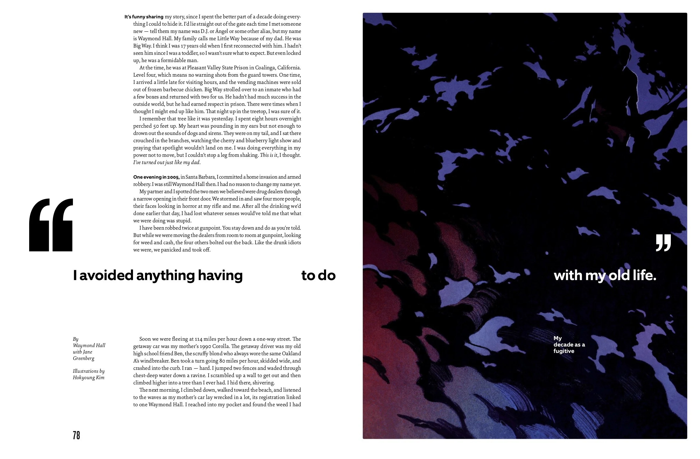
Illustration: Hokyoung Kim
SPD: What were the major creative elements?
LJ: Once we’d decided on Escape as the theme, the art department started to think about how to make the issue feel cohesive. One thing you’ll notice is that all of the headlines are quotes from one of the subjects in a story. Design-wise, we played around a lot with this idea on the page. The quotation marks frame the page; some stories have more white space surrounding the quotes than others. Some of the headlines are all on one line, one page, while others are separated on opposite sides of the spread. These decisions convey how these people dealt with their various escapes.
If I were to draw a Venn diagram of the two approaches to Escape, there would be a small area of overlap: the use of vertical lines, text alignment, and the imagery of a clouded blue sky. It’s probably more subtle than what most professors in identity design would likely recommend — but the intent was to be in that gray-ish area where the two titles remained true to their brands but still felt connected by association. I’ve always assumed that our readers/attendees are more visually literate than they even realize. Seeing how an identity system clearly ties everything together is satisfying, but I’m also interested in the subtleties and nuances of seeing things that are related in less obvious ways. It’s like seeing siblings with different personalities. They dress differently, but when they smile, you know they’re siblings. I suppose that’s why we call each other sibling publications.
SPD: Can you tell us about how the issue is segmented into 3 chapters?
AJ: The issue unfolds in three chapters: escaping the past, the present, and, finally, the future. The interstitials were produced with those sections in mind; the image of the clouds that introduces the “escaping the present” section is a current photograph, while the photograph’s design is altered for the “escaping the past” and “escaping the future” sections to represent subtle changes in time.

Photograph: Larissa Zaidan
SPD: The "Where is Your Escape" story is one of the features of this issue. How were the photographers and stories chosen?
Jacqueline Bates, Photography Director: Our cover story asks residents in three of the most populous cities in the world — São Paulo, Shanghai, and Los Angeles — to share where, and how, they escape. This is our first joint photo-illustrated essay, and I was so excited to work on this. We commissioned one established and one up-and-coming photographer in each city, so six photographers total. I also wanted to make sure we had one photographer who lived in that city and one photographer who didn’t, who could come in and shoot from an outsider’s perspective (a nod to Robert Frank’s The Americans). This amazing group of photographers included Tanyth Berkeley, Cristina de Middel, Lester Guijarro, Peng Ke, Xiaopeng Yuan, and Larissa Zaidan. It was really interesting to see the wide range of answers we received — some people’s escapes were literal and close by (a teenage girl escapes by dancing at an arcade after school), while some were far away (an airport employee’s standby flight to a country he’s never seen), and some to a different time period entirely. Our aim was to photograph people in their natural environment (the way they live in their city), as well as in their “escape” environment. When the latter wasn’t possible or we couldn’t get a photograph that represented it well, though, we commissioned illustrators to bring that escape to life in a different way. As you'll see, illustrations accompany most of the photographs in the essay and really add a new layer to the stories.
LJ: Yes, this may be the first time we had more illustrators than photographers in an issue!
AJ: This was also the first story that touched on all three of the regions California Sunday covers: the American West, Asia, and Latin America, which was an exciting feat for us.
SPD: How did you decide on the cover photo?
JB: The cover photograph is Peng Ke’s first editorial commission. It felt like a universal image of escape and longing — and when you open the magazine and see the sub-cover — featuring the subject in her working environment — you see a view into her daily life. The clouds that Annie mentioned using in the interstitials were also taken by Peng of clouds in Shanghai, which really ties the cover and the rest of the issue together as well.

Photograph: Richard Misrach
SPD: What was your favorite part about creating this issue?
LJ: I’m grateful for our photo department’s trust. Naturally, they want to see the photographs they commission take up as much visual real estate as possible — so when the idea of mixing photography and illustration together for the anchoring visual essay on “where people find their escape” was proposed, both Jackie and our photo editor, Paloma Shutes, were open and intrigued. If, at any point, they felt like we were doing a disservice to the photographs, I was prepared to abandon the idea altogether. But it stuck. We all felt that it worked well and felt unexpected in a good way. In the end, we commissioned six different photographers and nine different illustrators.
JB: As Annie mentioned, this was our first themed issue that included all of our territories, so we had the opportunity to do deep dives into the contemporary photo scenes in São Paulo and Shanghai, which is always so gratifying for us to work with new artists. I also loved going through Richard Misrach’s never-before-seen photos from Burning Man — he stumbled on a group of people while shooting in the desert in 1987. The images are surreal and otherworldly and far from what Burning Man has become today.
AJ: My favorite part is the development of the design system for this issue. The theme of escape allowed us to approach the design in a more conceptual way. We wanted to experiment and think about how to use type to convey the idea of escape.
I came up with the design for interstitials first, where I typeset the table of contents to form a negative space, having the idea that the type is outside of the box and escaping the form. With this principle in mind, I went in and saw how this approach would apply for each story, and how that would work with different lengths of the headline, how the dek and art could intersect within the space and interact with the headline. The result was something that feels refreshing and feels very different from our previous special issues. It’s less templated, and the design for each story is different enough that it allows the reader to feel refreshed and carries the energetic feeling from start to end.
SPD: What's next for California Sunday?
RN: We’re hard at work on our December issue! And we also find time to have some fun... we’ve been having a lot of really great issue launch parties this year in San Francisco, and we also launched The Escape Issue in New York City. It was exciting to see the appetite for the magazine on both coasts, and we can’t wait for you to see the next one.